
10 Most Common Web Design Mistakes To Avoid

Website design mistakes undermine site effectiveness and make it lose visitors and potential clients. That’s why it is important to create websites that are not only visually attractive but also easy to navigate and use. In this article we demonstrate examples of web design mistakes and give useful tips on how to avoid them.
1. Unbalanced Layout
Visitors come to the website looking for information but if it’s not organized and structured well, they will leave. To avoid it you should structure the page so that user can quickly find important chunks of information by simply looking through it.
Don’t let website design mistakes make it to your next layout:
- Always use grid. It splits you layout into sections with series of vertical and/or horizontal guides. You use these guides for placing elements and balancing the page.
- Use 2/3 rule: divide image into 9 equal parts (3 x 3) and place the most important object on the intersection of these lines.
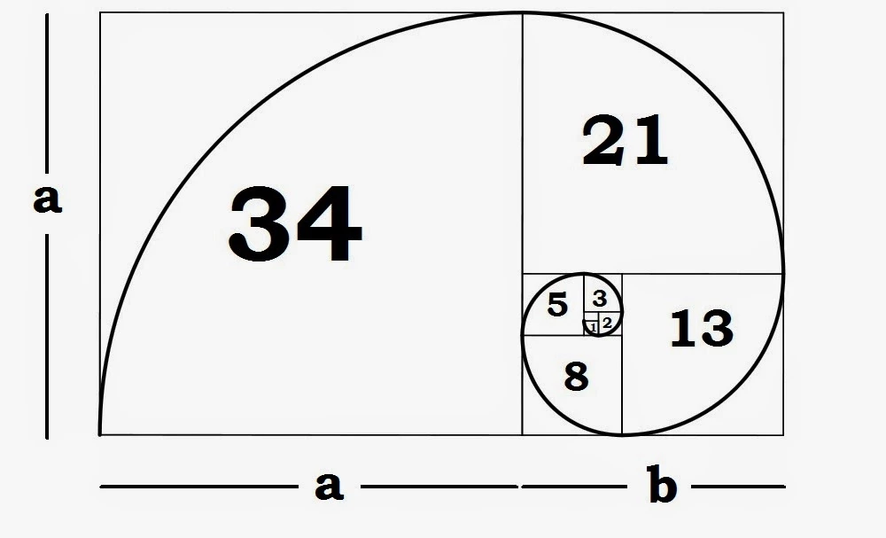
- Maintain the golden ratio. Nowadays you don’t even have to do any calculations — simply use one of those handy online calculators created for this purpose. When using golden ratio page layout is divided into 2 parts, bigger (a) and smaller one (b) maintaining the following proportion: (a+b) : a = a:b.
2. Navigation That Is Hard To Use
If user can’t find link to some of the website sections, he or she will automatically decide that there’s no such section on your website at all and leave. And when clicking menu item user expects to be taken to the respective section of the site. But drop-down menus force him or her to choose again and again — it’s pretty frustrating.
Remember the following:
- User expects horizontal navigation to be available on top of the page and vertical to be placed on the left.
- Try to avoid drop-down menus if you have only a couple of sections.
- The first and the last item attract more attention than the rest of them. Keep it in mind and place important information in the beginning. Reserve the last place for Contact us section.
3. Lack Of Page Design Consistency
When pages belonging to the same website differ too much in design, it confuses users since switching to another section might look like going to an entirely different site. Also, if position of navigation block changes from page to page the site looks disjointed.
To maintain design consistency:
- Use the same color scheme on all pages.
- Make sure vertical and horizontal spacing between the elements is identical on all pages.
- The size of titles from different pages should be the same.
- Don’t change the position of navigation on different pages (unless you are absolutely sure you know what you are doing and it’s justified).
- Stick to the same link formatting.
- Use icons following the same style.
- Maintain form consistency.
4. Poor Color Scheme
Colors not matching site theme will weaken the overall impression from the website. When weak colors you risk losing your visitor in seconds:
Mistakes in web page design above are caused by bad color scheme and are seen at once. To eliminate basic mistakes of this type, take the following into account:
- Check whether company has corporate colors. If yes, make sure you use them when creating website design.
- What is the goal of the website? Color theory says that red is color of passion and enthusiasm, it attracts attention and calls to action while blue is the color of calmness and confidence evoking feelings of trust and reliability. If you are free to choose colors, allow time for choosing those that best correspond to the website goal.
- Are there any photos or images you need to use? In this case you need to use colors that will match them well.
- Use three different colors. A recommended proportion is 60%, 30% and 10%. Remember that the more colors you use, the harder it would be to create a consistent, well-balanced page.
5. Design Looks Bad On Some Screen Resolutions
This issue has also made it to top 10 web design mistakes and comes in different forms. For example, users with smaller screen resolutions may see horizontal scrolling bar in their browser.
For design to look good on most screens:
- Place the most important sections on top of the page so that users won’t need to scroll to see vital information.
- Check whether text in columns of various size is easy to read.
- Make sure that all the elements stay whether they should be and nothing is misplaced.
Check whether it’s true for various resolutions from 800 x 600 to 1280 x 1024. You can also offer your client adaptive website development so that these web design mistakes won’t bother site visitors.
6. Lack Of Free Space
Of course websites should be rich in content. But the more the better is not a rule to live by:
Information should be provided in a way that leaves enough whitespace between the text blocks. It will help you to:
- Improve readability and overall impression from the text.
- Attract visitor attention to text by wrapping it in whitespaces.
- Create the feeling of elegance and openness.
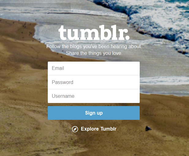
7. Too Complex Registration Forms
Days when users had to fill in numerous fields and re-enter data in validation fields are long gone:
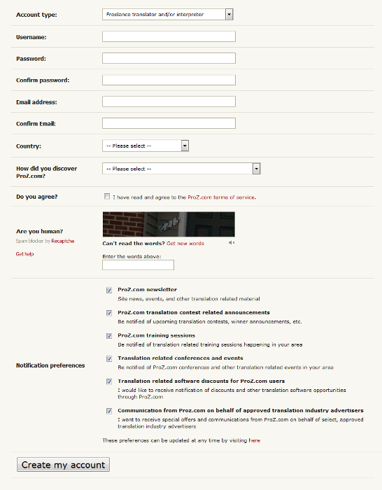
Make your forms as simple as possible. You can always request additional data from users later without annoying them:
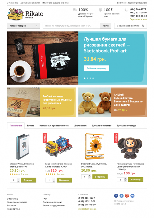
8. Unwise Usage Of Images
Too much images can negatively influence the overall impression but there’s no need to avoid them either:
Carefully selected images or photos complement the text on the page and help to understand what the website is about. Here are more advices on images:
- Every image needs a goal: to support ideas from the text, to trigger certain emotional response, explain how the product works etc.
- Use images with real people and avoid stock photography.
- Optimize image size so that it won’t take too much time to load them.
9. Contact Info Is Hard To Find
It is especially critical for shops — contact info has to be available on every page of the website and be noticeable enough.
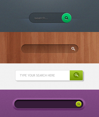
10. No Search
It is entirely possible that data the user needs is located somewhere deep within the website structure. Allow him or her to find it by adding search field. You can make this element pretty attractive actually:
Finally, we’d like to say that the most common mistakes in web design are often caused by inexperienced designers losing focus on client’s needs and thinking more about visual attractiveness of their designs then solving problems. It’s a road to nowhere so before proceeding to actual design, make sure you fully understand needs of your client and have received all the information necessary for creating a high-quality product.
Our Experience
Hosty
Stfalcon was contacted by a client with extensive experience in the realm of real estate rental, possessing a deep understanding of the subject matter and firsthand insight into the challenges faced by real estate managers.
While several property management solutions were available on the market, they were either cumbersome or lacked robust functionality.
Stfalcon's primary mission was to design an interface that would simplify and streamline the management of numerous properties, making it both straightforward and convenient. Additionally, we faced the challenge of seamlessly integrating our solution with the Airbnb API to ensure rapid and comprehensive data synchronization.
 Read the full case study
BBGO
The primary challenge of this project revolved around identifying the optimal design patterns for a new car ordering app. After an extensive analysis of numerous popular solutions, we identified the features that were most frequently utilized and valued by users, including:
- A user-friendly home screen with saved addresses.
- Streamlined car category selection with fixed pricing.
- A clear and intuitive display of the selected car.
- A post-trip review system for user feedback.
Simultaneously, the service aimed to incorporate a unique bonus system. Passengers would earn bonuses after each ride, which could be utilized for discounted rides or shared with friends.
To facilitate the most effective solution search, we conducted regular workshops in close collaboration with the client's team. Their active involvement in the design process fostered a relationship of trust, enabled real-time feedback, and expedited iterative changes for an optimal outcome.
 Read the full case study
Bottom Line
If you're encountering challenges in achieving both an exceptional visual design and efficient functionality for your websites, there are some fundamental adjustments you can implement to enhance your outcomes.
Building a remarkable website extends beyond incorporating all the latest features; it's about the strategic and aesthetic placement of your content. A successful website should incorporate crystal-clear calls to action, which effectively steer visitors and facilitate seamless navigation toward their desired destination. If you are interested in creating, a top product with effective web design, contact us, and our dedicated team will be happy to help you!