How Colour Affects Consumer Behaviour? Complete Guide
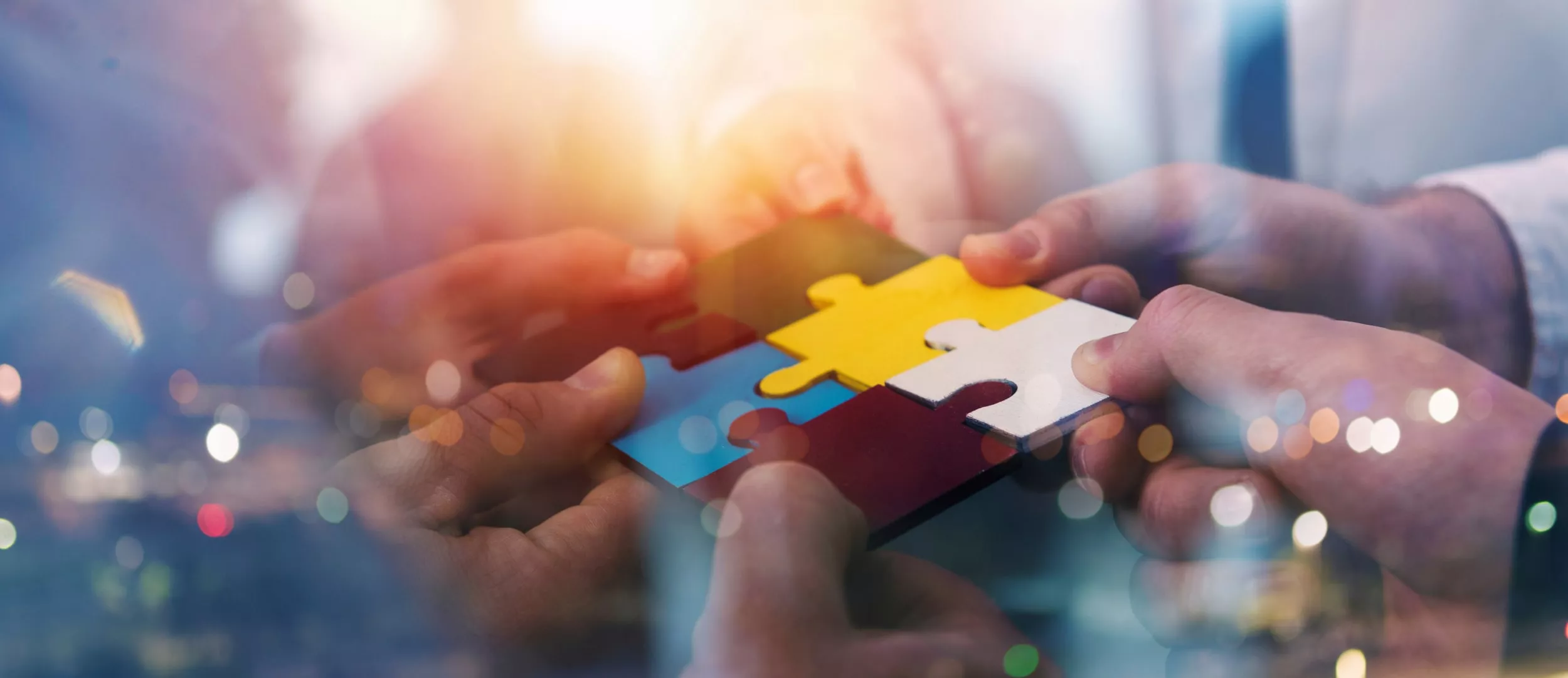
The effect of color on user’s behavior can’t be overestimated, especially when it comes to web design. The virtual user can’t touch the product or service physically, therefore well-chosen colors and user-friendly interface based on user experience are the most powerful tools of online communication. Which colors will help to increase website conversion and the mobile apps popularity?
Color psychology
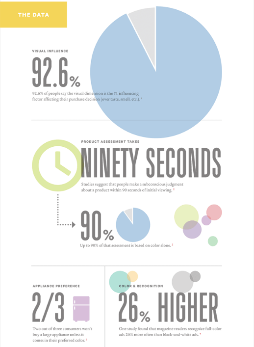
Studies show that it takes 90 seconds for a customer to form the opinion about the project and 90% of this opinion is influenced by the color. Two out of three consumers will make a large purchase only if they like its shade, and almost 93% of people primarily perceive visual information. That’s why so many people love infographics — it is much easier to perceive the same data visually:
 |
Creating a pen portrait of the target consumer
Depending on the age, gender and impulsivity of actions users have different reaction on colors and shades.
Age
The optimism of the youth — young audience loves vibrant saturated colors. As for older consumers, you should be careful with bright colors — too vibrant can decrease the conversion. Mature users, often think garish bright colors repulsive.
Men vs Women
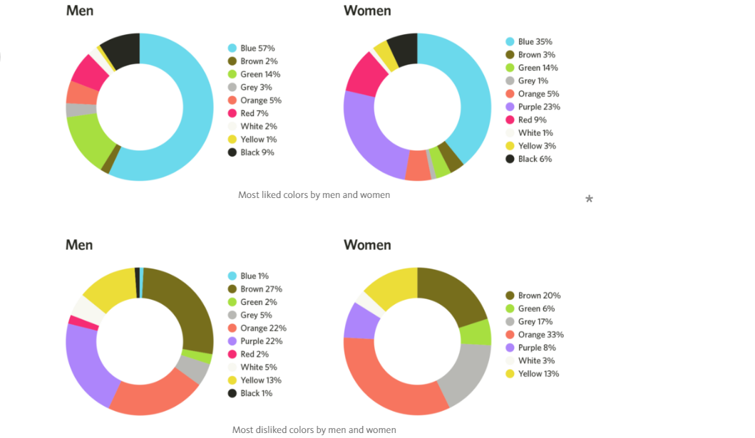
Color perception research shows that men prefer bright, contrasting colors, while women prefer softer shades. Both men and women like blue and green, but many women adore purple meanwhile, this color repels men.
Character
The so-called impulsive buyers who make decisions under the influence of immediate emotions, often choose orange, red, Royal blue and black colors. Economic shoppers, who will think ten times before committing to action, prefer a greenish blue and sea blue. Traditional buyers — often visitors of clothing stores prefer pink, Ashes of Roses and sky-blue.
Choosing lucky colors for your business
The brand is closely associated with the color, and the color, in its turn, with a certain sphere. When creating a product it is important to analyze which colors are most in tune with your idea. You also need to stand out among competitors.
Blue — tranquility, reliability, productivity
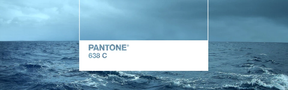
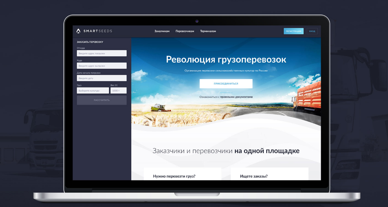
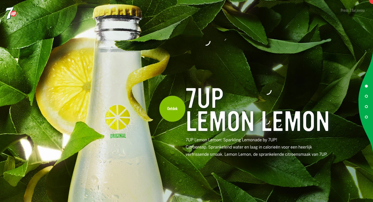
The blue color is the most popular among both men and women, in addition even people suffering from color blindness can see it. As a universal color for both genders, blue is actively used in messengers’ design (Skype, Twitter, Facebook). Shades of blue, as dominant, are suitable for industries: Finance, health, transportation, technology, agriculture. Blue color’s meaning is trust and focus on business relationship. Here is how we used shades of blue in SmartSeeds — the service for agricultural products transportation:
Green — sustainability, harmony, success and new beginnings
The PANTONE Color Institute has named GREENERY (15-0343) the most popular color 2017. Researchers believe the warm green tint, the first color of spring leaves, is a symbol of growth and professional development. As for website colors, green is used in various eCommerce projects in order to help customers relax, and improve sales with color.
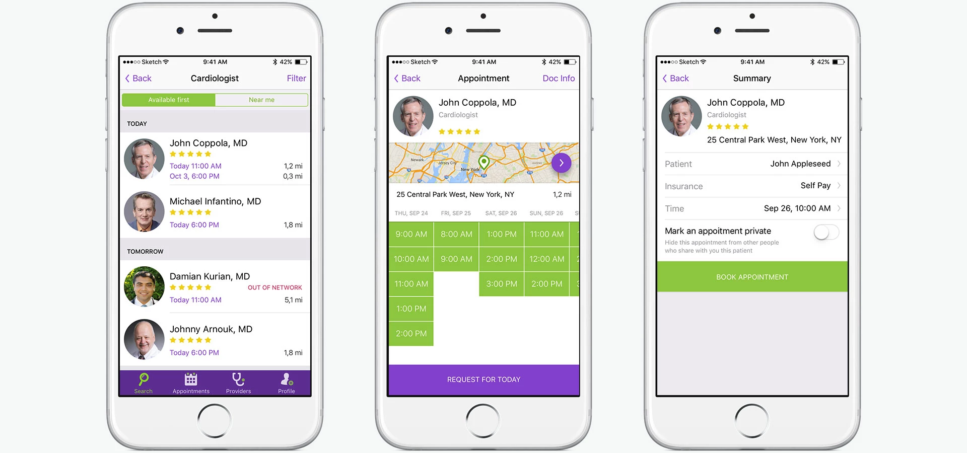
Website color schemes with green are recommended for financial, food, home appliances spheres as well as the original solution for the healthcare industry. Here’s how we used green in IsDocIn application design — an Uber-like service to search for a doctor in the United States.
Red — energy, attention and entertainments
For the first time in 12 years YouTube has changed its logo from red to even redder — #FF0000 «a really pure red that goes to the RGB of video». The red color is perfect for sales and promotions, but in addition to aggression and quick reaction, the red color meaning is also love, passion and entertainment. Red choose global brands in fast food and drinks industries: McDonald’s, Coca-Cola, Red Bull. The red color is also chosen by Nike, Nintendo and Colgate. If to talk about the use of red for call-to-action buttons, the red HubSpot button was 21% more effective than the green competitor.
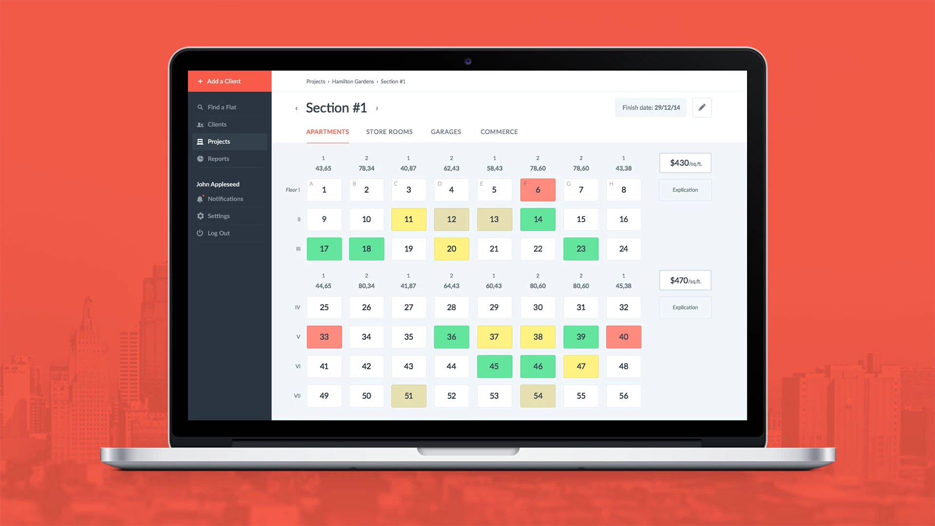
Our experts used red color, when designing a CRM for real estate. A soft color does not distract or tire eyes throughout the day, meanwhile, it emphasizes object’s status, for the convenient work in the system:
Black is the color of premium segment
The black color is the most popular emphasis on luxury goods marketing. It is popular for categories: technology, clothes, cars. As the core, this color use MontBlanc, Jaguar, Chanel and many other fashion houses. In January 2017 Juventus has changed its logo to black and white. Now on the club’s official website yellow color is present only in small details and subscribe button.
Yellow plus brown — sense of confidence and good mood
Shades of chocolate, as well as blue color, give a sense of confidence, while yellow inspires joyful emotions and optimism. Our designers used the combination of yellow and dark brown when creating the On-Demand Massage project — a massage therapist searching service.
Colors and marketing insights
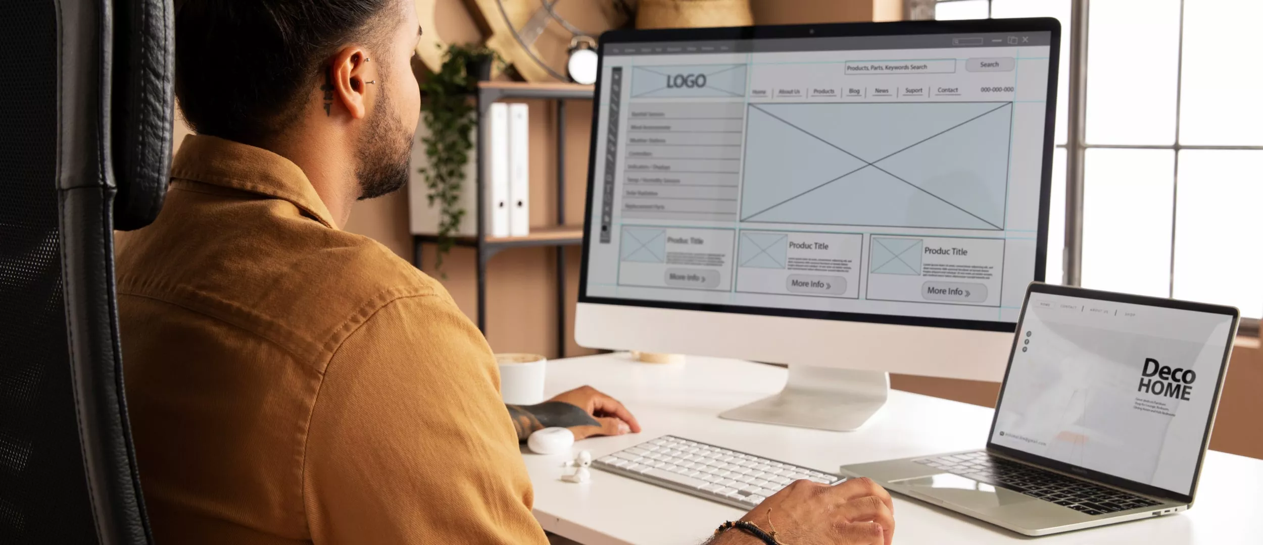
In order to increase conversion and create the good image of your product, it is important to use colors and shades correctly. It is obligatory to analyze the potential audience, the competitive field and to take into account the color trends in your industry. Remember, if you like the color personally, it does not mean that this color will attract your customers. Still best solution is to ask professional web designers to help with the color palette selection for your product. Creating a custom app design, specialists curate all the details, so that your users have an intuitive solution which will increase the audience loyalty.
Our team has strong experience in a custom design creating and native Android & iOS app development, as well as in creating complex solutions and CRM systems for large business. Share your idea on info@stfalcon.com! Let’s create the project of your dreams together!