Nova Poshta Shopping V2.0 — the redesign of the site for a delivery service
npshopping.com
In the course of the service long existence, our customer had found out a lot of drawbacks in the work of its interface and the service itself. We wanted to know, which problems had been the most critical for the users. Besides, we were eager to find some new creative insights to approach the redesign substantially.
Investigation
To dive deep into the product and to offer the most viable decisions to our client, we needed to know not only the requirements of the business, which we worked for but also the problems of the service users, the tasks they set for NPS and the benefit they wanted to get from it.
Read about first version of Nova Poshta Shopping
After we had become familiar with our customer’s opinion, we decided to dive deeper into the world of service users. In the first turn, we went all the user way through, starting from the registration on the site and finishing with getting the package at a local post office of Nova Posta. It provided us with the first-hand knowledge of the process.
The specialists of our team had taken 7 in-depth interviews of the users and found out certain problems of the interface and the service in more deep-lying levels. We started to realize why the problems occurred and what the users’ opinion as to it was. It provided us with more space for generation ideas.
Additionally, we have investigated the analytics of the project, read comments in social networks and studied the complaints coming to support.
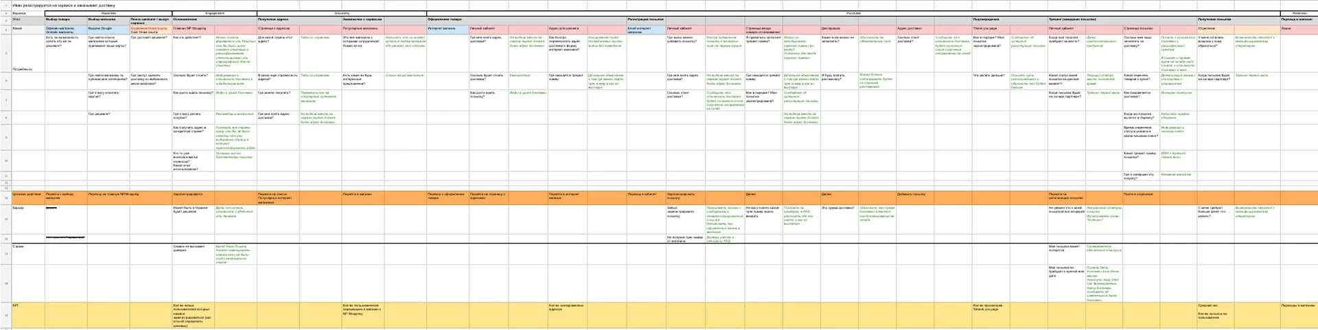
We had arranged the results in the form of an ideal user case — Customer Journey Map, which became the basis for the future service interface design.
Prototyping and testing
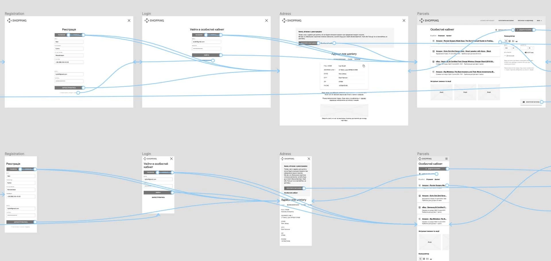
After the investigation stage, we knew for sure, which problems we were going to solve, we had to try different variants in practice. We used Low-fi prototype, which is a perfect choice for such cases, it’s easy to create, to test on real users, and it’s quick to make the necessary changes to already after the first feedbacks.
In the course of testing, the prototype was constantly updated and soon it turned into a ready-made guide for the designer, all he had to do further is just to sit down and to draw it.
After the investigation and testing stages, the customer and our team as well got quite another level of confidence in the liveness of the solutions we proposed.
What has been done
We used the old site style, to which the users had been already accustomed, as a basis, due to the fact that the main task of the present redesign was specifically the UX
In the course of the redesign we:
- Changed the home page. We made our best to explain the essence of the service to the customer in detail, to estimate the cost of delivery and to indicate the stores, where shopping could be done;
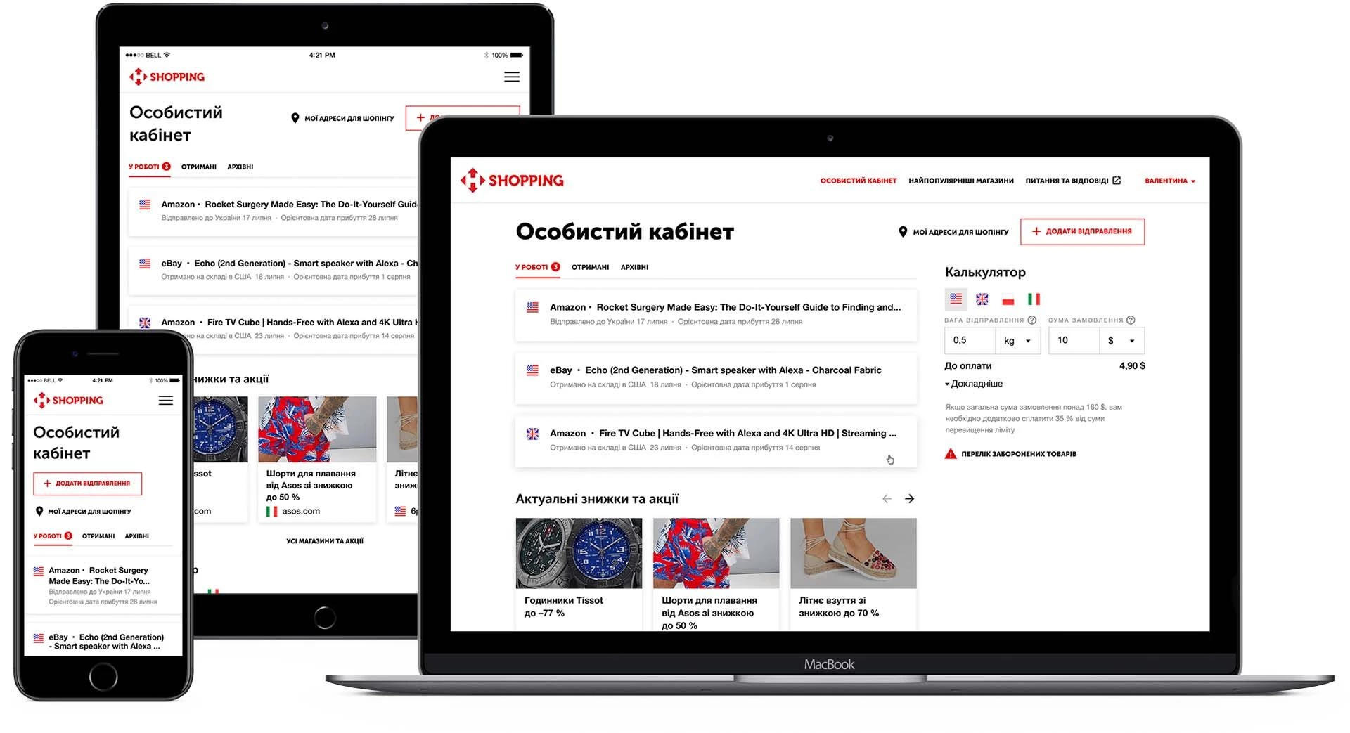
- Totally reconsidered the packages page. We turned it into the full-featured personal account with all the necessary information at hand;
- Changed the page of the separate package. We have improved certain deficiencies, which confused the users;
- Added the section of Special Offers. It should motivate the users to buy more and order delivery then.
We also:
- Added Questions-and-Answers section, our specialists used Zendesk possibilities for the purpose;
- Integrated the service Mopinion for the online collection of the service reviews and NPS estimations;
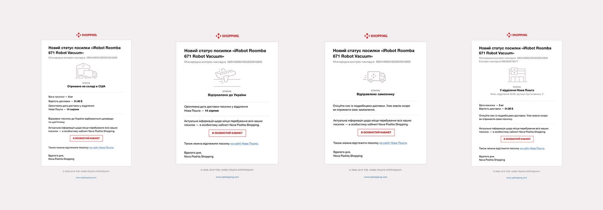
- Changed letters. We made them more informative and beneficial for the users. One can now track the shipping even without logging in into a Personal Account.

«Questions and answers» Section
We’d like to write about the section with the most frequently asked questions in more detail. The users badly lacked it, and it left a certain loose end in their relationship with the service. In fact NPS seemed not so straightaway and clear to the users, as it really was. Besides, we aimed to reduce the task load on the support department.
We used a Zendesk-based solution as the basis for the section. It’s a perfect tool, which is easily integrated and can release the service owner from a number of problems. And one of such problems is the development of the in-house solution, which is anyway unlikely to be competitive to Zendesk from the point of view of functionality.
We managed to adapt the section to the general visual style of the service interface so that the user doesn’t get the impression that he has been taken to another site.
Cast:
-
 Oleksandr Arbuzov
Project Manager
-
Maksym
Design Team Lead
-
Mykola Anikieienko
Designer
-
Yulia
Designer
-
Ruslan
Frontend Developer
-
Andriy
Frontend Developer
-
Yevgen Zholkevskiy
Backend Developer
-
Timur
Backend Developer
-
Yevhen
DevOps Team Lead


Case Studies
-
Nova Poshta — Dashboard
Personal dashboard design for the leader of express delivery, Ukraine
-
Nova Poshta Shopping
Delivery from foreign stores, Ukraine
-
Fwdays
The site of the largest Ukrainian tech conferences, Ukraine


