
Why Does Responsive Web Design Matter
Responsive web design is about creating websites that are accessible, user-friendly, and can adapt to changing technologies and user behaviors. By designing with responsiveness in mind, businesses and organizations can stay ahead of the curve and provide a positive user experience across all devices.
What Is Responsive Web Design?
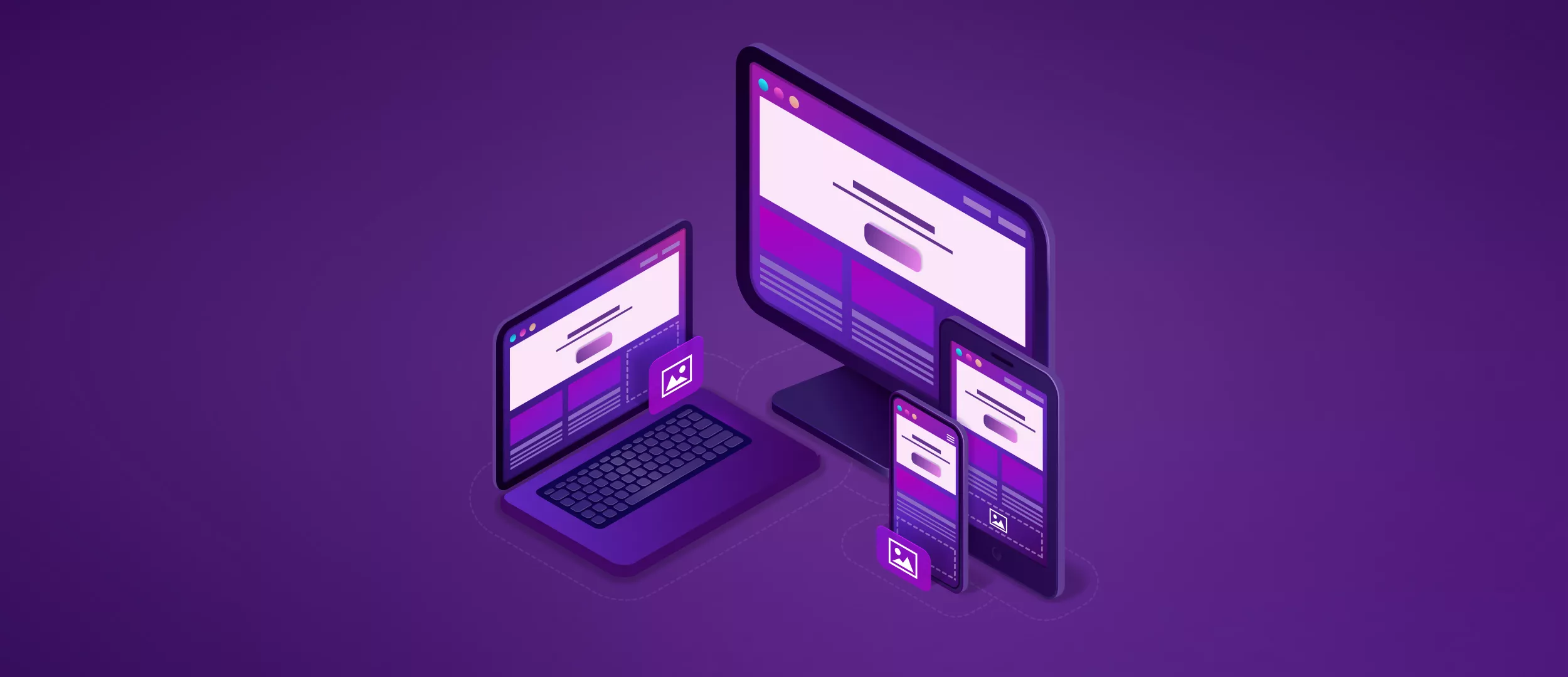
Responsive web design is a method of designing websites that allows the layout and content to adapt to different screen sizes and devices. This means that a website designed with responsiveness will look good and function flawlessly on a desktop computer, a tablet, a smartphone, or any other device that can access the internet.
Responsive web design achieves this adaptability by using flexible grids, images, and media queries. Flexible grids allow the layout of a website to adjust to the size of the screen, while flexible images and media queries ensure that images and videos are displayed at an appropriate size and resolution for the device being used.
By designing a responsive website, you can provide a consistent user experience across all devices, improve your website's accessibility and SEO, and ultimately reach a wider audience.
The Concept Of Responsive Web Design
The concept of responsive web design is based on the idea of creating websites that are flexible and adaptable to different screen sizes and devices. Rather than creating separate designs for each screen size or device, responsive web design uses a single design that can be adjusted based on the size of the screen.
The goal of responsive web design is to provide a consistent and user-friendly experience across all devices. By ensuring that a website looks good and functions well on desktops, laptops, tablets, and smartphones, businesses and organizations can reach a wider audience and improve their website's accessibility.
Responsive web design achieves flexibility and adaptability through the use of flexible grids, images, and media queries. Flexible grids ensure that the layout of a website adjusts to the size of the screen, while flexible images and media queries ensure that images and videos are displayed at an appropriate size and resolution for the device being used.

Ivanna
Client Manager
Responsive Web Design vs Adaptive Design
Responsive web design and adaptive design are two popular approaches used by web designers to create websites that can adapt to different devices and screen sizes.
Responsive web design
- It is a method of designing websites so that they automatically adjust their layout and content to fit the screen size of the device being used.
- It uses a grid system and flexible images that adjust in size depending on the screen size of the device.
- It provides a consistent user experience across different devices, as the website adapts to fit the screen size of the device being used.
- Responsive web design takes longer to develop, as it requires more complex coding to ensure the website is fluid and adjusts to different screen sizes.
- It is easier to maintain, as the website only requires one set of code that adapts to different devices.
Adaptive design
- It uses predefined layout sizes to target specific devices and resolutions.
- It uses multiple fixed layouts that are specifically designed for different device sizes.
- The adaptive design provides a tailored experience for each device, but can sometimes result in inconsistent user experiences.
- Adaptive design is quicker to develop, as it uses predefined layouts.
- It requires multiple sets of code for different devices, which can be more difficult to maintain.
The Building Blocks of Responsive Web Design
Building blocks include CSS and HTML, media queries, fluid layouts, flexbox layouts, responsive images, and speed.
CSS and HTML
CSS (Cascading Style Sheets) and HTML (Hypertext Markup Language) are the basic building blocks of web design. CSS is used to style and format the content, while HTML is used to structure the content. With responsive web design, CSS and HTML play a crucial role in creating a responsive layout. Using CSS, developers can define different styles for different screen sizes, and using HTML, they can structure the content in a way that makes it easy to adapt to different screen sizes.
Media Queries
Media queries are a powerful tool for creating responsive web designs. They allow developers to define specific styles for different screen sizes and devices. Media queries are written in CSS and use conditional statements to determine which styles should be applied based on the size of the screen. For example, a media query might define styles for screens that are smaller than 600 pixels, or for screens that are between 600 and 800 pixels.
Fluid Layouts
Fluid layouts are another important building block of responsive web design. A fluid layout is a layout that adjusts to the size of the screen. This is in contrast to a fixed layout, which has a set width and does not adjust to different screen sizes. Fluid layouts are achieved by using relative units, such as percentages, for defining widths and heights, instead of fixed units like pixels.
Flexbox Layout
Flexbox layout is a newer CSS feature that is ideal for creating flexible and responsive layouts. Flexbox allows developers to create complex layouts with a minimum of code. With flexbox, elements can be aligned, positioned, and spaced flexibly and responsively. Flexbox is especially useful for creating responsive navigation menus and grids.
Responsive Images
Images are an important part of web design, but they can also be a challenge when it comes to responsiveness. Responsive images are images that adjust to the size of the screen. This can be achieved through various techniques, such as using the srcset attribute, which allows developers to define different images for different screen sizes, or by using CSS to adjust the size of the image based on the screen size.
Speed
Speed is a crucial aspect of responsive web design. A website that is slow to load will not provide a good user experience, especially on mobile devices. To ensure that a website is fast and responsive, developers need to optimize the code, compress images, and use techniques like lazy loading to ensure that the page loads quickly.
Showing Or Hiding Content
Responsive design is all about ensuring your website looks great and functions well on any device or screen size. One key aspect of this is showing or hiding content based on the device being used. For example, you might want to show a large image on a desktop computer, but hide it on a mobile phone to save space. To achieve this, you can use CSS media queries to target specific screen sizes and apply different styles to your content. For example, you could set the "display" property of an element to "none" for small screens and "block" for larger screens. This will allow you to tailor your content to each device and provide the best possible user experience.
Touchscreens vs. Coursors
Another important consideration in responsive design is the difference between touchscreens and cursor-based devices like laptops or desktops. Touchscreens require larger buttons and elements that are easy to tap with a finger, while cursor-based devices can use smaller buttons and more precise targeting. You can use CSS to adjust the size and spacing of your buttons and other interactive elements based on the device being used. You can also use JavaScript to detect whether the device is a touchscreen and adjust the behavior of your website accordingly.
Responsive Typography For Your Website Text
Typography is an important part of any website design, but typography in responsive web design becomes even more important. You want your text to be legible and easy to read on any device, whether it's a small mobile phone or a large desktop monitor. To make typography responsive, you can use CSS to adjust the font size, line height, and other typographic elements based on the screen size. You can also use responsive typography frameworks like FitText or Typeplate to automatically adjust your typography for different devices.
Test Responsiveness
It is crucial to test your responsive website to ensure it works well on a variety of devices and screen sizes. There are many tools available for this, including browser-based emulators, responsive design testing websites, and device testing labs. It's also important to test your website on real devices, as this will give you a better sense of how it performs in the real world. Make sure to test your website on different devices and browsers, and iterate on your design until you're satisfied with the results.
Responsive Design Examples
When using responsive design, a website's layout, and content adjust automatically to the screen size and device used to access it. Here are some examples of websites that have implemented responsive design successfully:
1. Online Newspaper: New York Times
The New York Times is a well-known newspaper and a great example of responsive web design. The website is designed to be easily accessible on desktop, mobile, and tablet devices, with a layout that changes dynamically depending on the user's screen size. For example, the navigation menu changes from a traditional top-bar menu to a hamburger menu on smaller screens. The website's content is also designed to be easily readable on different devices, with font sizes and line spacing that adjust according to the screen size.
2. Blog: The Art of Non-Conformity
The Art of Non-Conformity is a personal development blog that uses a responsive design to ensure that its content is easily accessible on all devices. The blog's layout is designed to be simple and minimalist, with a focus on the content. On smaller screens, the sidebar is hidden, and the content is rearranged to make it easier to read. The font sizes and spacing are also adjusted to ensure that the text is easy to read on all devices.
3. eCommerce: Amazon
Amazon is one of the world's largest eCommerce websites, and it uses a responsive design to ensure that its website is accessible to all users, regardless of the device they are using. The website's layout changes depending on the screen size, with the navigation menu and search bar changing position on smaller screens. The product listings are also designed to be easily readable on all devices, with images that resize automatically and font sizes that adjust according to the screen size.
4. Video Site: YouTube
YouTube is a well-known video-sharing website, and it has a responsive design that ensures that its content is accessible on all devices. The website's layout changes dynamically depending on the screen size, with the video player and sidebar moving below the video on smaller screens. The website's content is also designed to be easily readable on all devices, with font sizes and spacing that adjust automatically.
Our Experience
Passenger Transportation Company MeinFernbus
Stfalcon was participating in the development of the app and website of MeinFernbus, which works in 20 European countries on 100,000 various routes. To achieve responsive design, our team used a combination of techniques such as fluid layout, flexible images, and media queries that allow the app to adapt to the user's device.
 Read the full case study
Real Estate Rent Hosty
A client, well-versed in the field of real estate rental and possessing a profound understanding of the challenges faced by property managers, approached Stfalcon. Stfalcon was primarily responsible for creating an interface that would ensure effortless and hassle-free management of multiple properties. The designer's objective was to design an interface that utilizes a minimal number of distinct components while ensuring optimal usability.
 Read the full case study
Bottom Line
Responsive web design matters because it ensures that a website is accessible and user-friendly on all devices, including desktops, laptops, tablets, and smartphones. Users can access the same content and features, regardless of the device they are using, making it easier for them to navigate and use the website.
Also, responsive websites are more likely to rank higher in search results, improving visibility and driving more traffic to the website.
Creating a separate mobile website can be expensive and time-consuming, so responsive design eliminates the need for a separate mobile website, reducing development and maintenance costs. You can choose from numerous free responsive web design templates, or give your project to professionals.
At Stfalcon we create websites with responsive designs that can work flawlessly on all devices, just contact us, and a free consultation is available.