Best Free Fonts, Part 2
So many good fonts have appeared in several recent years, and lots of free among them, that we have made up our mind to write a continuation of our article about the free fonts for designers.
Every designer has a set of his own favorite fonts, which he is comfortable with and which reflect his graphics style. The designers often say: «You can’t get enough of good fonts». Nowadays it’s easy to make a set of such kind, totally consisting just of free fonts.
Why do you need free fonts?
The answer is quite obvious — licensing cost saving on the usage of the fonts in a ready product. The cost of the web license often depends on the number of page views. If the users visit, for instance, 2 million pages a month on your popular site, the license fee can reach thousands of dollars monthly.
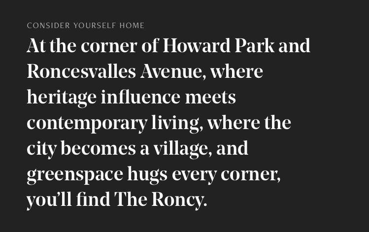
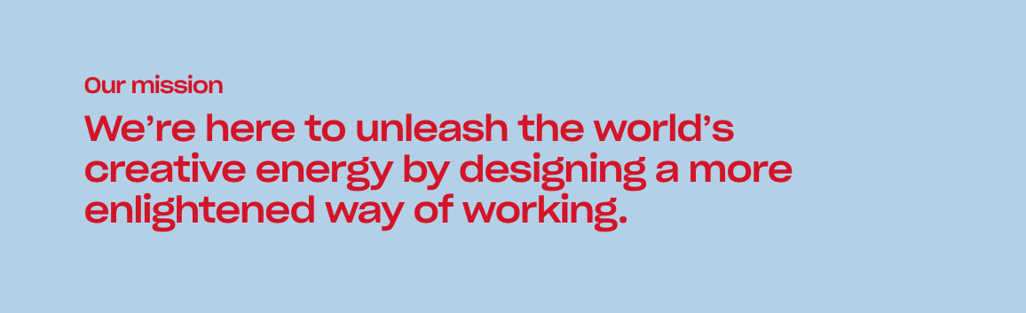
Modern typography has much more simple attitude to the fonts, and the difference between the display typefaces and text types is only formal at present. You can see below, how interesting the text looks with the following paid fonts.
Lydian font

Cooper at the new Mailchimp
NoeDisplay
Sharp Grotesk at Dropbox site
Here are the 5 free fonts, which are as good as the paid ones above:
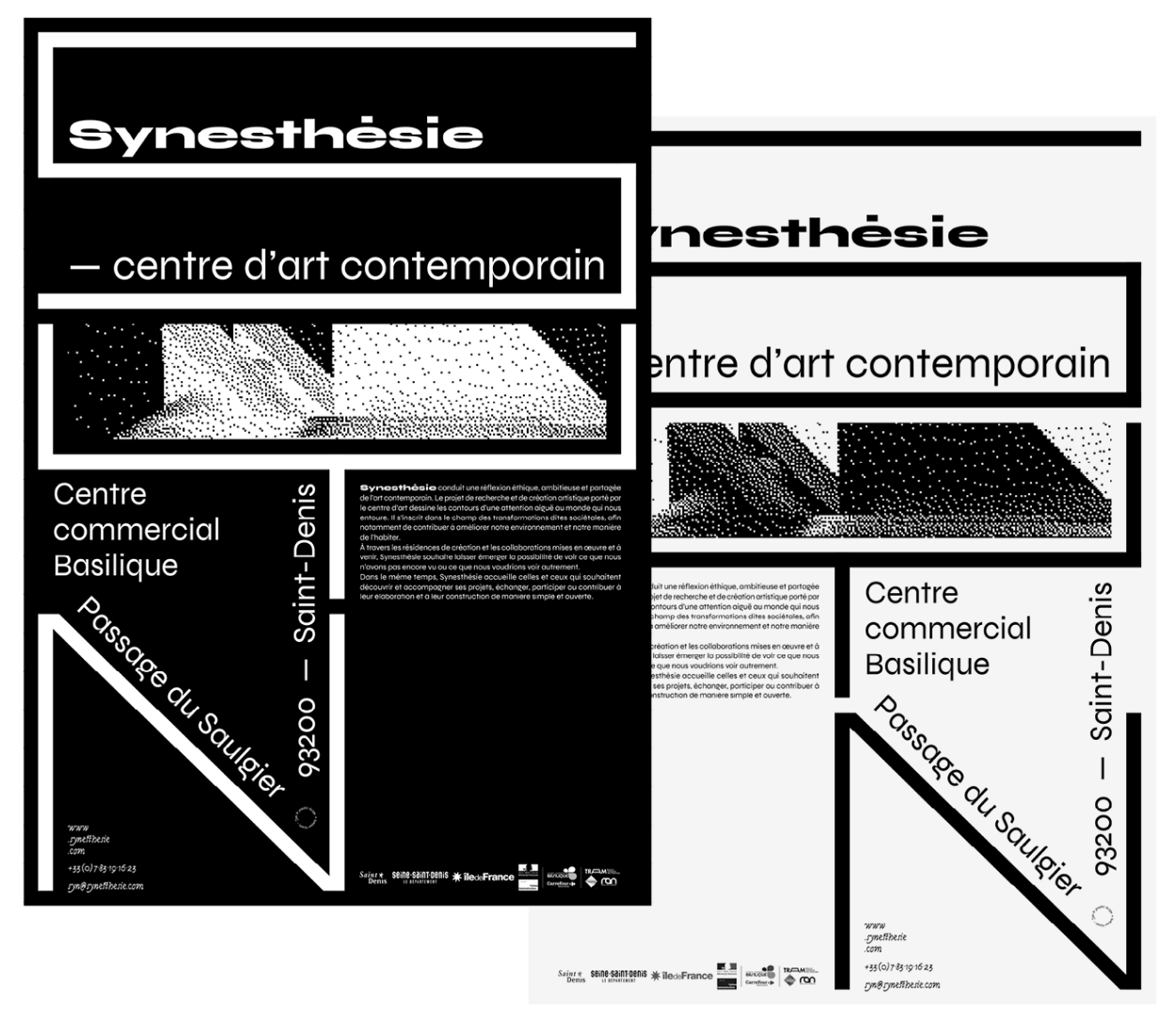
1. Syne — it is a French font created for Saint-Denis Art Gallery. It received an open-source license in summer 2018. Though it has a bit weird Mono and Italic variations, the overall text pattern looks rather interesting when they are applied. Bold and Extra variations of the font can become a free replacement to Druk or Sharp Grotesk.
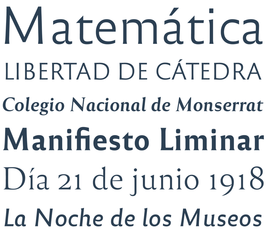
2. Reforma — this font is created for Universidad Nacional de Córdoba in Argentina, the oldest State University. It demonstrates a delicate balance between the traditional Roman lithoglyph and plain user-friendly letter form. There are just 18 designs of typeface, which allows to easily choose the necessary style for the text.
3. Facultad — at present, the font has just one typeface design, but it’s quite possible it will in future develop into a type family of multiple weights and variations. Such font type is called “Humanist grotesque” – it means that the font demonstrates more calligraphic influence than the one in Geometric san-serifs.
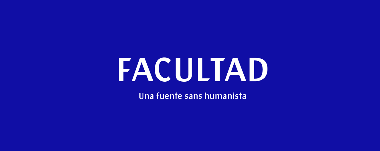
The font has a moderate contrast of character strokes and a good x-height, both these factors are beneficial for user reading speed.
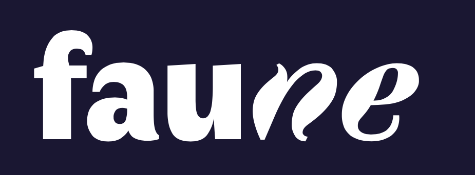
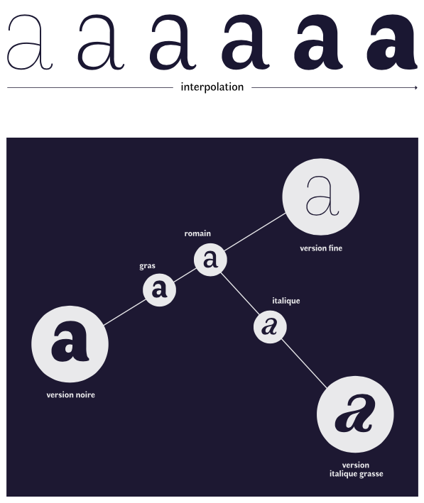
4. Faune — Faune is one more French font with a prominent character and open letter form. You can use the font for a poster as well as for the text on your site, it will never leave a reader indifferent to the content.
Interpolation method was used during the typeface creation and it allows generating hybrid and intermediary variations of the font.
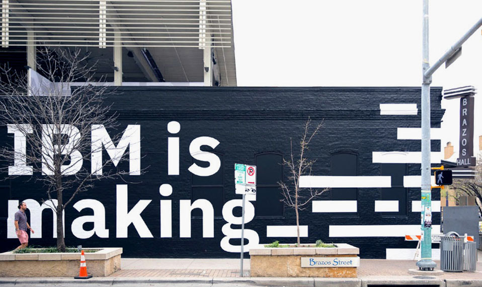
5. IBM Plex — IBM spent more than a million dollars annually on Helvetica Neue license, being nevertheless unable to install the font onto all 380 thousands computers of IBM employees. It was one of the reasons, why the company has developed its own font. Plex — is a universal and clear font, supporting more than 100 languages, 4 subfamilies and 16 designs of typeface in each variant. The font is appropriate for any template design and it can easily be used for display matters as well as for body text. The letter design comprises simultaneously soft humanism and sharp bends, reflecting the brand origin and IBM company spirit, -to turn the best technological solutions into the client’s business values.
The IBM font is also represented in the Google web font library. We have additionally prepared 5 good new fonts from Google Fonts:
1. Nunito — being a soft, rounded font, Nunito has recently received a more reserved Sans version. Nevertheless, the main version can still be used in the interfaces.
2. Proza Libre — it’s a free version of a perfect humanistic font, it looks especially attractive in small text sizes.
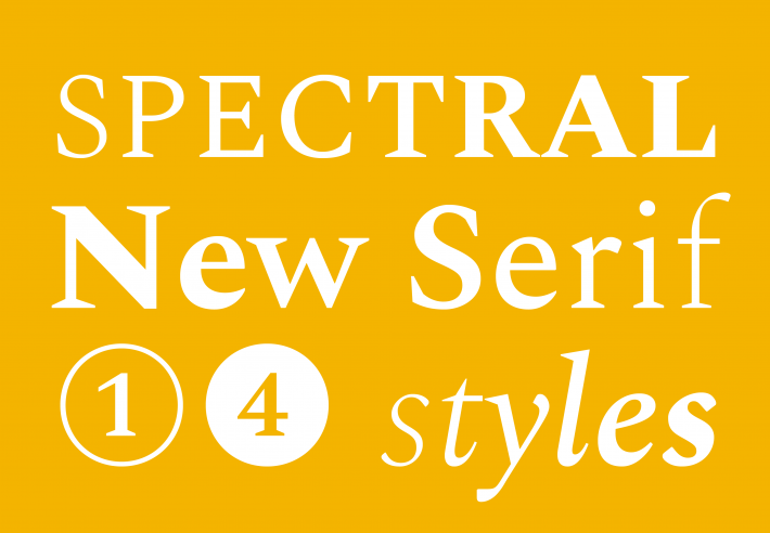
3. Spectral — spectral is a serif typeface of a good quality developed on the order of Google and optimized for long-form screen reading.
4. Inknut Antiqua — it is one more font good for large texts or books, patterned like an old manuscript with fancy shapes. But because of the large kerns, it requires an increased line-spacing for comfortable reading.
5. Poppins — it is a new font belonging to the category of popular Geometric san serifs. It works perfectly in large size, but weak contrast in small size, makes long texts typing difficult.