

Випуск iPhone X (читається як iPhone 10) був приурочений до 10-річчя Apple Smartphone. Подія стала несподіванкою для фанатів Apple, порушивши логічний ланцюг випусків (де iPhone 9?), і змусила всіх шанувальників iPhone ще більше чекати на реліз. Поки користувачі рахують дні до 3 листопада, давайте дізнаємося, як великий екран і новий Super Retina вплинули на тренди дизайну мобільних застосунків для iOS.
iPhone X, що нового?
iPhone 10, окрім бездротових можливостей (навушники та зарядка), покращеної камери та повністю скляного дизайну, здивував фанатів можливістю створення Animoji. Використовуючи камеру TrueDepth, користувачі тепер можуть створювати анімовані Emoji, які повторюють міміку людини. Для цього розробники Apple використали потужний процесор A11 Bionic з Neural Engine, який значно прискорює процес відтворення відео і надає новий імпульс для створення застосунків, що використовують доповнену реальність.
 |
Крім того, Apple має дійсно великий екран і незвичну форму дисплея без кнопки Home.
Великий вигнутий екран
Новий iPhone X буде приблизно на 20% (145 пікселів) вищим за своїх попередників. Інновації, які вплинуть на дизайн мобільних застосунків для iPhone X:
- Дисплей розміром 5.8 дюймів з роздільною здатністю 1125×2436px;
- Закруглені кути дисплея;
- Відсутність фізичної кнопки внизу екрану;
- Виріз для камери та динаміка вгорі екрану.
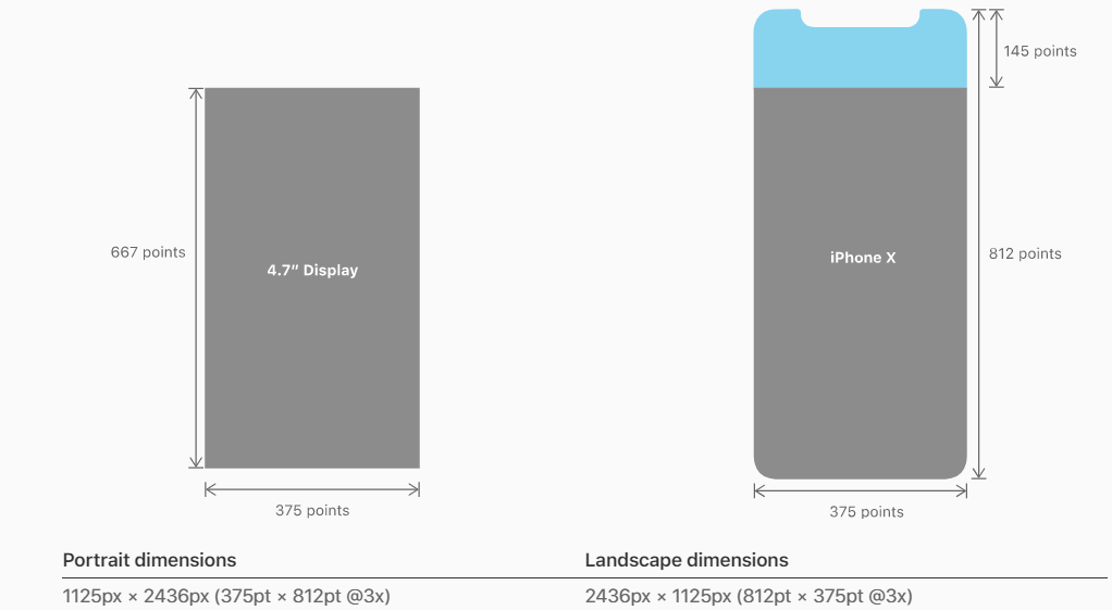
Розміри iPhone X у порівнянні з попередньою моделлю
Прощавай, кругла кнопка!
Вперше у iPhone немає фізичної кнопки Home, однак розробники Apple все ж залишили сенсорну опцію на випадок, якщо користувач захоче повернутися «додому». Тепер достатньо провести пальцем вгору знизу, щоб потрапити на головний екран. Ця інновація ще раз підтверджує орієнтацію мобільного дизайну на інтуїтивні жести.
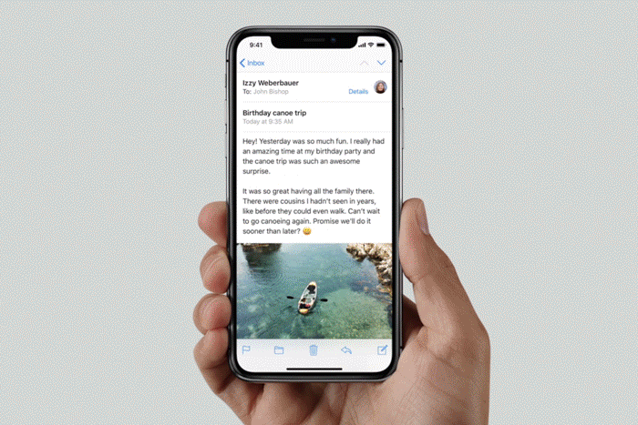
Кнопка не завжди видима — розробники iOS передбачили можливість приховати сенсорну лінію, якщо користувач не торкається екрану протягом кількох секунд. Ця опція корисна для перегляду фотографій та відео. Колір кнопки буде адаптуватися до фону вашого застосунку. Здається, Apple дійсно створила просторий екран, але дизайнерам слід бути обережними з нижньою частиною екрану — функціональні елементи можуть бути розташовані лише по краях дисплея, враховуючи, що вони не повинні перекривати кнопку Home.
Визначення безпечної зони
Кнопка Home (яка ховається через кілька секунд), закруглені кути та незвичний виріз у верхній частині екрану надають більше простору для креативності, але також змушують дизайнерів застосунків бути обережними.
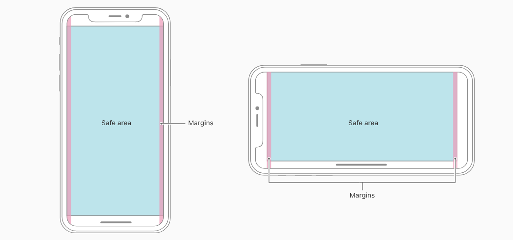
Безпечні зони iPhone X у портретній та ландшафтній орієнтаціях
Наприклад, щоб увімкнути режим на весь екран, фон застосунку має бути розподілений по краях дисплея; вертикально прокручувані елементи, такі як таблиця, повинні досягати дна екрану. Це особливо актуально для застосунків з фіксованою висотою області контенту. Не забувайте про кнопку Home — не плануйте активні елементи внизу дисплея. Червоні зони також «під загрозою», оскільки цей контент буде обрізаний закругленими кутами після прокрутки.
Індивідуальний дизайн елементів
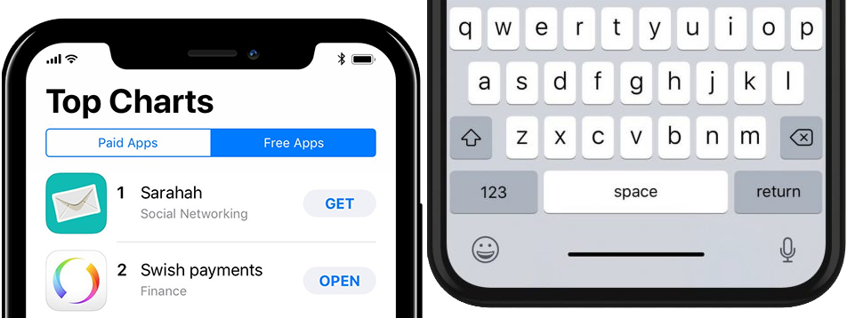
Статус-бар
Важливо зазначити — статус-бар в iPhone X на 22 пункти вищий, ніж у попередніх версіях. Також елемент не змінює висоту під час запису голосу або геолокації. Apple не рекомендує ховати статус-бар в застосунках для iPhone X, але якщо ця опція вже використовувалася в застосунках, її слід переглянути.
Клавіатура
Тепер немає потреби надавати кнопки Emoji та запису голосу при створенні клавіатури для iPhone X — ці елементи автоматично додаються внизу екрану, поруч із кнопкою сенсора Home.
Super Retina Display, x3 зображення та Face ID
iPhone X підтримуватиме автентифікацію користувача за допомогою Face ID. Для застосунків, інтегрованих з Apple Pay та іншими сервісами, що потребують автентифікації, цю інновацію слід врахувати.
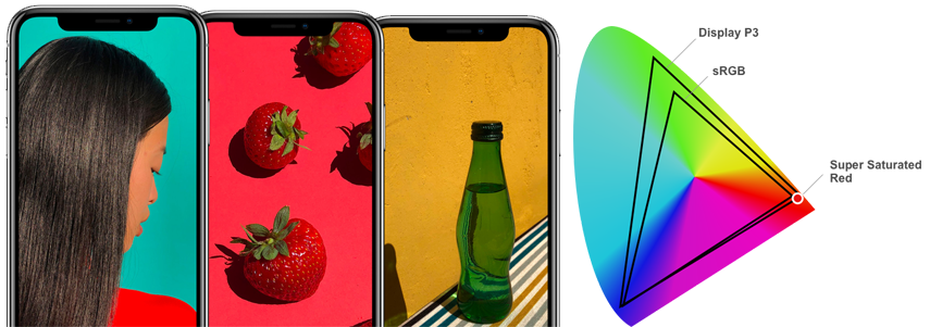
Новий iPhone X використовує колірний простір P3. Такий колірний простір застосовується в цифрових кінотеатрах. Інновація iPhone дозволить покращити зображення завдяки ширшому спектру кольорів, ніж sRGB (хоча покращена кольоропередача навряд чи буде помітна людському оку).
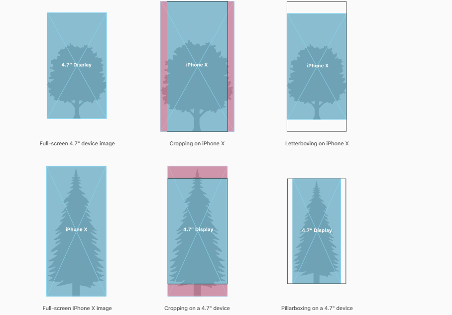
Творці iPhone X, незважаючи на інноваційний дизайн смартфона, залишили зображення з роздільною здатністю x3. Це дозволяє дизайнерам безпечно використовувати готові активи для створення іконок, кнопок та інших елементів. Хоча пропорції дисплея трохи змінилися, в цілому, дотримуючись параметрів безпечної зони, дизайнер може легко спланувати розміщення важливого контенту як для нових, так і для попередніх версій смартфона.
В статті були використані візуальні матеріали з офіційного сайту Apple сайту, а також прес-реліз iPhone X прес-релізу. Завантажити актуальні шаблони UI для Photoshop та Sketch ви можете тут.
Наші фахівці створюють індивідуальний дизайн і мають великий досвід у розробці нативних Android та iOS застосунків. Напишіть нам на info@stfalcon.com, щоб поділитися своїми ідеями. Ми допоможемо вам реалізувати ваш проект мрії!