Now that the trend of creating flat design sites is widespread, we have selected 5 great examples of its use for you. But first let’s remember why “flat” design over the past few years has become, de facto, a synonym for modern web design.
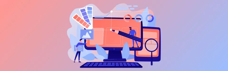
Why “Flat” Design is so Good?
First, minimalism as an integral part of flat design provides laconic of expression means and composition clarity. Here it is appropriate to recall the motto of minimalism — “Nothing excessive!” By getting rid of excessive decorations and graphic effects that follow real objects properties, the interface became more “digital”.
Second, “flat” design web pages focus on good typography. It can be argued that the active development of web typography came with “flat” design. Content comes first and this is extremely important in today’s information flow.
Third, “flat” design web pages are not stuck with a large number of visual effects and therefore have smaller size. This feature of “flat” design was useful to create adaptive versions of sites because simple forms are easier to download and display on a variety of mobile screens. By using these features “flat” design, you can solve a number of important tasks on your site. Let’s look at good examples of “flat” design, and the challenges that it helps to solve on these pages.
Examples of “Flat” Web Design
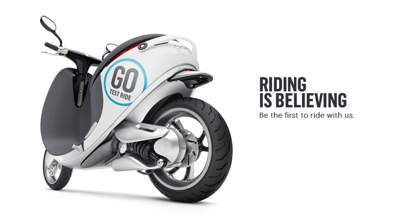
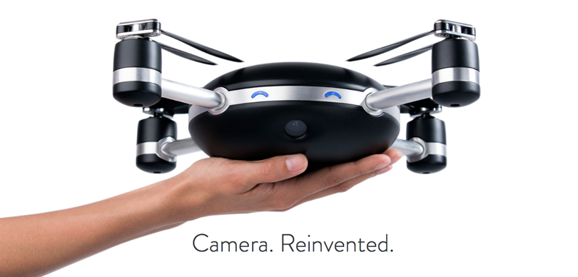
As a first of examples of flat web design, let’s have a look at the website about smart scooter benefits. The perk is a flat design combined with large photographs in style of Apple products. Pure white, metallic gray, deep black and accidental blue create impression of technology and innovation. Sharp images and fonts enhance the effect of color. A bit of animation adds dynamism and liveliness to site. An important part of the page is smaller charts and infographics that explain and show some benefits of their scooter based on facts.
Classic “flat” design: big headlines, flat buttons and contrasting images. This design is perfect for your selling landing page. Illustrations are made in the same style with same color palette that enhances the integrity of the site. Due to scroll animation the page is easy and interesting to explore. One would like to share the site with friends and this is quite an advantage for any site.
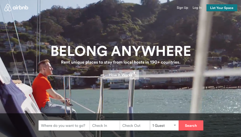
In 2014 a popular spot for booking accommodations Airbnb made a large-scale redesign. Flat UI web design got rid of gradients and shadows, and now it handles better with providing information to a user. The site uses flat form elements and minimum colors. Large pictures help solving the main task of new design — making it easy for service users to decide about accommodation booking.
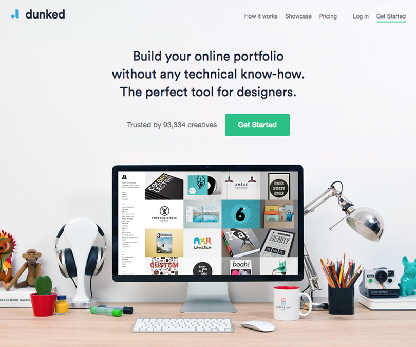
Service for portfolio publishing targeted to representatives of creative professions. The site is distinguished by a good selection of bright colors, flat web design icons and large flat buttons. In general it looks minimalistic and simple, creating a feeling of reliable and affordable service. Clear and neat page allows a user easily understand the content and meaning of the page, without distracting with excessive visual effects.
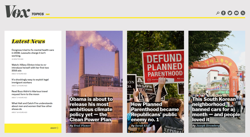
News site is in flat, minimalistic design which set an important goal — to explain the news. Recognizable design that uses a few colors and big pictures creates a memorable style. On the main page, thanks to flat design, the user spends less time selecting news of interest. Large typography and modular grid work perfectly for news and articles representation on your website.
Our Experience
TicketsBox
Our team was tasked with developing a CRM system aimed at establishing a comprehensive platform for ticket sales across diverse event categories in the market.
The product needed to address the following key objectives:
- Event creation and management.
- Ticket management.
- Sales management.
- Generation of various types of reports.
- Integration of an API for external system connectivity.
- Integration of payment services.
Conceptually, the system can be divided into three main components:
- The CRM itself.
- An API facilitates seamless connections between the CRM, the website, the widget, the mobile application, and other systems.
- A widget designed for ticket purchases, which was concurrently developed by our clients' contractors in collaboration with Stfalcon.
 Read the full case study
Hosty
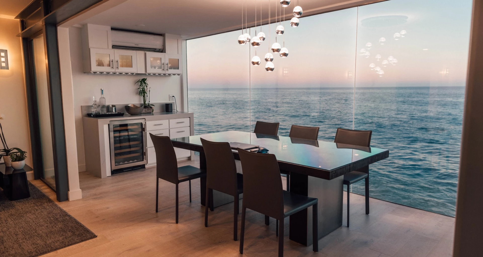
Stfalcon was contacted by a client with significant expertise in the realm of real estate rental, possessing a deep understanding of the subject matter and firsthand insight into the challenges faced by real estate managers.
Objective:
While several property management solutions were available on the market, they were either cumbersome or lacked robust functionality.
Stfalcon's primary mission was to create a user-friendly and efficient interface that would simplify the management of numerous properties. Additionally, we faced the task of seamlessly integrating our solution with the Airbnb API to ensure rapid and comprehensive data synchronization.
 Read the full case study
Conclusion
Does your site necessarily need “flat” design? Despite the fact that appearance of a site is a matter of taste, one cannot deny the obvious advantages of “flat” color web design. We have extensive experience in creating “flat” design sites and are always happy to create nice flat designs for you. Our design team is ready to carry out research and help to select the best graphic solution for your website.