
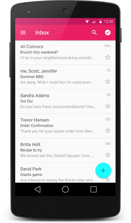
Hi everybody! I think everyone has already watched Android L presentation and saw its revolutionary innovations for Android material design platform. Well, it won’t take long to get the release; and for now attentive users could notice the emergence of new design elements in some applications. My attention was drawn to «Play Press» update. It looks and feels really revolutionary; I got stuck for a few minutes, and even began to look through the press.

Each section is accompanied by an animated background that smoothly slides and, dissolving, changes image. There are many unusual animations, that bring certain freshness to the application.
Naturally, every developer having seen all these sweet things wants to implement given solutions in their projects, even without tutorial. Unfortunately, at the time of the presentation available guidelines and documentation didn’t bristle with details, they seemed more like a promotional price list. Fortunately, till the moment of writing this article, Google set the situation right and we'll see what they have.
Guidelines rather briefly and succinctly described the philosophy of Material Design. I advise everyone to read the material to avoid mistakes in the future and I won’t be duplicating it here. Just one remark: the writing «This document is a preview» is intriguing, and shows that perhaps this is not the final version.
Further goes documentation. What do they promise us in the new version? If in short, it all comes down to a new theme, new widgets, custom shadows and animations.
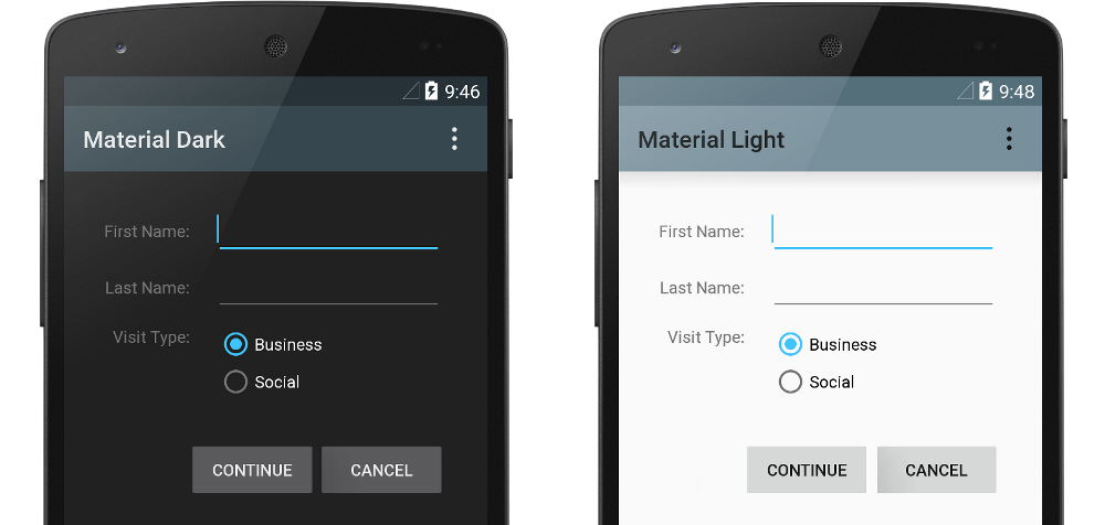
Material Theme
New theme will add new styles to old widgets, new button styles, animations on responsiveness on touches to interface elements, new animations of activities transition. What else do we need ?! :)
New Widgets
RecyclerView
RecyclerView, in fact, is a logical continuation of ListView — the most popular of Android developed widgets. Actually, its purpose remains exactly the same — to display a list of items, but there appeared some issues.
Mandatory use of ViewHolder pattern. Earlier using ListView and being not experienced enough one could use an adapter that created a separate view for each item in the list from scratch, and having list of a large size could result in less UI responsiveness and usage of extra memory. Now Android RecyclerView Developer forces a developer to implement only ViewHolder pattern. Let's see how it looks in the code of the adapter for RecyclerView.
LayoutManager. To use RecyclerView you need to send class object to it with help of setLayoutManager() method, that implements LayoutManager. This class is responsible for working with the adapter, only it decides whether to re-use View or create a new one, and accordingly, it pulls adapter methods onCreateViewHolder (), onBindViewHolder () and getItemCount (). Nowadays only one implementation of this class is available — LinearLayoutManager, to create custom LayoutManager you need to use RecyclerView.LayoutManager.
Animation of list operations. If you watched the presentation about Material design, you may have noticed that one of its main features is the smoothness of UI, which is achieved by the widespread use of animation. Surely, with a special wish, you can also add animation to ListView. I have not done it yet, but in RecyclerView it is done by a couple of code lines.
For the RecyclerView object the class implementing animation should be given:
  RecyclerView.ItemAnimator itemAnimator = new DefaultItemAnimator();
        recyclerView.setItemAnimator(itemAnimator);
When adding or deleting a list item you should correspondingly call notifyItemInserted (int position) or notifyItemRemoved (int position) adapter method.
By request you can write your own animation implementation, based on RecyclerView.ItemAnimator.
Rawness. Remember that the widget is yet underdone, and perhaps it will have significant changes. For example, now there is no way in RecyclerView to define header and footer of the list, and generally Internet still possesses very few information about it.
CardView
CardView is a widget implementing such an element of Material design as a card. In fact, this is a container, where you can define radius of corners roundness, the colour of a card and the height along the z axis.

Display of shadows
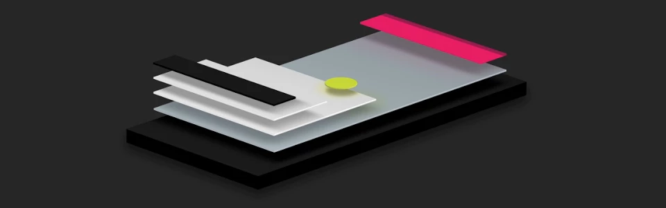
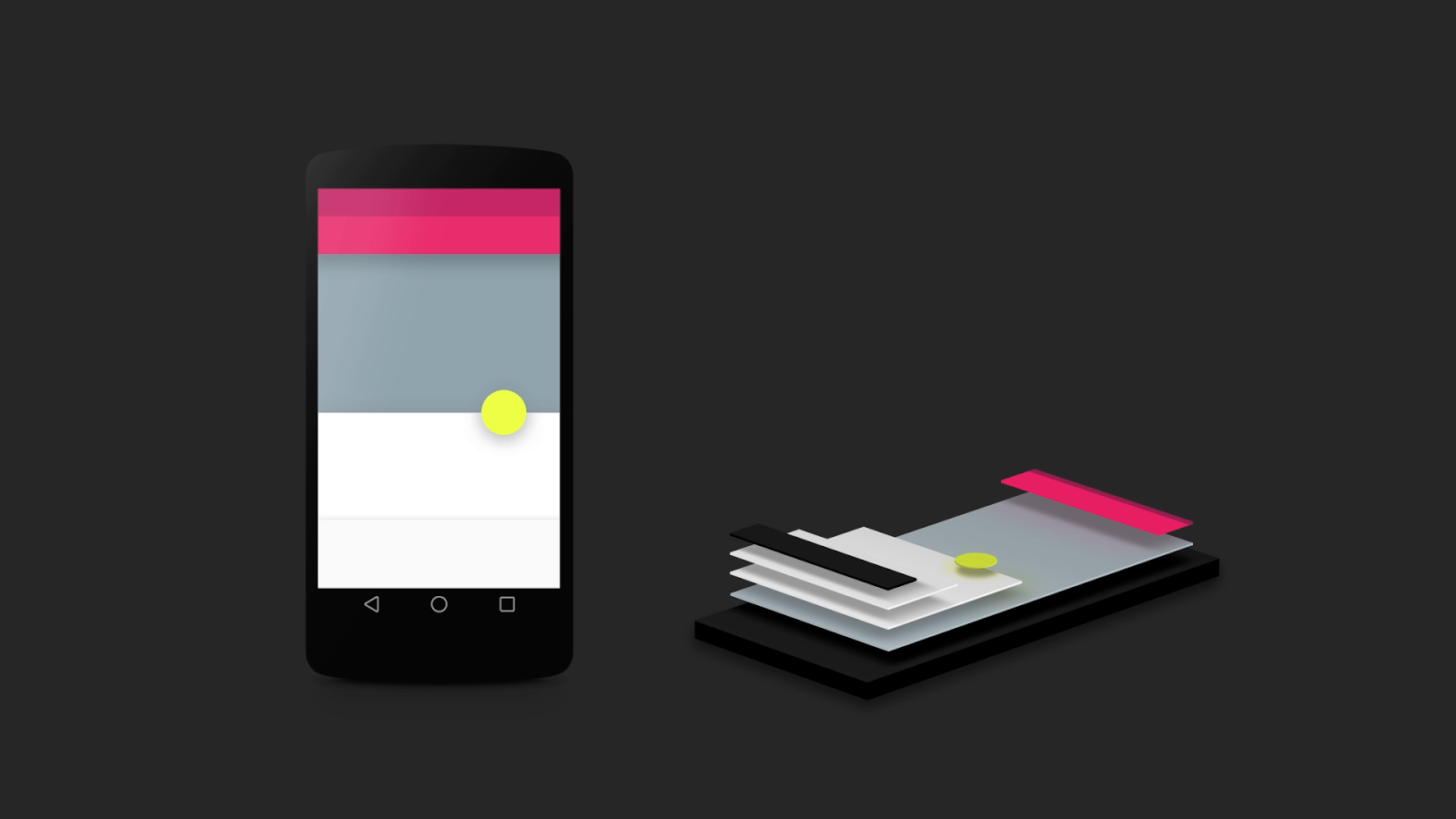
Rendering of shadows is an interesting innovation for Material-philosophy followers. I imagined it like this: if interface elements are material, they must cast a shadow. And how big this shadow should be? Naturally, the size will depend on the position of the element relatively to the background and other elements. That is why widgets got a new setting. Before we defined their X and Y sizes, now we added Z height. Thus, the widget at a higher level will cast a bigger shadow.
This option is called «android:elevation» and is used as follows:
<TextView
android:id="@+id/my_textview"
android:layout_width="wrap_content"
android:layout_height="wrap_content"
android:text="@string/next"
android:background="@color/white"
android:elevation="5dp" />
Such an approach also lets to control multilayer options of our interface. Widgets can be shifted against each other casting corresponding shadow, overlapping partially or completely layers under them. It looks very impressive and natural, resembles a collage or an appliqué, made of interface elements.
Animations
Animation actually undergone great changes, and those who watched guidelines, would agree with me, and those who didn’t — have rushed to do it :).
In the new API, we are provided with new animations of response to user’s touches; new animations for changes of separate widgets states and animations for changes of activities. Let’s briefly go through each group.
Touch Feedback. New animation for touch response highlights a coordinate point on which a user clicked, and shows further ripple effect from the point in all directions. Animation has a logical beginning and end, looks really great and is designed to replace the old selectors. It’s implemented by a RippleDrawable class. It can be implemented as in xml, and in the code applied to its/your view. An example of implementation in xml, set as backround:
android:attr/selectableItemBackground
android:attr/selectableItemBackgroundBorderless
There is a implementation of this class for the previous versions. It can be seen on github.
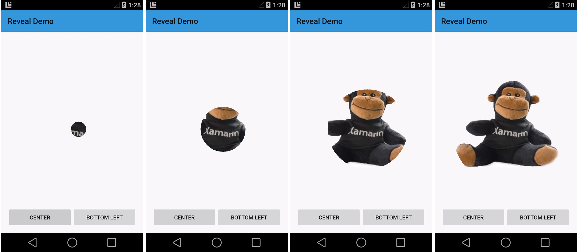
Reveal Effect. This effect lets effectively show and hide diverse views, is realized by ViewAnimationUtils.createCircularReveal class. Here are some example explanations taken from the documentation.
To show a previously hidden View:
View myView = findViewById(R.id.my_view);
// we get a center for opening circle
int cx = (myView.getLeft() + myView.getRight()) / 2;
int cy = (myView.getTop() + myView.getBottom()) / 2;
// we get a final radius of opening circle
int finalRadius = myView.getWidth();
// animation start with value 0
ValueAnimator anim =
    ViewAnimationUtils.createCircularReveal(myView, cx, cy, 0, finalRadius);
anim.start();
To hide a previously displayed View:
final View myView = findViewById(R.id.my_view);
// we get a center of closing circle
int cx = (myView.getLeft() + myView.getRight()) / 2;
int cy = (myView.getTop() + myView.getBottom()) / 2;
// we get a starting rarius of opening circle
int initialRadius = myView.getWidth();
// create an animation with final radius 0
ValueAnimator anim =
    ViewAnimationUtils.createCircularReveal(myView, cx, cy, initialRadius, 0);
// make view invisible when animation is finished
anim.addListener(new AnimatorListenerAdapter() {
    @Override
    public void onAnimationEnd(Animator animation) {
        super.onAnimationEnd(animation);
        myView.setVisibility(View.INVISIBLE);
    }
});
// animation start
anim.start();
Activity Transitions. Here it wasn’t without changes. Google has added the concept of «common» element between activities. That is, during the transition between the activities of the animation we have an element that can change its location and size without leaving a screen — it looks cool.
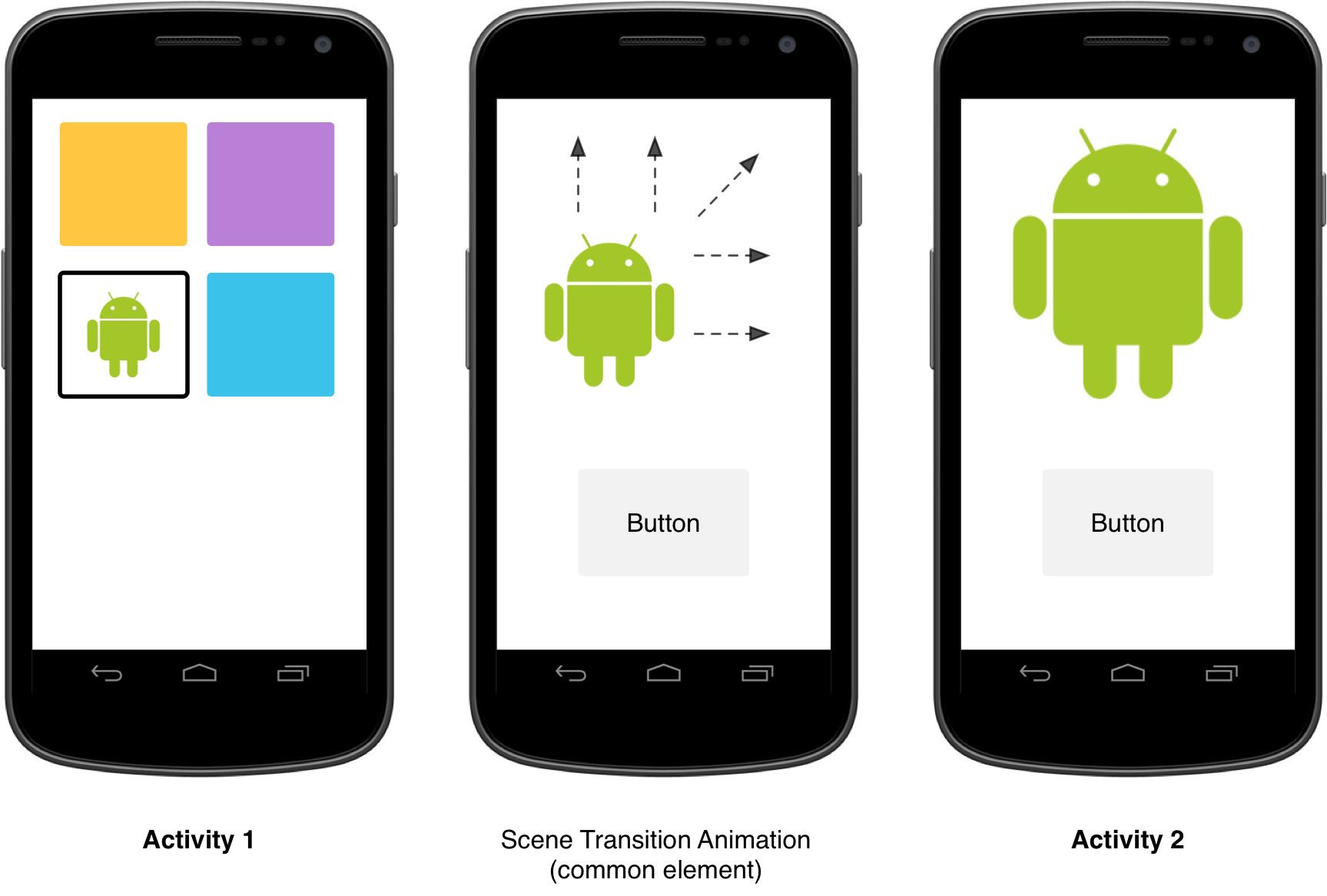
All animations of transitions are described in styles; elements are to be sent as parameter to the intent:
// get the element that receives the click event
final View imgContainerView = findViewById(R.id.img_container);
// get the common element for the transition in this activity
final View androidRobotView = findViewById(R.id.image_small);
// define a click listener
imgContainerView.setOnClickListener(new View.OnClickListener() {
    @Override
    public void onClick(View view) {
        Intent intent = new Intent(this, Activity2.class);
        // create the transition animation - the images in the layouts
        // of both activities are defined with android:viewName="robot"
        ActivityOptions options = ActivityOptions
            .makeSceneTransitionAnimation(this, androidRobotView, "robot");
        // start the new activity
        startActivity(intent, options.toBundle());
    }
});
You can send several parameters, if we use several common views:
ActivityOptions options = ActivityOptions.makeSceneTransitionAnimation(this,
        Pair.create(view1, "agreedName1"),
        Pair.create(view2, "agreedName2"));
Curved Motion. All animations in the Material must be smooth, and differentiate over time, that is, change its speed. Previously, all it was different. If any animation began at a certain speed it would end with the same one. Now, if represent the course of events in the form of a graph, it will resemble the parabola with a flattened top. This explanation can be seen on video in the guidelines.
PathInterpolator classes and ObjectAnimator will help us to create such animation, the first one is used to animate in xml resources and the second one — directly in the code:
ObjectAnimator mAnimator;
mAnimator = ObjectAnimator.ofFloat(view, View.X, View.Y, path);
...
mAnimator.start();
Animating View State Changes. Animation of our view state changes is done by the advanced selector and StateListAnimator class.
<!-- animate the translationZ property of a view when pressed -->
<selector xmlns:android="http://schemas.android.com/apk/res/android">
  <item android:state_pressed="true">
    <set>
      <objectAnimator android:propertyName="translationZ"
        android:duration="100"
        android:valueTo="2"
        android:valueType="floatType"/>
        <!-- you could have other objectAnimator elements
             here for "x" and "y", or other properties -->
    </set>
  </item>
  <item android:state_enabled="true"
    android:state_pressed="false"
    android:state_focused="true">
    <set>
      <objectAnimator android:propertyName="translationZ"
        android:duration="100"
        android:valueTo="2"
        android:valueType="floatType"/>
    </set>
  </item>
</selector>
Also it appeared animated version of a selector:
<!-- res/drawable/myanimstatedrawable.xml -->
<animated-selector
    xmlns:android="http://schemas.android.com/apk/res/android">
    <!-- provide a different drawable for each state-->
    <item android:id="@+id/pressed" android:drawable="@drawable/drawableP"
        android:state_pressed="true"/>
    <item android:id="@+id/focused" android:drawable="@drawable/drawableF"
        android:state_focused="true"/>
    <item android:id="@id/default"
        android:drawable="@drawable/drawableD"/>
    <!-- specify a transition -->
    <transition android:fromId="@+id/default" android:toId="@+id/pressed">
        <animation-list>
            <item android:duration="15" android:drawable="@drawable/dt1"/>
            <item android:duration="15" android:drawable="@drawable/dt2"/>
            ...
        </animation-list>
    </transition>
    ...
</animated-selector>
Extracting Prominent Colors from an Image. A powerful tool for design in real-time appeared called Palette class. It returns the dominant color from the image transmitted. Further this allows using mask for the same image to draw a text on it, or in any other purposes. Thus, the palette used by your design can be adjusted to the content in real-time. This case is used in the Material version of Play Music and looks really cool.
Reasoning
Unfortunately, not everything is so rosy and there is a fly in the ointment here too... Practically all the innovations are available only in L-preview version, so you can’t take advantage to use them at the first try. To get this opportunity we need to use the latest version of Android Studio with a new manifesto manager. This is a utility that allows you greater flexibility to control the process of «matching» of all libraries manifests involved in the project.
Connect a new xml-scheme called tools:
xmlns:tools="http://schemas.android.com/tools"
Redefine the version that will ultimately be polished in build.gradle of file:
<uses-sdk tools:node="replace" />
Add depending libraries:
dependencies
       {
              compile 'com.android.support:cardview-v7:+'
              compile 'com.android.support:recyclerview-v7:+'
              compile 'com.android.support:palette-v7:+'
       }
Thus, we may have to use new widgets but the functionality will be cut. As for the theme, it will only be available in API version 21. After writing an application using the new SDK on a device with kitkat, we will see that almost nothing has changed. Everything should turn the appropriate kind if set L-preview in the same application — the key word here is «should» because at the moment all crashes terribly. You can certainly try to fix it, but the lack of support of the theme in older versions completely kills any desire to do it.
Conclusion: Play Press represents a Google’s attempt to adapt the application to the transition to the new API using there new widgets, and to give a view similar to Material, having involved the old tools. Perhaps this was done in order to experiment with the support of the new version, but till now Play Press is not ready for it because after installation on the Nexus 5 L-preview it also crashed.
As to the new possibilities, they are vague... If Google doesn't do normal support of previous versions and series of devices that are to receive new update won’t soon be replenished with most popular devises of other manufacturers, the next six months our work with the new design and our other efforts could be appreciated by a very small percentage of users... Well, I am as always hope for the best :).
Our software development company excited to announce the release of a new blog post of 2023 covering the latest updates in Android Material Design 3, and we extend a warm invitation for you to explore and get acquainted with these advancements.