Long time ago when only PC and laptops were used for internet browsing, it was fairly easy to create a website that looks good on most screens. But nowadays smartphones, tablets, smartwatches and other wearable devices has significantly complicated this process. That’s why responsive ecommerce site that adapts to various screens is a necessity for many companies.
How To Make Responsive Website
Create several specialized layouts
First of all, you should decide how many layouts do you actually need. For example, if the website has only one column, all you have to do is adapt it to screens with various resolution. But if the website uses more complex structure, you’ve got to have several layouts that take into account space availability on screens of various size. For example here’s how website design from our portfolio looks on desktop computers:

But when you are viewing it on smartphone, a more simple layout is displayed which is more suitable for small screens:

You might have noticed that PC version has a horizontal menu while on the mobile site its elements are hidden in the sandwich menu. It’s a good practice for mobile sites since on small screens navigation takes over too much of valuable space distracting user from the important website content.
Think about load speed
Today people are rarely away from their mobile devices and you have to pay attention to page load speed since they can access the website from high-speed Wi-Fi, 3G or slower EDGE networks. Remove those heavy images from mobile version and don’t load videos automatically. For example on the background of website for our Code’n’Cofee IT event we used video that is played automatically. But visitors viewing it on mobile devices will see photo instead:

Another way to make page download faster is to use special signs instead of images for simple forms, such as stars in ranking systems (★ и ☆).
Use viewport and media query
HTML5 introduced new viewport element for controlling scaling and page size. Here is an example code:
<metaname="viewport"content="width=device-width, initial-scale=1.0">width=device-width indicates that page width should correspond to the width of the device screen.
initial-scale=1.0 specifies scaling level used after the page has loaded.
To make the website adaptive you should use viewpoint element.
CSS3 has introduced @media rule that allows you to use specified CSS parameters only when a certain condition is true:
@media only screen and (max-width:500px){ body {width:100%;}}
And here’s how you can load different styles for different types of devices:
<linkrel="stylesheet"media="mediatype and|not|only (media feature)"href="newsheet.css">Specify size in relative units
To make the website adaptive you should specify all sizes in relative units (such as percents). For example, when you state that the size of the column equals 50%, it will always occupy exactly half of the screen. This approach is used in grid-view concept that divides the screen into 12 columns with overall width of 100%. When we are resizing the page grid-view and elements it contains are adapting to the new size. For example, here’s how website design we’ve created for our client KeepSnap looks like on wide-angle screens:

And here’s the same page with hamburger menu on a smaller screen:

As you can see, page adapts to the size of the screen of iPhone, iPad, Android devices. Here’s how KeepSnap looks like on a smartphone screen:

Use vector and adaptive images
When to use vector and when to stick to bitmap images? The answer is simple here: if the icons on the website are simple enough and don’t have a lot of details, use SVG images or special icon fonts. In this case icons will look good even on a very big screens. But it’s not as easy to implement for bitmap images. For them to look good on most screens you need to use JavaScript or PHP for generating and showing images that are meant for a particular screen size.
These were the basics of adaptive website development. Now, let’s take a look at several examples.
Top Responsive eCommerce Sites Examples
Here’s a responsive eCommerce site we’ve made for Radialka shop selling products for camping and hiking:

Here’s the same website on a smaller screen:

You might have noticed that on a smaller screen two boxes that were earlier in the center are now placed one above the other. Search field is also placed just above the menu.
Here are some more adaptive websites examples. Online shop selling e-books:

iOS/OS X game site:

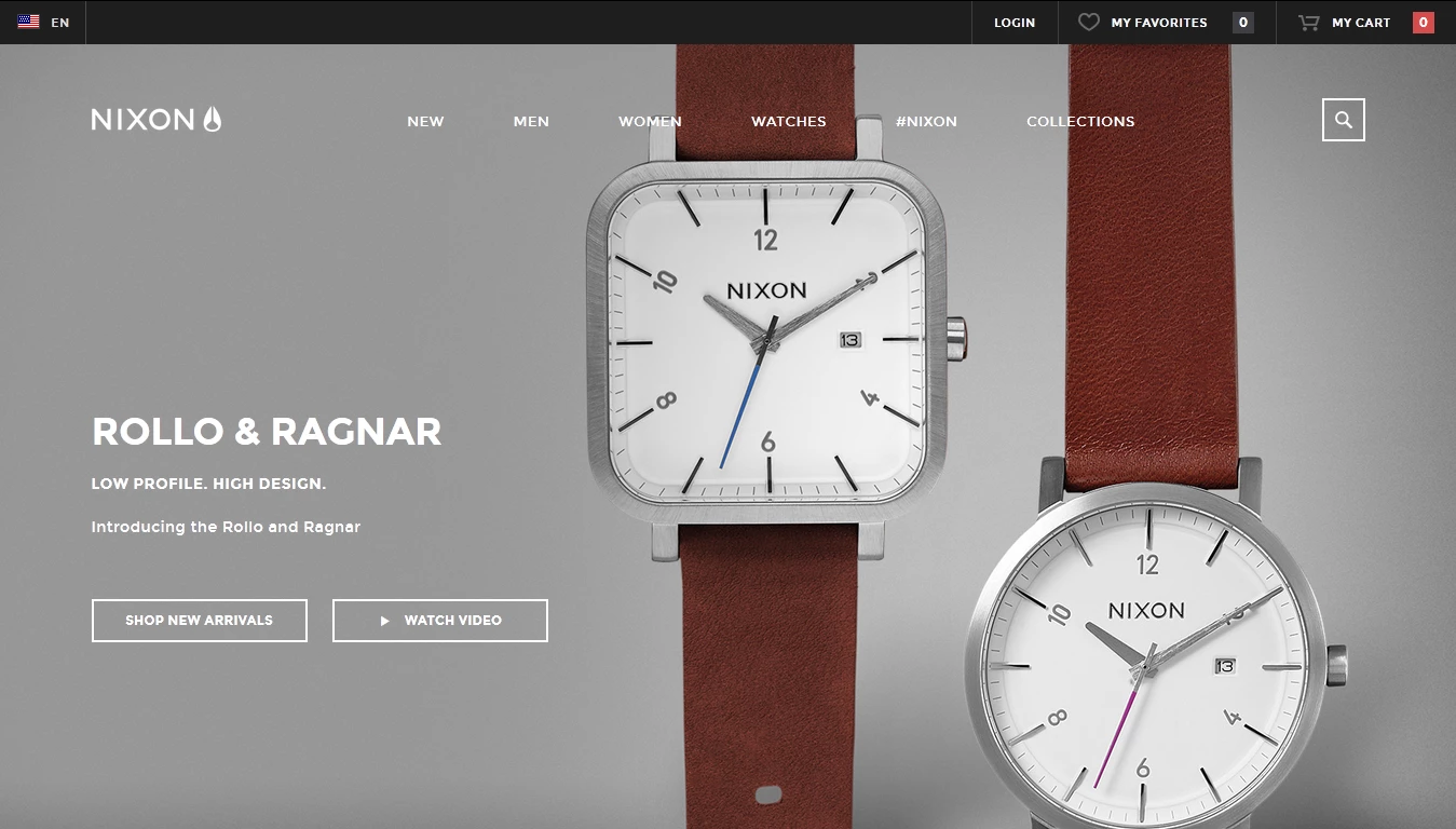
Shop selling watches:

Mobile Adaptive Site Examples
And here are several examples of adaptive sites for smartphones. Hotel group:

Shop selling ties:

Company selling interior and exterior paint:

Finally, we’d like to say that developing a responsive site is definitely a great way to make your online store more appealing to customers viewing it on different devices.
We, the IT company Stfalcon.com, are passionate about responsive web design eCommerce sites and will be happy to help your site go responsive. Get inspired by business ideas of profitable online marketplaces - and let's create a successful e-commerce project together!


