

Navigation is an important part of your design that helps users get to the website sections they need. From this article, you will learn why navigation planning deserves a lot of attention. We will also show you the best website menu designs worth looking at.
When visiting your website for the first time, users do not necessarily see the main page. They could have clicked the search results link in Google or come to look at the product or article somebody shared with them on a social network. That’s why all site pages should contain navigation that will help users learn about other sections and pages with information they might need. For example, when it comes to eCommerce websites, most users will be interested in learning about payment and delivery options.
Good website needs navigation since:
- It helps to understand what a website is about (is it a shop, magazine, or portfolio?) without looking at all the pages.
- Navigation helps website content to look logical, organized, and well structured which leads to a better user experience.
- It encourages users to stay on the website longer and check other sections.
- Navigation is good for SEO since it helps crawlers index the content of your website.
We have grouped design menu examples into three categories: horizontal, vertical, and drop-down. But you can use several types of menus simultaneously if your complex website structure requires it.
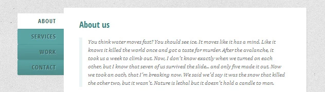
Horizontal Menu
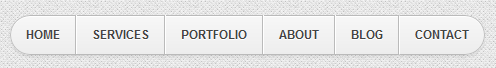
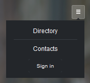
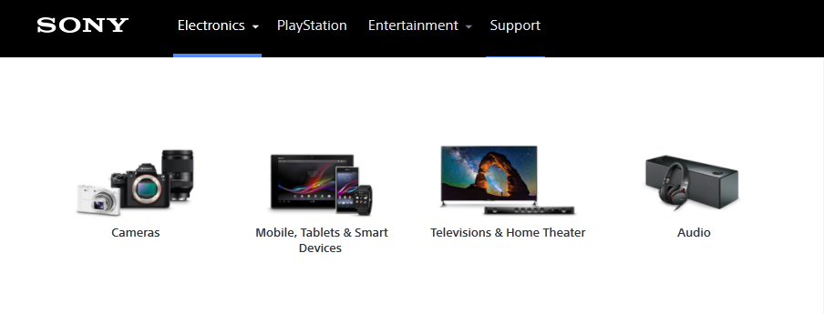
Horizontal menu is used by websites with few sections and one-column layouts. It is usually placed below or above the header. Here’re several design options for this kind of menu:
Design using tabs:

Design with items displayed as links or buttons:


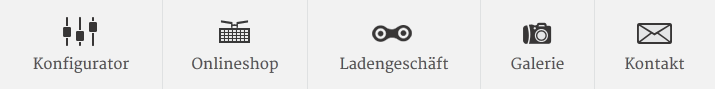
Using icons:
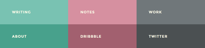
Highlighting current menu section is good for usability: users see which section they are currently looking at:

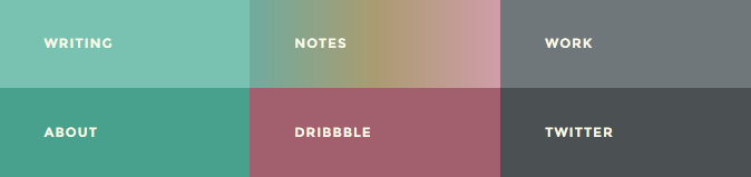
The same is true for the item hovered with a pointer. In this menu design example Notes section changes when hovered with pointer:
If the site is quite long, you can always display horizontal menu on top when user is scrolling down the page:

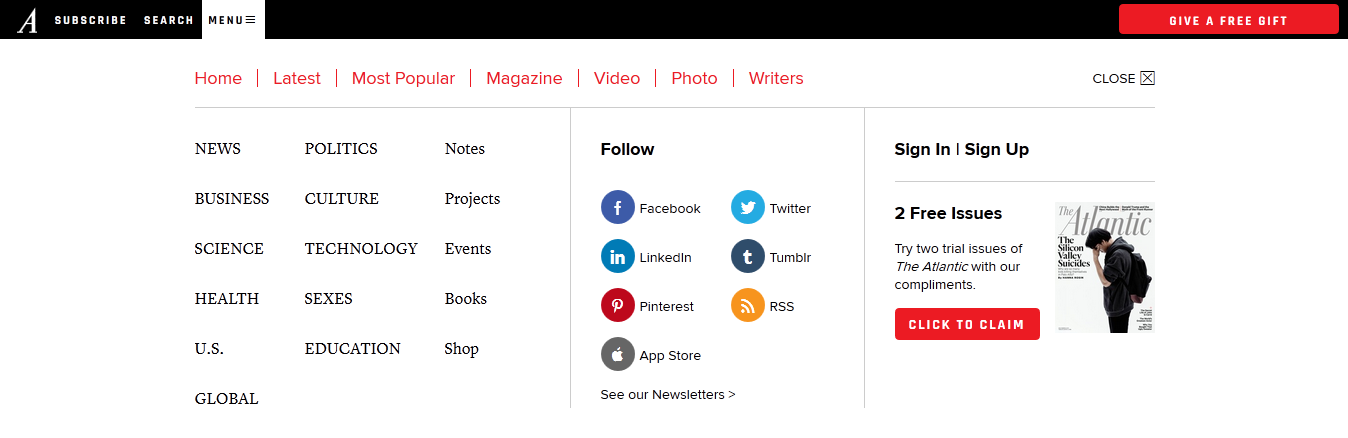
The drawback of horizontal menu is that the number of links they can contain is pretty limited. That’s why sites with complex structure prefer to use drop-down menus or utilize both horizontal and vertical menus. For example, this website uses both drop-down hamburger menu and horizontal menu (in the form of tabs Magazine, Popular and Recommended):
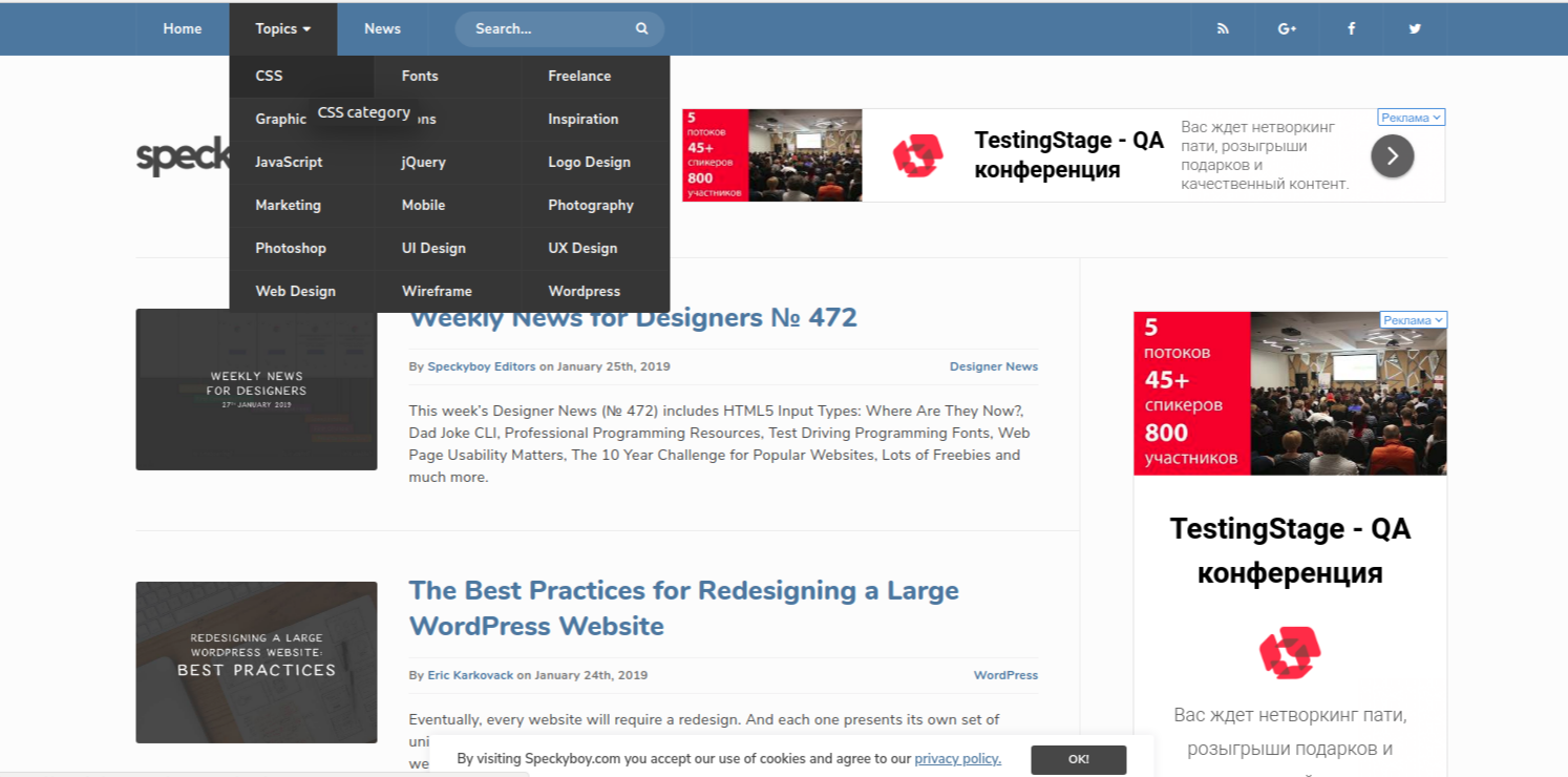
And here we see two horizontal menus with only the last of them droppping down. The logic behind it is the following: the first and the last item attract most attention.
And here horizontal and vertical menus are used simultaneously:

Ivanna
Client Manager
Contact us, and we will share our case studies related to website menu designs
Get a Free ConsultationVertical Menu
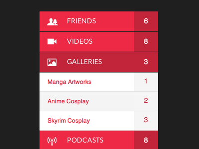
Currently manufacturers favor widescreen monitors with width being significantly bigger than height. By putting menu on the side we free space for content on the top of the page. Vertical navigation is usually placed on the left since that’s how it is best viewed by speakers of languages with left-to-write writing.
Unlike with horizontal menu, tabs in vertical website menu designs are used less frequently:
But vertical menus use links grouping more often:
Icon usage is also common. In addition, sometimes vertical menu can be minimized to show only icons:
Since vertical menus have more space for links, sometimes they tend to become hard to look through. In such cases you should look at drop-down menus as possible alternative.
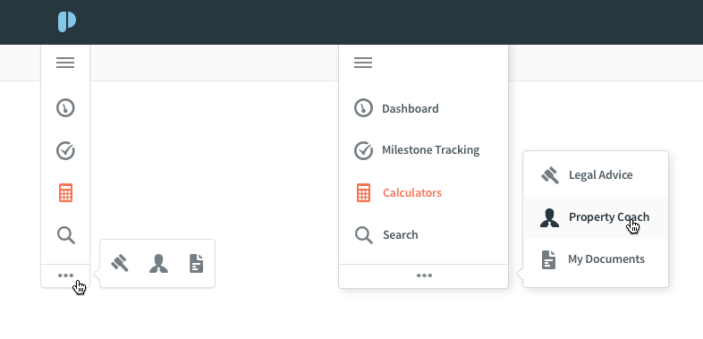
Drop-Down Menus
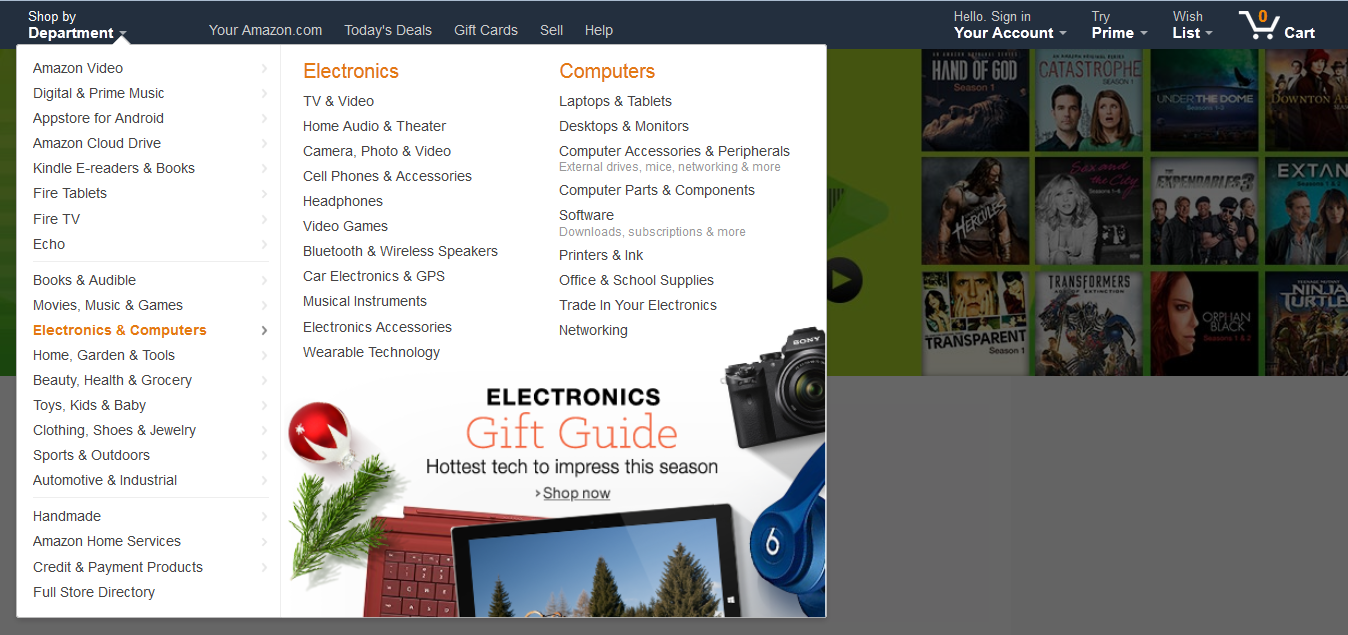
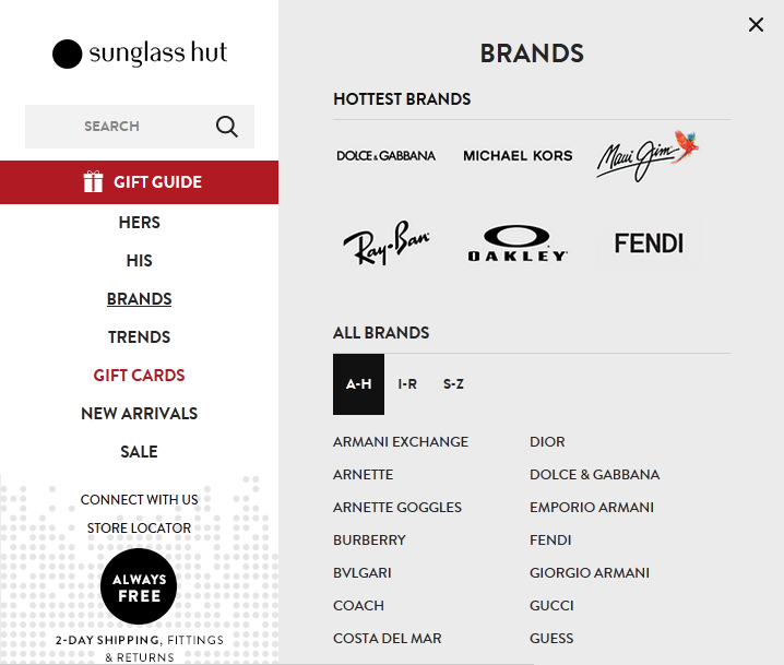
Drop-down menus are good for websites with complex structure: online shops with a wide range of goods and a lot of product groups. With them you can hide subsections and keep the precious space uncluttered:
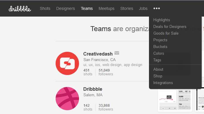
Hamburger menu is also a type of drop-down menu that was originally used on mobile devices but currently can be seen on desktop versions of websites as well. It can contain a short list of website sections:
Or a whole lotta of sections and subsections:
Example above follows website menu best practices and effectively uses whitespace to make the menu easier to look through.
This type of menu has a drawback though — it can be too hard to notice. That’s why it is used for data of secondary importance. Nonetheless, designer has to make it visible enough to a user:
And when combining different types of menus you have to decide which parts would be dropping down and showing additional sections:
In big drop-down menus you can use graphical elements for guiding user’s attention. Example of using images in a horizontal menu:

In a vertical menu:
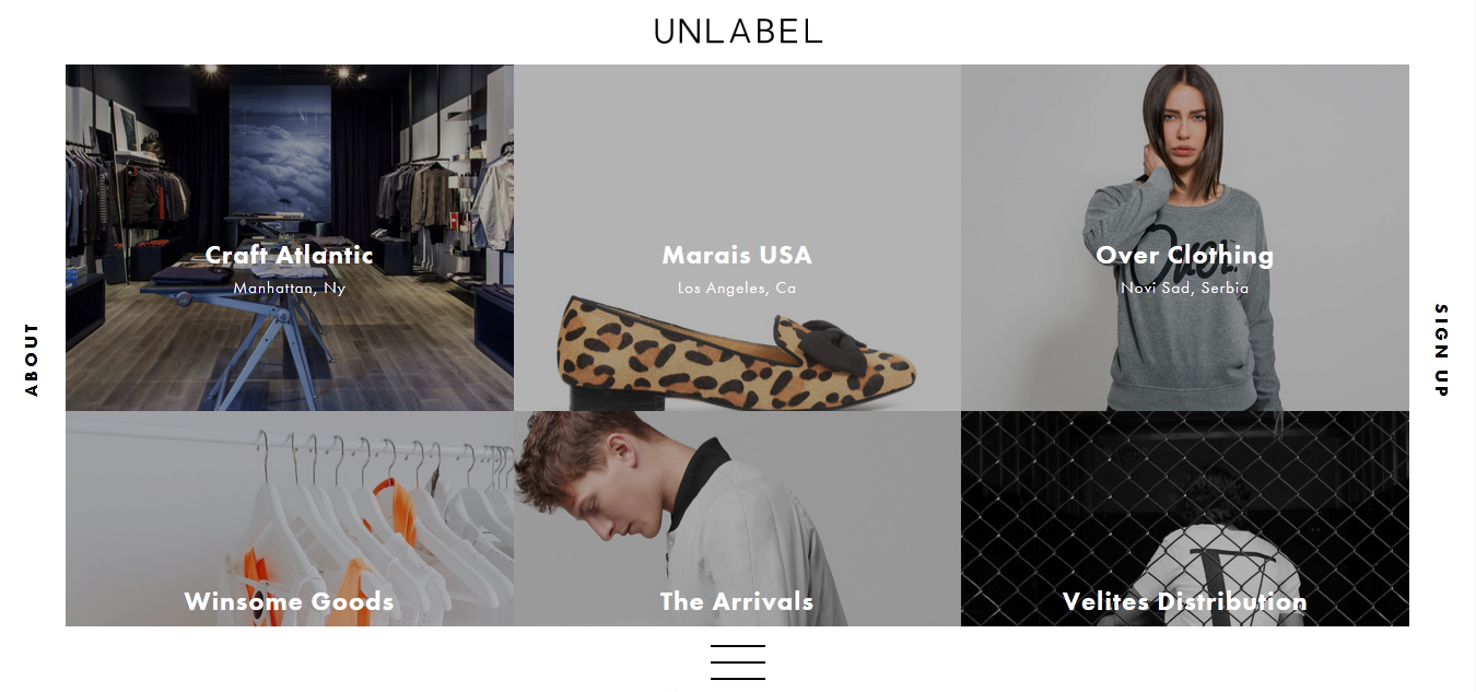
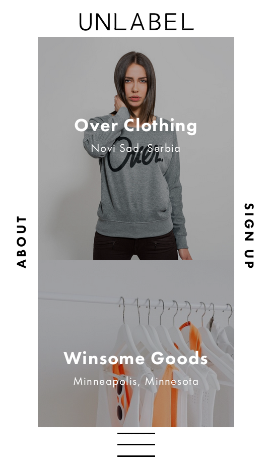
We should also mention innovative website menu designs that aren’t widespread yet but deserve your attention. For example, navigation elements at Unlabel website are placed on all four sides of the page content:
This type of navigation isn’t suitable for PC or laptop screens since it involves too much mouse movement but this unique menu can be successfully used on mobile devices with smaller screens:
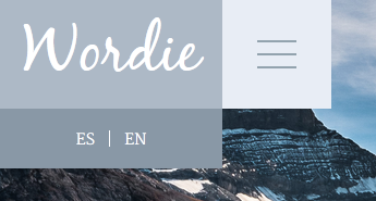
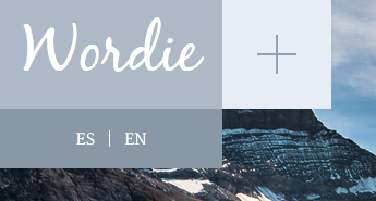
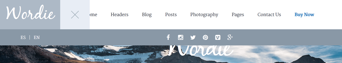
Fly-out menu idea is well developed in Wordie Wordpress template:
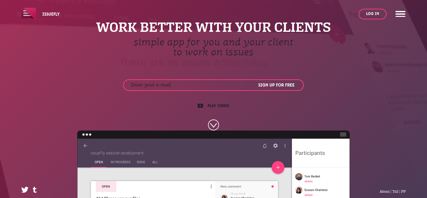
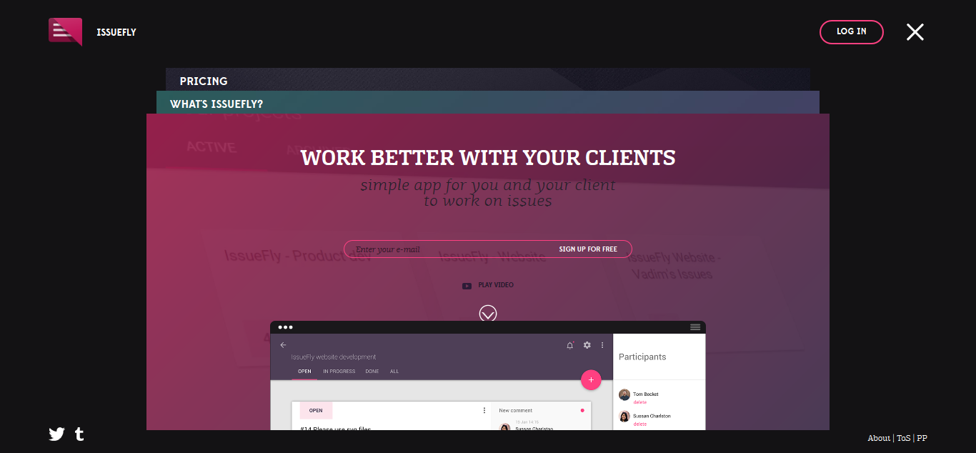
Issuefly web app has a creative and unique menu with window navigation usual for operating systems:
Our Experience
Air Alert
Our situation is truly unique, as it brought together a multitude of individuals following the commencement of the Ukraine war on February 24th. They collaborated to devise a sophisticated technological solution as a modernized replacement for the outdated street notification system. Typically, projects of this nature take several years to come to fruition, but we managed to accomplish it within a matter of days.
The initial versions of our applications were swiftly developed in close partnership with the Ajax team and received vital support from the Ministry of Digital Transformation of Ukraine. From the inception of recognizing the necessity to the first official release, merely one day elapsed (on the fourth day of the war). By the sixth day of the war, we had successfully launched the application to the public, amassing an impressive user base of 140,000.
Within just a few days, the application had reached every corner of Ukraine, boasting an extensive user base that has since grown to exceed 11 million users. The Air Alert application embodies a minimalist design philosophy, and the invaluable lesson we've derived from this project is that even the simplest of designs can play a pivotal role in saving lives!
 Read the full case study
Conclusion
Website navigation exerts a significantly greater influence on the usability and overall user experience of your website than nearly any other element within your design. A website that is user-friendly and inviting enhances the likelihood of retaining visitors. It's important to note that the visitors who ultimately convert into active participants are those who remain engaged with your site.
We hope that examples of website menu design from this article will help you improve navigation on your own website.
We, studio stfalcon.com, develop designs with functional and user-friendly navigation and will be happy to create a website or app for your business,just contact us, a complimentary consultation is available.