Дизайн мобільних застосунків не стоїть на місці, а стрімко розвивається. Смартфони увійшли в наше життя давно і зайняли в ньому значну частину. Щодня з'являється величезна кількість застосунків, які пропонують нам нові можливості використання смартфонів. Щоб перевершити конкурентів, дизайнери вигадують нові чудові дизайни. Згодом найбільш цікаві та успішні з них стають трендами. У цій статті ми опишемо деякі сучасні тренди дизайну мобільних застосунків.
1. Інтерактивні прототипи з анімацією
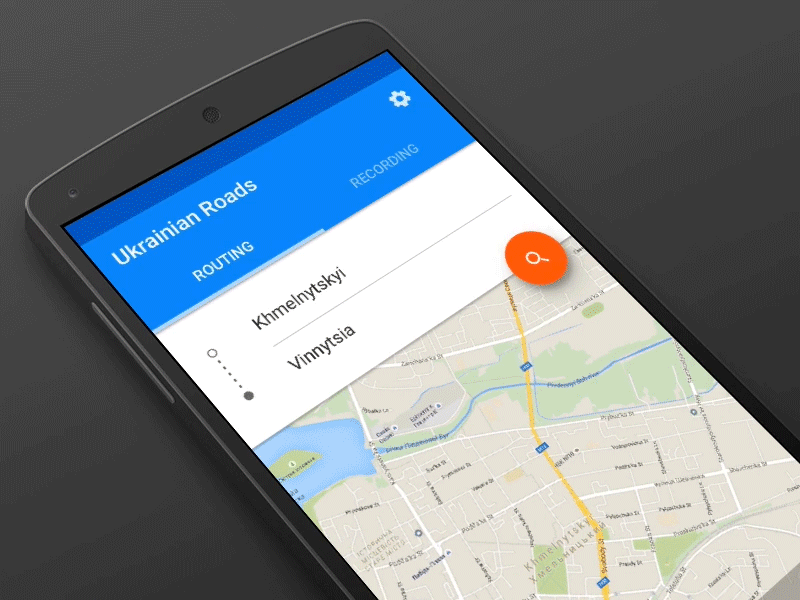 Концепція анімаційних переходів у стилі Material Design розроблена в студії stfalcon.com
Бум анімації інтерфейсів почався в 2014 році. Дизайнери усвідомили, що анімація значно покращує взаємодію з інтерфейсом. Спочатку для цього насправді не було інструментів. Багато дизайнерів змушені були відкривати монструозний After Effects і створювати анімації в ньому. Сьогодні ситуація змінилася на краще. Ринок пропонує безліч інструментів для створення інтерактивних прототипів мобільних застосунків. Їх можна поділити на кілька груп.
Інструменти, які імітують рідну CMS за допомогою HTML та JS. Найбільш популярні серед них:
- InvisionApp
- Framer.js
- Atomic
Ці інструменти хороші тим, що не вимагають глибокого розуміння системи. З їхньою допомогою можна швидко зібрати простий прототип з великою кількістю екранів та легкими переходами між ними.
Інструменти, які використовують системну CMS і в цьому відношенні найближчі до рідної поведінки, належать до другої групи. Першим з них став плагін Origami для QuartzComposer. З його допомогою можна скласти досить складний прототип з анімацією переходів, жестами, реакцією на дії користувача тощо. Крім того, прототип можна перевірити безпосередньо на пристрої.
Інші інструменти, що використовують системні засоби, це:
- Form
- Pixate
- Noodl
- JustInMind
Ці інструменти підходять, якщо потрібно створити дизайн з нестандартною поведінкою або з реакцією на жест користувача. З такими інструментами, як Origami та Form, можливо створити абсолютно божевільний та багаточастинний дизайн для мобільного застосунку.
Приклади інтерактивних прототипів можна знайти в спеціальному розділі на Dribbble.
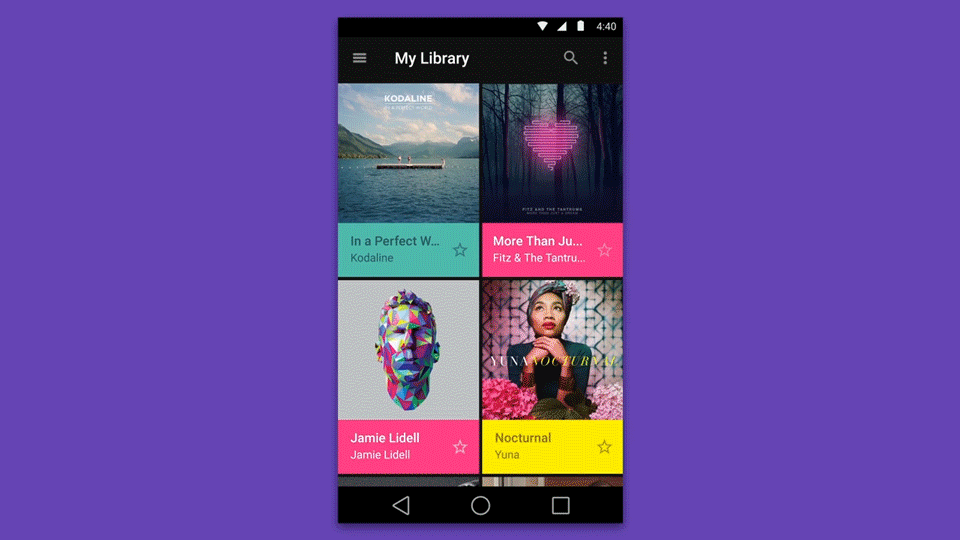
2. Картки
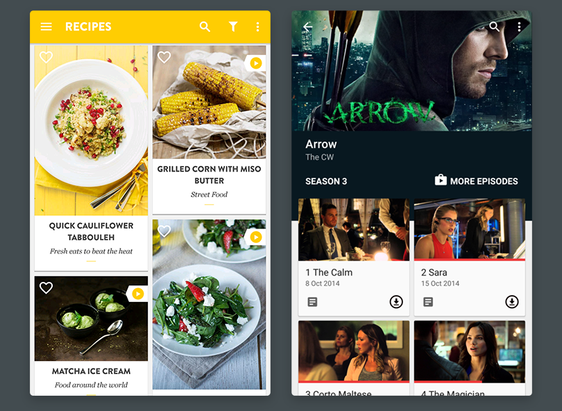
Google задає багато трендів. Один з них — картки як спосіб організації інформації на екрані. Картки самі по собі з'явилися давно, але зараз вони набирають популярності завдяки матеріальному дизайну. Їх можна знайти в додатках для iPhone та iPad, а також для Android і на веб-сайтах. Картки підходять для відображення:
- розкладу літаків і поїздів,
- квитків у кіно чи на концерт,
- інформації про профіль користувача,
- товарів в інтернет-магазині,
- публікацій в блозі або на новинному сайті,
- музичних колекцій та плейлистів.
Інформація, організована за допомогою карток, сприймається краще завдяки групуванню. Користувач чітко розуміє зв'язок між даними. Наприклад, між ціною подорожі та маршрутом. Як правило, частина картки займає зображення (обкладинка). З картками можна виконувати кілька дій за допомогою кнопок, розташованих на картці.
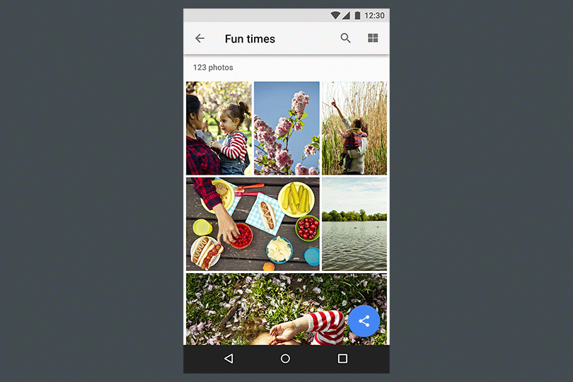
3. Плаваюча кнопка дії
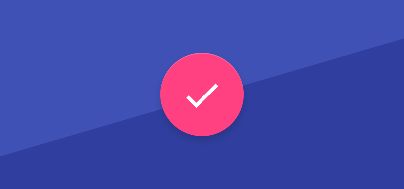
Ще один тренд прийшов з матеріального дизайну — плаваюча кнопка дії. Суть у тому, що вона не є частиною навігаційної панелі чи інших панелей на екрані. Вона існує незалежно і відповідає за основну дію користувача на поточному екрані. Її розташування може змінюватися, але завдяки круглій формі кнопка вписується куди завгодно. Ця кнопка зазвичай виділяється, щоб створити додатковий акцент або привернути увагу користувача. Плаваючі кнопки дії можна знайти в клієнтах електронної пошти, нотатках, списках та інших додатках з функціями створення контенту.
 Приклад з керівництва Material Design
У таких додатках вона зазвичай розташована в нижньому правому куті або закріплена на верхній навігаційній панелі.
4. Візуальна безперервність
Дуже цікавий ефект став популярним з появою матеріального дизайну. Його також можна знайти в iOS. Як це виглядає? Коли шматок інформації, наприклад, зображення, переміщається з одного екрану на інший, не зникаючи. Контент навколо змінюється, а він залишається практично незмінним. Дуже хороший приклад — це список музичних альбомів, які розташовані по сітці. Наприклад, коли альбом вибирається, його обкладинка не зникає, а переміщується на нове місце, в той час як детальна інформація про альбом з'являється. Інший приклад — iOS. Коли ви відкриваєте додаток, перший екран з'являється з іконки. І якщо ви повертаєтеся на головний екран, додаток повертається до іконки.
5. Дизайн для смарт-годинників
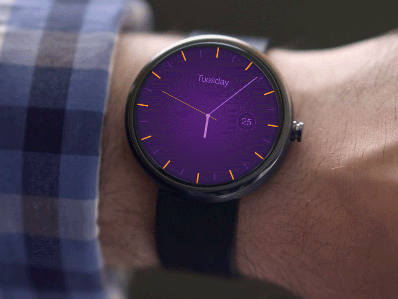 Android Wear Clock App
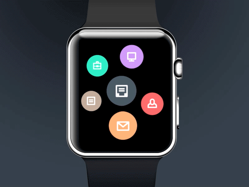 Apple watch Taasky creating
Носимі гаджети розвиваються швидкими темпами, і дизайнери придумують все нові і нові ідеї для їх інтерфейсів. Перш за все, для смарт-годинників. Звичайно, операційні системи смарт-годинників все ще не дозволяють розробляти яскраві дизайни, але кожен новий концепт, навіть якщо він далекий від реальності, все ж задає нові тренди і робить дизайн мобільних додатків актуальним. Наявність круглих, квадратних, прямокутних і витягнутих екранів годинників захоплює уми дизайнерів і спонукає їх реалізовувати найсміливіші ідеї щодо застосунків.
Ми, як сучасна студія, безумовно, слідкуємо за всіма трендами у світі дизайну мобільних додатків дизайну і намагаємося застосовувати найкращі практики у наших проєктах. Якщо вам потрібен гарний, зручний та сучасний додаток для iOS та Android, не соромтеся і завжди звертайтеся до нас. Разом ми визначимо новий тренд у індустрії дизайну мобільних додатків!