App icon is a small picture representing an app in Google Play or App Store and user device after installation. If you are soon to create your first mobile app icon design, follow our tips below. They will help you to avoid common app icon design mistakes and create high-quality images.
Your role as a designer is to make an app noticeable. Users tend to judge and choose apps based on their icons available in app stores. Well designed icon serves as an indicator of high quality and usability of the app and helps to convey the message of professionalism and reliability of the product.
To achieve great results, keep in mind the following tips for creative app icon design:
1. Follow Guideline Requirements
Icons are not just beautiful images meant to please the eye, they are viewed inside the graphical interface of the certain operating system. They should look naturally to the interface, harmoniously co-exist with other app icons and yet bear some uniqueness. That’s why you start app icon development with familiarizing yourself with guidelines from the OS manufacturer and looking at icon grid samples for Photoshop.
Here’re some guidelines to start with:
- Official website on Android Material Design. Here you can learn about style, animation, components, patterns, layout, usability and download reference materials for designers.
- iOS Human Interface Guidelines from Apple will be of service if you want to create app icon for iPad or iPhone.

These guidelines will give you an idea of general principles and recommended practices.
2. Make Sure You Know Your Audience
App icon design for a local company like meal delivery service is going to be different from an icon for company entering an international market. In the last case you’ve got to be sure that symbols you use are universal for people with different cultural background and won’t offend anyone:

3. Create Your Icon in Original Size
Icon looking nice in big size won’t necessarily impress as much when re-sized to 120 x 120 pixels. It should be taken into account when working on professional icon design.
4. Simplify and Get Rid of Unnecessary Details
The more fancy details your add, the less recognizable your icon will be. Ideally it should be something close to a symbol: simple and comprehensible. For example, here’s an icon we've made for app with recipes:

5. Use Lights and Shadows Right
Lights and shadows are something to think about when working on an app icon design for Android. Guide on Android Material explains this aspect in great detail. It also lists values for shadows casted by objects of different colors.

6. Check Whether Icon Looks its Best on Various Backgrounds (dark, light, colored)
In market your icon will be displayed on white or light-grey background but it is only wise to check whether it looks good on popular backgrounds of different color since users like to personalize their home screen wallpapers.
7. Be Brave and Use Perspective
Standardization is good only to a certain point. Utilizing perspective you can achieve interesting results and help your app icon design become more vivid and fresh. Here’s an excellent example of using perspective to attract attention:
8. Create a Unique Form
App icons below are memorable thanks to the interesting forms used on them:
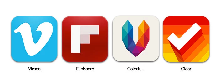
Those forms help users to recognize the icon even when it is displayed in small size.
9. Use Less Colors
Once you start adding colors, it’s hard to stop. That’s why you should make sure you stick to as little as two or three colors — it would be enough. Here’s a good example of icon using only two colors:

10. Don’t Use Photos
There’re great photorealistic icons out there but using actual photos is a taboo.

11. Avoid Using Too Much Text
Firstly, tiny text is hard to read. Secondly, it creates localization problems when the company decides to launch its app on a new market (think China or South Korea with their unique writing systems). But you can still use the first letter of your app name, just like Tumblr or Pinterest do:

12. Don’t Use Interface Elements on Your Icon
It’s a very bad idea confusing app users. Graphical control elements shouldn’t be placed there.
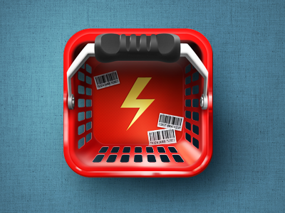
13. Create Icons Introducing Main Feature of the App
Good icon tells users what app function is and allows him or her to skip descriptions that tend to be lengthy and include too much extra information. Music players often use notes, music instruments or visualizers, cameras — lenses or photo cameras. Messengers like Viber go with conversation bubbles:

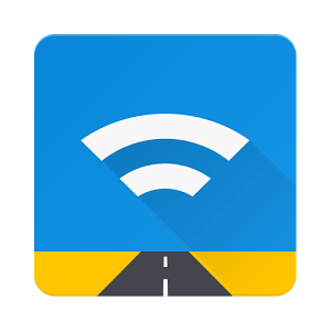
On UARoads icon we have shown two important aspects of the app: transferring data to server and its driver-oriented nature:
14. Look at the Icons of Competitors
Despite the previous tip you should first check icons of the main competitors. They have probably already used the more obvious representations of the main function. Try to bring more originality. Take example from Wunderlist icon that stands out among the rest of standard to-do list applications:

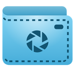
And here’s an icon we’ve made for a KeepSnap app used by photographers:
As you can see, even a small image representing your app in the store needs careful consideration. Good app icon design attracts attention of users who were searching market for another application entirely.
Changing icon of a popular application is a serious business as well. For example internet radio player Radium had to change icon several times since new design wasn’t welcomed well by existing users.
Our Experience
MeinFernbus
MeinFernbus stands as a prominent provider of passenger coach transport services in Germany. In 2015, they made headlines by announcing a merger with another company, thereby solidifying their position as the foremost player in Germany's passenger transportation market. At present, MeinFernbus operates across 20 European countries, offering a vast network of 100,000 distinct routes. The company oversees various critical aspects, including brand consistency, network planning, pricing, marketing, sales, distribution, transportation management, and customer service. Meanwhile, their regional bus companies are dedicated to enhancing efficiency through a relentless focus on high-quality standards and safety.
Over the course of three years, we have been actively involved in a collaborative effort with the IT team at MeinFernbus, contributing to the development of a web project and mobile applications for both Android and iOS platforms.
 Read the full case study
BBGO
We have distilled the most effective design patterns for ordering apps for our new product by examining a multitude of popular solutions. These patterns have been widely embraced by users and include:
- A user-friendly home screen featuring preferred addresses.
- A streamlined car category selection with fixed pricing.
- Transparent and unmistakable confirmation of the selected car.
- An intuitive after-trip review system.
Additionally, our service incorporates a distinctive bonus system. Passengers accrue bonuses following each ride and have the option to redeem them for discounted rides or share them with friends.
 Read the full case study
Conclusion
The primary objective of an app icon is to instantly capture the user's interest and encourage them to download the app. Designing an app icon that is not only distinctive but also effectively conveys the app's core functionalities is crucial. We have explored 14 expert recommendations and best practices to create a well-optimized app icon.
Our dedicated team, will be happy to create a unique design for your application to help your business stand out from the app crowd. Contact us, a complimentary consultation is available.