BBGO Wins New Customers with a Cost-Effective Ride-Hailing Platform
Challenge
Build a custom mobile app to attract more customers
Solution
Intuitive ride-hailing app for passengerss
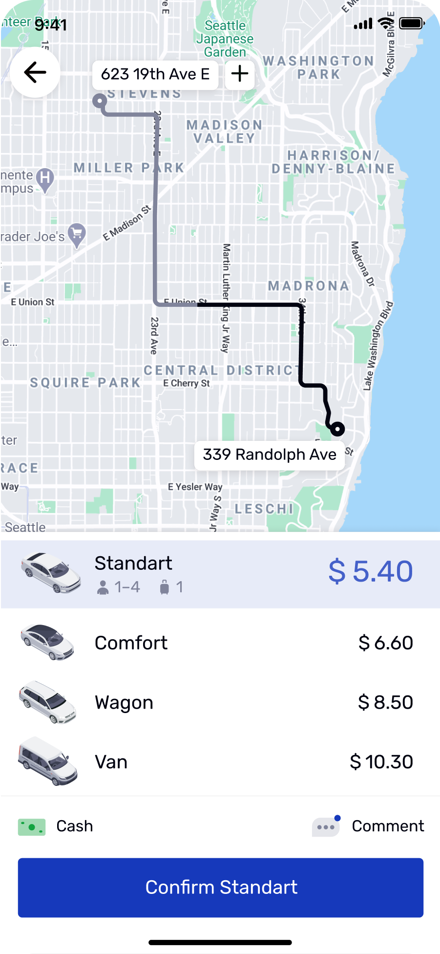
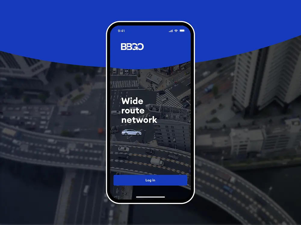
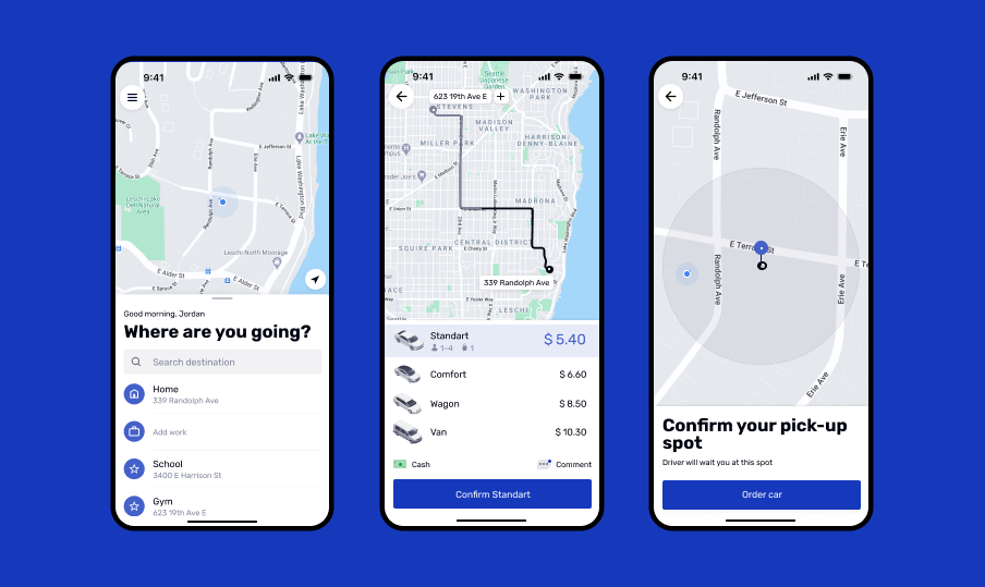
The client’s goal wasn’t just to gain new riders, but also to attract and retain new drivers. That’s why, alongside the rider app and admin panel, we developed an app for drivers to meet their needs and keep them with BBGO. The core idea behind the app was to make ordering a ride quick, easy, and stress-free. Here are the features that made it possible
Solution
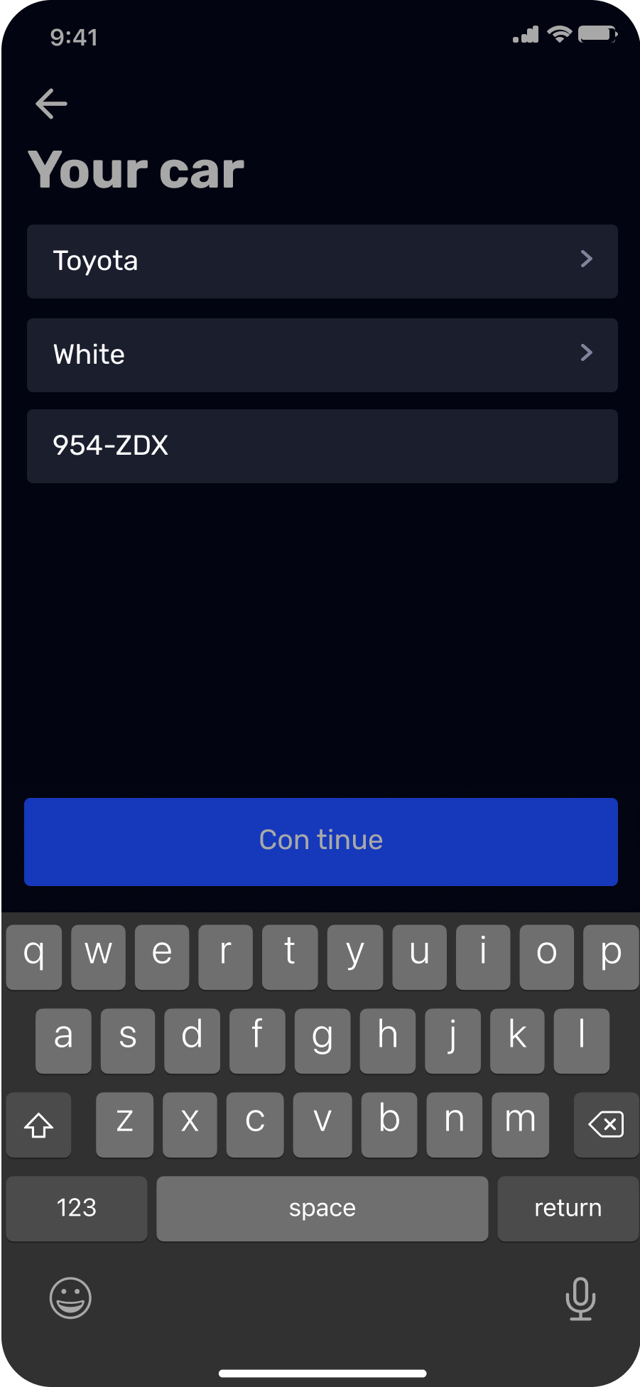
Mobile app for drivers with paperless registration
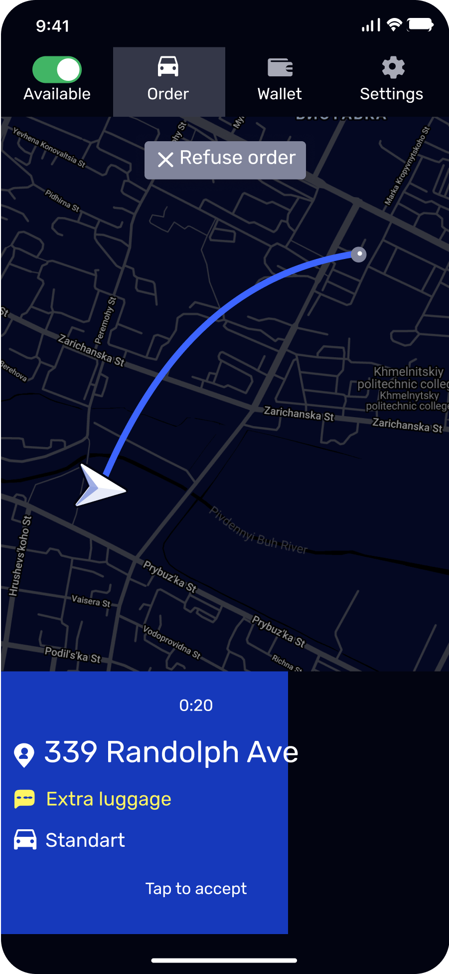
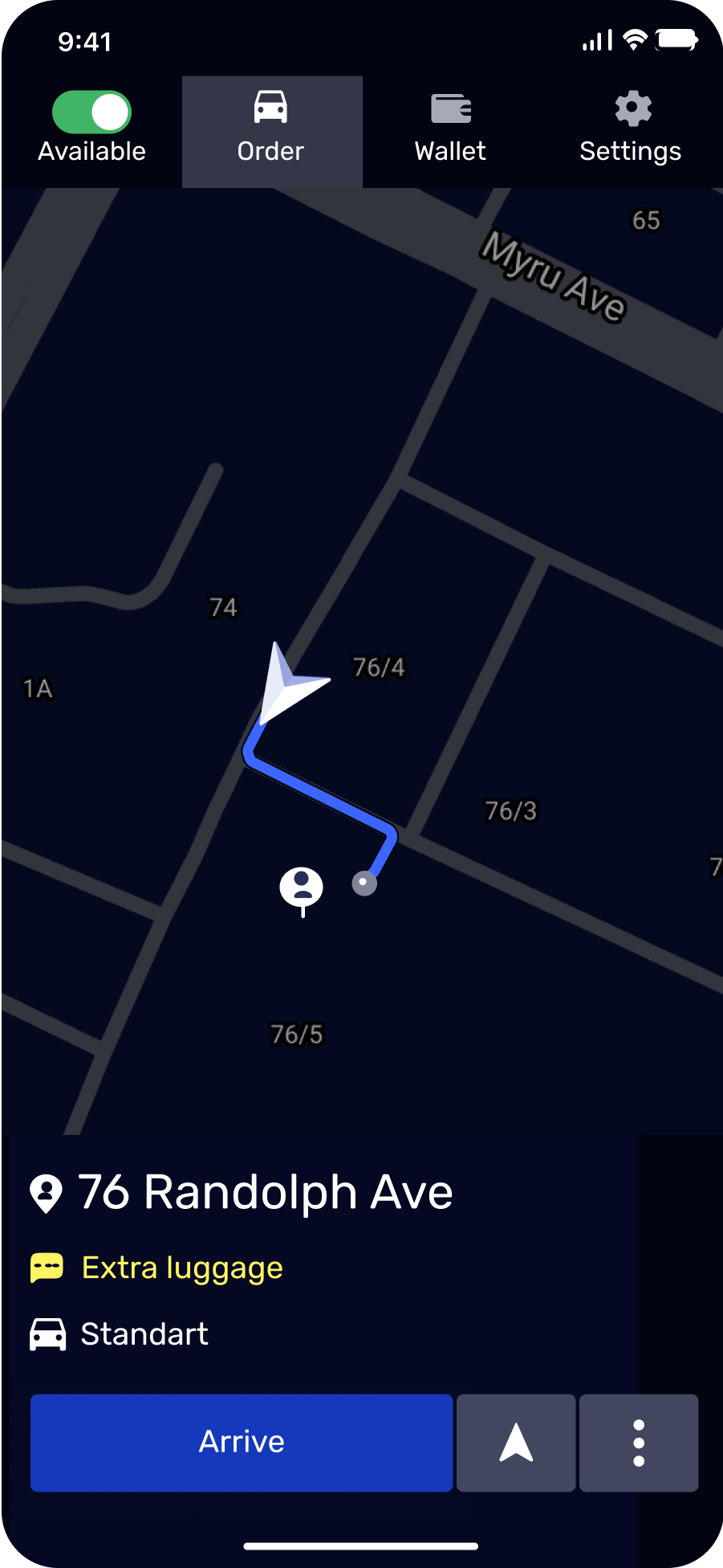
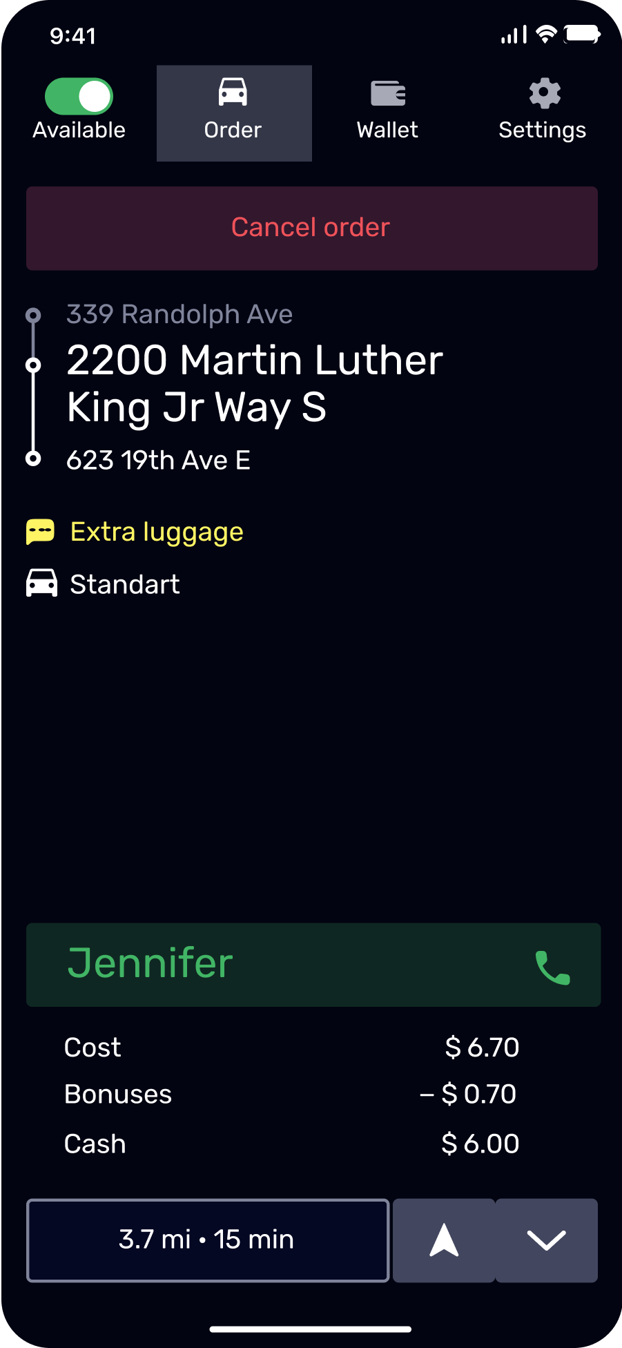
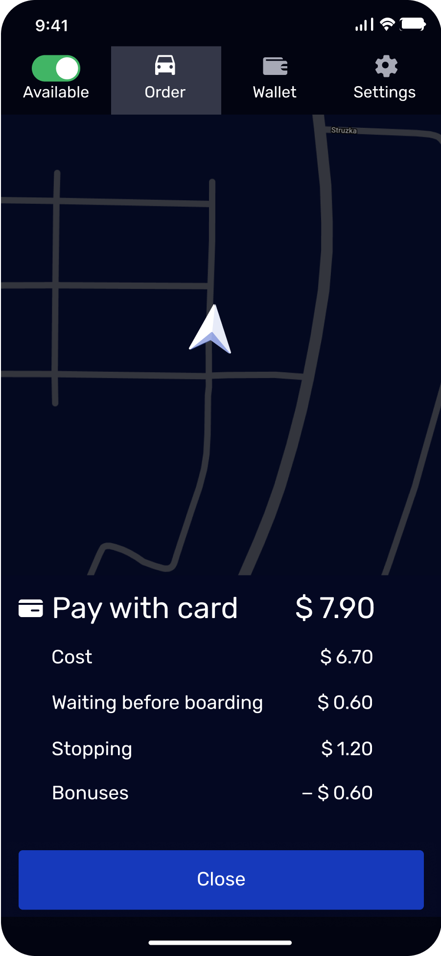
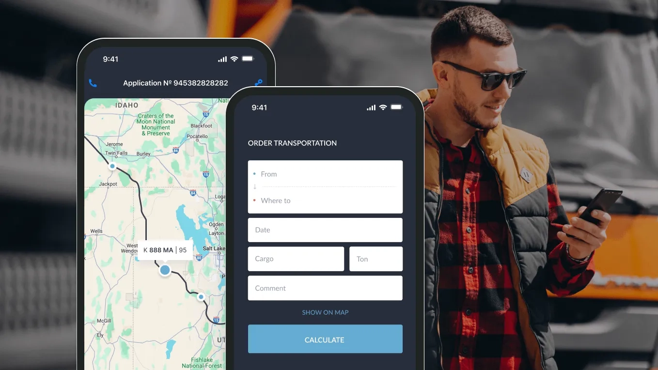
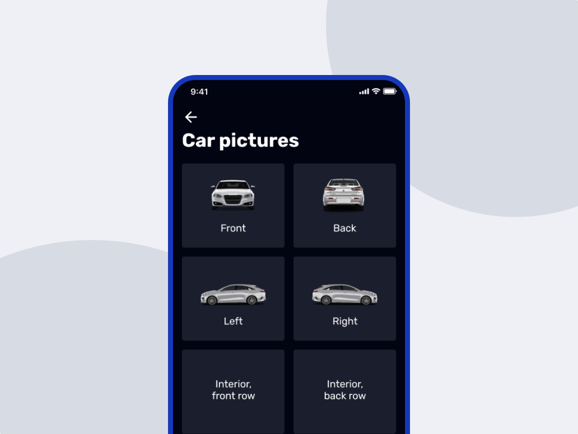
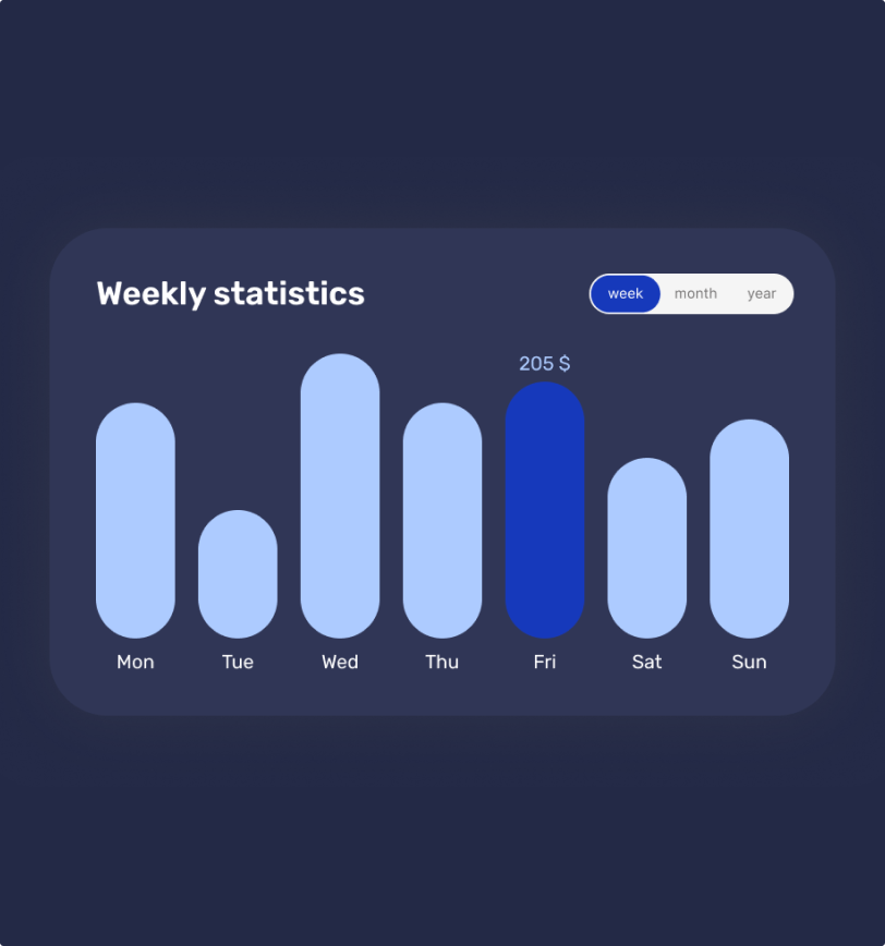
The driver application was also built with a focus on simplicity. Since drivers are constantly behind the wheel, the app is designed for minimal screen interaction. With big buttons, bold colors, and a clean layout, it’s easy to use even on the go. One of the key features we added to enhance the driver experience was the ability to register and get paid without ever leaving their car. Through the app, drivers can register online in a few taps, eliminating the need for any in-person visits. Once registered, they pay a commission fee to BBGO and receive their earnings directly to their personal card or in cash from the passenger.
Admin panel for driver approvals and dynamic pricing
Administrators can review and approve driver registrations based on the information submitted through the app.
They can also manage dynamic pricing rules. For example, admins can set specific time slots, like 7–9 AM and 5–7 PM, when prices increase automatically. During these peak hours, a pricing coefficient is applied, adjusting fares without any manual effort.

Process
How we designed a ride-hailing platform for riders and drivers
To understand how the taxi service worked, we started by gathering requirements. We spoke with everyone involved, from the founders and chief drivers to shift supervisors and call center operators.
We mapped must-have features and designed the UI
Once we had a clear picture of the workflows, we explored the competitors like Uber, Uklon, and Bolt to identify must-have features and opportunities to improve the user experience.
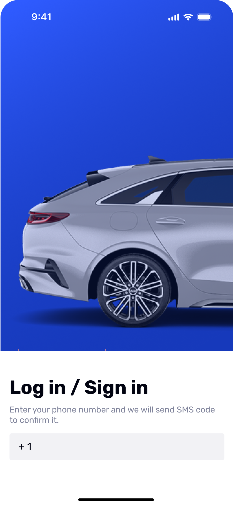
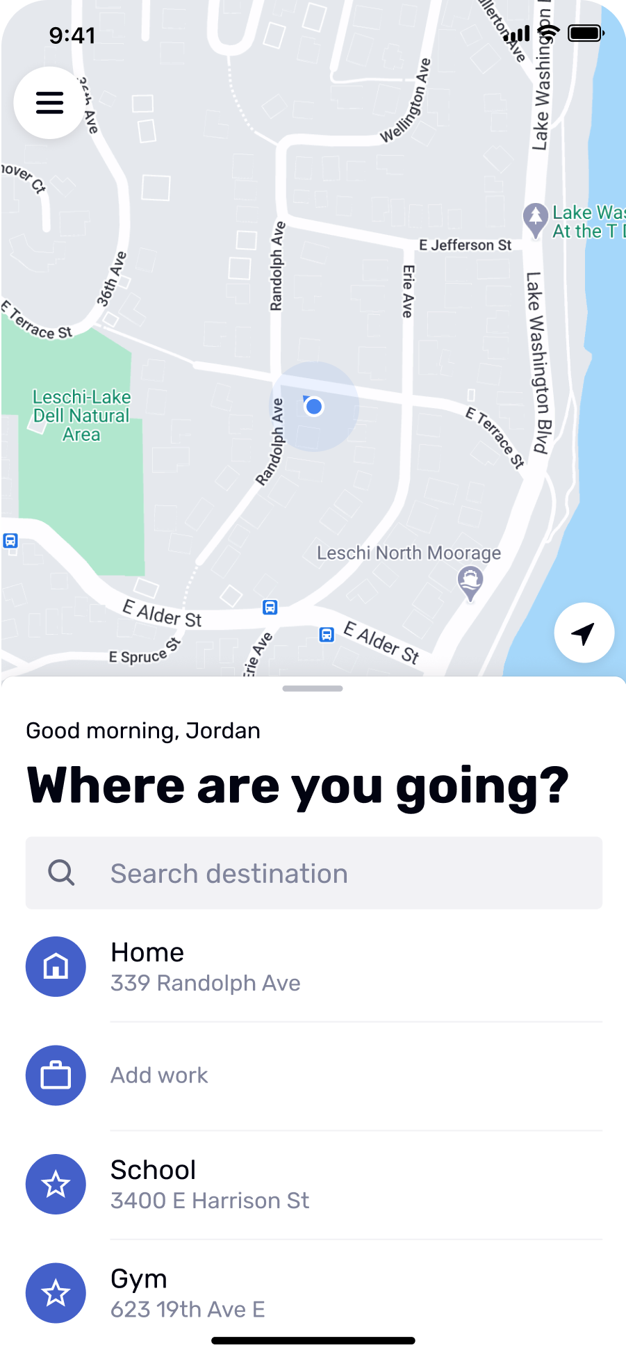
The app for riders had to be intuitive and easy to navigate. So we prioritized core functions, like quick registration, instant ride selection, and flexible payment options. We also added extras like child seats and pet transportation for added convenience. This way, we didn’t confuse a customer with functions people rarely need.
For drivers, ease of use was also a priority. We added online registration to simplify onboarding, plus automatic order search and a built-in map showing accurate rider locations.
In just a month, we had key UI components ready – clear, intuitive, and mobile-first. From there, we transitioned into backend development.
For real-time location tracking, we integrated Google Maps and used an XML live map
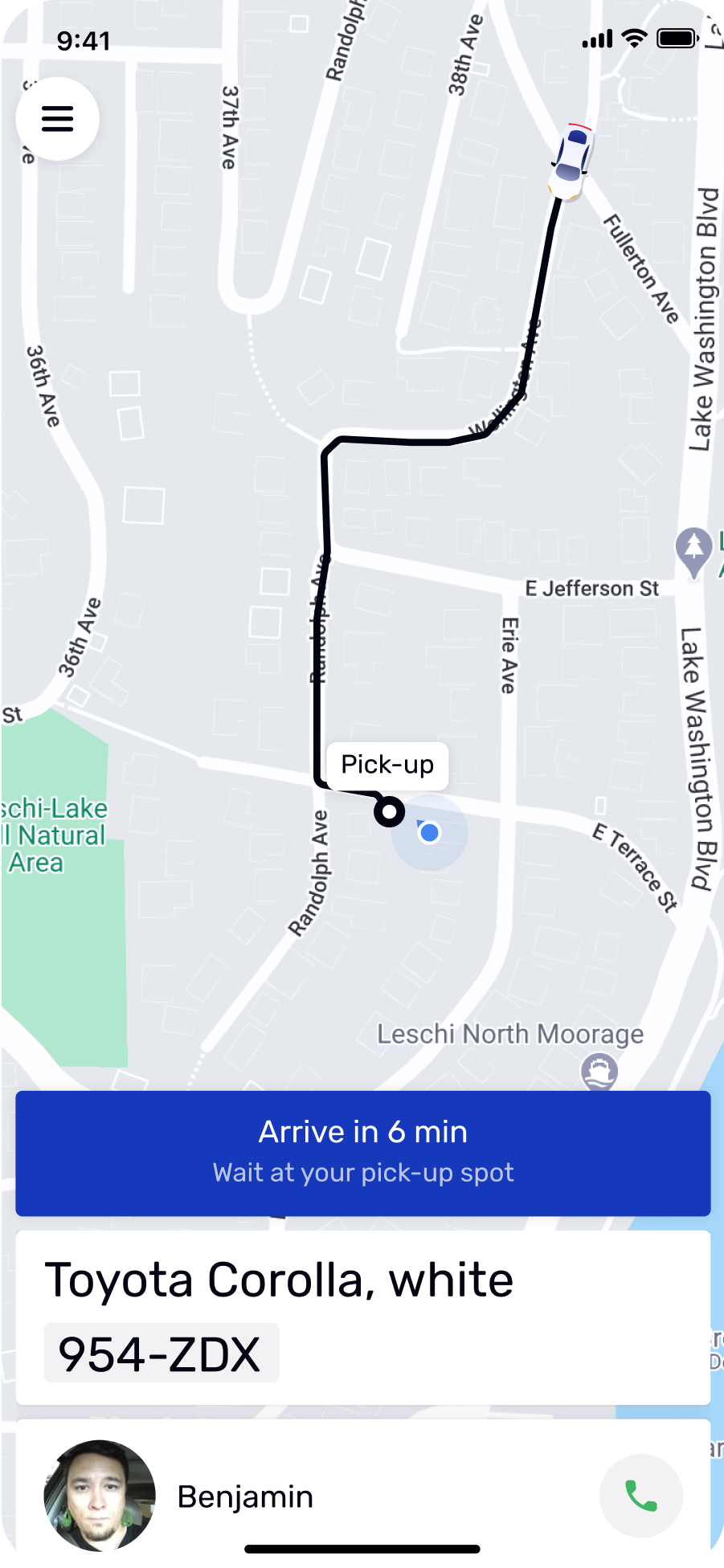
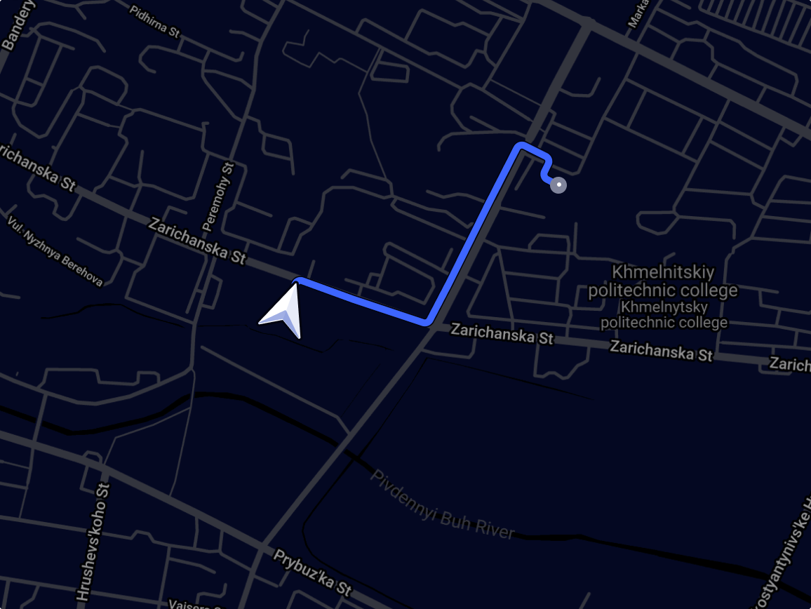
Accurate location tracking is key for any ride-hailing app. We integrated Google Maps to pinpoint passenger locations and track drivers in real time. To keep it up to date, we used an XML live map that feeds real-time data from the backend, like driver positions and vehicle availability, directly into the map interface. This way, both passengers and drivers always see the most current info on their screens.
We developed backend algorithms for smart dispatch and ride chaining
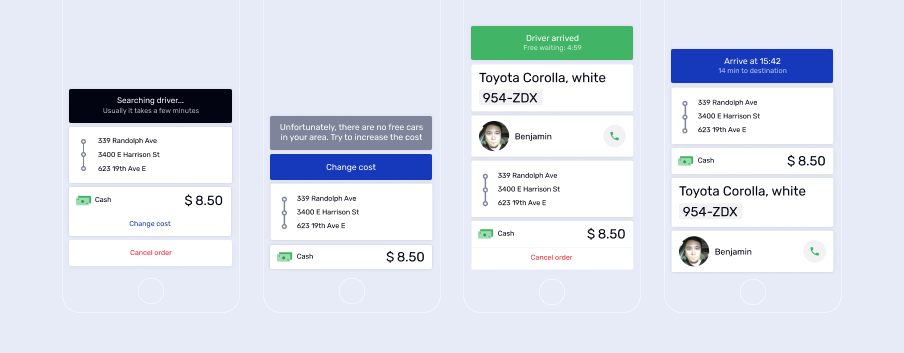
To match riders with drivers, we developed an algorithm that starts the moment a pickup is confirmed. When a rider sets the pickup point, the system searches for available drivers within 500 meters. The driver who has been idle the longest gets the request first. If no match is found, the search radius expands step-by-step to 1 km, 1.5 km, and 2 km.
We also added an algorithm where, if a driver is finishing a trip near a new pickup point, they’re offered the next ride immediately. It keeps wait times short for passengers and helps drivers stay busy and earn more.
We integrated flexible payment options for passengers
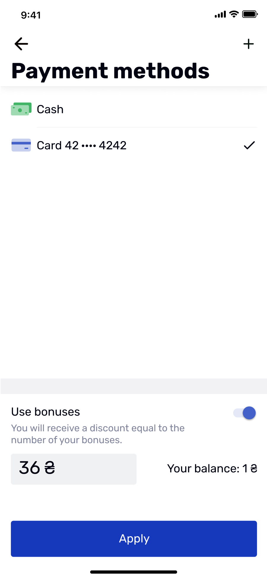
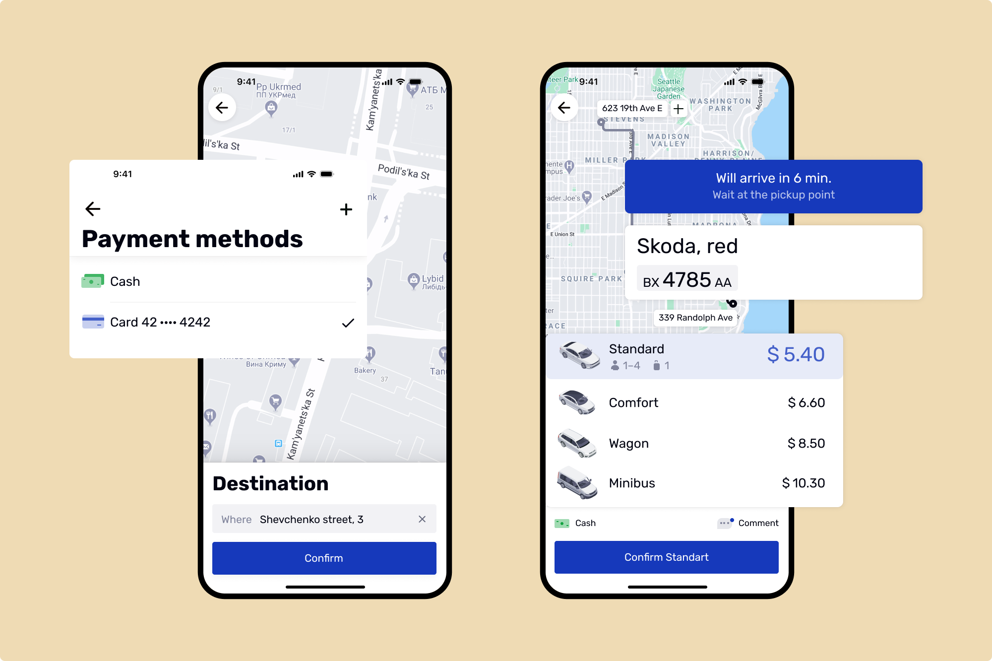
To give passengers more convenience, we integrated multiple payment methods, including bank cards, cash, bonuses, and the Way4Pay payment service. Way4Pay also supports Google Pay and Apple Pay, allowing for seamless mobile payments right from the app.
We implemented a dynamic pricing algorithm to adjust ride fares
Using the GeoJSON format, we mapped the city and its neighborhoods into zones (hexagons). We developed algorithms that automatically adjust prices based on activity in specific zones. For example, if more than 10 ride requests are made within a five-minute window in a particular hexagon, the price coefficient might increase from 1.0 to X2.5.
In addition to these automatic rules, administrators can create and manage manual pricing rules through the admin panel. For instance, on Wednesday at 3:00 PM, when there's heavy rain, an admin can manually set a rule from 3:00 PM to 4:00 PM with a price coefficient of X5. Once the time window ends, fares return to the normal rate.
Disruption-free migration from GCP to lower cloud costs
At first, we developed the infrastructure on Google Cloud Platform, using Kubernetes and Helm. We also implemented a complete CI/CD pipeline, which allowed us to automatically build, test, and deploy new code with minimal manual intervention. This setup helped us build a scalable solution that could easily handle peak demand periods, like New Year’s Eve.
When the pandemic hit, the client began raising concerns about the high costs of running on Google Cloud. So we decided to migrate to Hetzner Cloud, a more cost-effective alternative. As the app infrastructure was designed to be cloud-agnostic from the start, using Kubernetes and containerization, the transition between cloud providers was fast, seamless, and disruption-free.
Result
A scalable ride-hailing system that puts users first. And costs less
We developed a ride-hailing solution that balances the needs of both passengers, who want a seamless ride experience, and drivers, who look for flexible work opportunities and steady earnings.
- Custom solution with lower operational costs.
- Instant rider registration through a simple, intuitive mobile app.
- Scalable, cloud-agnostic infrastructure migrated to a more affordable cloud.
- Tailored solution with full flexibility.
- Driver-focused features with easy registration and direct payouts .
Need a similar solution?
After launching BBGO, several companies approached us to discuss opportunities to revamp their apps or scale their platforms using similar tech. If you’re thinking in the same direction, we’re ready when you are.
Cast:
 Svetlana Bolgar
Project Manager
 Maks
MaksDesigner
 Anton
AntonAndroid Developer
 Ivan Krasilnikov
Android Developer
 Artem
ArtemBackend Developer
 Yevhen
DevOps
 Yevhen
DevOps Team Lead
 Yurii Shevchuk
QA
 Oksana
Account Manager

