MeinFernbus — Bus Ticket Booking System Development
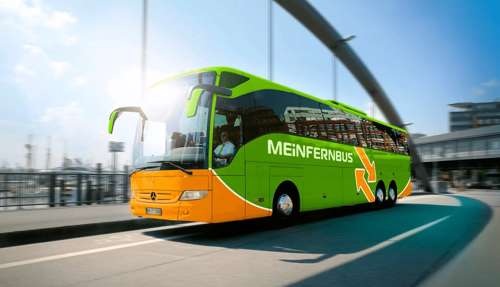
MeinFernbus is a leading German supplier of transport services in the area of passenger coaches. In 2015, MeinFernbus announced a merger with another company, thereby becoming the number one player in Germany's passenger transportation market. Currently, this company operates in 20 European countries on 100,000 different routes. The company takes care of the consistent use of the brand, network planning, pricing, marketing, sales and distribution, transportation department, and customer service, while its regional bus companies are improving effectiveness by focusing on high-quality standards and Safety.
For 3 years we have participated in the development of a web project and mobile applications for Android and iOS together with CTO IT-MeinFernbus team under the leadership of the company Alexey Kolupaev.
Bus Booking Platform Development
The passenger transportation software part of the system is written in the PHP framework, Symfony2. It all started with a stable 2.0 version. The project developed as we were advancing the framework. Due to the high architecture of the framework and the availability of a large number of ready-made components, our readymade bus app development company was able to reduce the cost of standard solutions for routine tasks, allowing more time for business logic. The result is a robust and versatile transportation management software system for the company.
The system consists of three main components: the sales site (frontend), company management system (backend) and API. Portal of agencies and partners is set in separate services. They display reports and statistics to partners and representatives of agencies.
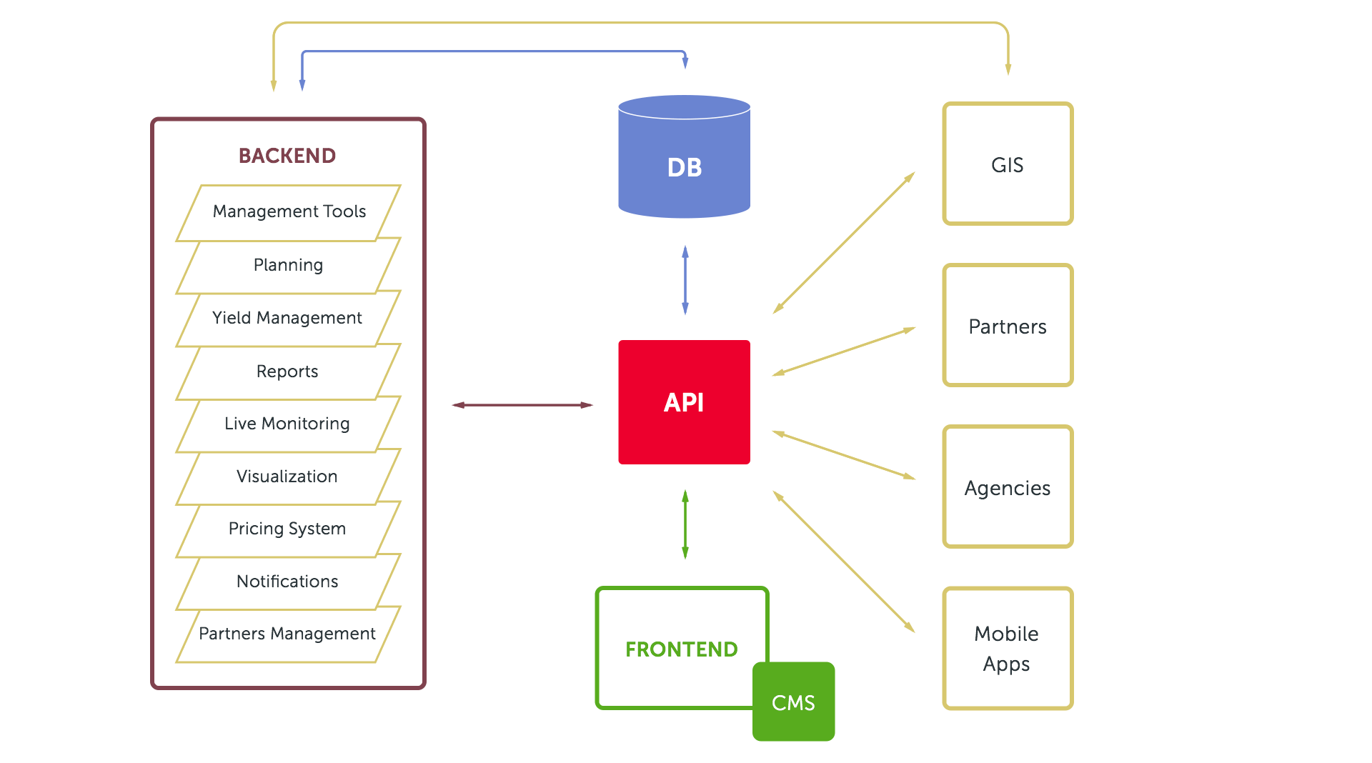
The sales site (frontend) is the main site, through which tickets are sold. It connects with the backend via the API. Website appearance and information can be controlled by a simple system of content management. CMS is also written in Symfony, using both the studio and the party bundles.
The heart of the system is the API through which all business processes run. It is designed not only for internal communication between services and mobile applications but is also available for outside partners and agencies. This is a key component of the online bus ticketing solution.
Company management system (backend) represents a huge part of the project where the whole management of the transport company is carried out.
Key components of backend:
- A bus route management system with the ability to plan routes and control transfers
- Management of passenger volumes (monitoring the filling of buses, the addition of new buses on popular routes, distribution of passengers on buses)
- Tools for flexible pricing, profit optimization, sales analysis: by days, hours, prices, trips
- Powerful transport, financial and reporting system
- Visualization of data with the help of D3.js library
- The system of passengers alerts by e-mail or SMS
- Managing agencies and partners
- Online monitoring of the buses movement on a map
Geographic Information System (GIS) is a separate service. It is engaged in processing of geodata:
- obtains coordinates of buses, filters and processes them,
- prepares the data for display on the map in real time,
- defines buses delays,
- analizes accumulated data on delays that is necessary to adjust bus timetable.
This complex system also functions as a bus ticket booking system, capable of processing high volumes of real-time data and requests.
The system quickly handles multiple requests with large data sets. For its realization, we used the Silex PHP-micro framework. It is lightweight, fast, and has a minimal set of components to build good application architecture. Silex can be expanded with help of the individual components of Symfony.
By separating into different constituting parts, the total load is distributed to the individual components. This would facilitate the scalability of the system in the future, and gives flexibility in the power distribution of servers depending on the needs. This scalable backend also allows for seamless integration of a bus reservation system that meets the operational needs of both passengers and partners.
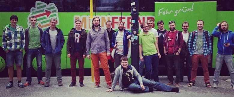
At the invitation of the company’s executives, we have visited Berlin twice to share experiences and discuss the details of the project development. It was very pleasant to see the system in the development of which we were participating working in practice.
Website Design for Ticket Sales
Like any start-up, MeinFernbus Company developed gradually the external representation of its brand. We took part in enhancing the convenience of interaction with the sales website, improving the appearance of its particular parts — first of all, the key things such as searching and buying tickets, filling passenger data. At the same time, we tried to preserve to the full the overall style of website design.
Search form
One of the key objectives was to improve the search form, as a website visitor began his or her purchase exactly with it. We analyzed a lot of similar forms on the websites for booking train and flight tickets. A characteristic feature of the search form on MeinFernbus website was a choice of room to carry bicycles. We also planned and designed the autocompletion for quick and easy station name input.

Search results
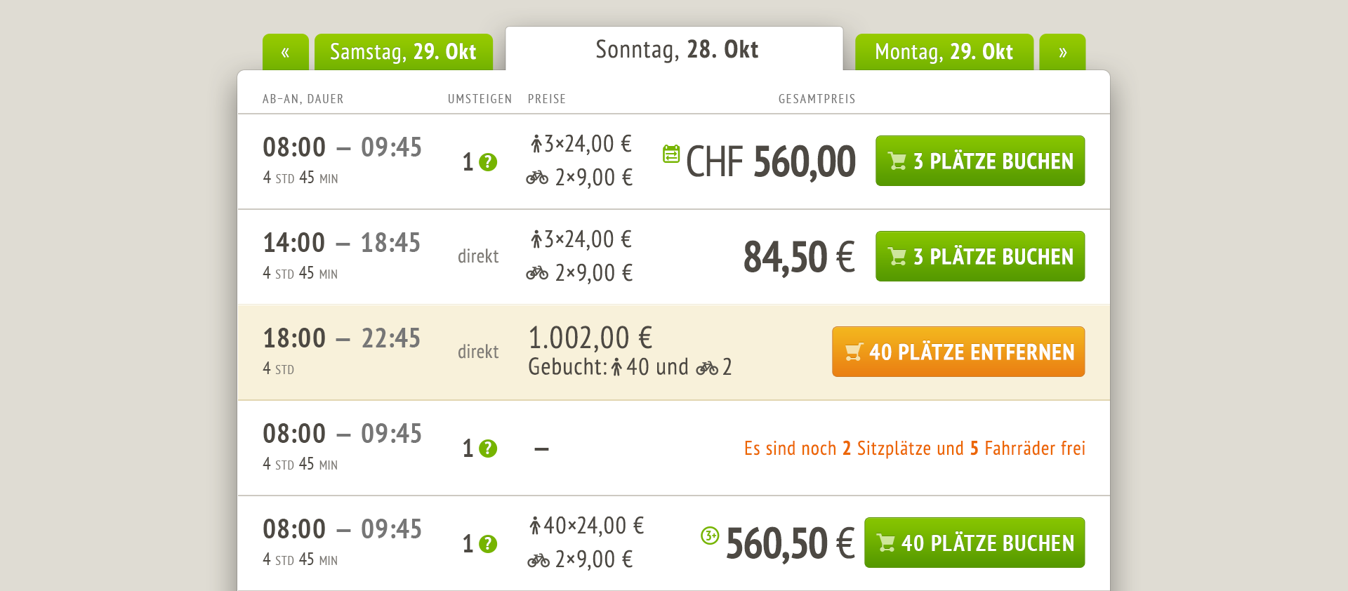
The successful purchase of a ticket depends directly on the choice convenience and informativity of search results. For visitors, it is important to see the departure and arrival time, possible transfers, and, of course, the price. The page also contains convenient navigation by days. If a visitor has not found the right time or is not satisfied with the price, he or she can quickly select the next or previous day. Due to the limit on buying tickets for the trip on the same day, the buttons «Add tickets to the cart» vary depending on the selection. The intuitive UX enhancements helped deliver a more efficient intercity bus booking platform experience for users.
Icon set for FAQ sections
The website visitors have questions, which they often address to the company support. In order to facilitate the work of the support team, chief executives decided to bring navigation through frequently asked questions in the homepage, and for a particular focus on them to make them in the form of teasers with icons.

City Pages
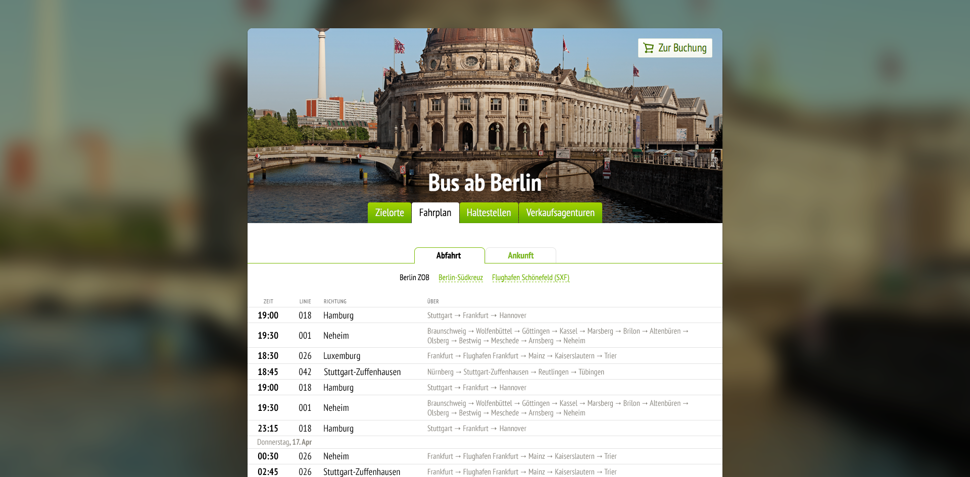
For the benefit of the website promotion, it was decided to create pages of arrival/departure cities en route. On these pages, we placed bus schedule, travelling options with MeinFernbus buses, bus stop locations, and a list of agencies where you can buy tickets offline.
Route Map
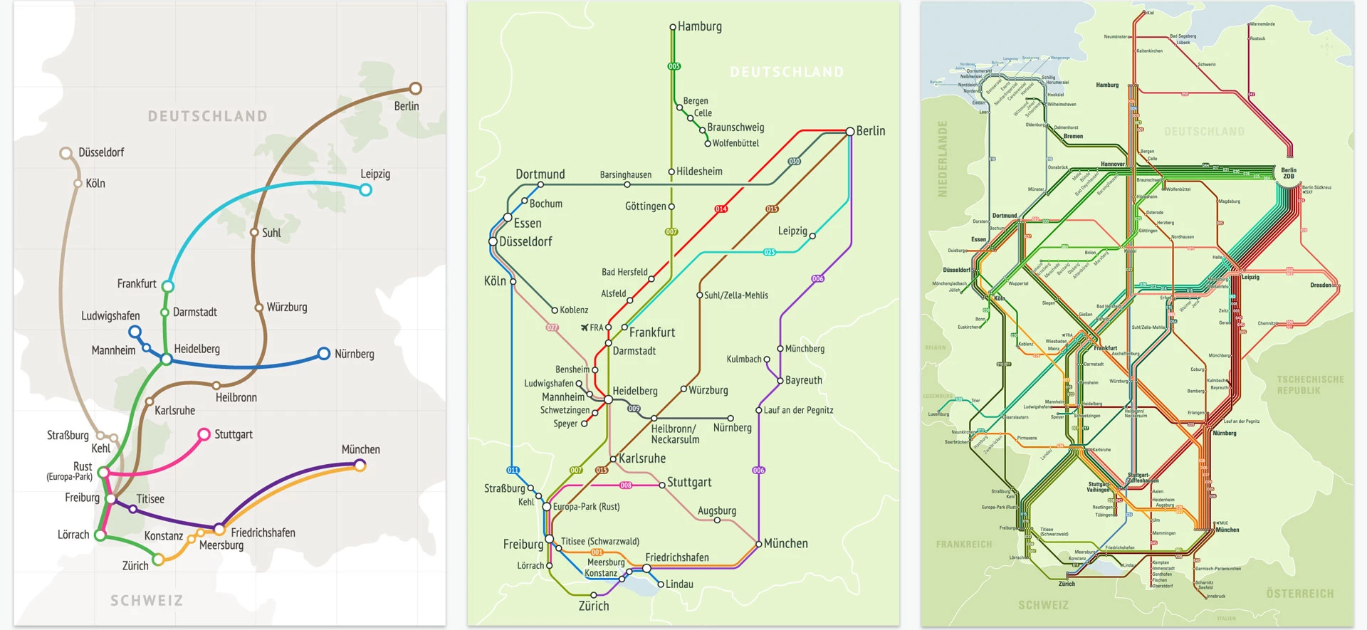
The company began with one routing line between Freiburg and Munich. We visualized bus route on this line for the first time then. The company was constantly evolving, increasing the number of routes and lines, so the map was also constantly evolving and improving.
We were inspired by the famous metro maps of London, New York, Sydney and others. But, unlike the metro map, the bus routing lines map needed geotagging, that’s why it was less balanced and required continuous optimization due to the increasing number of lines.
The map has experienced three major redesigns and optimizations.
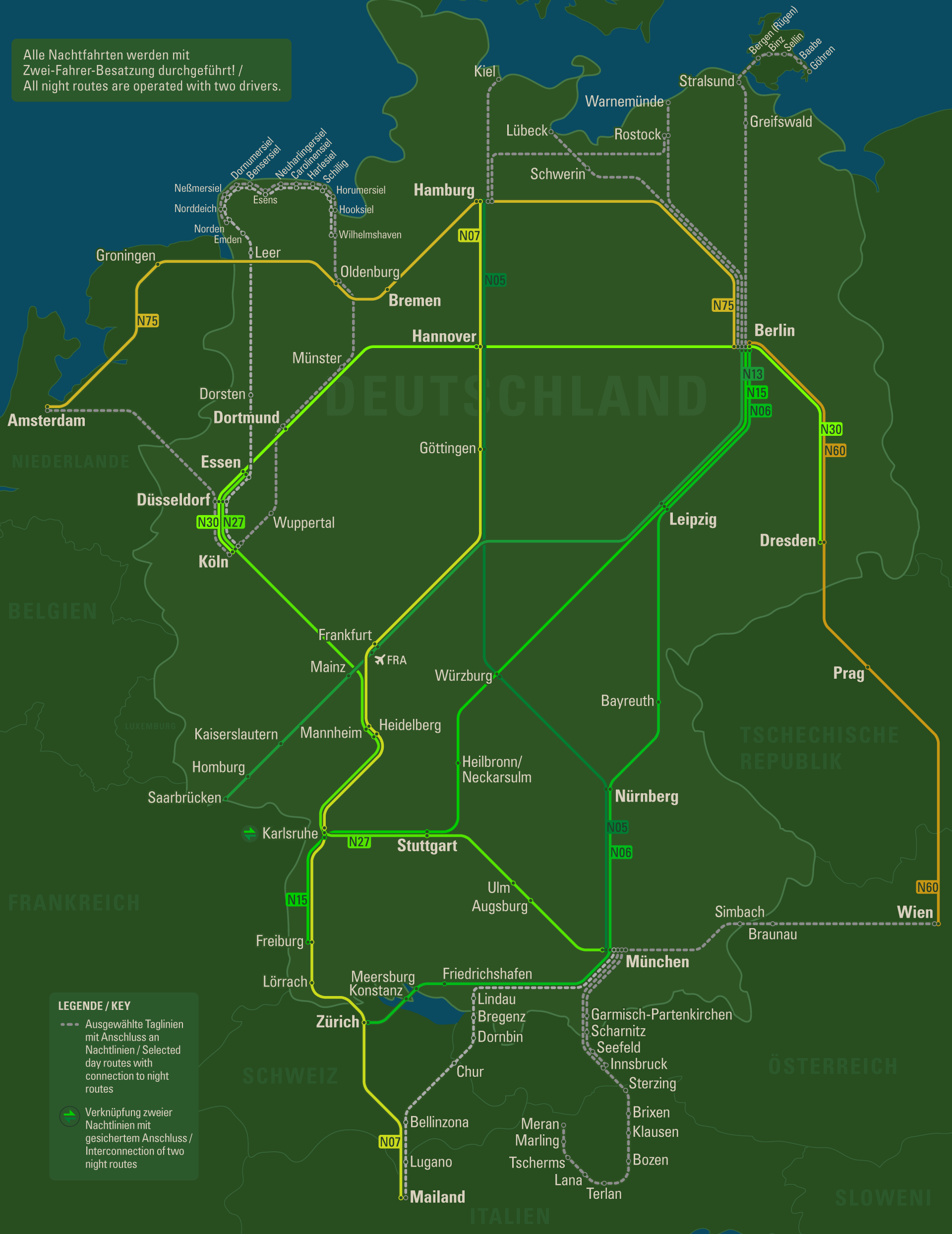
When the company launched night routes, we made a separate dark version indicating only the night lines.
Trip Reminders and Notifications
The original concept of the company was that the person didn’t need to be in possession of a ticket or something like that: it was enough just to show your passport when boarding the bus. This caused the burden on drivers, and the boarding speed was rather low. The company’s chief executives decided to introduce a sort of reminder ticket with passenger data, travel information, as well as QR code. Reading the code is much faster than manual search of names on the passenger list.
The designer had a task to build the reminder layout as convenient as possible to use before the trip, during the boarding and during the trip. Reminder is printed out to A4 size, and can be also downloaded in electronic form to a smartphone or tablet in PDF.
Passengers usually fold these sheets, so that it’s convenient to put them in a pocket or bag. On this basis, a folded view of the reminder was considered when building the layout. We tested the basic options of folding the reminder and placed the information, so that a person could use it, without unfolding.

Cast:
 Stepan Tanasiychuk
CEO & Founder
 Oleg U.
Designer
 Ivan Samaryov
Front End Developer
 Valera
Developer
 Artem
ArtemBack End Developer
 Andrey Shkodyak
Developer
 Yevhen
System Administrator
Other Case Studies

Logistics
Switzerland
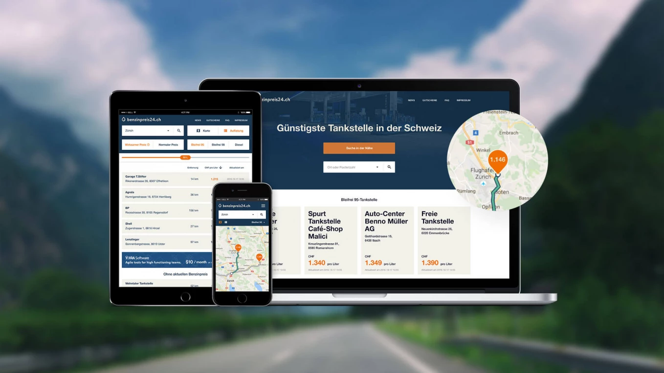
BenzinPreis24
Service for efficient search of petrol stations

Logistics
Ukraine
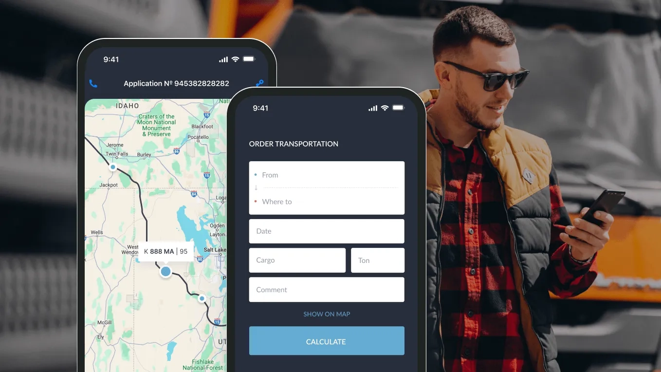
Uber-like solution for trucking grains
Development of the service for a cargo transportation company

Travel and Hospitality
Germany
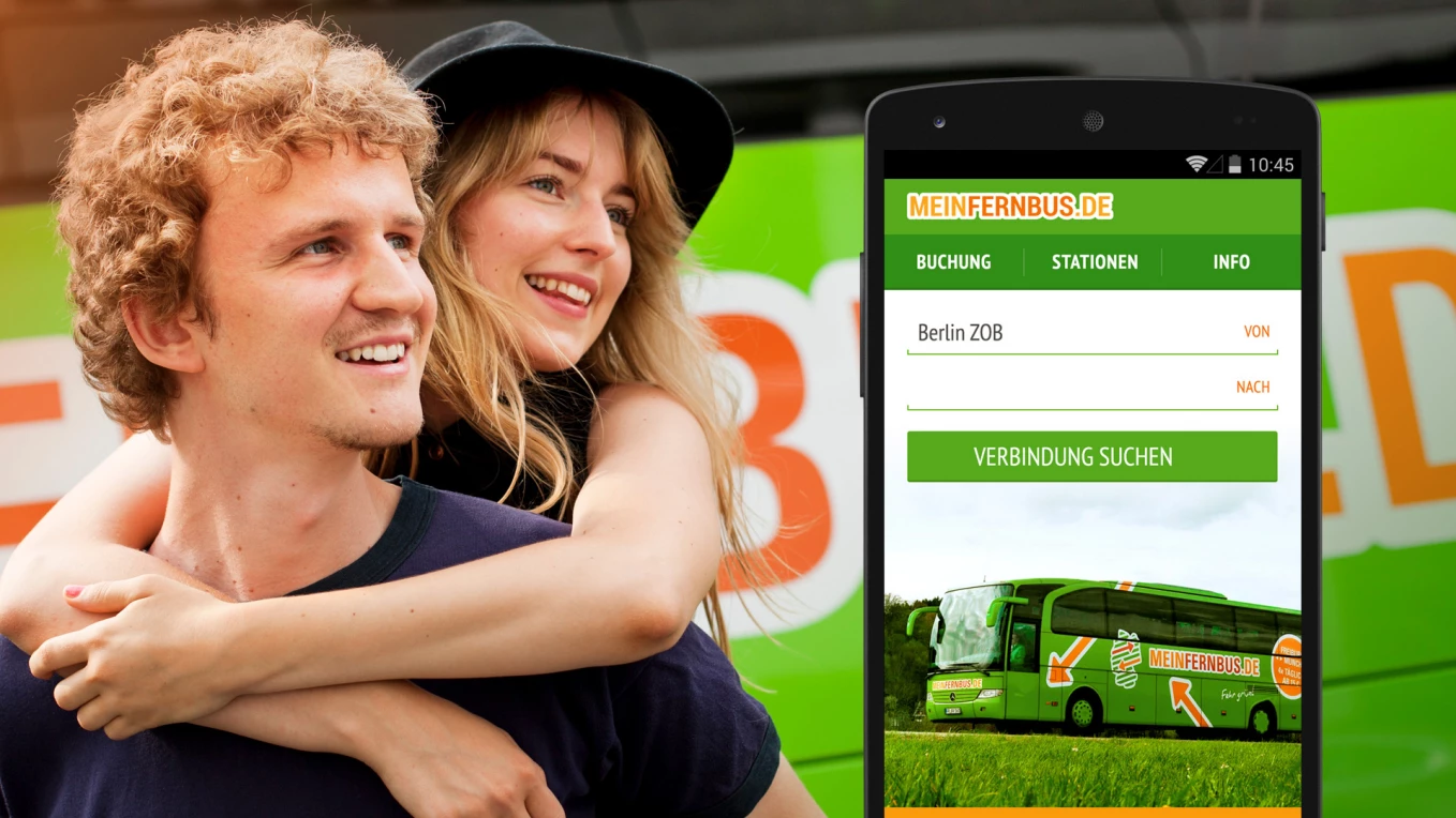
MeinFernbus apps
Mobile app development for a largest passenger transportation company
Build logistics software with generative AI
We help transportation and logistics companies automate operations and scale faster through:
- 16+ years of proven logistics expertise
- Full-cycle custom software development
- 30% faster delivery with AI
- CTO-led delivery on time and on budget


