Nova Poshta — Parcel Dashboard UX
new.novaposhta.ua
Nova Poshta, a Ukrainian company, has become a market leader in delivery and a driver of its development over the past 20 years. The company actively works on elaborating on and improving user-friendly online services. Nova Posta and stfalcon.com's cooperation was intended to substantially improve the current Personal Dashboard and bring the user experience to the next level.
Challenge: Improving the Parcel Dashboard for Nova Poshta
The tasks we needed to implement in the project:
- A new Personal Dashboard design
- A custom web application development
- A front end integration with the Nova Poshta's API
The front end development was not the easiest task, because at the start of all the works some of the backend functions were partially unavailable. However, the frontend was developed in a way to make changes easy afterwards, with taking into account the future jump from the old API to the fresh one.
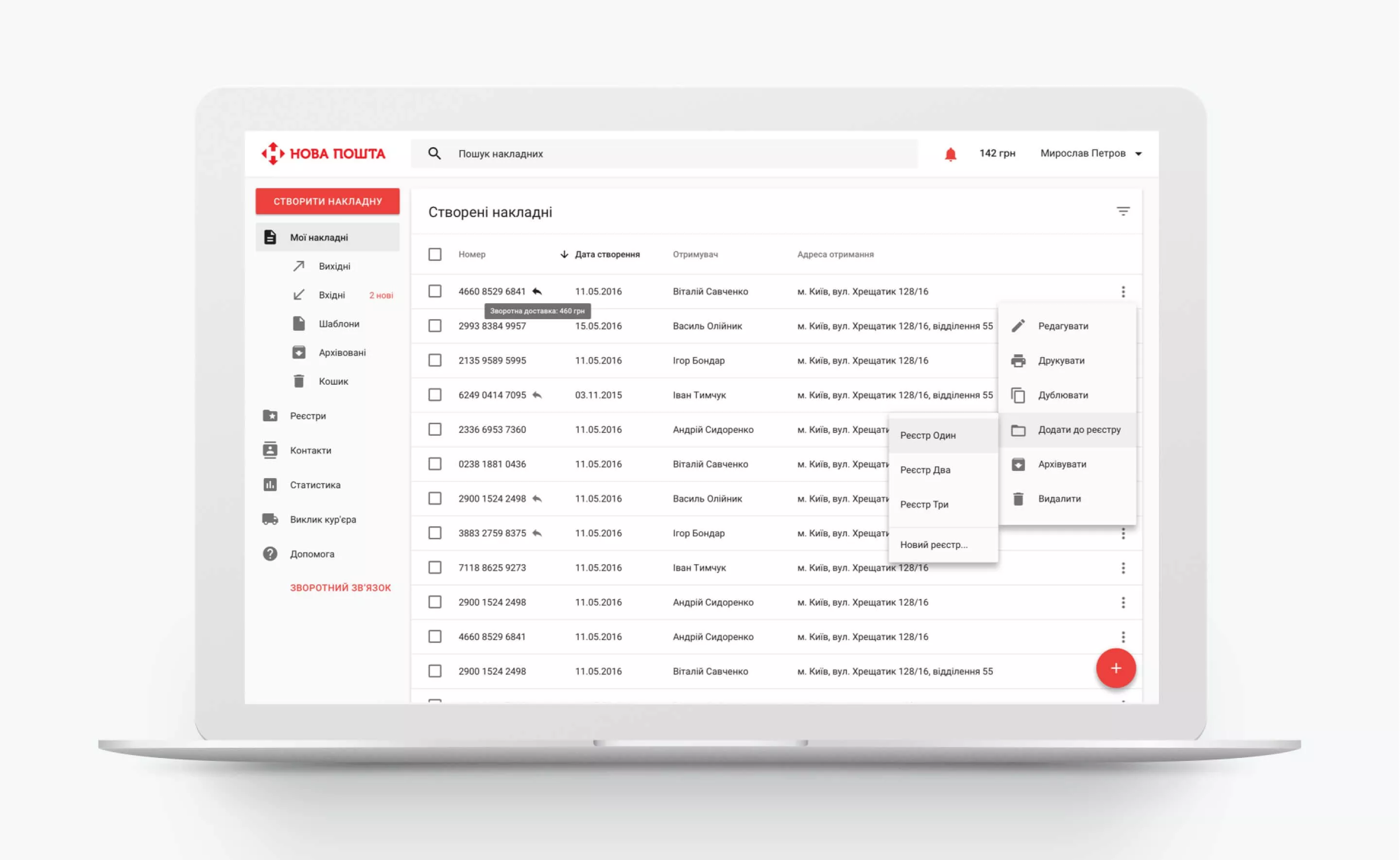
A new project starts with research of a subject area, and analysis of the current issues. Also, you need to discuss it with your customer, of course. Talking about the Nova Poshta dashboard development case, we were given the user stories and the test results, which helped greatly during interface design.
Customer representatives have been involved into the project even at the early design stage for operational consultations and discussion of the proposed solutions.
Material Design + Angular
To accelerate the UI development and the creation of high-performance web applications, it was decided to use the Google Material Design library, based on the Angular framework. This approach to the implementation of the interface allowed us to focus on business logic, to consider the interaction design to the smallest detail and to avoid writing from a scratch all the UI and input controls.
This kind of flexible approach is fast enough to create and support new features for end users.

User Authentication and Access
We made a small interface animation at the Dashboard's login screen with switching between sign-in tab and registration tab. While signing in, user can see the list of Dashboard's new features.
List of invoices
Of course, the main page of the Personal dashboard for delivery service has a list of the user's invoices. For convenience, all invoices were divided into categories:
- AThose, which have been created, but not yet contented in the office or by a courier
- Inbound packages
- Outbound packages
- Blank templates
- Archived invoices
- Recycle bin with the option to recover invoices
A user can work with single invoice or several selected invoices. For the advanced users we've provided the option to choose the column to display and sort the table on the particular column.
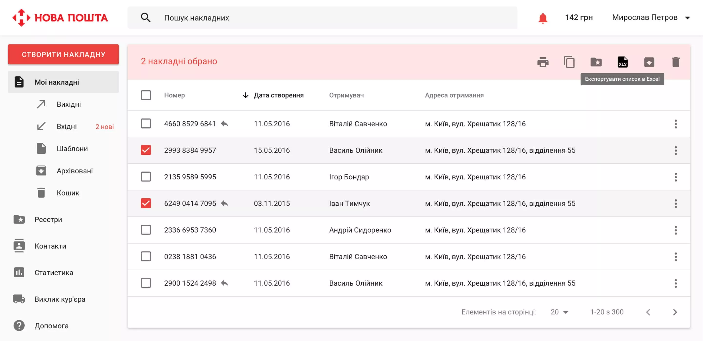
Shortcut button
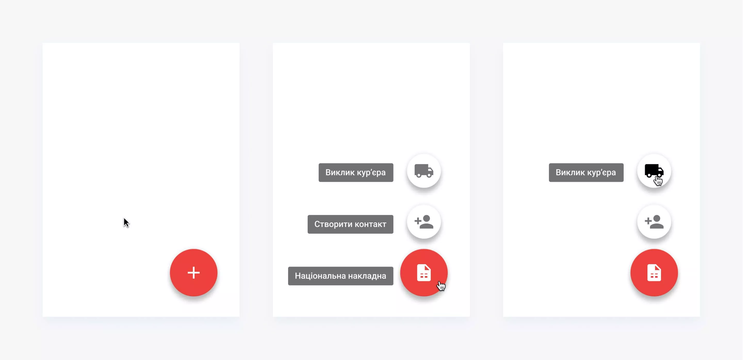
Perhaps the most recognizable element of Material Design is the so-called Float Action Button. This element is used for quickly access the most important functions and is always in the same place on the page. This is a great way to make a needed action from any application screen.
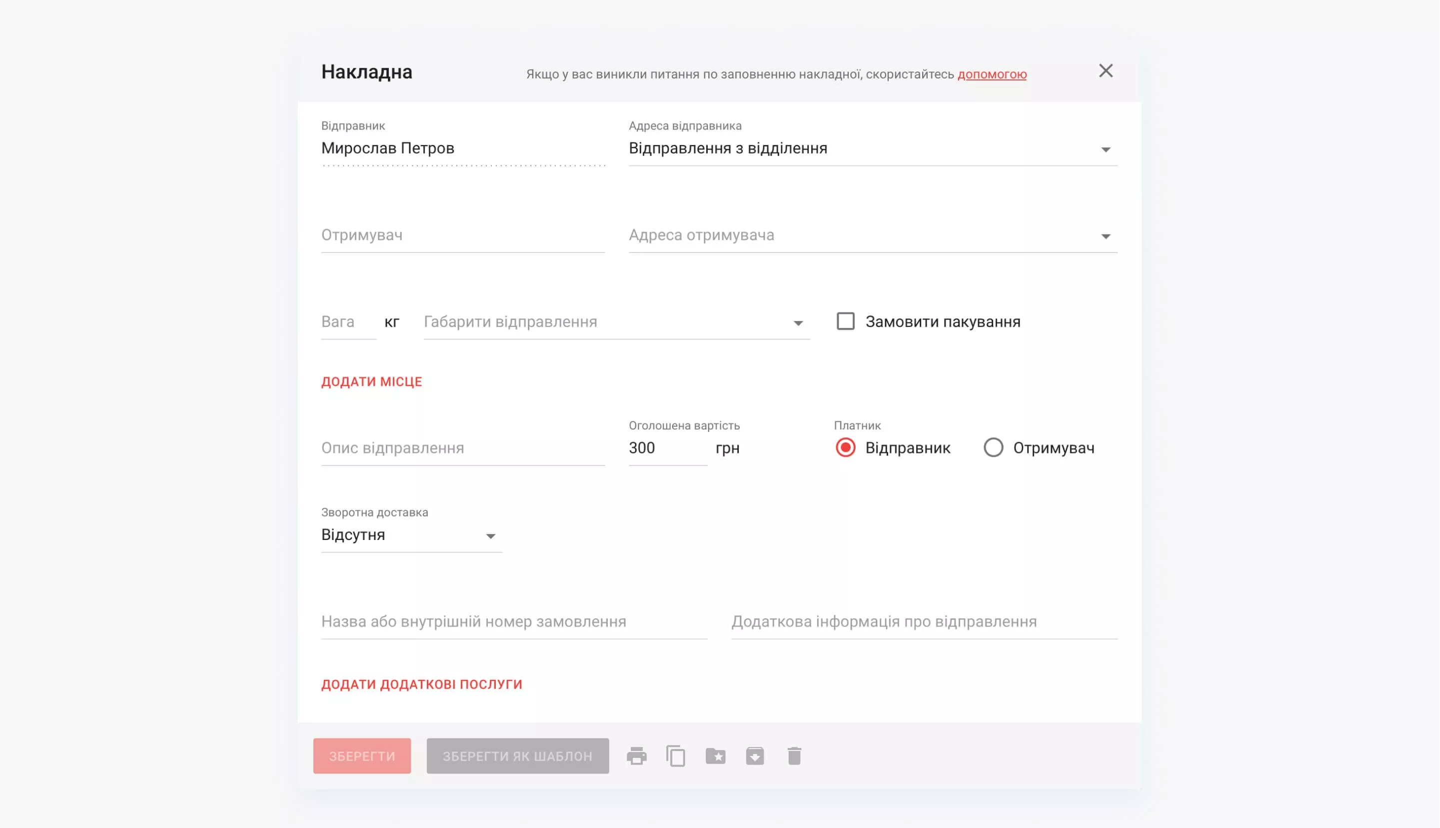
Creating new invoice
While design implementation, we've paid much attention to the "create invoice" window. To simplify the data entry and remembering the fields' locations we've placed the elements via Z-pattern: all the data are grouped in rows, filling each row from left to right. Since the creation of the invoice is an iterative process, we tried to fill a particular data by default. For example, the sending rate is declared as the minimum possible. And if there are redelivery money specified, the declared value is automatically increased.
Keyboard input is optimized, allowing to work with forms quickly and effectively without using a mouse.
Package tracking
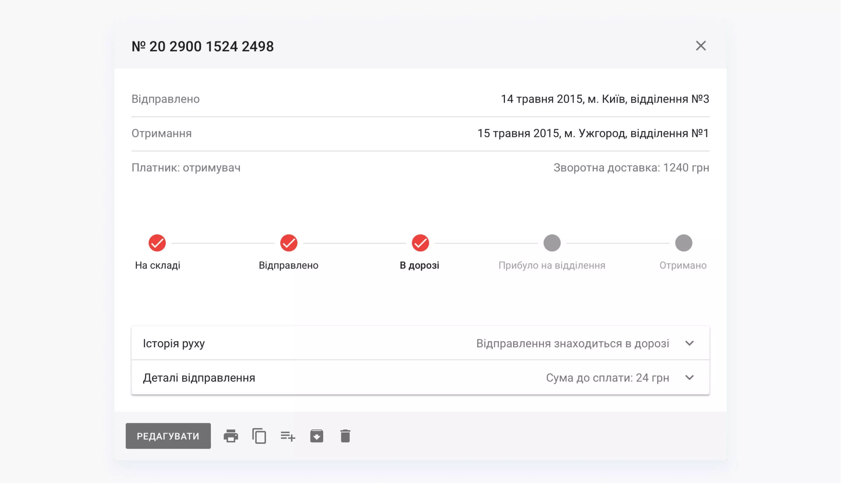
All outgoing and incoming packages are displayed in the сustom dashboard for parcel tracking system interface with general information and a history of the package transition.
Templates and registries
The most constant and demanding Personal Dashboard user is a client, who often sends packages. For example, an e-commerce. The system allows you to create a copy of the invoice to get the same order. Users can create templates with the most popular items and package descriptions to simplify the formalization of a new invoice. Of course, there is also a possibility to group several invoices in a single registry.

Contacts and addresses
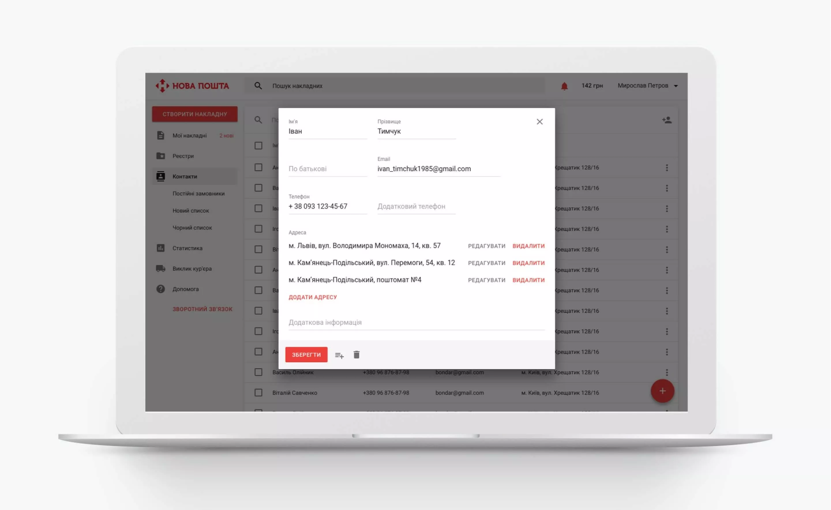
The system stores user's contacts database with quick search by name or phone number. Each counterparty may have multiple addresses, it can be a local post office of Nova Posta, or a personal address. For the convenience, contacts can be organized into lists.
Statistics
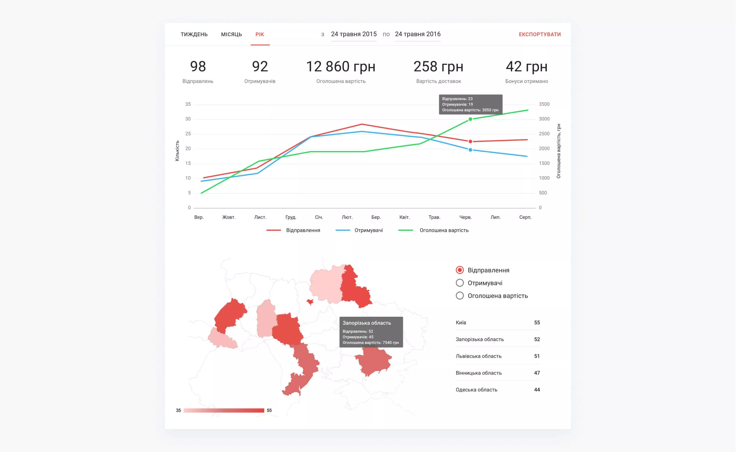
Orders' statistics is very important for regular users of the system. We wanted to make Dashboard as a full-fledged tool for a private entrepreneur, with the ability not only to create invoices and track them, but also to analyze the past shipment, to view general statistics by month, by day and even by regions of the country.
Features of front end architecture
Javascript is a convenient and flexible programming language, which can be run at all browsers. But as the project focuses on a stable structure and architecture, followed by scalability, Typescript language was used, which is compiled to Javascript. Typescript has all the advantages of a typed language. It has stable parameters of function classes with predetermined type, which originally absent in Javascript.
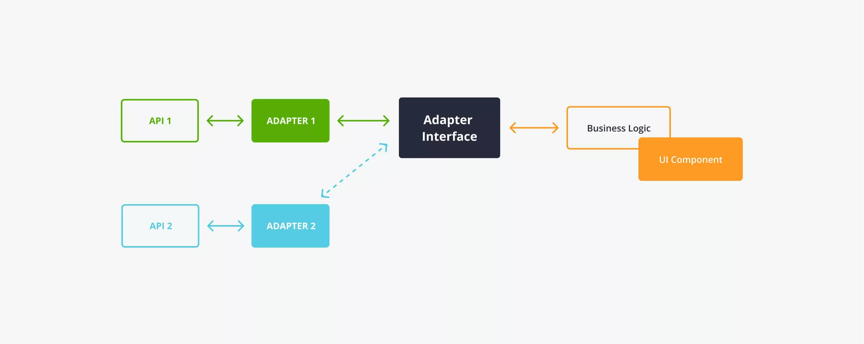
Due to the planned relocation to a new API we've made some steps to do it safely and without changing the business logic. We've applied an "adapter" programming pattern, separated the business logic from the server query, made standalone processing. The data adapts to the stable structure, distributed by model. Data Services are described using interfaces, and now a new API data processing services must implement written interfaces. As a result, by changing our adapter to another one our application does not notice the difference, at the level of interaction with adapter API has not changed.
Features of front end architecture
The application itself is a component, which is composed of smaller components, and they, in return, are composed of smaller components. Their usage greatly accelerates development. The internal logic is isolated, which allows not to write excess code, but to control the behavior. Same components can be used repeatedly. In addition, new components can be formed from various combinations of components.
Angular-Translation library helped us to implement multi-language. Application language is determined by the user's browser language or the operating system language. The language is loaded only once and stored locally in the browser, and then updated when you update the version of the app.
Cast:
 Vladimir Sutowski
Project Manager
 Maks
MaksDesigner
 Svetlana Bolgar
Project Manager
 Andrey Siagrovskyi
Front End Developer
 Ruslan
Front End Developer
 Yevhen
System Administrator
 Viktor Shpak
QA Engineer
 Misha
MishaQA Manager
Build logistics software with generative AI
We help transportation and logistics companies automate operations and scale faster through:
- 16+ years of proven logistics expertise
- Full-cycle custom software development
- 30% faster delivery with AI
- CTO-led delivery on time and on budget

