
More than a decade has passed since Apple launched its AppStore in the summer of 2008. The new platform has actually given birth to a new ecosystem of digital apps and the launching of it can by right be considered a starting point of the new epoch in mobile application development. Billions of people worldwide own smartphones now and use mobile apps daily, can even be said hourly.
The Apple App Store hosts a staggering 1.76 million applications, while back in 2008, everything started from just 5000.
Another indispensable aspect of the modern life is traveling and though mobile travel apps are among the top 10 most downloaded application types both for iOS and Android, the travel industry still has multiple corners to be filled by means of modern travel application development.
You may use our calculalor to estimate the approximate cost of app development
Why Invest in Travel Mobile App Development Today?
Criteo states that a growing number of individuals worldwide are keen on embarking on journeys. Significantly, travelers from the APAC region exhibited the most substantial year-on-year increase in air travel bookings compared to other global regions. In September 2023, air travel bookings in APAC surged by an impressive 23% compared to the previous year.
In a closely trailing position, the Americas reported a robust 15% increase in bookings during the same period. In contrast, the EMEA region experienced a more modest 8% uptick in flight bookings.
So make the best of the travel mobile application for your business, boost conversions and enjoy some additional benefits.
Though mobile booking behavior varies substantially due to the local preferences, platforms, and demographic peculiarities of the users, there are certain patterns which can be exploited according to recent travel app statistics.

People live on the go now and modern tourists still admit they lack confidence as to the best price and options when using mobile travel and tourism apps.
So considering the travel app ideas make sure you provide your users with the most relevant data, the best price possible and the ability to compare alternatives in one place. In such a way you’ll take over the competitors and gain loyalty to your brand. Offer your clients one of the smartest and most useful travel apps ever and you’ll win their hearts once and forever.
In the modern newly fashioned lifestyle, travelers value the possibility to consolidate all the journey details and services in a single place and to simplify the time-consuming process of trip planning and arranging.
We guess you’ve already realized that a travel mobile app development is worth the cost, but how much does it actually cost to develop an app of such kind?
Let’s deal with this question in more detail below because the budget of an application development process depends on multifold factors and aspects.
Core Features that Define Successful Tourism App Development
The majority of travelers nowadays carry smartphones with them and give preference to mobile apps in solving various travel-related tasks, starting from planning a route and finishing with solving the language barrier problem in the place of destination.
Want a web app that does more?
Let's build a solution that's smart, sleek, and powerful.
Alina
Client Manager

Thus the modern web application development trends prompt smart business owners that the users expect multi-benefits from the apps they use. No matter if you need a travel agency application or consider mobile app development for searching holiday hotels, make it a one-stop solution for your customers, so that they do not need various car rentals portals, ticket booking sites, insurance platforms or travel-related marketplaces. Make all these options available in a single place and it will pay!
Needless to say that every feature you include influences the cost of building an application you need. So there are certain features essential for all travel apps while some can be added as a bonus.
Let’s deal with the must-haves first.
1. A personal account with social media authorization and sharing.
This option is beneficial both for the traveler and for the app operator. The tourist has simplified and speedy sign in into the account and can share the most memorable experience or important aspects of the traveling. On the other hand, it works as an app additional promotion and allows you to access users’ social profiles and to build personalized deals for each traveler.
2. Booking and payment options.
Great travel apps provide their users the option of booking with just a click, it’s convenient to choose the necessary flight and comfortable apartment with several taps and book them right away. Various secure payment options which facilitate transactions for your users will only add up to your app rating.
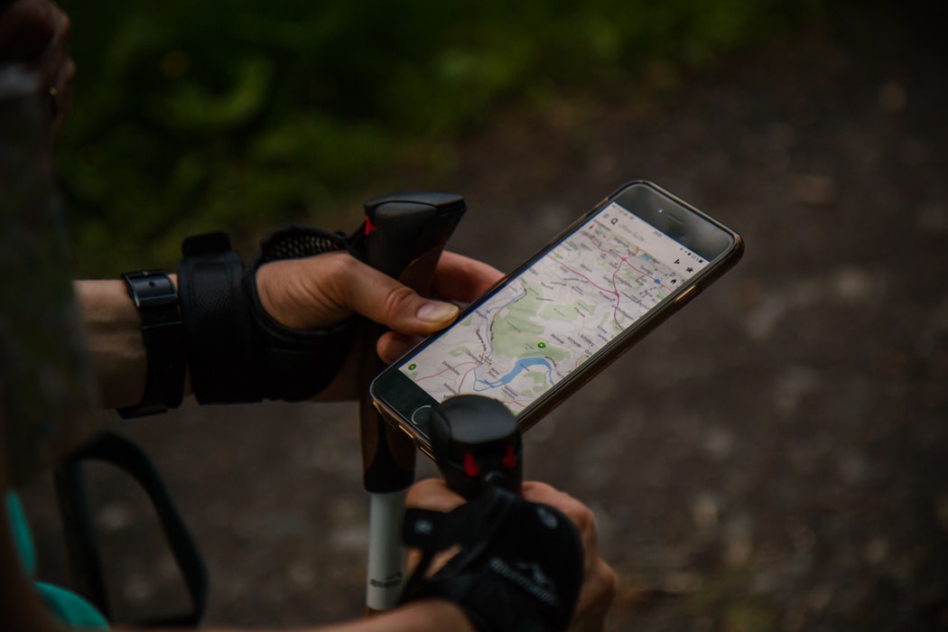
3. Geolocation and Navigation.
When a traveler is at his destination, he or she is more comfortable if he/she can spot the current location and the way to get to the next necessary point -hotel, café, bus stop, whatever. Even though it will add up your custom application development cost, it’s much advisable to implement this feature and to add a map with routing and navigation possibilities.
4. Search and Filters Option.
It may be restricted to only transport and accommodation options or expanded for popular spots and attractions finding, but a comfortable search tool will undoubtedly be beneficial for your travel application.
5. Reviews with rating option.
Nowadays people rely more on other travelers’ experience than just on the formalized info about the hotels, restaurants, cafes, or other spots. Implement this feature and you will get an opportunity to increase awareness of your service and improve it if necessary. Give your users the ability to share their experiences and review the places they visit.
You can also add some pleasant bonuses for your customers in the course of your advanced application development, provide weather forecast with regular updates for holiday destinations, add some info about most popular eating facilities with local cuisines or indicate best shopping places to unify travel experience of a user.
A good idea is also to get real-time updates, alerts, and notifications about special offers and discount deals. We can speak a lot about the additional features improving your user experience with the app, starting from travel plans synchronization with the mobile calendar and finishing with the language translator and offline access. By the way, the latter can be crucial when a person is a stranger in a certain area.
However, you should select the features based on your users’ common behavior and preferences and your business needs and budget available.
Travel App Development Cost and Time Estimations
We guess we have already answered to a certain extent your question «What do I need to build an app ?’’. Let’s now look into an average development time needed and deal with the initial question «How much does an app cost?».
For the minimum set of features, you will have to pay on average from 30 000 to 50 000 US dollars and it will minimum take 3 months to develop such an app.
In case you need the design to be created, you should add one more month to your time estimations.
The final cost of your application is driven by many important factors, read about them further.
Key Factors Influencing the Total Travel Application Development Cost
1. Features and their complexity.
The time needed for the application development depends on the functions you want to implement and their complexity of them. Consequently, these factors influence the size of the team working on your task and the man-hours needed.
You should define the scope of the project first and answer certain questions initially, the main of the are how many features must be implemented, and if MVP development is needed or the app should be built at once.

Keep in mind that serious features require special expertise or the cutting edge technologies usage, making them rather expensive. AR elements, voice recognition, animation, real-time synchronization can be referred here.
2. Platform.
Here you should keep in mind that developing a native travel App for iOS or Android requires longer time and greater investment, however, the quality of the end product is also higher. By the way, though Android applications take more time and may consequently cost more to develop than those for iOS, this platform is 3 times more popular and more widely-used. So, in case of hesitation which app to develop, you’d better go for Android in the first turn.
3. Method of authorization.
A great many of the mobile applications require to first sign in on the part of the user. Nowadays the implementation of social media logins is already a standard, we should say. Actually, it’s rather a reliable method, beneficial for the app operator as well. The person’s profile can be created automatically then, providing good opportunities for personalization in the future. Though developing a user login system is not difficult, it may be rather time-consuming and consequently influences the end cost of your application.
It’s also important to remember here that mobile app users do not always have access to the internet and when the device is offline, the app is unlikely to distinguish between the users. So you may think of the offline authentication option for your app.
To take it a step further you can think of the dual-factor authentication when the user has to input a certain code received via a telephone call or a message on logging in the attempt.
Even more modern, and more costly methods to consider may be biometrical, like a fingertip or retina scan for instance, but it requires more expert work and as a result higher investments on your part.
4. Integration.
It is also an important aspect, which presupposes that API exposes information and gives your travel app access to various data slices.
Integration of the mobile application is actually a challenge, which every mobile developer faces and has to cope with. They have to expose the existing infrastructure of a site or a service into the new delivery channel — mobile, more than that the changes to the back-end infrastructure should be minimized. The process of app integration is resource intensive and time-consuming due to numerous QA and release cycles.
Besides the more data source you add the more engineering effort is required for the integration purposes and consequently the cost increases.
5. Real Time Synchronization.
Modern life is extremely time-sensitive and prompt real-time actions matter in many aspects of it. Thus, real-time synchronization has become a crucial aspect of mobile apps development. The faster the information is received, the faster it can be processed and the faster the user can take actions due. Real-time synchronization nowadays means meaningful actions and better decisions taken at the right time.
The user can promptly order a tour after the notification about a special offer, book a flight or even pay for it at the lowest price, spot his location and find his way in an unknown locale or even send messages to his friends and family right away.
Certain contemporary solutions and technologies allow to easily stream data to multiple clients. But depending on the purpose of the real-time synchronization it can take additional effort, time and consequently client’s money to be implemented into the travel app.

Our Experience in Travel and Tourism App Development
MeinFernbus
MeinFernbus is a prominent provider of passenger coach transportation services in Germany. In 2015, MeinFernbus made a significant announcement by merging with another company, consolidating its position as the top player in Germany's passenger transportation market.
Our team was responsible for creating the initial version of the Android app. Subsequent development, which encompassed implementing the local payment system, developing subsequent app versions, and crafting the iOS app, was handled by the MeinFernbus team.
Although we were not directly involved in these later stages, we are enthusiastic about sharing our contribution to the project and sincerely appreciate the opportunity and experience gained through our collaboration with MeinFernbus.
 Read the full case study
The Hump
Stfalcon's mission was to create a service solution catering to frequent air travelers, whether for leisure or business purposes.
The primary objective for this service was to streamline and expedite all aspects related to baggage, commencing with its delivery to the airport and culminating in the issuance of a boarding pass and baggage tag, ultimately saving travelers valuable time.
 Read the full case study
Here are the common questions about travel and tourism app development and the answers to them.
FAQ: Frequently Asked Questions About Travel App Development
What are the essential features that every travel app should have?
Travel app development should include building a user-friendly interface for searching and booking flights, hotels, and rental cars. Robust search and filtering capabilities allow users to discover flights, hotels, attractions, and more based on their preferences. It also needs user accounts with social media integration for easy sign-in and sharing experiences. Maps and navigation features are essential for helping users get around. Additionally, secure payment gateways and user profiles for storing travel preferences and history are important. Finally, review and rating systems enable users to share feedback and make informed decisions. These core features create a one-stop solution that caters to the needs of modern travelers.
How long does it typically take to develop a travel app?
The development time for a travel app can vary depending on its complexity and the features included. A basic app with core functionalities like flight and hotel booking may take 3–6 months. However, developing a travel app with advanced features like AI-powered recommendations, itinerary sharing, or multilingual support could take 6–12 months or longer.
What are the most popular technology stacks used for travel app development?
Common technology stacks for tourism app development include React Native or Flutter for cross-platform mobile apps, and languages like Java or Swift for native Android or iOS apps, respectively. On the backend, frameworks like Node.js, Ruby on Rails, or Django are popular choices, often paired with databases like MongoDB or PostgreSQL.
What are the key factors that influence the cost of developing a travel app?
The primary cost factors include the app's complexity and features, the development team's expertise and location, the need for third-party integrations (e.g., payment gateways, mapping APIs), design and UI/UX requirements, and ongoing maintenance and updates. Think about features you want to have to build a travel app and budget accordingly.
How can I reduce the development costs for my travel app?
To reduce travel app development cost, consider starting with an MVP (Minimum Viable Product) with core features and then adding more functionality over time. Outsourcing to experienced developers in cost-effective regions can also help. Leveraging open-source technologies and pre-built components can save time and money. Finally, plan for regular maintenance and updates to keep costs manageable in the long run.
Bottom Line: Starting Your Travel App Development Project
By now, we are sure you have a clearer vision of the innovative travel app you want to develop, and even though it may be a time-consuming and costly undertaking, it has obvious advantages and benefits in the modern world.
We are happy to offer our experience in case you are looking for the top mobile application development company to create a travel app. It’s not just immodesty. Stfalcon.com has been listed first among the best lifestyle and travel mobile application developers by Clutch.co and we deserve it.
We always start with a careful investigation of the modern market, newest mobile app development trends, client’s business with its requirements, and the target audience along with the current user experience and expectations. All these combined allows us to provide our customers with the state-of-art travel and hospitality solutions. Just contact us, and our dedicated team will be glad to help you.