The right font can do wonders — it communicates clearly, keeps users engaged, and gives your design personality at a glance. The wrong font? It can make even a great app feel off. Headers that don’t align or mismatched typography can distract users, make them uneasy, or reduce trust in your product.
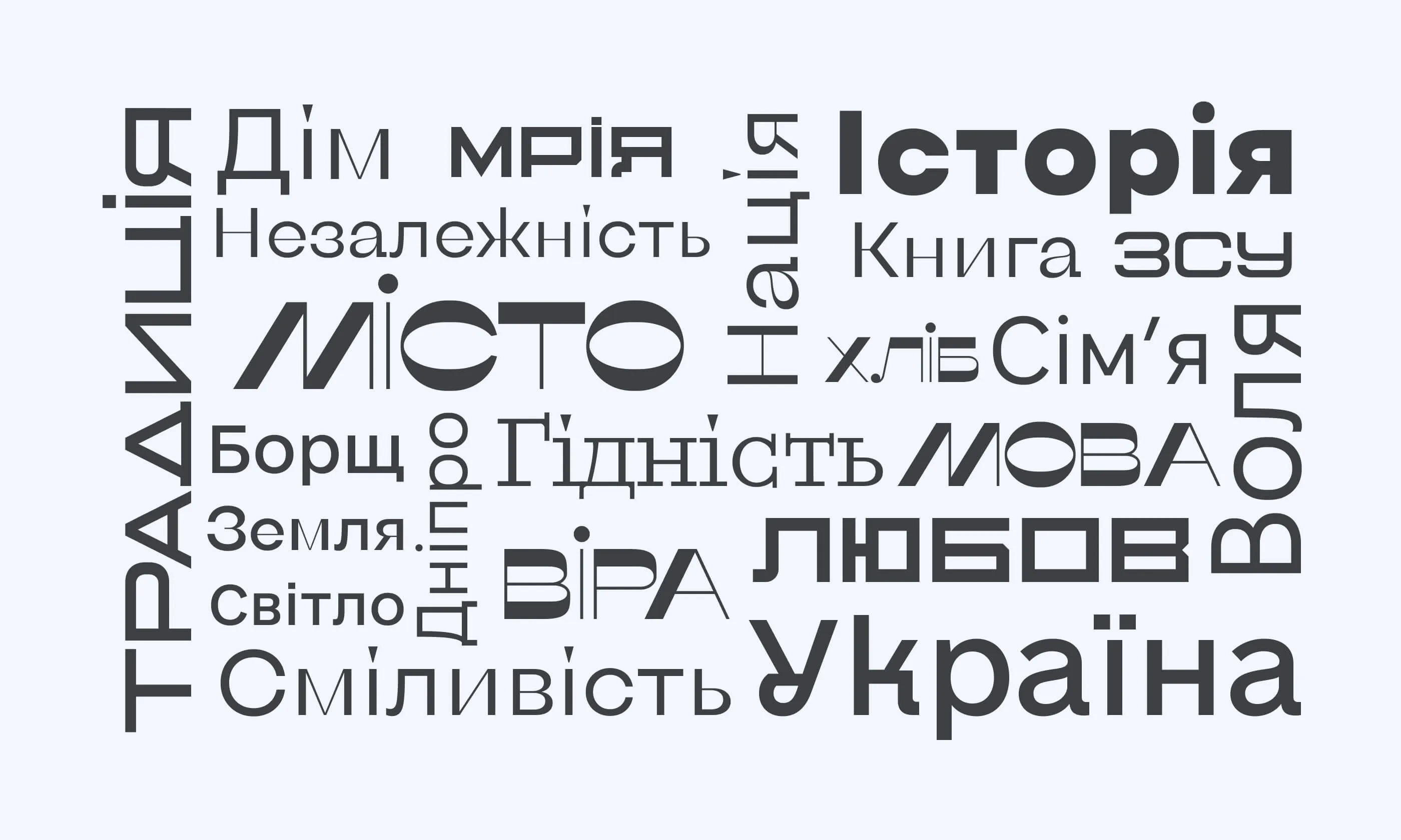
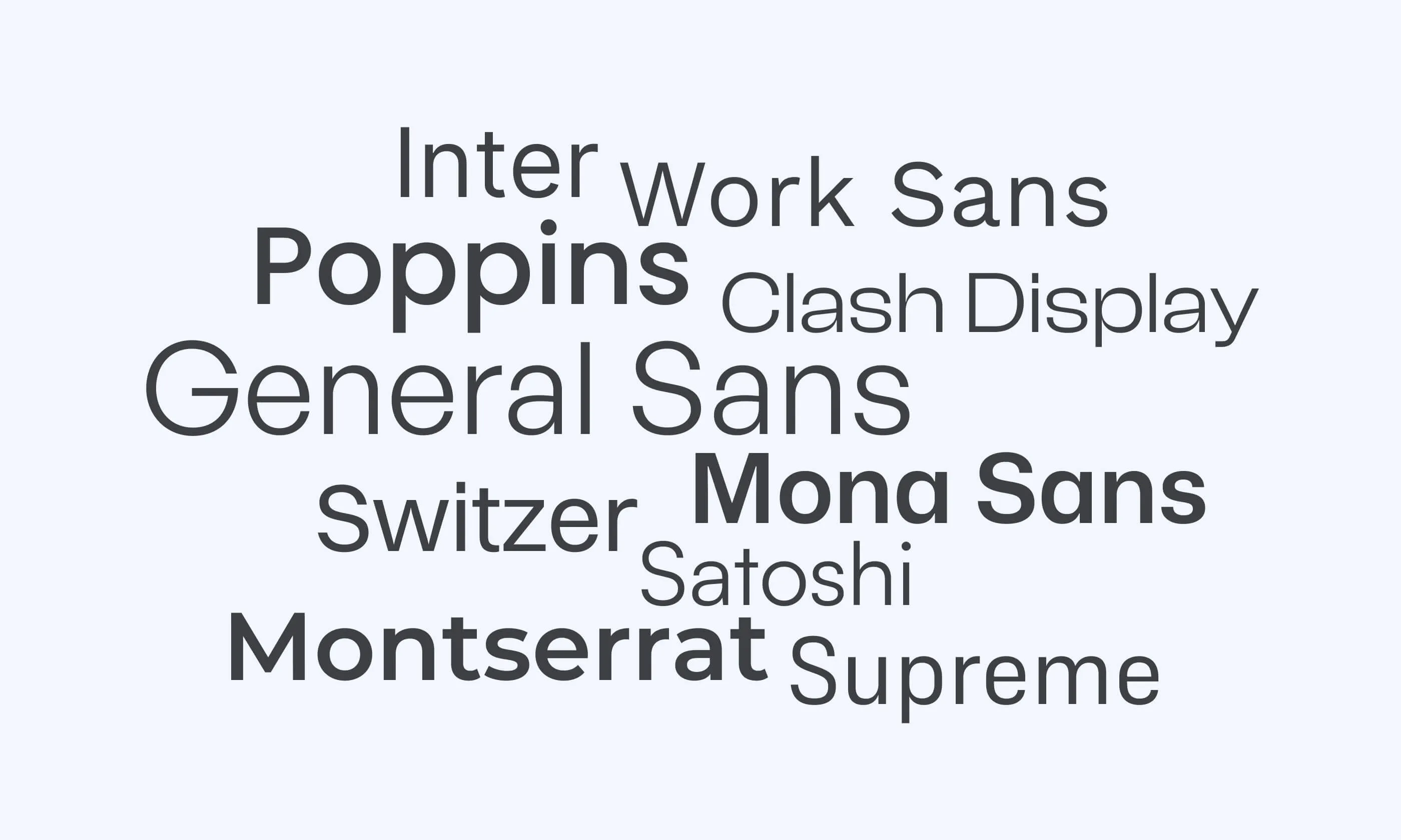
At a transportation app design company, we know that understanding user psychology is key to good UX/UI design. That’s why our team has put together these curated lists: Bests of Free Cyrillic Fonts and Bests of Free Latin Fonts — resources that help designers quickly pick the right typefaces and create polished, user-friendly interfaces.
What Makes a Good Web Font for UI and UX
A good web font should be legible, readable, and usable.
Legibility means that each letter or character in the font is easily distinguishable from others. The font is unsuitable if users can't distinguish between "0" and "O" or have to squint to read.
Readability means arranging words and blocks of text to make them easy to read. Proper spacing between words and sentences helps users interpret and understand the content easily. Factors such as alignment, line length, hierarchy, and contrast significantly affect readability. For instance, if the space between characters (tracking) is too wide or too narrow, even the best-written text can become difficult to read.
Want design that actually works?
We help to choose the right UI solutions for web products, branding, and digital experiences.
Alina
Client Manager

Sans-Serif and Grotesque Fonts: What Do These Terms Mean?
Sans-serif refers to typefaces designed without serifs, the tiny lines or tails at the end of letters. UI designers worldwide prefer sans-serif fonts for their clean appearance, larger x-heights, and reduced visual complexity.
Grotesque fonts were the earliest form of sans-serif typefaces, named for their irregular and unconventional shapes. A refined version, known as neo-grotesque, became popular in the mid-20th century. Examples include Fixel and Work Sans, which we'll explore further below.
Top 10 Best Free Cyrillic Fonts for Designers

1. Fixel
Fixel is a typeface with two styles, Text and Display, and nine weight options from Thin to Black. One of the best free Cyrillic fonts combines geometric and humanist grotesques, resulting in open letter forms, wide widths, crisp edges, and low contrast. This design strikes a balance between simplicity and playfulness.
MacPaw created Fixel to avoid being too expressive, making it suitable for large volumes of text. However, letters like "a" and "g" have unique features that make Fixel distinctive. The typeface also includes alternative symbols along with the standard letterforms.
2. Arsenal
Arsenal is a typeface designed as a semi-closed grotesque with traditional forms, ideal for business documentation.
Features:
- Narrow proportions for efficient use of space
- Open letter forms for readability
- Noticeable contrast
It has such qualities: neutral, transparent, and quick to read.
The contrast and letter construction give the font an expressive, soft, and slightly lyrical character, adding a Ukrainian touch. "ARSENAL" is licensed under the SIL Open Font License.
3. Road-UI-Font
Road UI, a font for interfaces
Based on the Ukrainian road font, the font is adapted for use in screen interfaces, websites, and mobile applications. It supports monospaced numbers and arrows (←↑→↓↘↙). Regular and slanted versions are available, naturally, with the Cyrillic alphabet.
4. e-Ukraine
The e-Ukraine typeface was developed with a modern and inclusive design to serve as the font for the digital state. Its simple spelling and particular letter structure make it easy to read, ensuring that online public services are accessible and user-friendly, especially for people with visual impairments. This thoughtful design approach helps everyone navigate and use digital public services efficiently.
5. Nyght Serif
Nyght Serif is a modern serif font with a unique character. It features smooth and sharp curves like blade serifs and spurs. Initially inspired by William Caslon's typefaces, it evolved with influences from calligraphy and modern serifs. Designed by Maksym Kobuzan, Nyght Serif includes a wide Latin character set and Ukrainian Cyrillic. In 2023, it won the Typographic Excellence Certificate at the 69th Type Directors Club competition. The font is still being developed and will have many updates.
6. Zvin Serif
Zvin Serif is a variable typeface that embodies the elegance of ancient Greek script with a contemporary twist. Drawing inspiration from 1850 to 1960 typography, it combines decorative shapes with a sophisticated flair. This font is not just a design choice but a custodian of sophistication, inviting users to appreciate its intricate curves and lines. Zvin Serif is a testament to timeless beauty and refined craftsmanship, resonating with the grace of antiquity in every stroke.
7. Ermilov
The Ermilov font is named after the Ukrainian constructivist artist Vasily Ermilov. "The idea of dedicating a geometric typeface in the spirit of constructivism to the wonderful Kharkiv-based designer and constructivist artist Vasily Ermilov seems to me to be appropriate. And the opportunity to advertise Yermilov's work due to the wave of popularity of Ukraine Now is very pleasing," explains Tkachev - author of the Ermilov fontThe future use of the font depends on whether the development of the font typeface will continue. That is, whether other variants of saturation ("boldness") will appear. Currently, there is only Ermilov Bold. It is one of the best free fonts to use commercially. Use this font for headlines or logos, but avoid it for large amounts of text.
8. Misto
Misto font is a free reverse-contrast display typeface inspired by Slavutych, my hometown and the youngest city in Ukraine, created after the Chornobyl explosion.
Misto font is ideal for headlines, logos, brand identities, websites, packaging, and posters. It supports both Cyrillic and Latin characters.
Misto font received the Ukrainian Design: The Very Best Of award.
9. Univermag
Univermag font is inspired by the outdoor signboard at Kharkiv TSUM, a building designed by architect Movshovich in 1952. The letter “Y” has a unique shape due to a design issue with a small window under the roof. This simple adjustment made the signboard look more Ukrainian.
10. KTF Metro
In 2022, the Kyiv Metro became a bomb shelter for thousands of people, echoing events from WWII. This tragic event is another chapter in its rich history. Built six decades ago, the Kyiv Metro is one of the most exciting structures in Ukraine. The station letters tell much of its history, like a book you can read in many directions. At each station, you'll see different letterings. In the summer 2023 workshop called "Kyiv Metro Fonts," students create fonts based on them.
The five most representative fonts were carefully finished. The result is a font family called KTF Metro, which aims to preserve the city's typographic memory. Additionally, Yevgen Anfalov interviewed Oleg Totsky, a metro historian. His insights provide context for the letters of the Kyiv Metro and complement the showcased typefaces. KTF Metro is accessible to Ukrainians.
Top 10 Best Free Latin Fonts for Web and Design

1. Inter
Inter is a popular UI design font created by Rasmus Andersson while working at Figma. This Google font offers a distinct look and is widely used in UI design.
Inter is favored for its excellent legibility and readability. Each letter is perfectly symmetrical, making the font easy to read. Its tall x-height of 69% improves the readability of mixed-case and lower-case text. If you're using our Shipfaster UI—Figma design system and UI kit, you might recognize Inter as the default font, helping to improve consistency and workflow.
2. Work Sans
Work Sans is a font created by Australian designer Wei Huang and is a good font for Latin. Inspired by early sans-serif fonts, it was influenced by designers like Stephenson Blake, Miller & Richard, and Bauerschen Giesserei.
With an x-height of 75%, Work Sans reads and scales well. Similar to Inter, it has minor inconsistencies in the letterforms, adding a bit of personality without distraction. It is one of the best free fonts to use commercially.
3. Switzer
With a tall x-height of 79%, Switzer is a great alternative to traditional grotesque fonts. Originally released as "Volkart" at Indian Type Foundry, it was renamed and moved to Fontshare in 2021.
Some designers note that the "descender is quite wide," which can be tricky for one-word or single-line text, depending on lowercase letters.
4. Satoshi
Satoshi is a Fontshare font created by Deni Anggara. It's popular among The Designership's team, including Mizko, for its excellent readability and sharp contrast, especially at larger scales, making it one of the most simple Latin fonts.
Satoshi has a lower x-height of around 66%, which can create a slight gap between uppercase and lowercase letters. For UI design, choosing a font with an x-height of around 70% is generally better to avoid misalignment issues like those sometimes seen with Satoshi.
5. Mona Sans
Mona Sans is a strong and adaptable typeface inspired by industrial-era grotesques and designed with Degarism. It excels in various applications, including product design, web interfaces, and print materials. Additional geometric accents give it a technical and unique vibe - ideal for headers and pull quotes.
6. Poppins
Poppins is Google Fonts Latin, making adding personality and performance to your websites and products accessible. Our catalog of open-source fonts and icons helps you integrate expressive types and icons seamlessly, no matter where you are.
Geometric sans serif typefaces are always popular. Poppins supports Devanagari and Latin writing systems, making it a versatile choice. Like the ampersand, many of its Latin characters are more constructed and rational than usual.
7. General Sans
General Sans is a rationalist sans serif typeface with a 1950s French vibe - orderly yet lively. The letters have small apertures, creating enclosed counter-forms. The family includes twelve weights from Extralight to Bold, with matching italics.
Lowercase ascenders match capital heights. Standard numerals are slightly smaller than capitals, while alternate numerals match capital size via OpenType features. It also includes superior and inferior numerals for fractions. Many capital letters are geometric, like the spur-less 'G' and simple-tailed 'Q.' The lowercase 'a' is double-story, and the 'g' is single-story. The 'f' and 't' are wide, and the dots on 'i', 'j,' punctuation, and diacritics are circular. General Sans is perfect for branding, corporate identity, and modern lifestyle editorials.
Designed by Frode Helland for the Indian Type Foundry.
8. Montserrat
Montserrat is a geometric sans-serif typeface designed by Argentine graphic designer Julieta Ulanovsky released in 2011. Inspired by early 20th-century posters, signs, and painted windows in the Montserrat neighborhood of Buenos Aires, it features a large x-height, short descenders, and wide apertures for high legibility, even in small sizes.
Montserrat is popular among web designers and is used on over 17 million websites. The typeface family includes nine weights (from Thin to Black), alternate characters, a distinctive Subrayada (underlined) variant, and supports the Cyrillic character set.
Julieta Ulanovsky describes Montserrat as a functional and contemporary typeface suitable for publishing and corporate use, calling it a "geometric typeface with bold optical adjustments."
9. Clash Grotesk Display
Clash Grotesk Display is a sans serif font family designed for large sizes, featuring six styles from Extralight to Bold. It stands out with small apertures like the nearly closed space in the 'c.' This unique feature makes it eye-catching yet suitable for corporate and editorial use.
Clash Grotesk Display has a companion family, Clash Grotesk, for smaller text sizes. The main difference is that Clash Grotesk has optically monolinear strokes, while Clash Grotesk Display has more stroke contrast, especially in heavier weights, resulting in a 'pinched' look. The numerals are proportional lining figures, and the lowercase ascenders match the height of the uppercase letters. The x-height is tall, the 'a' is double-story, and the 'g' is single-story.
10. Supreme
Supreme is a sans-serif font family inspired by century-old engineering designs. It features 14 styles, from Extralight to Extrabold, including italics (obliques). The fonts have straight-sided, monolinear letters with a moderate x-height, prominent ascenders and descenders, and a double-story 'a' and single-story 'g'.
Originally for engineering and tech branding, Supreme is now famous for screen text. The Regular weight is ideal for body copy, while other weights are great for larger text. Jeremie Hornus and Ilya Naumoff designed them.
Conclusion: How to Choose the Best Free Fonts for Web
Use at most three fonts on your website, improving design, readability, and accessibility.
When combining fonts, consider using contrasting styles, like a simple serif with a futuristic sans serif, or stick to fonts from the same family for consistency. Website templates help make this process seamless.
At Stfalcon, we develop UI for websites and mobile apps. We are excited to create a modern design with high-quality fonts for your company or custom fonts in Latin and Cyrillic styles; just contact us.
Now, let’s proceed to the FAQ section.
FAQs About Free Cyrillic and Latin Fonts
What are the most reliable fonts?
Sans-serif fonts such as Work Sans are widely trusted for websites due to their clean, modern appearance. They are easily read on screens, convey professionalism, and maintain readability across different devices. Serif fonts like Times New Roman and Georgia can evoke trust and credibility, especially for formal or traditional websites. Choosing a font that matches your brand's voice and enhances readability is crucial for engaging website visitors.
What is one font you should avoid on your website?
Comic Sans is notorious for its casual style, often associated with children's books and cartoons, and is generally not considered professional.
What website sans-serif fonts could be described as attractive?
Some attractive sans-serif fonts commonly used on websites include Montserrat, Known for its modern and geometric design, which is sleek and elegant. Work Sans, with a clean and neutral style, offers excellent readability on screens. These fonts are popular due to their aesthetic appeal, readability, and versatility, making them attractive choices for website design.


