
A successful mobile app is the product of a well-defined process, strategic thinking, and a relentless focus on the user. It's a direct line to your customers, a powerful tool for driving engagement, and a crucial component of your overall business strategy.
In today’s post, we have wrapped up the expertise of Stfalcon’s design team to outline the key steps and best practices for creating a top-notch application design. For this post, Vadym, Design Team Lead at Stfalcon, shared his insights on design processes our team follows and his expertise in creating mobile experiences that are not only cutting-edge but also aligned with your strategic business goals.
Mobile App Design Workflow: Agile, Research, and Iterative Approach
At Stfalcon, we believe in building mobile apps that not only meet but exceed our clients' expectations. Central to achieving this is our commitment to the Agile methodology, a philosophy that emphasizes flexibility, collaboration, and iterative development. We've found that Agile empowers us to create exceptional user experiences by allowing us to adapt and refine our designs throughout the entire process.
Our mobile app design process begins with two crucial foundational steps: planning and prototyping. Planning lays the groundwork, defining the project's scope, goals, and target audience. This is followed by prototyping, where we create interactive mockups to visualize the app's functionality and user flow. These prototypes serve as a tangible representation of the app's core structure, allowing us to quickly gather feedback and validate our design decisions early on.
From this point forward, the project enters a dynamic, iterative cycle. We build a specific set of features or functionalities, rigorously test them, and then, based on the results and feedback received, decide whether to proceed with the existing plan or revisit and refine our approach. This "build, test, learn" loop is the heart of our Agile process.
Want a web app that does more?
Let's build a solution that's smart, sleek, and powerful.
Alina
Client Manager

The Agile methodology allows us to expand the app's functionality incrementally, addressing potential issues and incorporating new ideas at the earliest stages. This iterative approach minimizes the risk of significant rework later in the project, saving time and resources for both our team and our clients.
Perhaps the most vital element of our Agile process is the continuous flow of feedback. Throughout the development cycle, we regularly present our progress to the client and stakeholders, actively seeking their input. This feedback loop allows us to validate our design choices, identify areas for improvement, and ensure that the app is truly aligned with the client's vision. Based on the feedback we receive, we can confidently move forward, knowing we're on the right track, or make necessary adjustments to ensure the final product delivers exceptional value. This collaborative approach ensures that the final product is not only functional and user-friendly, but also perfectly tailored to the client's specific needs and goals.
Design Thinking
To adapt flexible and iterative approach to a specific app design workflow, we can turn to a Design Thinking framework. According to this method, we can break down the design into the following stages:
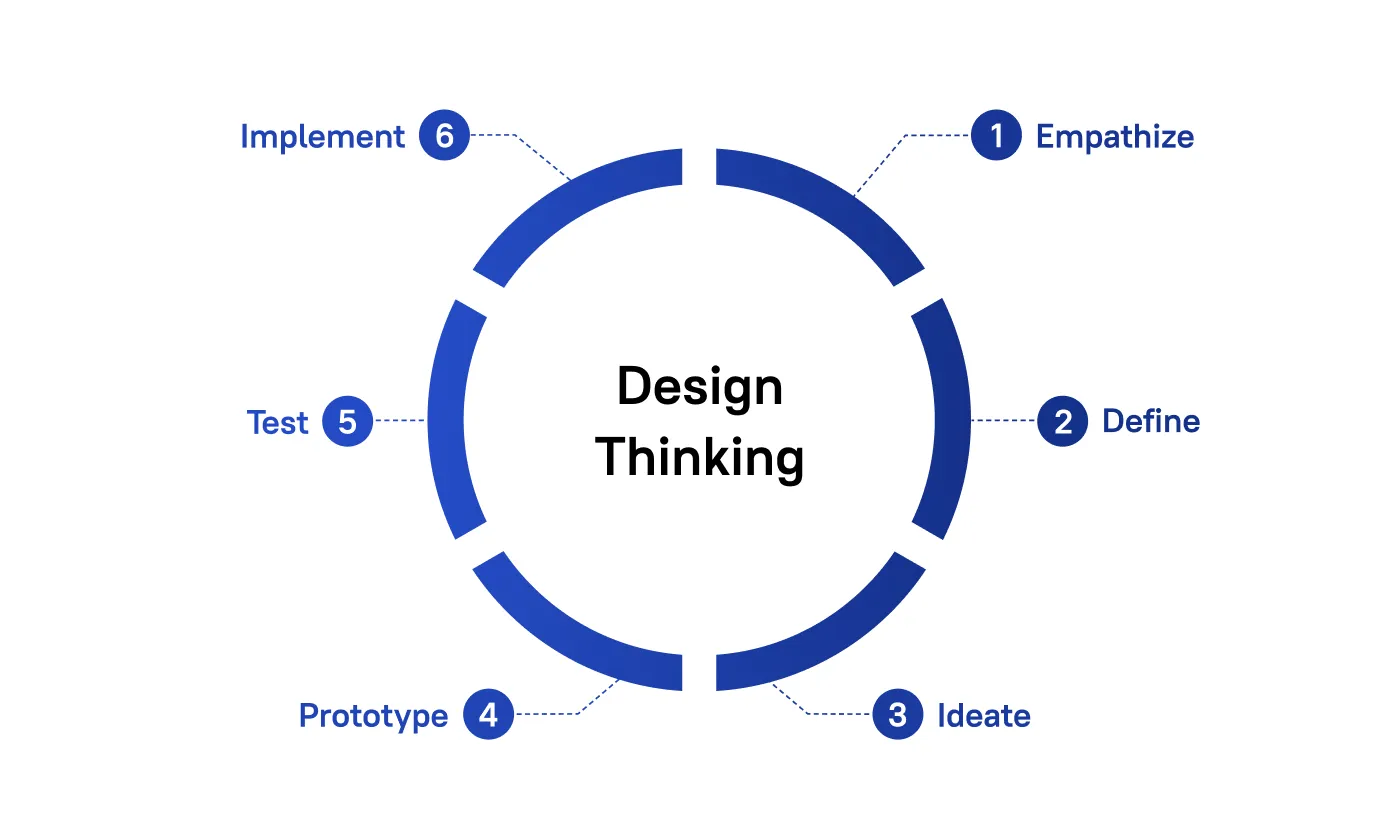
- Empathize: Here we need to understand the user's needs, context, and motivations. This stage often involves app design research, user interviews, and observation.
- Define: We clearly articulate the problem we're trying to solve based on user research. This is where we define the scope of the future work.
- Ideate: We generate a wide range of potential solutions. To explore the possibilities, we can use brainstorming, sketching, and other creative techniques.
- Prototype: Now, we need to create tangible representations of your ideas. These can be low-fidelity mockups or more functional prototypes, depending on the stage of the process.
- Test: Gather feedback on your prototypes from users. Observe how they interact with your designs and identify areas for improvement.
- Implement: At this stage we put our vision into effect. In our case it usually means passing our prototype to developers.
Now, let’s give a detailed look to each element of application design process.
Step-by-Step Mobile App Design Process
Discovery & Planning: Research, Requirements, and Product Vision
A key aspect of our approach is the discovery phase. During this crucial initial stage, we delve deep into understanding the client's business requirements and the specific development conditions. This understanding allows us to tailor our process to the unique needs of each project. Instead of being constrained by a rigid, pre-approved plan, we embrace flexibility, adapting to evolving requirements and the ever-changing development environment.
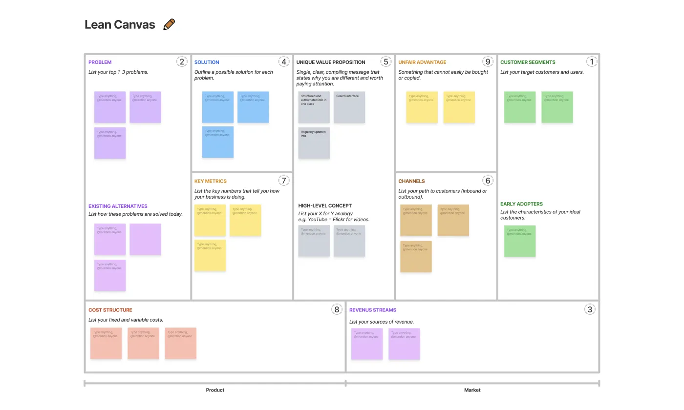
At Stfalcon we start all of our projects with collecting crucial information about the potential users and the ways our product can resolve their issues. At this initial stage we, together with our clients, also analyze competitors, user preferences and industry trends to get a comprehensive view of the market. To gather and properly arrange all the necessary information, we often turn to Lean Canvas tool which helps us makes further informed decisions.
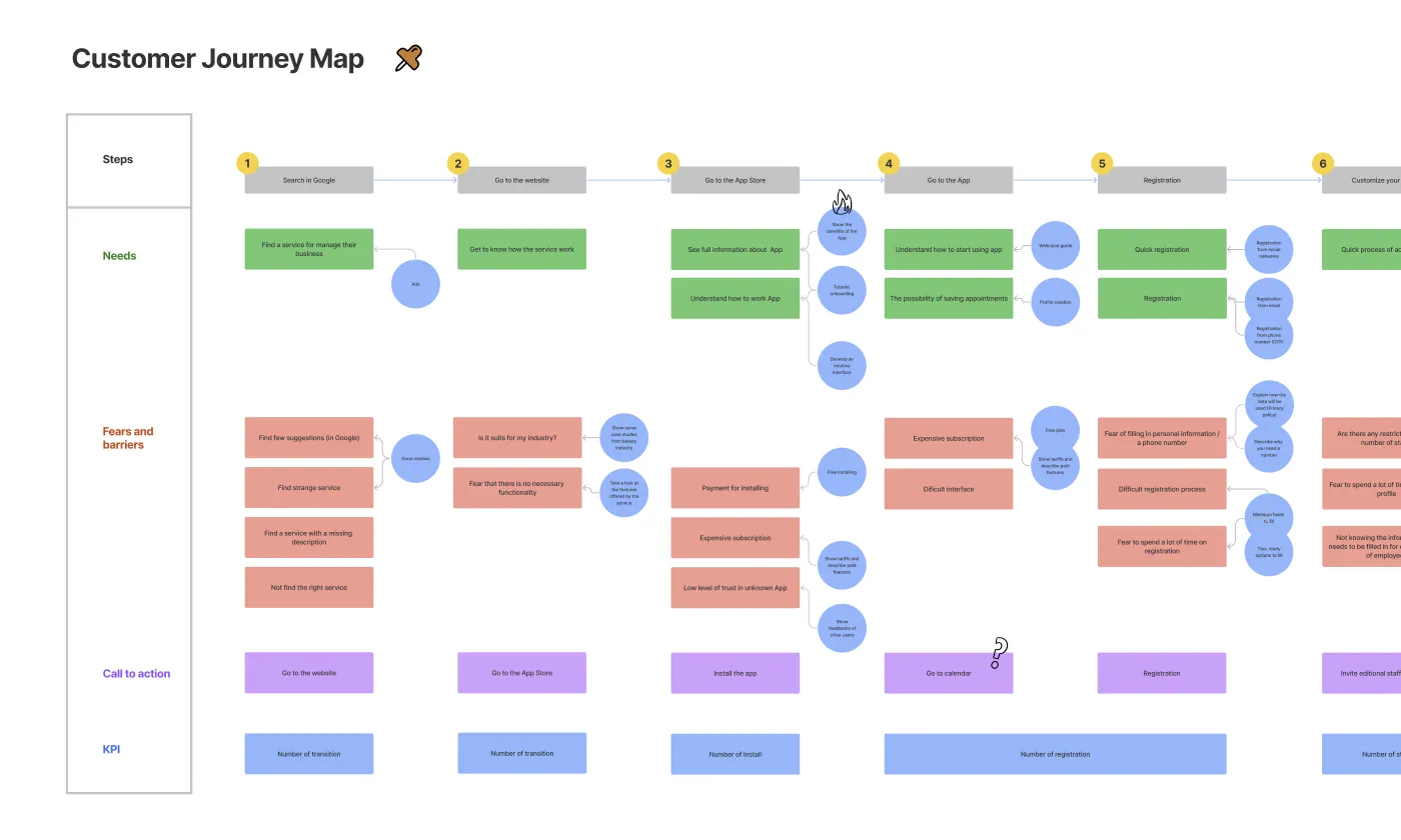
One of the crucial design process steps is user research. We need to find out as much about our potential users as possible to make our app useful to them. Preferable ways to conduct user research are surveys and live interview that can provide us with a great amount of information. The final result of this research can be composed into a Customer Journey Map — a visual scheme of the user interaction with the product.
With all the groundwork laid, we can outline the project scope: app's functionalities, features, and target platforms (iOS, Android, or both). Now we are also able to set realistic goals and timelines for the project.
Information Architecture: User Flows and App Structure
Ultimately, UX design aims to create an app that's easy to use, efficient, and provides value to the user, leading to a positive and engaging experience. To do that, we need to find out as much about our potential users as possible to make our app useful to them. Preferable ways to conduct user research are surveys and live interview that can provide us with a great amount of information.
A key aspect of UX design is creating user-friendly interfaces. This requires careful consideration of layout, typography, iconography, and other visual elements. The aim is to develop interfaces that are clear, uncluttered, and guide users seamlessly through the app's functionalities. Micro-interactions, subtle animations, and feedback mechanisms are also used to enhance the user experience and provide a sense of control. Additionally, accessibility is a crucial consideration in UX design, ensuring that the app is usable by individuals with disabilities. This involves adhering to accessibility guidelines, providing alternative text for images, and ensuring adequate color contrast.
To ensure users can easily find what they're looking for and navigate the app effortlessly, we need to design information architecture. This involves creating user flows to define the app's structure and hierarchy. Effective information architecture takes into account the user's mental model – how they expect the information to be organized. It also considers the app's content and functionality, ensuring that everything is easily accessible and discoverable.
Wireframing & Prototyping: Early UX Design and Interaction Testing
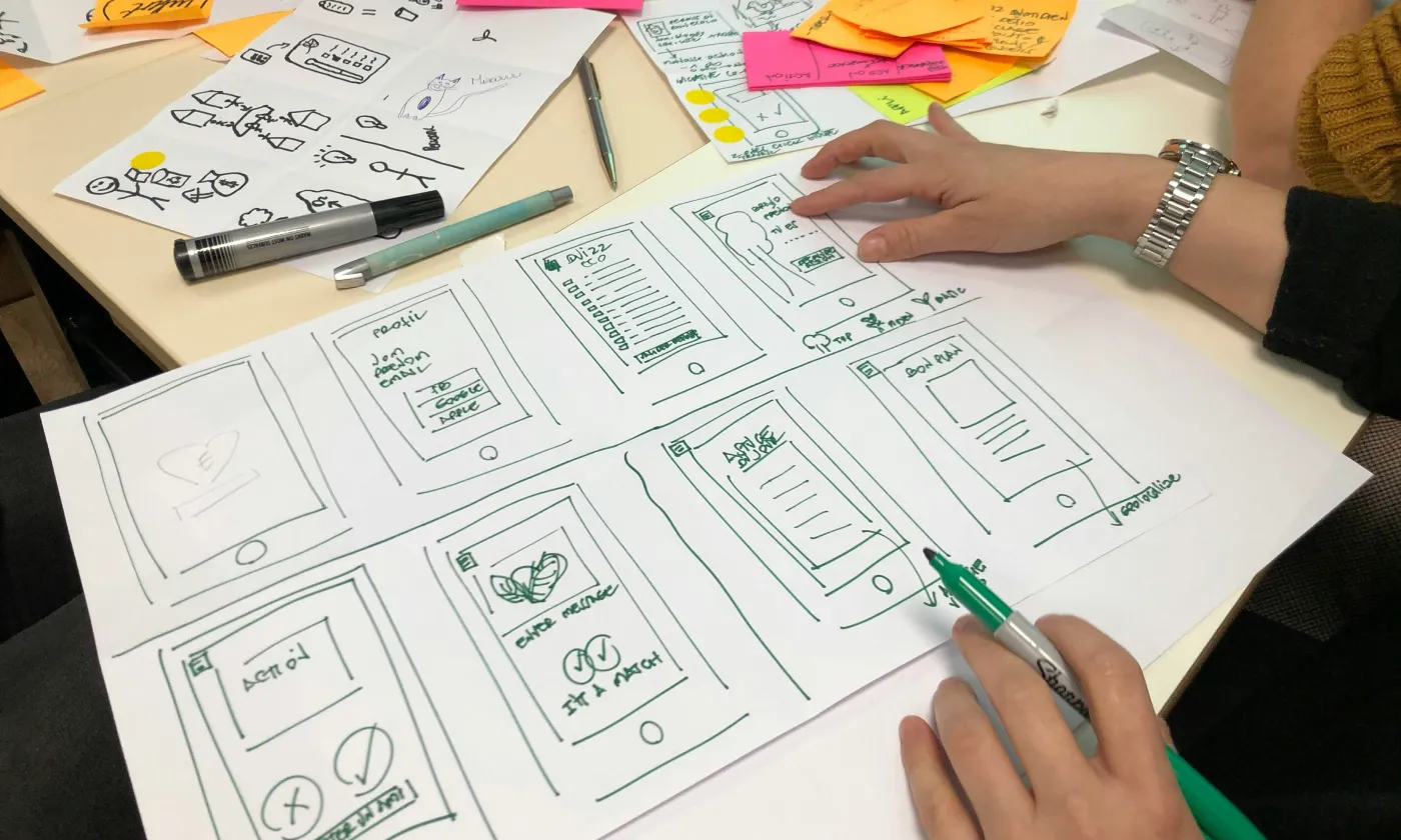
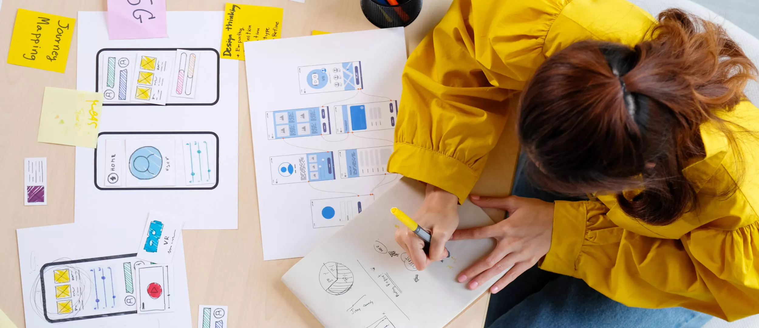
The process of turning our data and ideas into an actual design starts with wireframing. It's like creating the architectural blueprint for the app, focusing on the layout and placement of essential elements. Wireframes are basic visual mockups, typically low-fidelity and grayscale, that represent the skeletal structure of each screen. They prioritize functionality and user flow over visual aesthetics. You can think of them as the bare bones of the app, outlining where buttons, text, images, and other UI elements will be placed. This stage helps designers and stakeholders visualize the app's navigation, information hierarchy, and overall user journey.
The primary goal of wireframing is to ensure that the app's structure is logical, intuitive, and supports the user's goals. Wireframes can range from simple sketches on paper to more detailed digital mockups created using tools like Balsamiq or Figma.
Prototyping takes wireframes a step further, transforming them into interactive, clickable models that simulate the user experience. While wireframes are static representations, prototypes bring the app to life, allowing users to interact with it as if it were a real application. This stage is crucial for testing and refining the app's flow, usability, and overall user experience. By creating a clickable prototype, designers can identify potential usability issues, navigation problems, and areas of confusion early in the design process.
Creating a Figma prototype is a common and effective solution for mobile app design and an essential part of many ui ux development company workflows. Figma's prototyping features allow designers to easily link screens, add interactive elements, and simulate user interactions. These prototypes can be shared with stakeholders and users for testing and feedback.
Prototyping is an iterative process, meaning that the prototype is refined and improved based on the feedback received. This allows designers to identify and fix any usability issues before investing significant time and resources in visual design and development. By testing and iterating on the prototype, designers can ensure that the final product is not only visually appealing but also highly functional and user-friendly.
Feedback is a vital part of collaboration, ensuring both the team and the client are aligned and moving in the right direction. This stage often reveals unexpected needs, from legal updates requiring adjustments to use cases we hadn't initially considered. Here’s an example form Stfalcon’s practice: for one of our projects we were developing an application targeted at the Nigerian market. Our initial prototype for the app included standard authorization using a mobile phone number. However, during a presentation to the client, they pointed out that frequent phone number changes are a common occurrence in Nigeria. This valuable feedback prompted us to re-evaluate our approach and incorporate additional authorization methods to better serve the needs of the target users.
UI Design: Visual Style, Components, and Design System
The goal of UI design is to create a refined, final design based on the validated concept, wireframes, or any existing branding.
Here are the main elements of this process:
- Visual identity: It defines the brand's look and feel through color schemes, typography, and iconography. These elements should align with brand guidelines and target audience preferences, creating a cohesive and memorable experience. A well-defined visual style communicates the app's purpose and enhances user engagement.
- Responsive Design: It is crucial for ensuring compatibility across various screen sizes and devices. Using flexible layouts and media queries, the app adapts seamlessly to different screen dimensions, providing an optimal user experience regardless of the device. This approach simplifies development and ensures consistency across the mobile ecosystem.
- Design Tools: Tools like Figma, Adobe XD, or Sketch are essential for creating high-fidelity mockups and prototypes. These tools offer features for vector graphics editing, collaboration, and design specification, streamlining the app design workflow and facilitating a smooth handoff to developers.
- Accessibility Standards: You may want to ensure the app is usable by people with disabilities. This involves adhering to accessibility guidelines, such as providing alternative text for images, ensuring sufficient color contrast, and supporting assistive technologies.
User Testing & Validation: Improving UX Through Real Feedback
By observing users as they navigate the app and complete tasks, we can identify pain points, areas of confusion, and opportunities for improvement. This feedback loop is essential for creating a user-centered design that meets the needs and expectations of the target audience.
The choice of usability testing method depends on factors like project timelines, budget, and the desired level of detail. One of the quickest and most cost-effective options is "hallway testing." This involves recruiting a small number of readily available participants (typically 5 to 10) who are not directly involved in the project. While hallway testing may not yield statistically significant results, it's excellent for uncovering major usability issues and quick "red flags" early in the design process. Other common usability testing methods include user surveys, in-depth interviews, A/B testing (comparing different design variations), and using heatmaps to visualize user interaction patterns. Each of these methods offers unique insights into user behavior and preferences.
The insights gained from usability testing directly inform the next crucial step: iterative improvements. Based on the user feedback, we make necessary revisions and refinements to the app's design. This iterative process may involve adjusting the layout, navigation, visual elements, or even the underlying functionality. This cycle of testing and refinement continues until the app reaches a level of polish and usability that meets our standards and, most importantly, the needs of our users.
Development & Launch
With the design finalized and approved, the development phase begins, bringing the visual concepts to life. This is where the development team takes over, translating our carefully crafted designs into a functional mobile application. The design team remains available for consultation, ensuring the design's integrity is maintained throughout the development process. Designers can also participate in testing, focusing on the visual details and user experience, ensuring the final product aligns perfectly with the intended design.
After rigorous testing and refinement, the app is ready to be deployed to the app stores – the Apple App Store and Google Play Store. We continue to monitor user feedback and app performance, ready to iterate and improve based on real-world usage.
Best Practices in Mobile App UX/UI Design Process
- Focus on Simplicity and Usability
Users expect intuitive navigation, clear information architecture, and a streamlined experience. Avoid cluttering the interface with unnecessary elements. Prioritize essential features and present them in a way that is easy to understand and access. A clean, minimalist design not only enhances the user experience but also improves performance and reduces cognitive load.
Mobile app design requires a deep understanding of real-world usage contexts. Limited screen size demands prioritizing essential information and intuitive navigation. Mobility necessitates quick, one-handed interactions and consideration for offline functionality. Varying environmental conditions, like poor lighting, require designs that ensure readability and visibility. Furthermore, mobile usage is often characterized by short bursts of attention, so concise content, clear calls to action, and streamlined user flows are crucial. By addressing these challenges and prioritizing simplicity, efficiency, and accessibility, we create valuable and enjoyable mobile experiences for users in any environment.
- Adapting Design for Different Platforms (iOS vs. Android)
Users are accustomed to the distinct design language and interaction patterns of their respective operating systems. For example, navigation patterns, button placements, and UI elements may differ slightly between iOS and Android. Pay attention to platform-specific design guidelines and ensure that the app adheres to these conventions.
While iOS and Android once presented starkly different design landscapes, they've converged significantly in recent years, streamlining the design process. Although each platform maintains its own design systems, guidelines, and requirements, their increasing visual similarity simplifies cross-platform design. iOS design often benefits from a more focused approach, considering a smaller, well-defined set of devices. Android, on the other hand, presents a greater challenge due to the vast range of devices with varying screen sizes and capabilities. However, adhering to platform-specific design guidelines typically addresses the majority of use cases, ensuring a consistent and user-friendly experience across the diverse Android ecosystem.
- Scalability for Future Updates
Designing for scalability is essential for the long-term success of a mobile app. As the app evolves and new features are added, the design should be flexible enough to accommodate these changes without becoming cluttered or confusing. Consider the app's future growth and plan the information architecture and UI design accordingly. Use modular design principles and create reusable components that can be easily adapted and expanded upon. This approach simplifies future updates and ensures a consistent user experience as the app grows and evolves. By designing for scalability, you can avoid costly redesigns down the road and ensure that the app remains user-friendly and maintainable over time.
Now, after we have described the design process in details, we want to showcase Stfalcon’s experience on real-world examples.
Mobile App Design Case Studies by Stfalcon
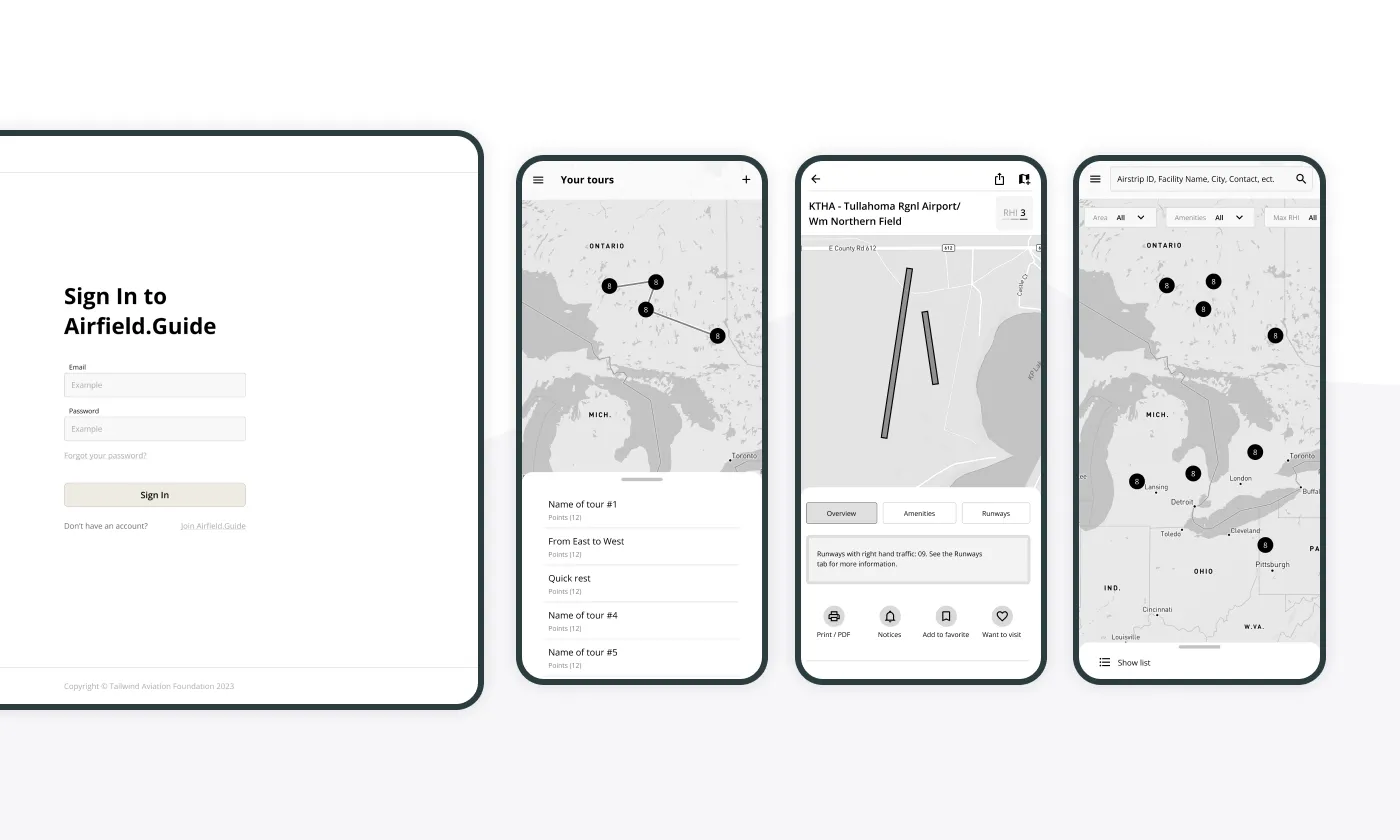
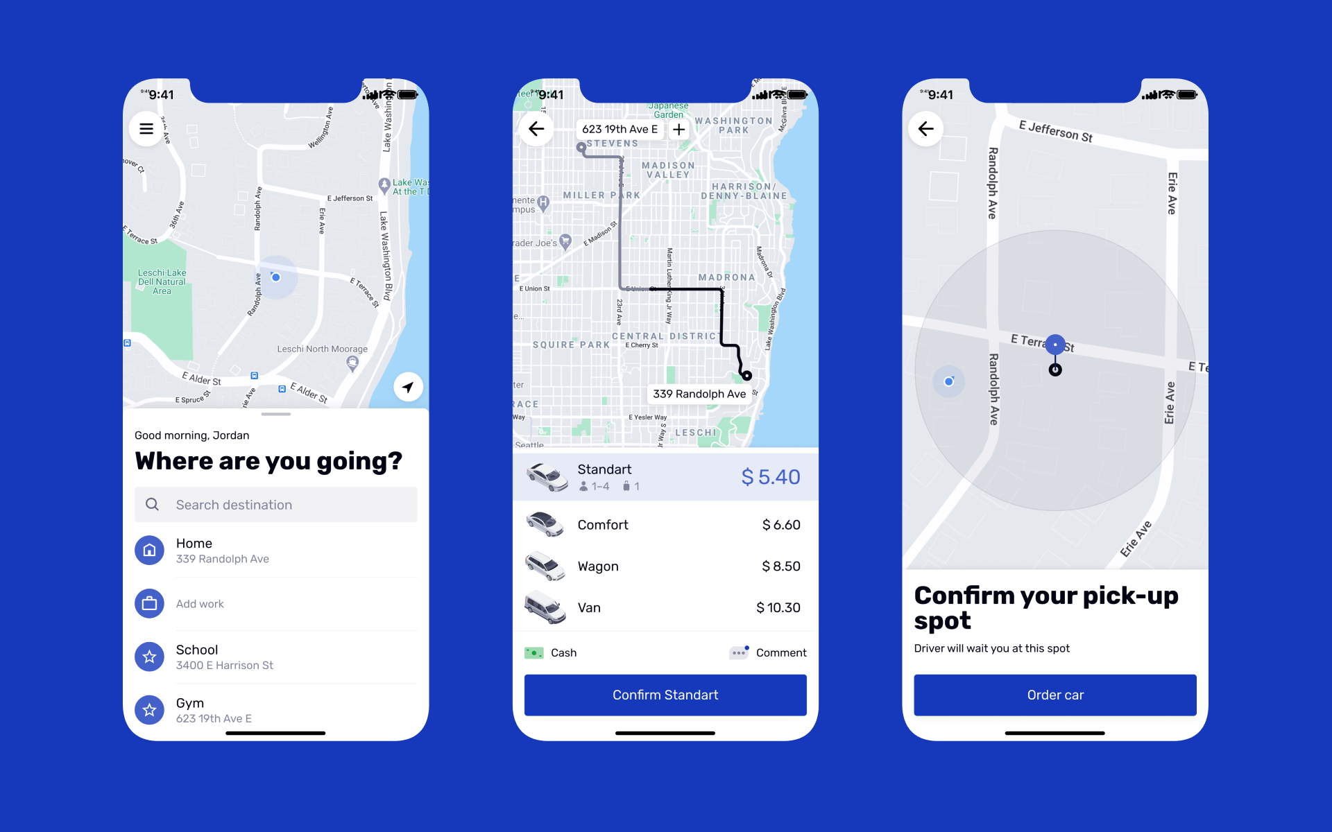
BBGO
For this project, we developed native applications for both iOS and Android platforms, creating distinct screen designs for clients and drivers. In the initial phase, we assisted our client in identifying user needs, analyzing the mobile solutions offered by local competitors and market leaders, and developing various usage scenarios for the application.
Our main challenge was to find the best patterns for the car ordering apps’ new product. To solve this effectively, we held regular workshops with the client’s team. Their active participation in the design work helped us build trust, get quick feedback, and make changes more quickly.
 Read the full case study
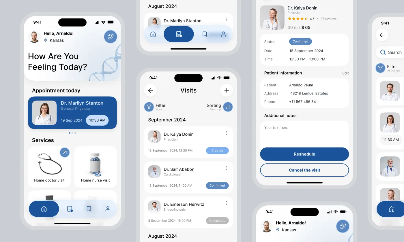
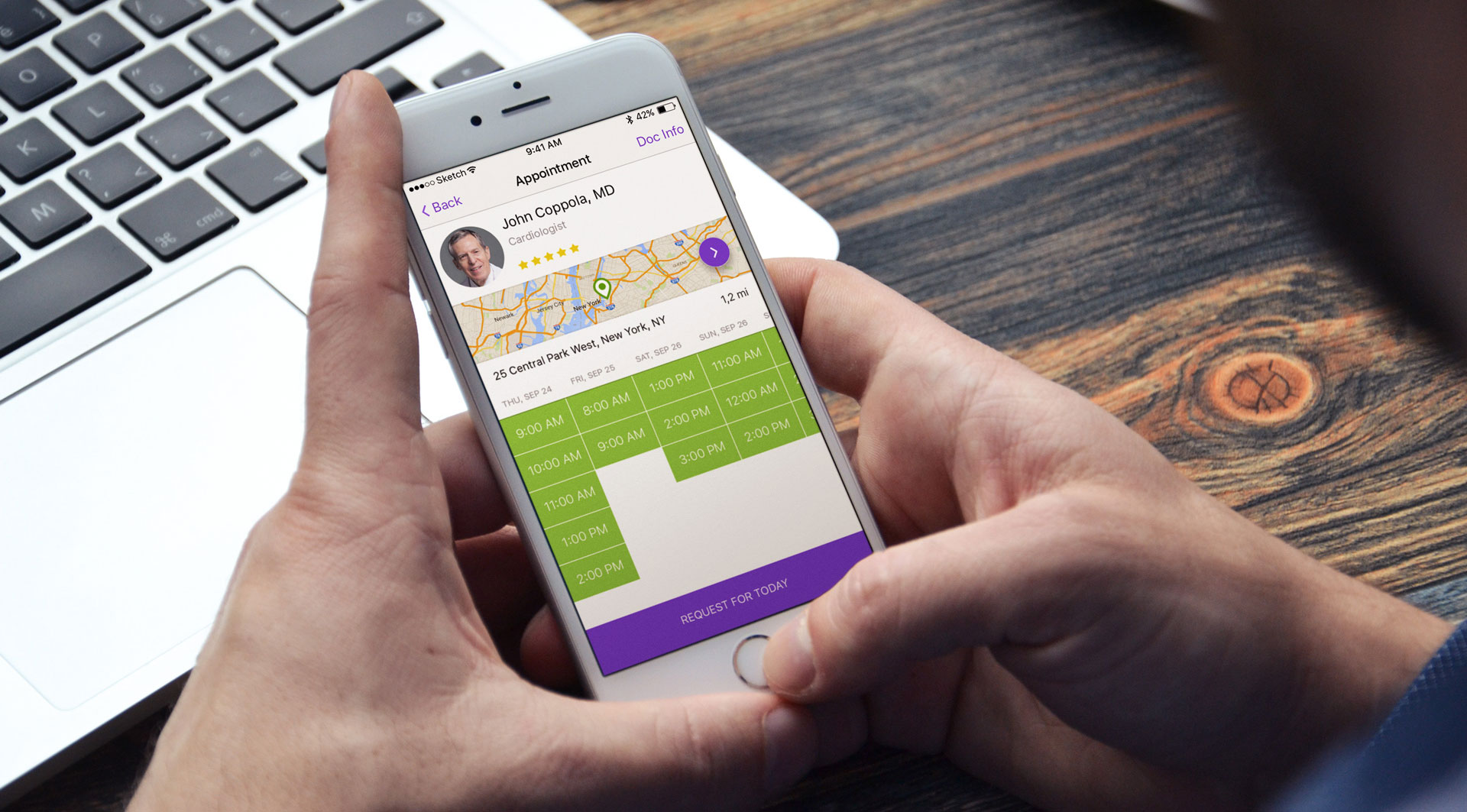
IsDocIn
The project aimed to develop a mobile app that helps users schedule appointments with doctors. Doctors can create profiles and receive notifications when someone books an appointment with them. We designed the user interface for the mobile app, which is used by patients, and developed native iOS and Android versions based on this design.
Our client provided us with detailed user stories, enabling us to quickly begin developing the prototype for the mobile interface. While it was challenging to adhere to all procedures and create a clear, easy-to-use interface, we worked through our vision and compiled a list of all the necessary features. As a result, we successfully built an interactive prototype.
 Read the full case study
Conclusion: A User-Centered Mobile Application Design Process
A beautifully designed app is only successful if it achieves its business goals. At Stfalcon, we focus on creating mobile experiences that delight users and drive tangible results. We believe in a collaborative partnership, working closely with our clients to bring their vision to life.
Ready to transform your app idea into a successful mobile experience? Contact us today to discuss your project, and let us help you bring your vision to life.
FAQs About Mobile Application Design Process
What types of user testing are the most effective for mobile app design?
When optimizing mobile app design, using a combination of testing methods brings the most effective results. Usability testing, which involves observing real users as they interact with the app, helps identify areas of confusion and navigation issues. A/B testing, on the other hand, provides data-driven insights into the performance of specific design elements. Additionally, remote testing and guerrilla testing offer cost-effective, real-world feedback, while eye-tracking studies can reveal user attention patterns. Finally, contextual inquiry allows designers to see how the app is used in users' natural environments. By integrating these approaches, designers can create mobile apps that are both intuitive and engaging for users.
How do you ensure the mobile app design is accessible to users with disabilities?
To ensure mobile app accessibility, we follow established guidelines and implement inclusive design practices. We prioritize the Web Content Accessibility Guidelines (WCAG) and the accessibility guidelines specific to each platform, such as Apple's Human Interface Guidelines and Android Accessibility. This includes ensuring sufficient color contrast, supporting text resizing, providing alternative text for images, enabling keyboard navigation, and designing for screen readers. Additionally, the best way to make sure the app is usable for the widest audience is to conduct accessibility testing with users who have disabilities to identify and address any usability barriers.
How do you balance aesthetic appeal with usability in mobile app design?
Balancing aesthetic appeal and usability in mobile app design focuses on a user-centered approach. By prioritizing user needs through research, clarity, and simplicity in design, along with consistent branding, both functionality and visual appeal can be achieved. Iterative design and A/B testing help refine the interface, while performance considerations ensure that aesthetic choices do not hinder app functionality. Ultimately, successful designs harmonize visual appeal with intuitive usability, creating a seamless and enjoyable user experience.

