AirLevel — UX/UI Design for a Property Inspection Service
- real estate
- UX/UI DESIGN
- design audit
Industry
Real Estate
Location
USA
Year
2023
Challenge: Digitizing the Inspection Workflow
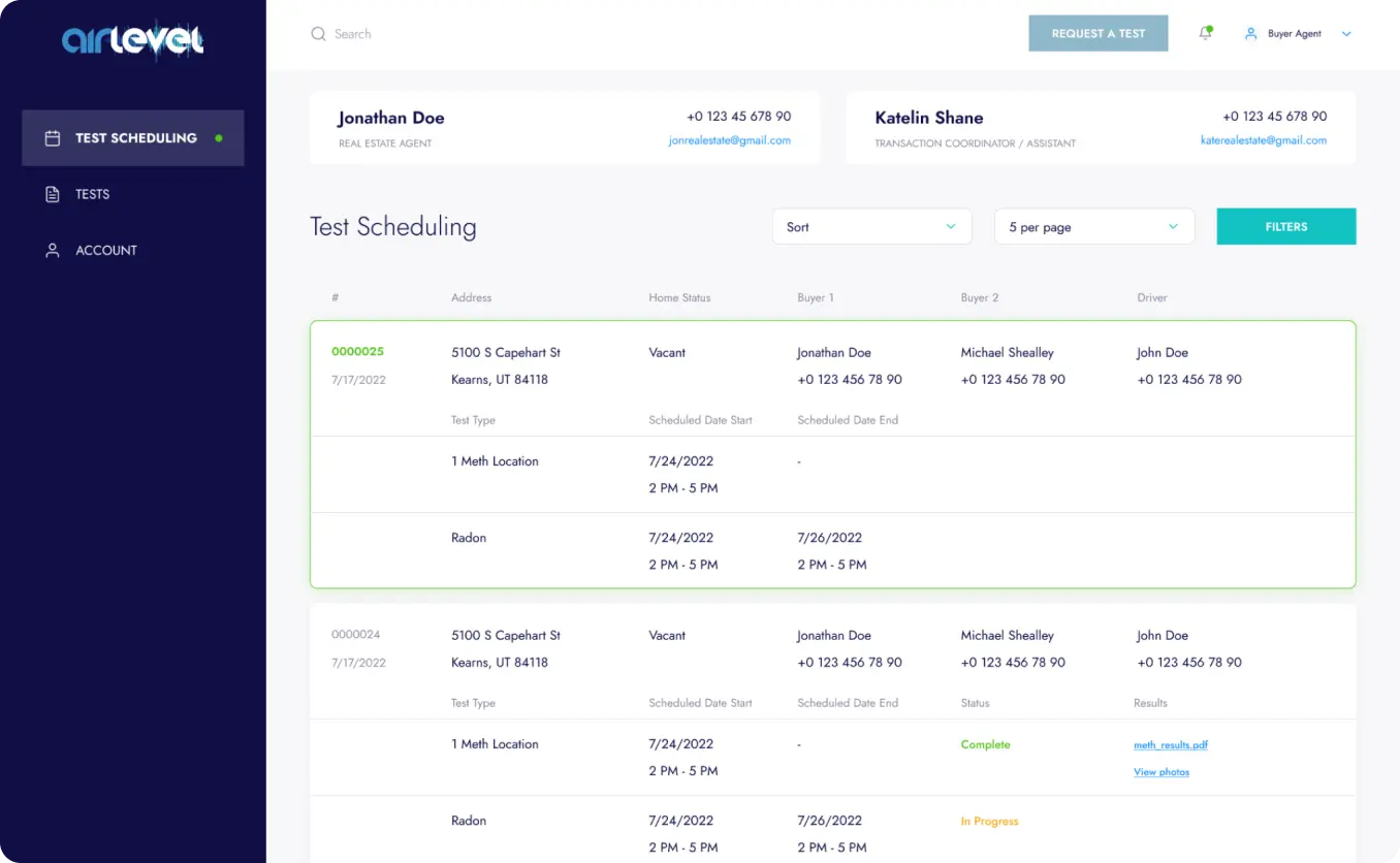
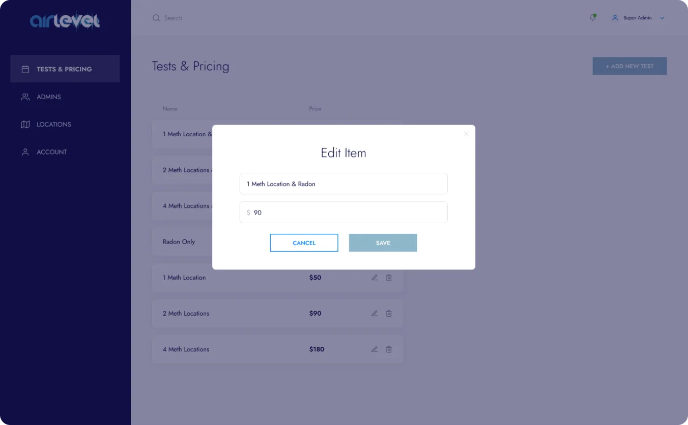
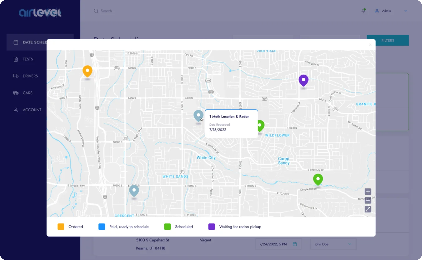
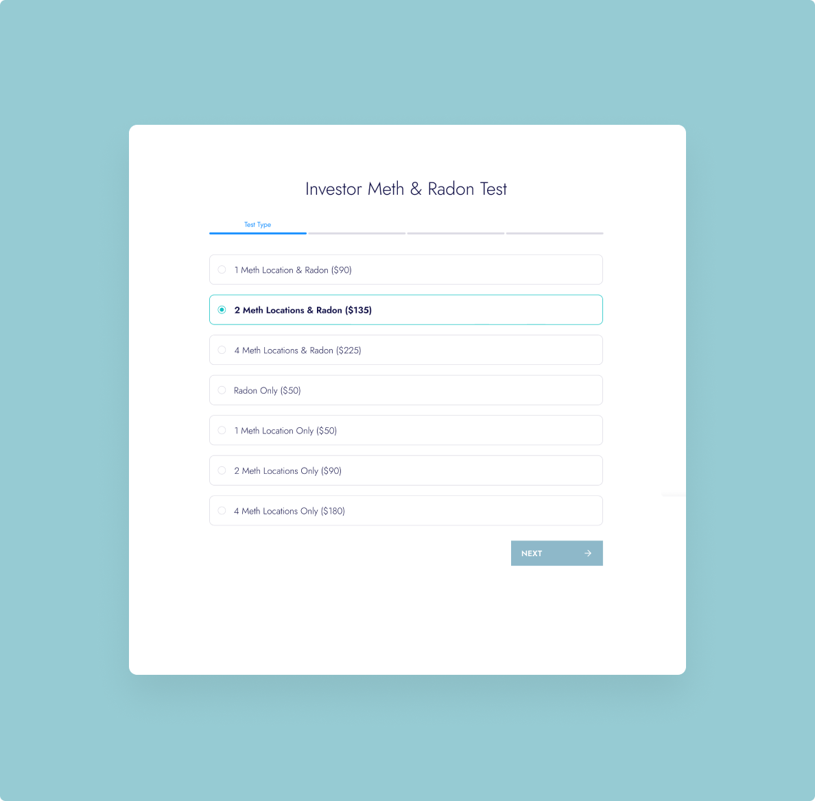
The main project goal is to redesign and modernize an existing website for radon and methamphetamine inspections and optimize business operations. Previously, order processing was done through Google Forms and phone calls. This workflow needed simplification, and a design for the admin panel automating current processes was also required.
Solution: Role-Based System Design
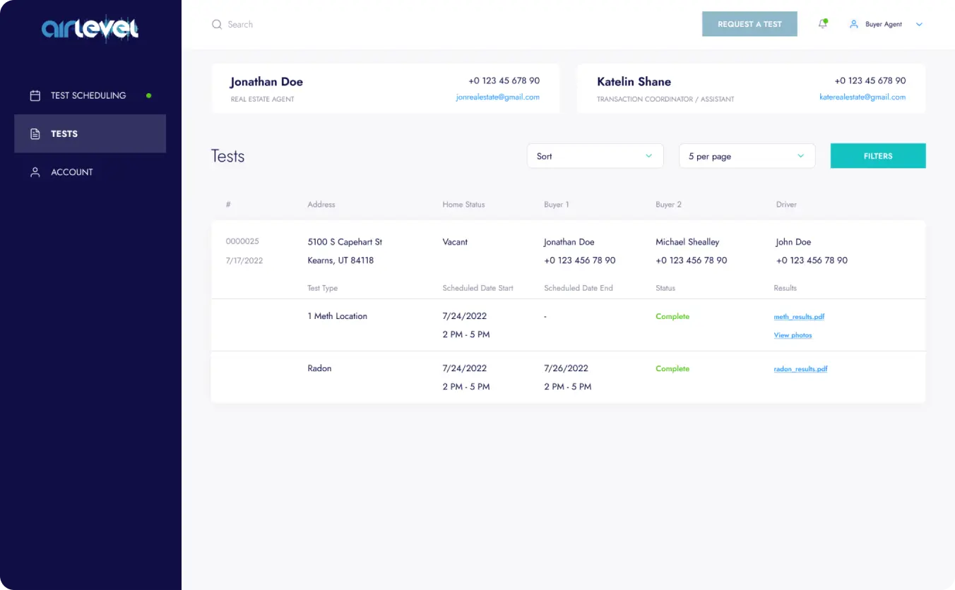
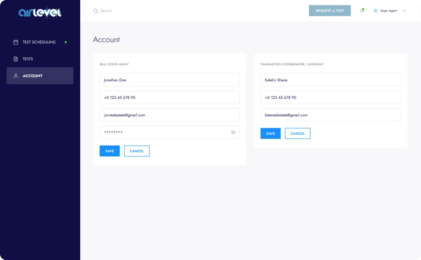
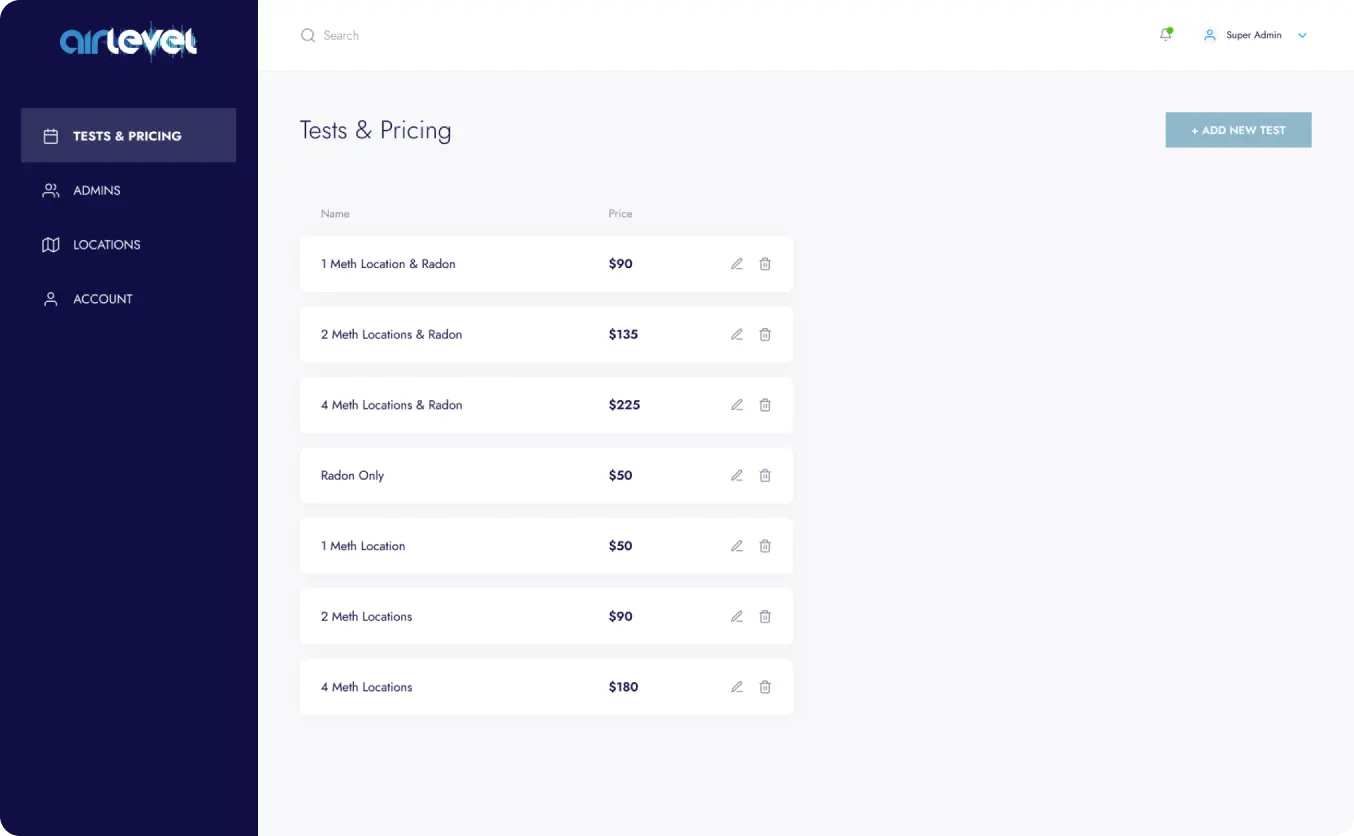
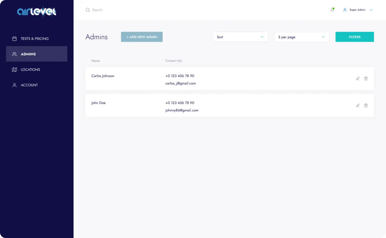
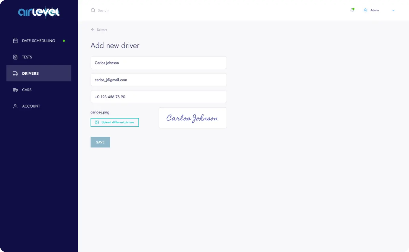
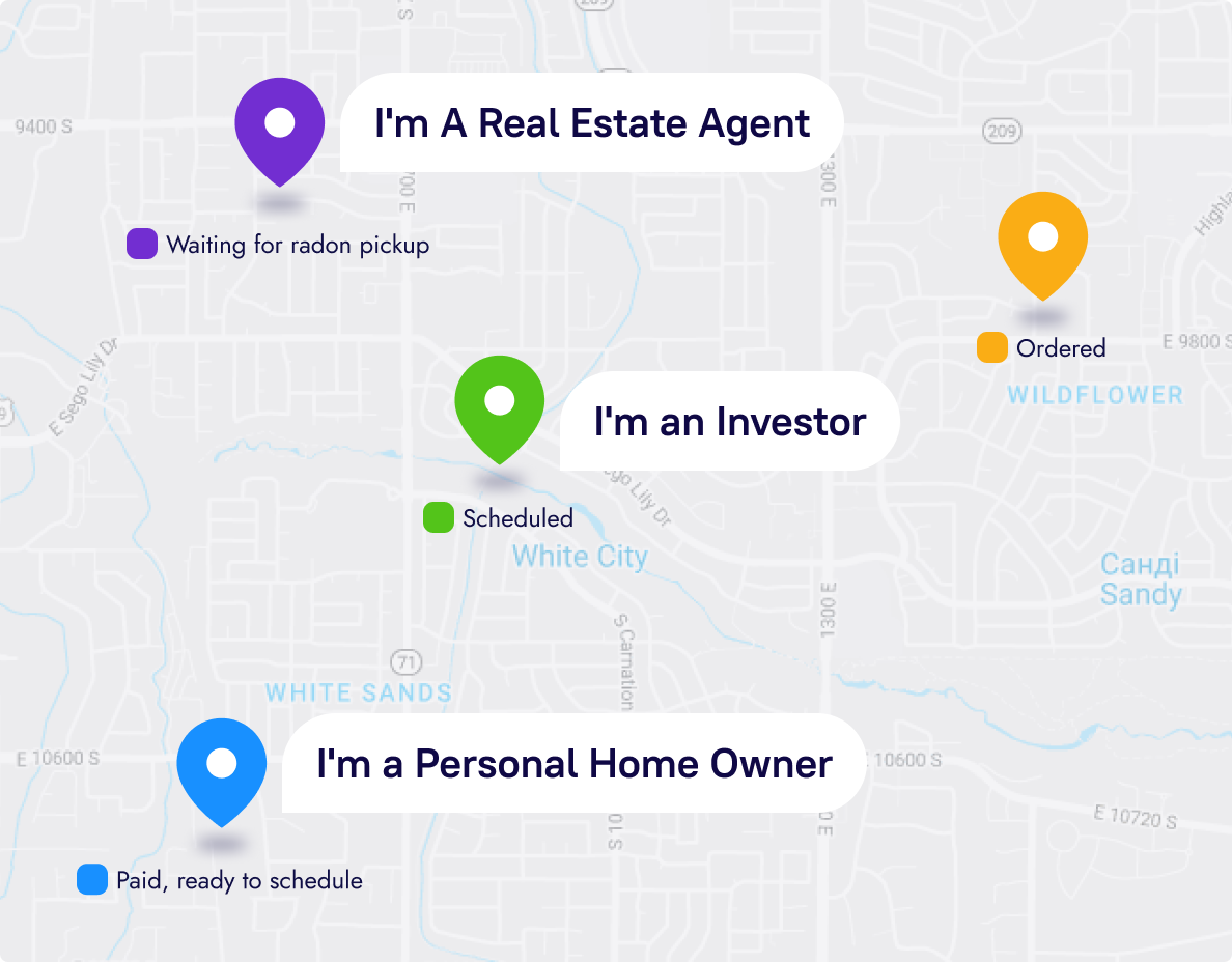
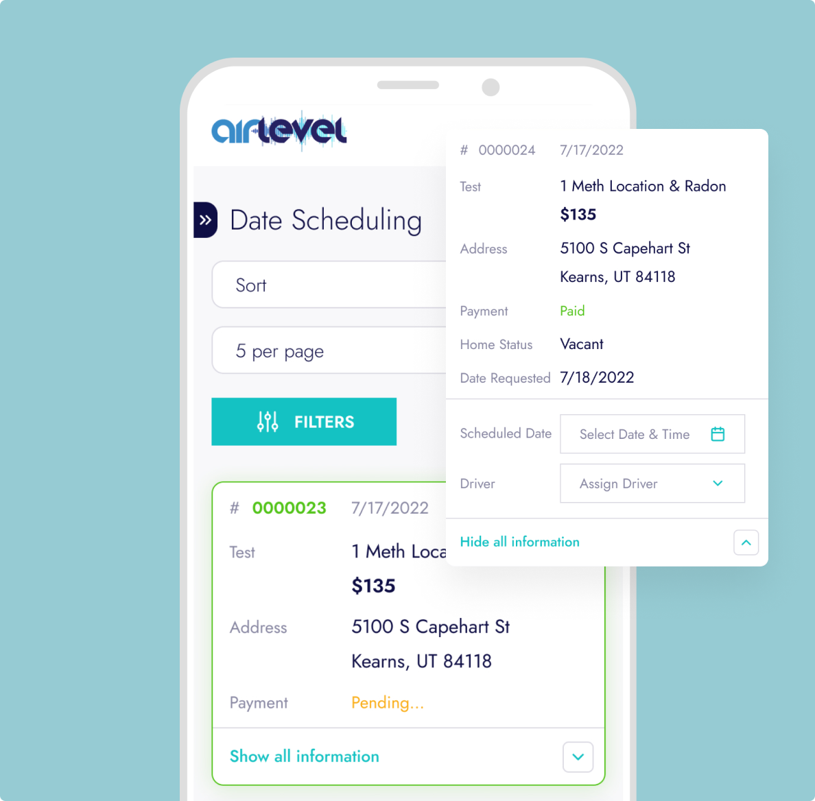
The solution was to start working on prototypes to streamline the automation of current business processes. For the admin panel, we created five roles: super-admin, admin, driver, investor, and agent. For each role, we outlined a set of functions that met business requirements.
The client-side of the website is accessible to everyone and includes a form for realtors, potential tenants, or property buyers, directing them to the admin panel where the main magic happens – inspection order status checks.
UI/UX: From Prototypes to Brand Identity
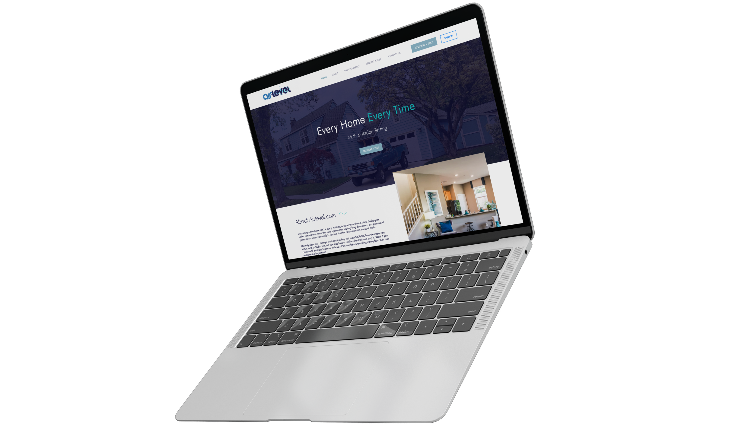
We promptly designed and approved prototypes with the client, translating the design into reality. We adhered to the company's corporate colors and the corresponding mood board in our work.
An additional task for us was updating the logo. It should look good on the website and various merch items such as hoodies, t-shirts, pens, etc. We also brought this into reality.
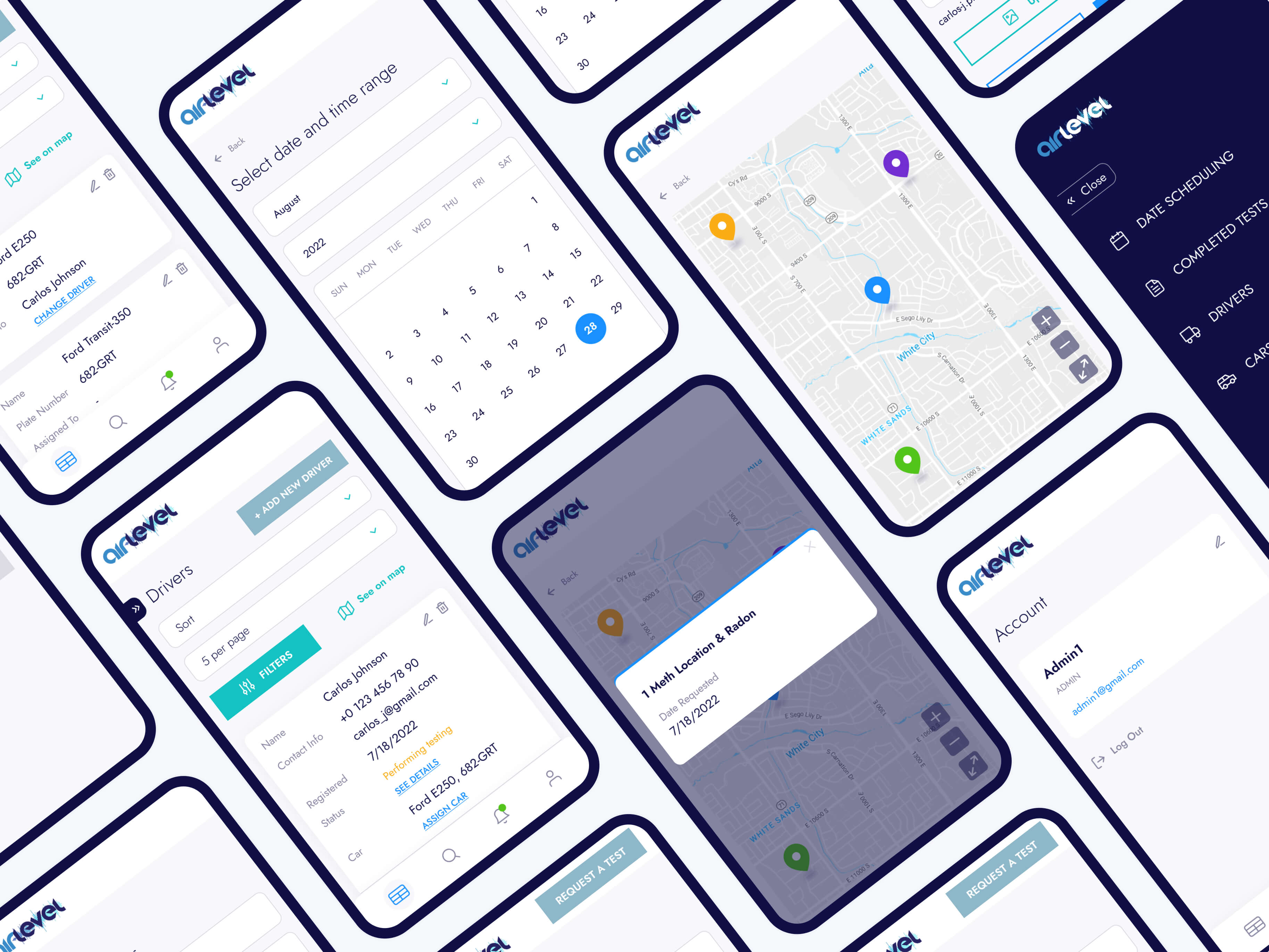
Responsiveness: Seamless Inspections on Any Device
In developing the AirLevel platform, we prioritized a responsive design to enhance user experience across various devices. The mobile-friendly design ensures that users can conveniently and efficiently test their surroundings, making inspections easy and accessible.
The primary goal was to provide a seamless experience regardless of the device used. Whether users access the platform on desktops, tablets, or smartphones, they can expect an optimal experience. This design guarantees that the website's functionality remains consistent and intuitive, regardless of the screen size or device specifications. This adaptability is particularly crucial for users who prioritize flexibility in conducting inspections without compromising on the quality of results.
Visual Style: Safety & Trust
The platform's visual style reflects a sense of safety and professionalism and was thoughtfully crafted with attention to detail. Adhering to the company's corporate colors and the guidelines set by our corresponding mood board, the design resonates with a cohesive visual identity.
The visual style features a blend of blue shades and grey tones. Every aspect of visual identity has been carefully considered to contribute to a comforting user experience.


Result
We delivered an intuitive design for the website and admin panel in line with market requirements and our client's needs, evaluated the development cost, and are expecting its launch.
Cast:
 Oleksandr
CTO
 Olha
OlhaProject Team Lead
 Ivanna
Account Manager
 Yevhen
Backend Developer
 Vladyslav
Backend Developer
 Vadym
VadymDesign Team Lead
Other Case Studies

Real Estate
Ukraine
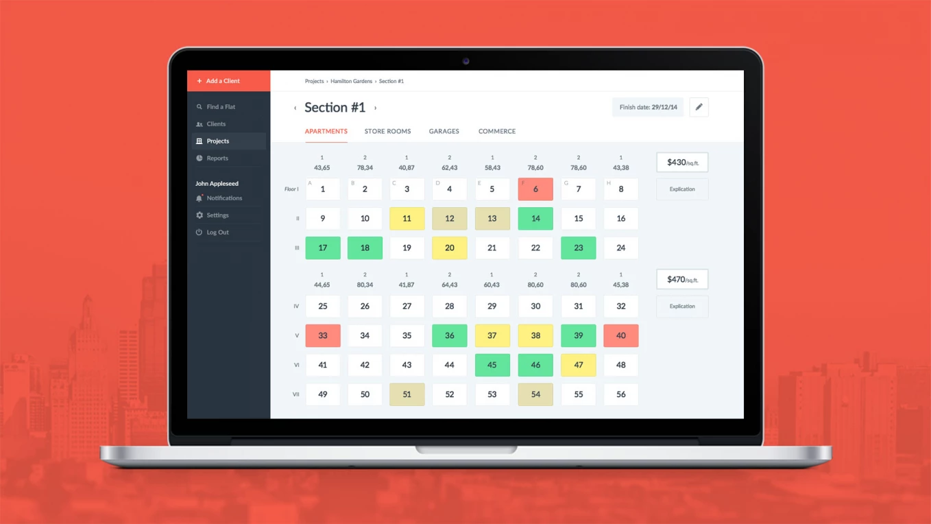
Custom Real Estate CRM System for Construction Company
Customer relationship management system for Naberezhny Kvartal

Real Estate
Saudi Arabia
Discovery phase for a real estate company
UX research, multi-role prototypes, user stories, MVP development roadmap, and a budget plan

Real Estate
Ukraine
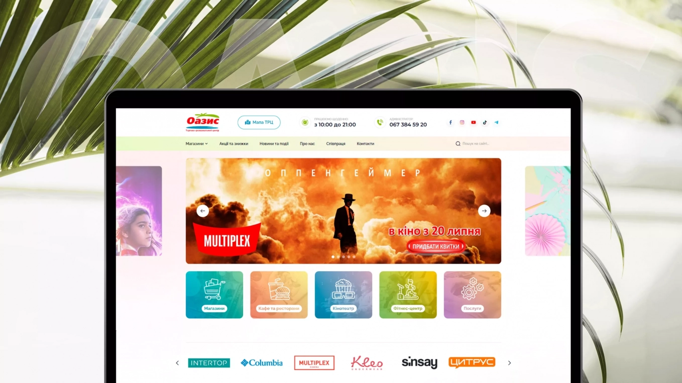
Oazis
Development of a website for a shopping mall
Build logistics software with generative AI
We help transportation and logistics companies automate operations and scale faster through:
- 16+ years of proven logistics expertise
- Full-cycle software development
- 30% faster delivery with AI
- CTO-led delivery on time and on budget

