Fwdays — Web Development for Ukraine's Largest Tech Conferences
Fwdays are IT conferences in Ukraine, which are held for developers, project managers, CEOs, CTOs and everyone related to IT. Since 2011, more than 100+ events have been organized.
The Challenge: UX Redesign & Conversion Rate Optimization
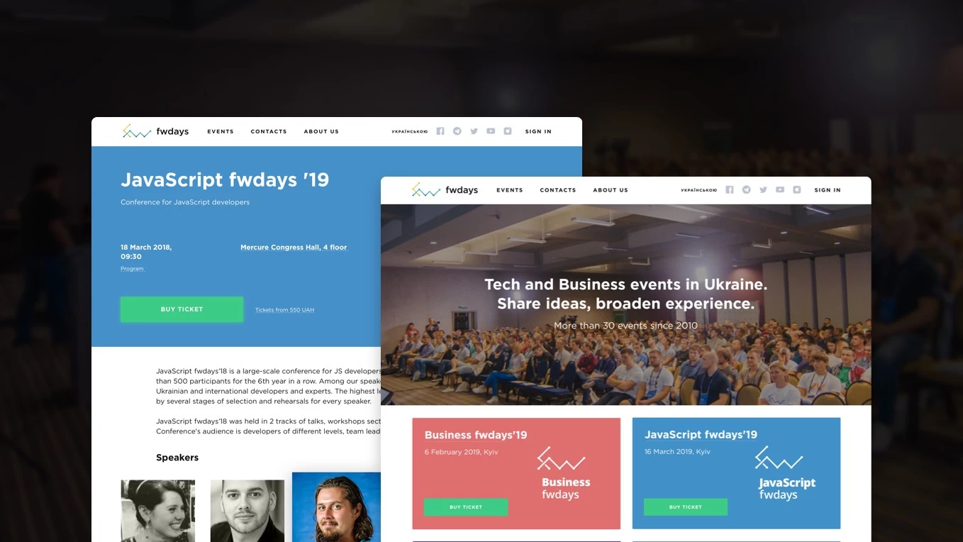
Our main task was to make a complete redesign of the site: update it visually and add a mobile version. We also decided to make the ticket purchase process faster and easier by reducing the number of clicks the user has to make.
So, we figured out the following tasks:
- to modernize the visual style of the site
- to optimize the main page and the conference page
- to develop a mobile version of the site.
The Solution: Intuitive Architecture & Content Strategy
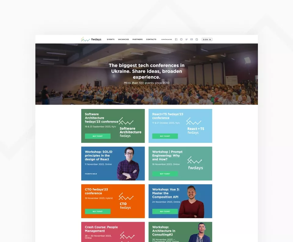
Main Page: Instant Access to Events
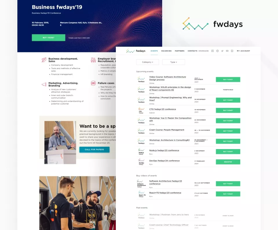
The major function of the main page is to provide a quick access to the relevant conferences. In the previous version, all relevant conferences were hidden in the slider. We relocated conferences outside from the slider and removed unpopular blocks: news, sponsor information, Twitter and Facebook widgets. Instead, we added sections with conferences photos and videos
Event Page: Transition from Tabs to High-Conversion Landing
Different colors for different conference flows is a branding idea which has been sustained since the very first days of Fwdays. We decided to uphold this tradition on the event specification page, too: each conference has its color.
With the old design, all event information (speakers, program, ticket price, and meeting address) was hidden in tabs. But in the world of social networks, people are more used to scrolling than to clicking. That’s why we placed all the information about the event on one landing page.
Smart Program Layout
We fixed the headlines so that users can always see the streams to which the reports belong. We also simplified the outlook of the program by leaving only the most important information: the start time and the title if the report and the speaker’s name.
Seamless Ticket Purchase Experience
Purchase section, due to the redesign, has become more demonstrable. It is easier for the users to understand what ticket price is relevant at the moment and how many tickets at this price are left. Instead of the monotonous green-colored text with the obsolete price being trivially crossed, there is a table with more air and color. The «sold» label has been added, and the relevant price is highlighted by the different background shade. The «Buy now» button allows users to make a purchase quickly and comfortably.
Mobile-First Approach: Performance & Growth Results
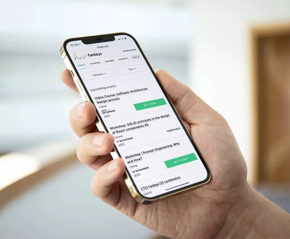
The new site is easily adapted for any devices. Now users can read about conference talks sitting in a traffic jam or buy tickets while drinking coffee during the brunch. As a result, the number of visitors and the percentage of transactions from the mobile version has increased twice. The number of website sessions has increased by 23 % and session duration — by 26 %. The figures show that the site has become more convenient and user-friendly
Result
The new website is compact, making event browsing and purchases faster. Thus, we help the target audience save time. Neither the number of projects nor the deadlines are obstacles to buying tickets for Fwdays conferences.
Cast:
 Maks
MaksDesign Team Lead
 Yulia
YuliaDesigner
 Mariia
Project Manager
 Svetlana Bolgar
Project Manager
 Ruslan
Frontend Developer
 Andriy
Frontend Developer
 Yevhen
DevOps Team Lead
 Andrij
Backend Developer


