UA
EN
Emergency
Ukraine
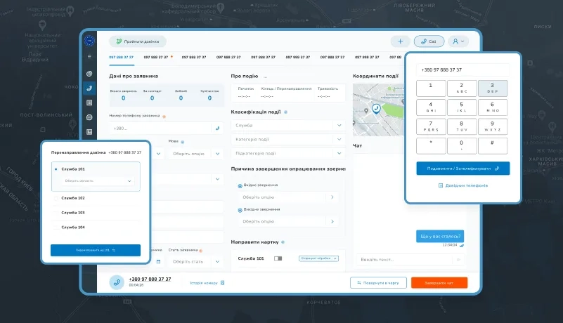
Development of an emergency aid platform for the Ministry of Internal Affairs of Ukraine
Logistics
Ukraine
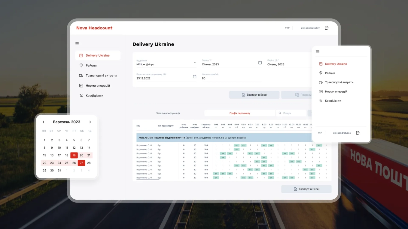
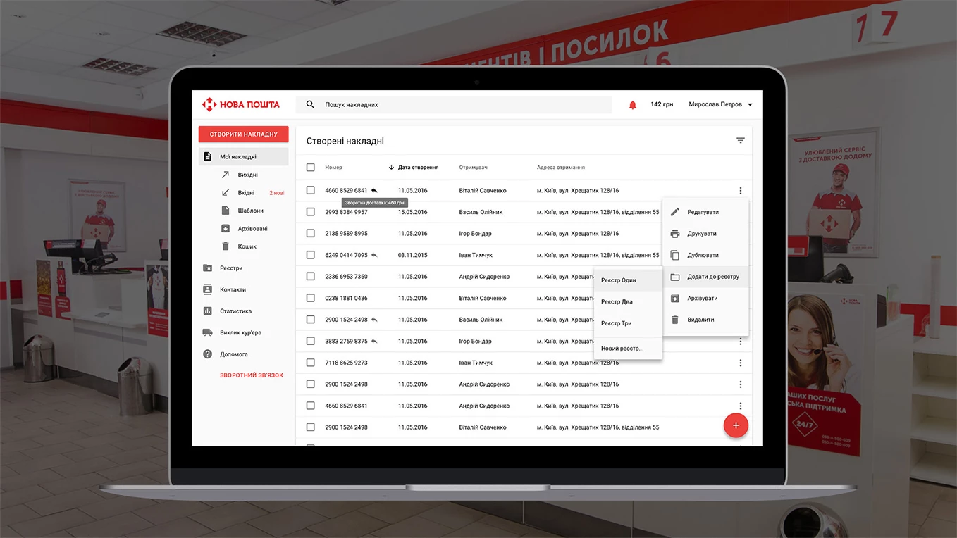
Nova Post automates shift planning and headcount forecasting at 13K+ post offices
Transportation
Germany
Berlin startup wins over 40% of bus market share with its ticket booking platform
Transportation
Latvia
One of Europe's largest coach operators doubles ticket bookings after mobile app overhaul
Transportation
Ukraine
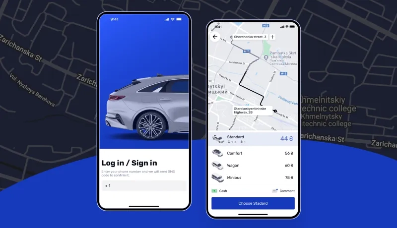
BBGO wins new customers with a cost-effective ride-hailing platform for a taxi service
Logistics
Ukraine
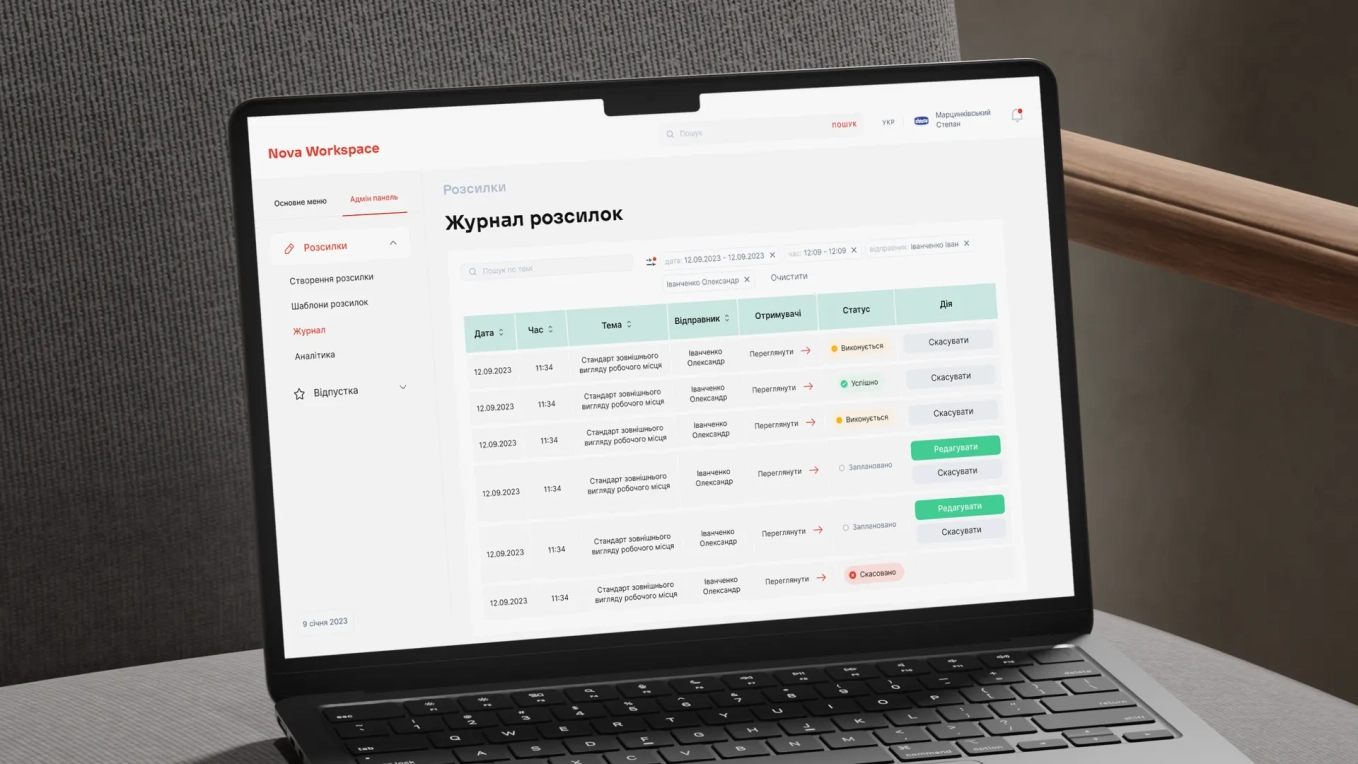
Nova Post saves $1.3 M+ on employee management with a workspace portal
Transportation
Ukraine
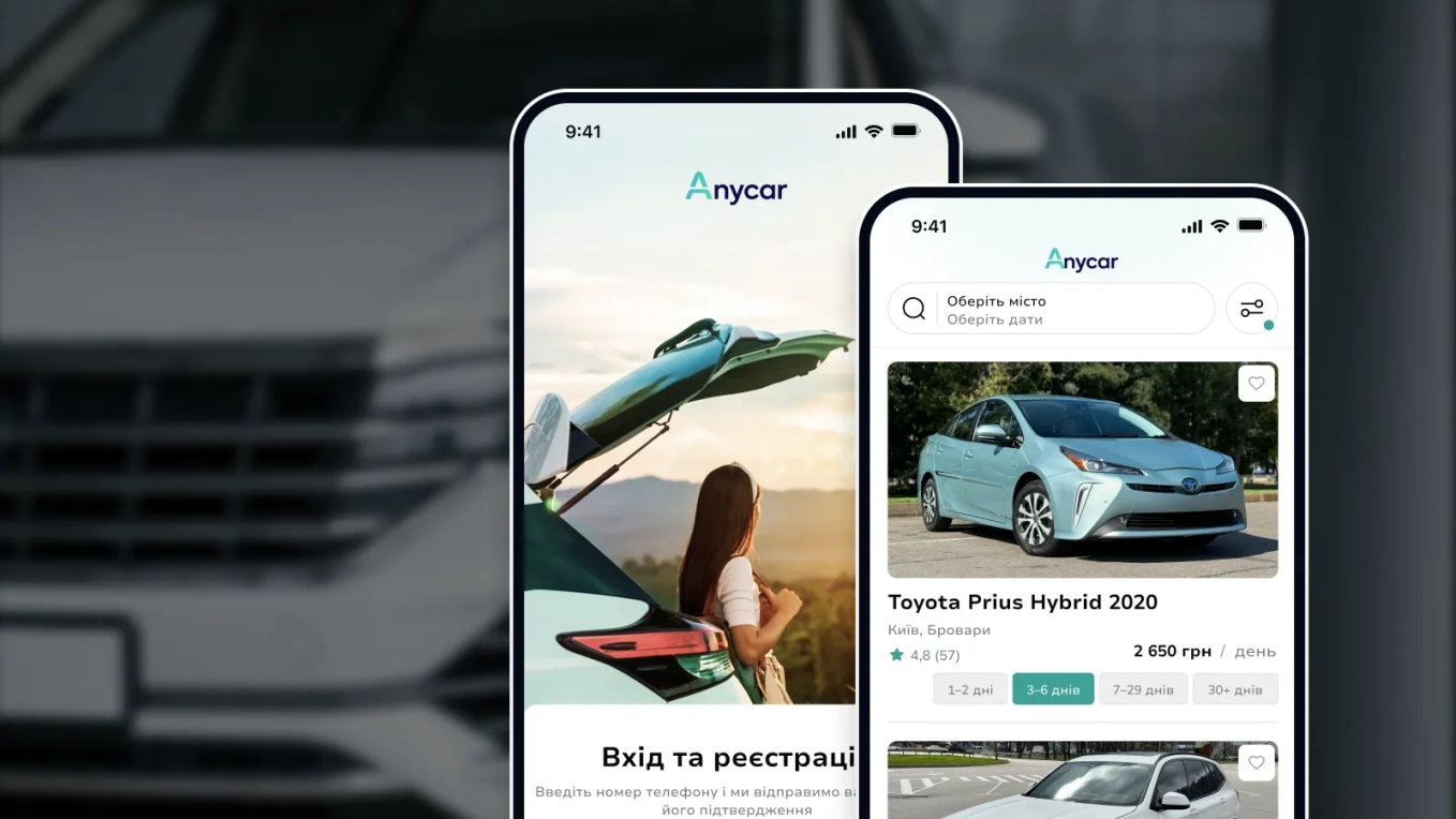
Development of a P2P car-sharing platform for renters and car owners
Transportation
United States
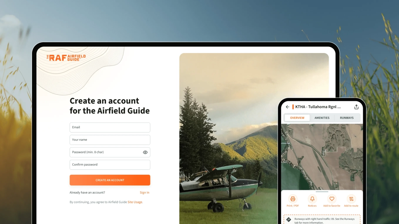
Development of a website guide for hidden airports and locations for pilots
Logistics
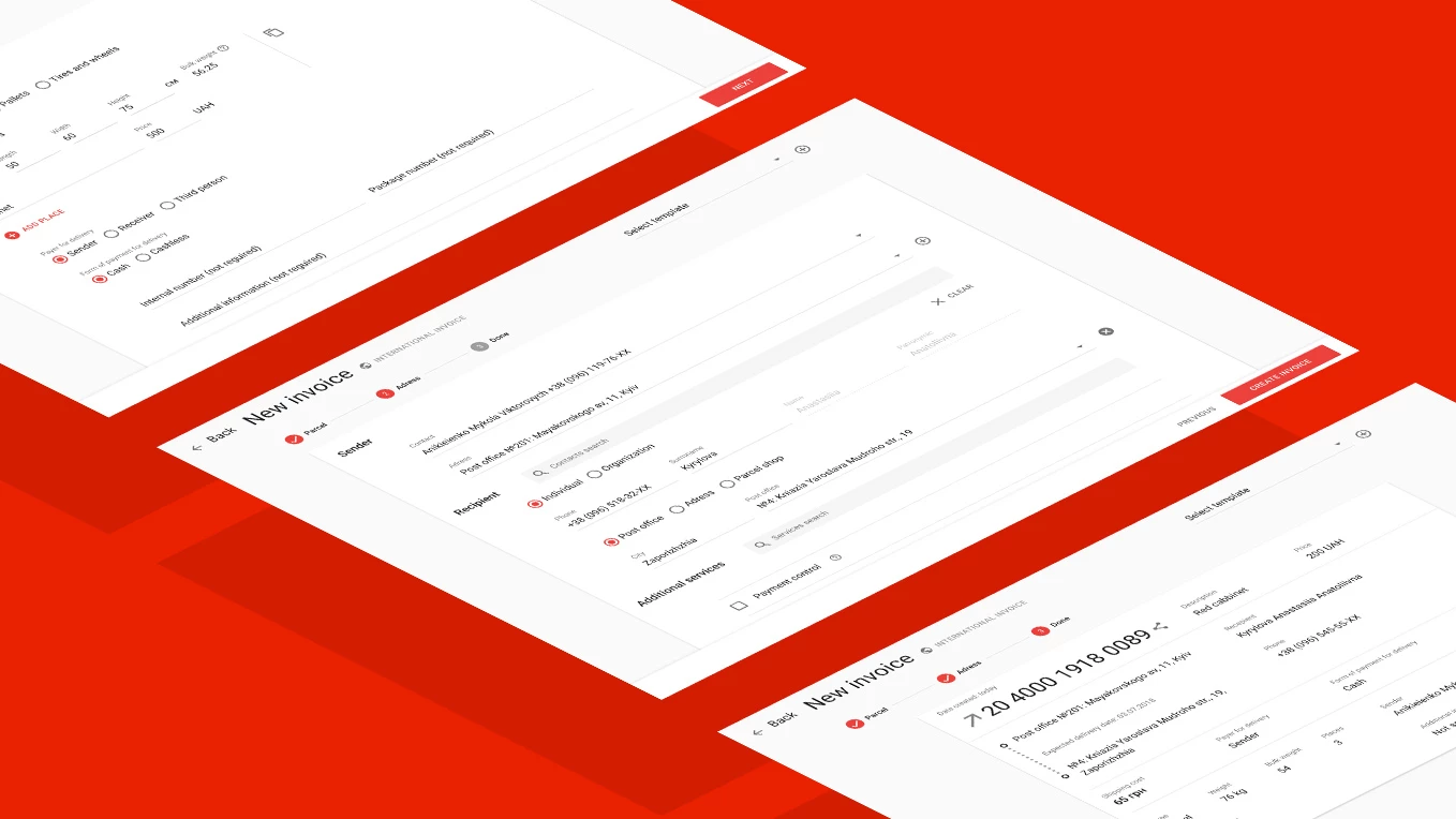
Ukraine
Personal dashboard design for the leader of express delivery
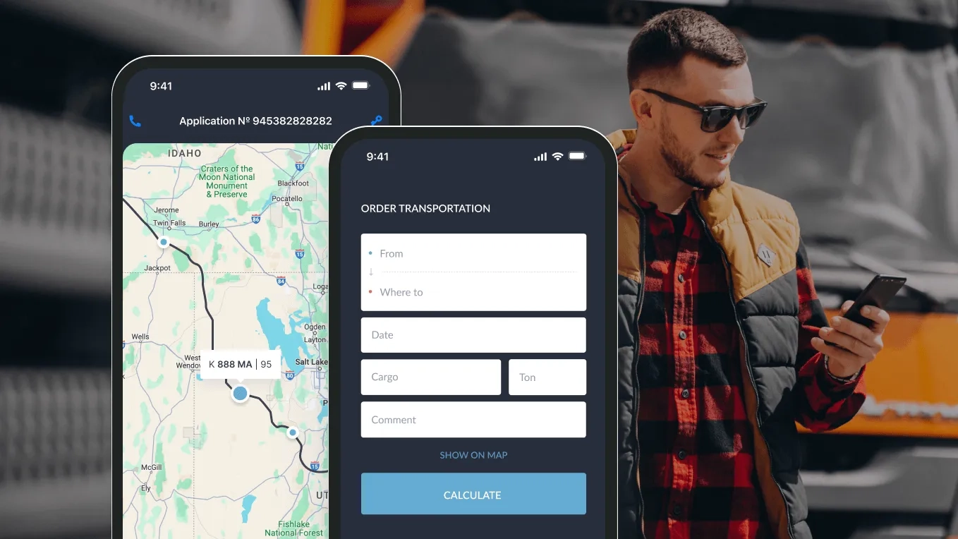
Logistics
Ukraine
Development of the service for a cargo transportation company
Emergency
Ukraine
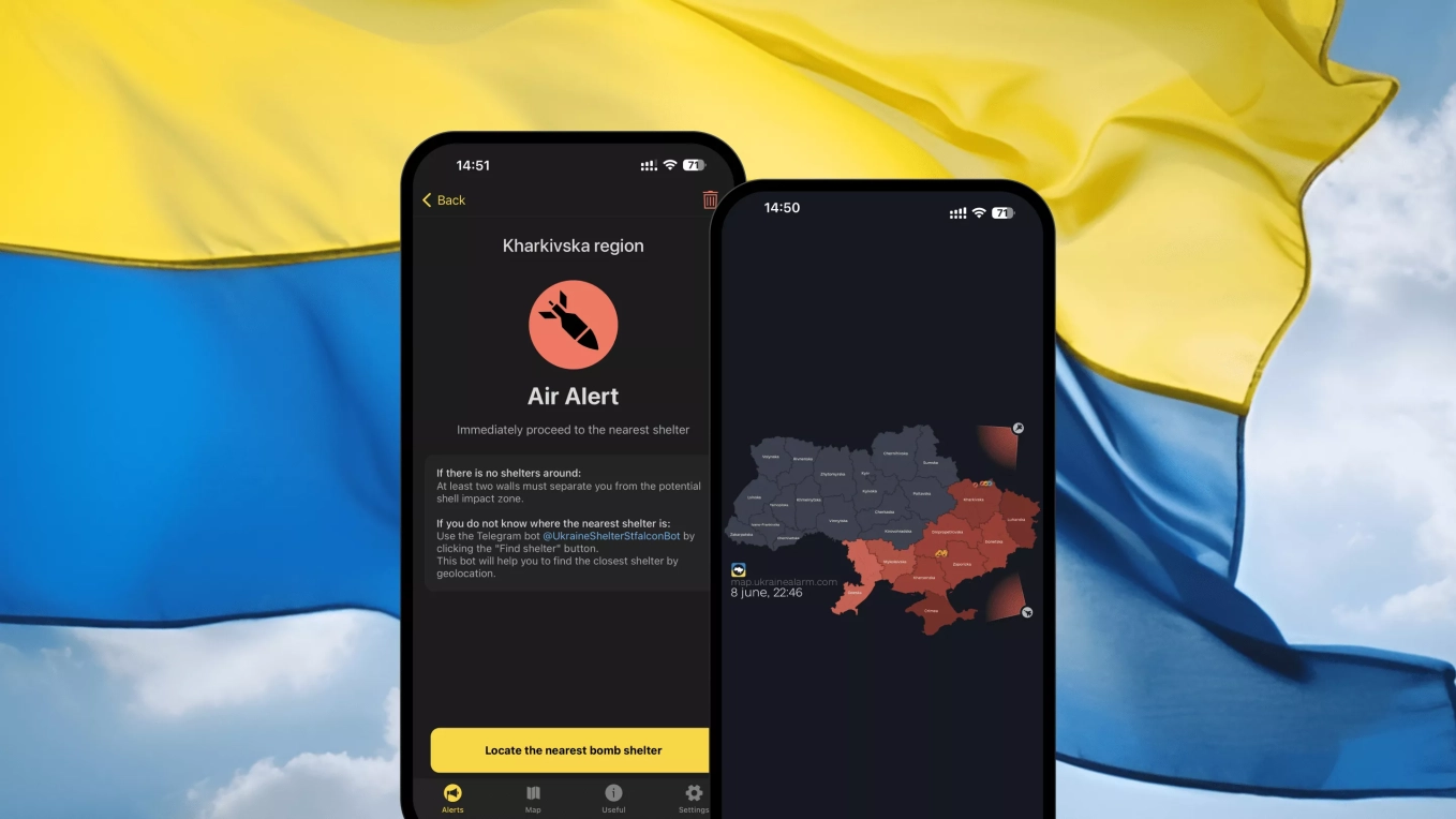
Mobile application development for an air alert notification service
Transportation
Ukraine
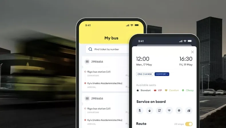
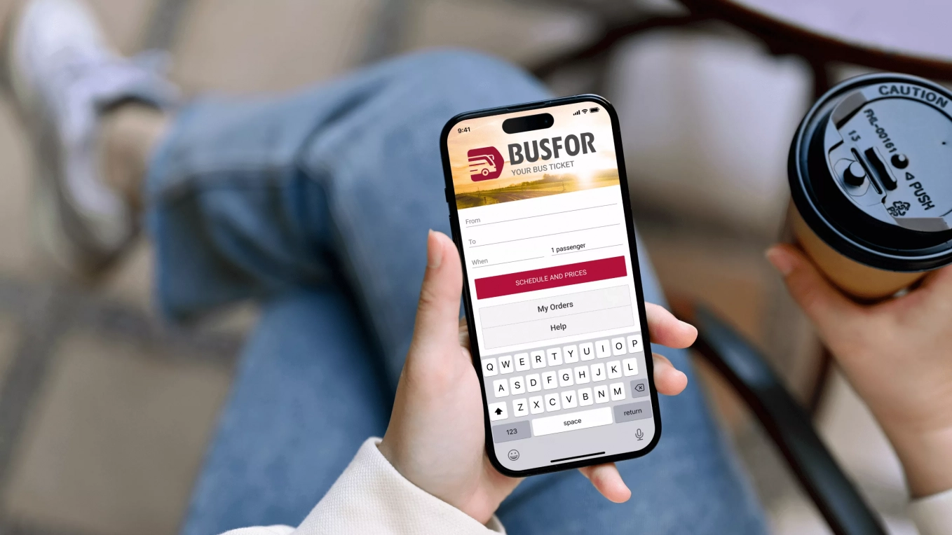
Development of Android and iOS applications for bus ticket sales service

Travel and Hospitality
Germany
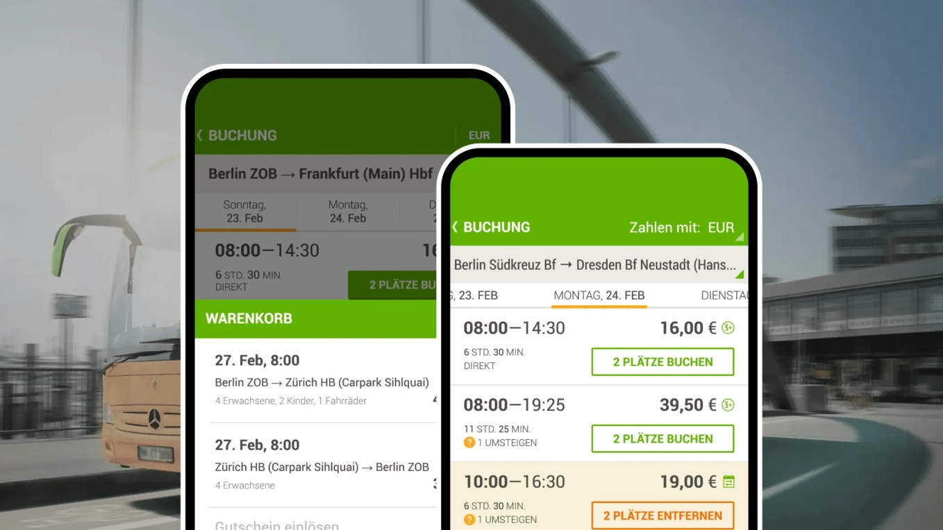
Mobile app development for a largest passenger transportation company

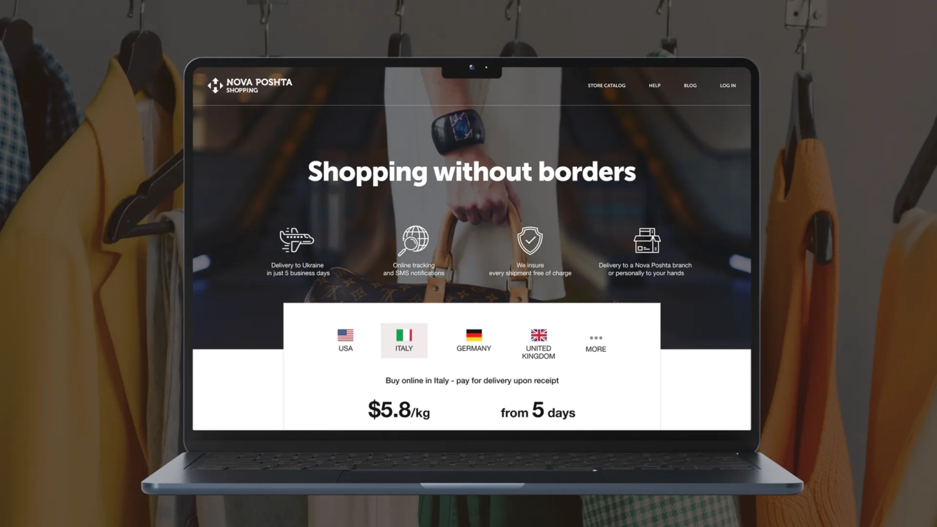
E-commerce
Ukraine
Redesign of the site for a delivery service

Logistics
Sweden
Development of the online platform for an ordering service

Logistics
Saudi Arabia
Development of a logistics app and website for a delivery service
FinTech
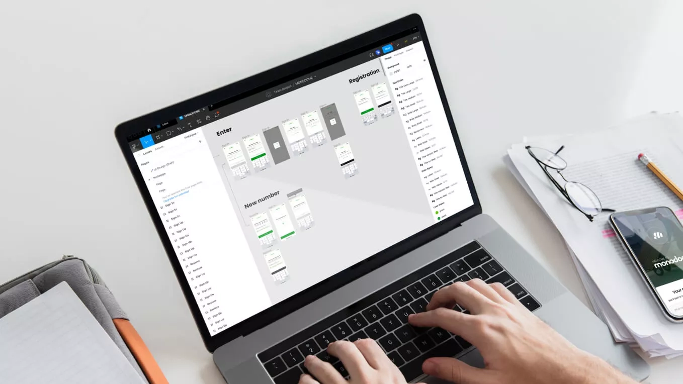
Ukraine
Web Document Creation Form
Transportation
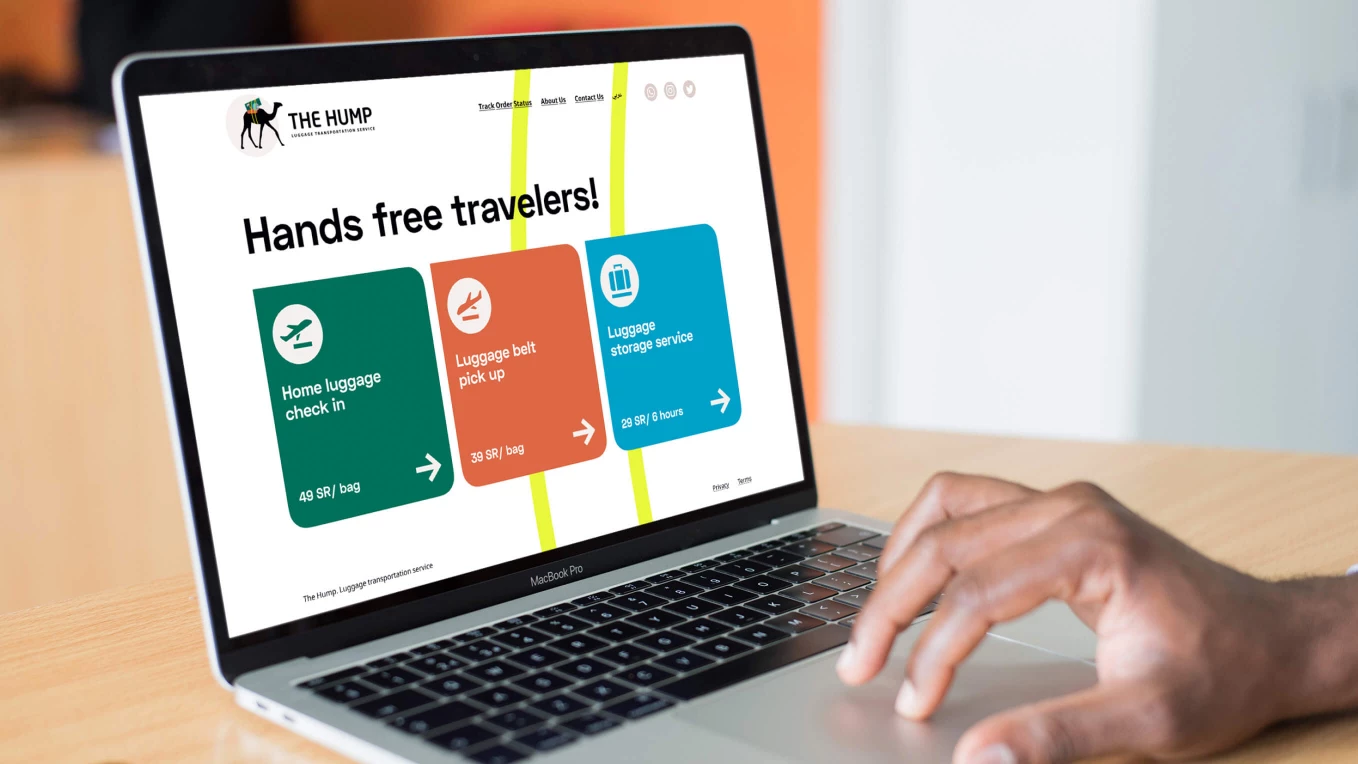
Saudi Arabia
Design and development of the luggage transportation service
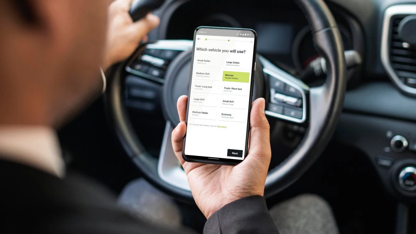
Logistics
United States
Development of the logistics exchange application

Transportation
United Kingdom
The internal observation system in the train carriages
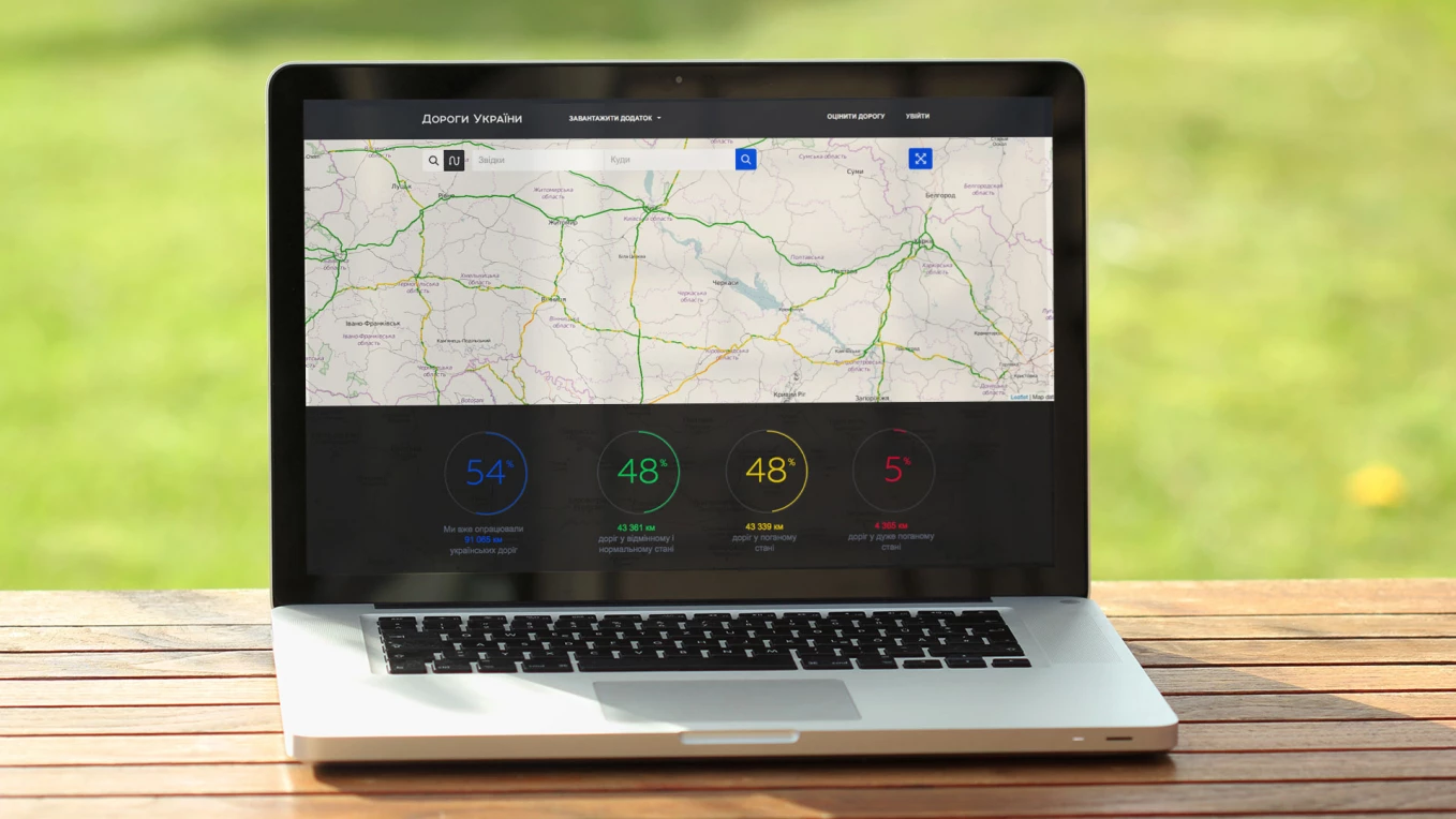
Transportation
Ukraine
Startup for monitoring road quality

Logistics
Saudi Arabia
MVP roadmap, a product vision document, user stories, and an estimated budget
E-commerce
Ukraine
eCommerce shipping solution development

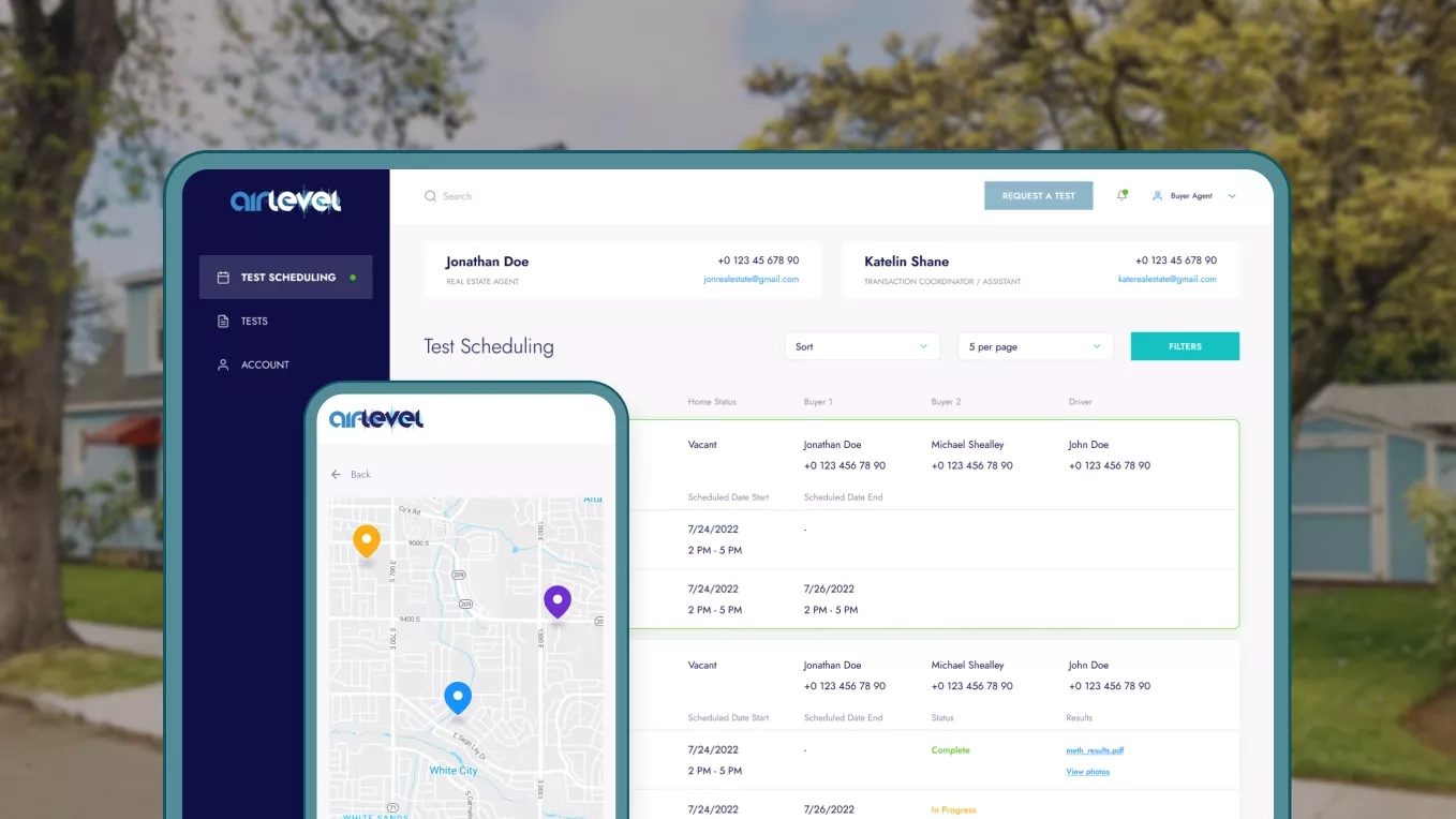
Real Estate
United States
Analysis, market research, CJM, prototyping, and strategy for a successful platform launch

Food
Germany
Project under the NDAs

Healthcare
United States
Native iOS app for fitness activities before, after, and during pregnancy

E-commerce
Ukraine
Containerized infrastructure with Kubernetes for the largest platform of Ukrainian brands
Emergency
Ukraine
Development of a solution for real-time alert management and centralized control

Food
Ukraine
Discovery & UI/UX design for food ordering app
Logistics
Nigeria
Project under the NDAs

E-commerce
Ukraine
CRM ticketing system development
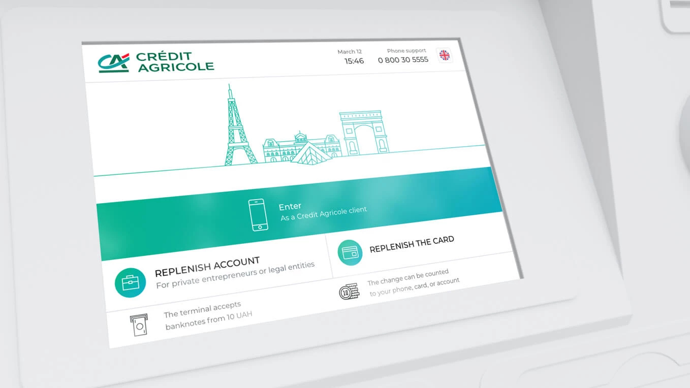
FinTech
France
Interface design for Credit Agricole payment kiosks
Real Estate
United States
Design for a Property Inspection Web Service
Emergency
Ukraine
An app as an additional component of the air defense forces
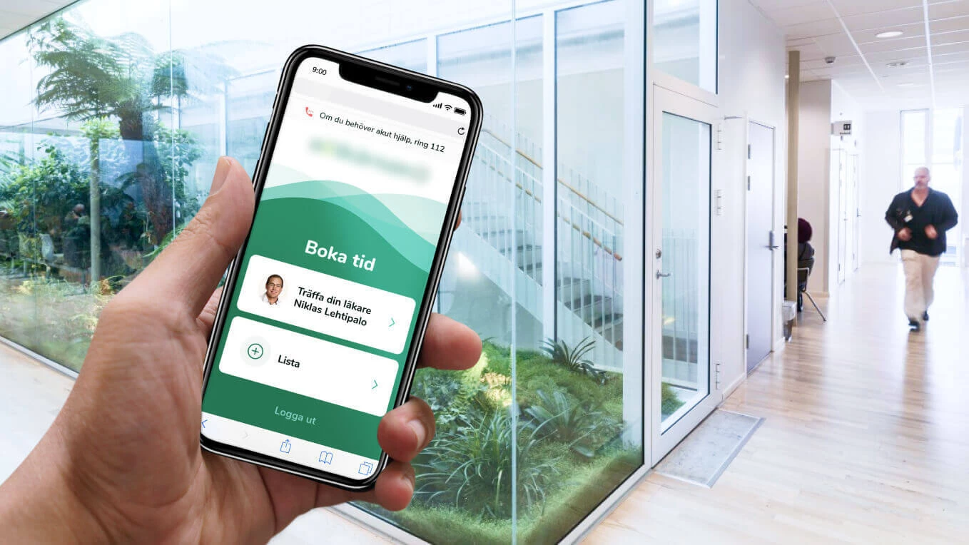
Healthcare
Sweden
Project under the NDAs

FinTech
Germany
Development of native Android and iOS apps for monitoring e-distribution sales

E-commerce
United States
A catalog of books with links to retailers
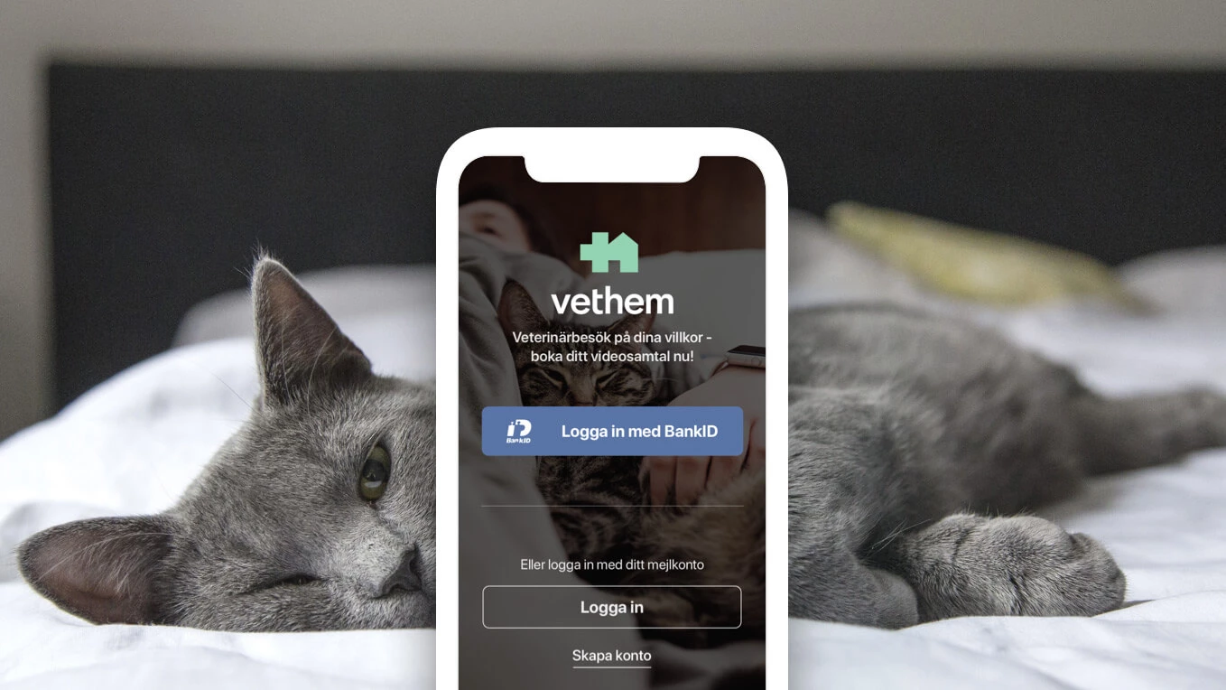
Healthcare
Sweden
Vet appointment booking application development

FinTech
Ukraine
Project under the NDAs
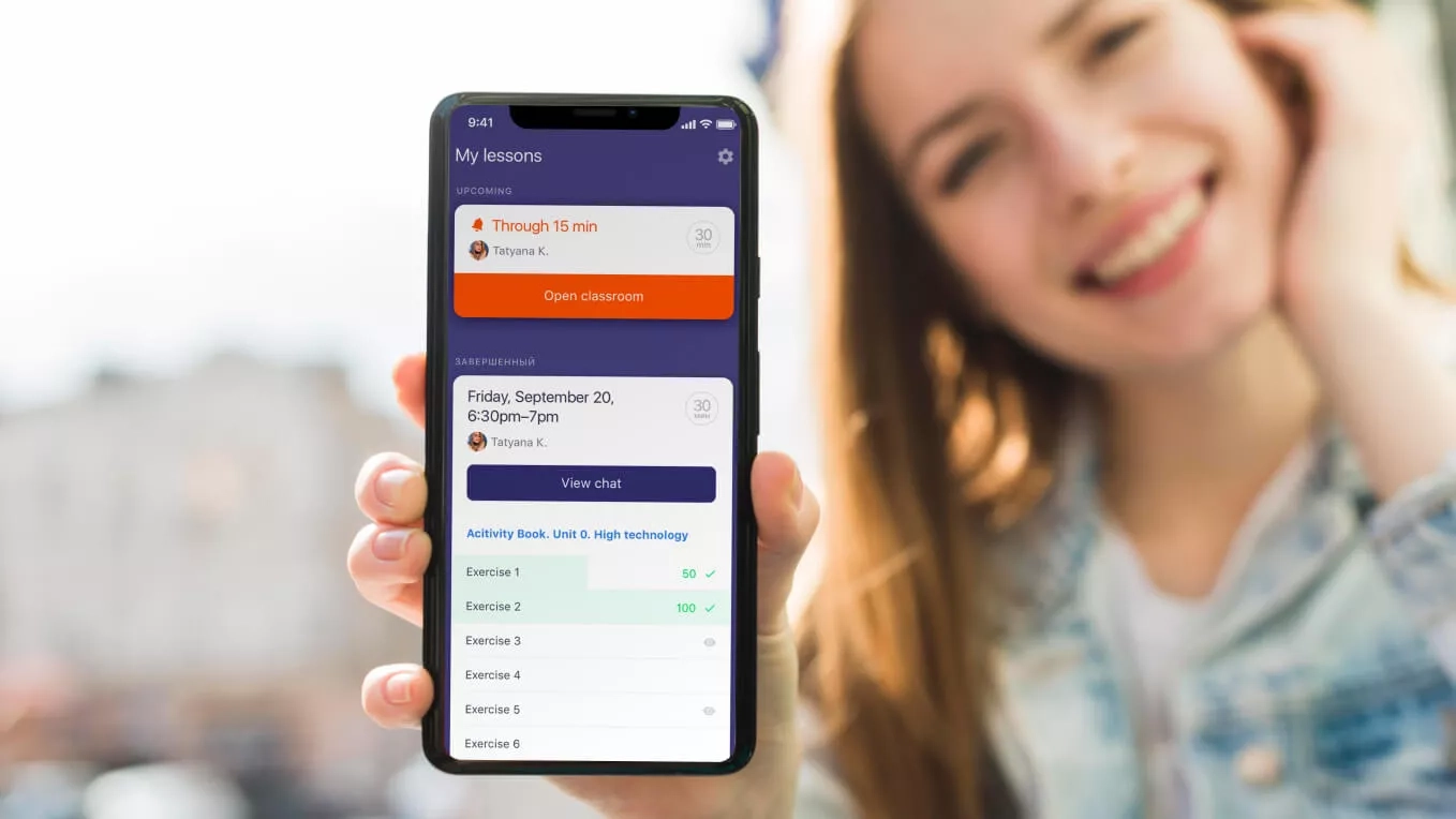
Education
United States
An app for interactive learning of English with a tutor for children

Healthcare
United States
A web app to share user experience of disease treatments

Transportation
Germany
Web project and website design for a large passenger transportation company
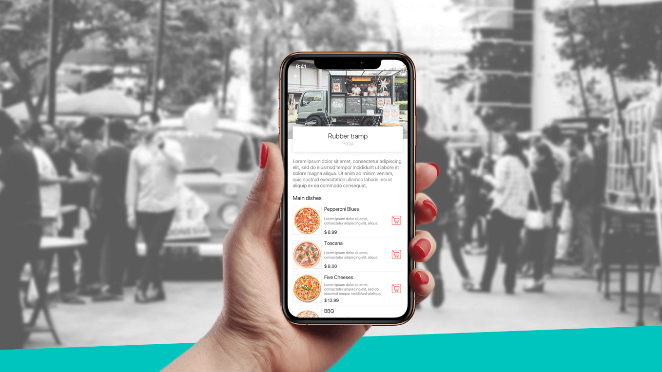
Food
United States
An App for a Food Truck Management Company

Social Networks
Germany
An independent agro network app

E-commerce
Ukraine
Corporate store landings

Real Estate
Canada
Short-Term Property Rental Management System

Emergency
United States
Project under the NDAs

Social Networks
United Kingdom
Discovery phase for a social app for real-life connection

Logistics
Ukraine
Development of an AI agent that automates document intake, reducing processing time by 67%
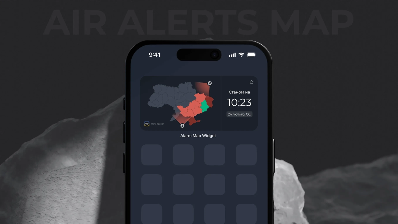
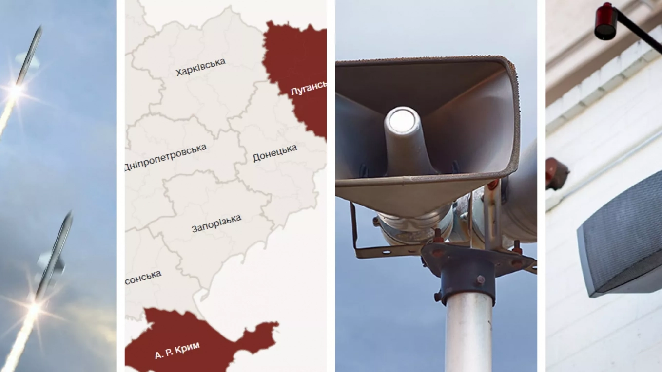
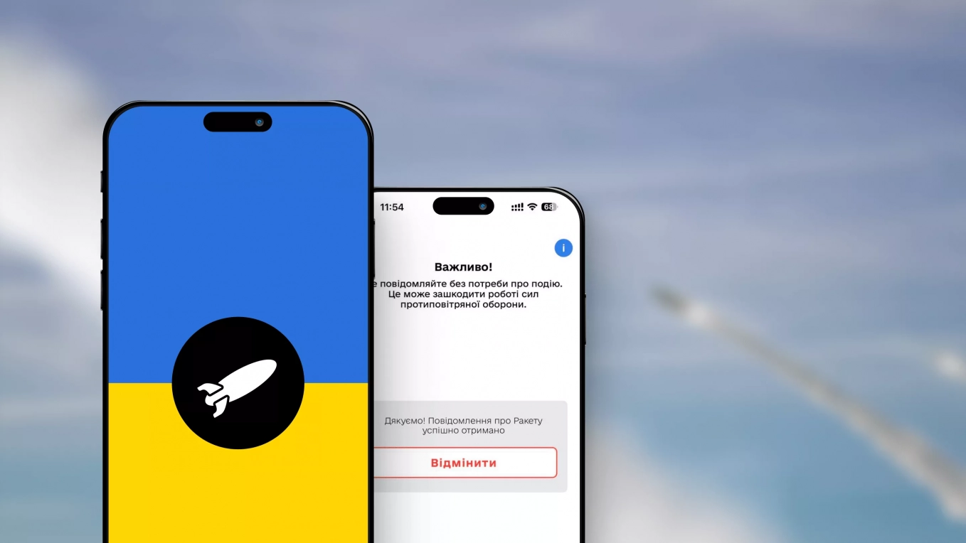
Emergency
Ukraine
Development of an air alarm map widget for the smartphone

Emergency
Ukraine
Development of a website for the official air alarm map

Real Estate
Saudi Arabia
UX research, multi-role prototypes, user stories, MVP development roadmap, and a budget plan
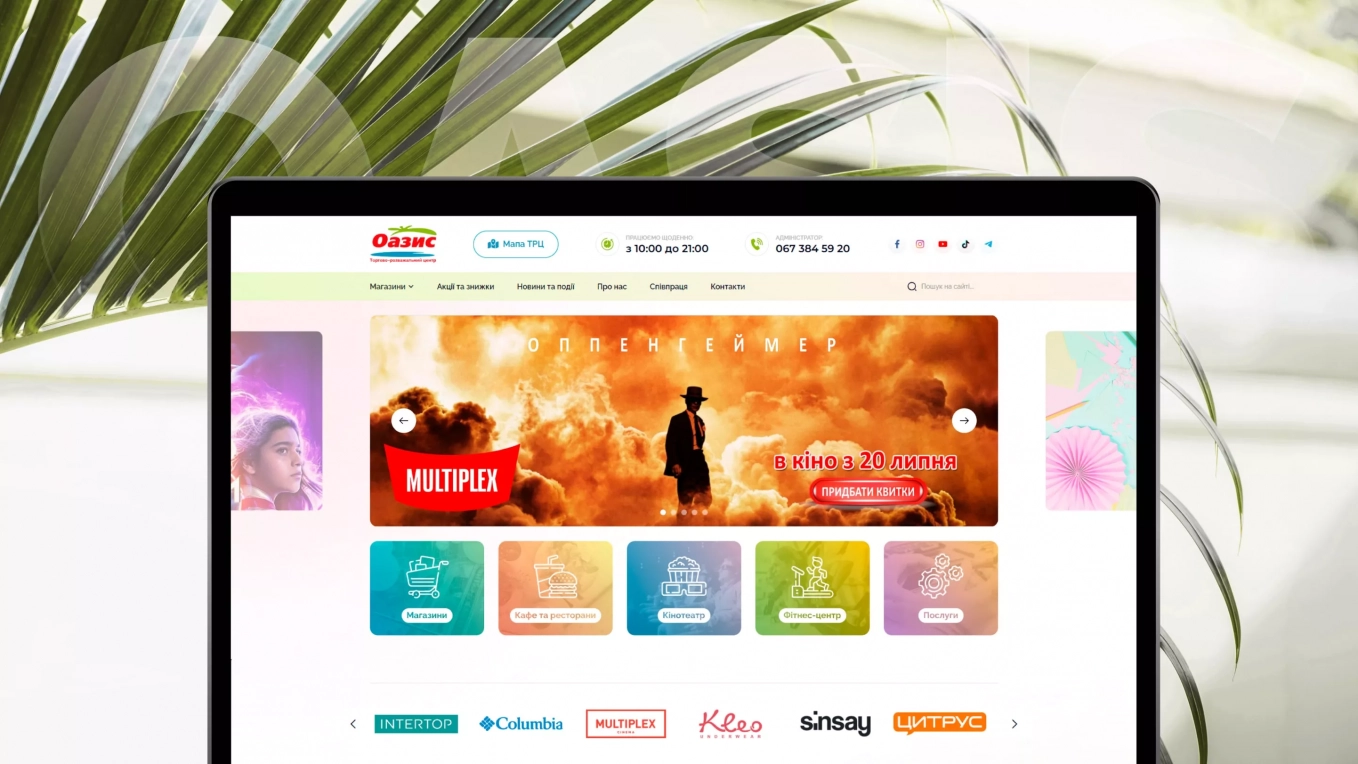
Real Estate
Ukraine
Development of a website for a shopping mall

E-commerce
Ukraine
Development of the website for a domain name registrar
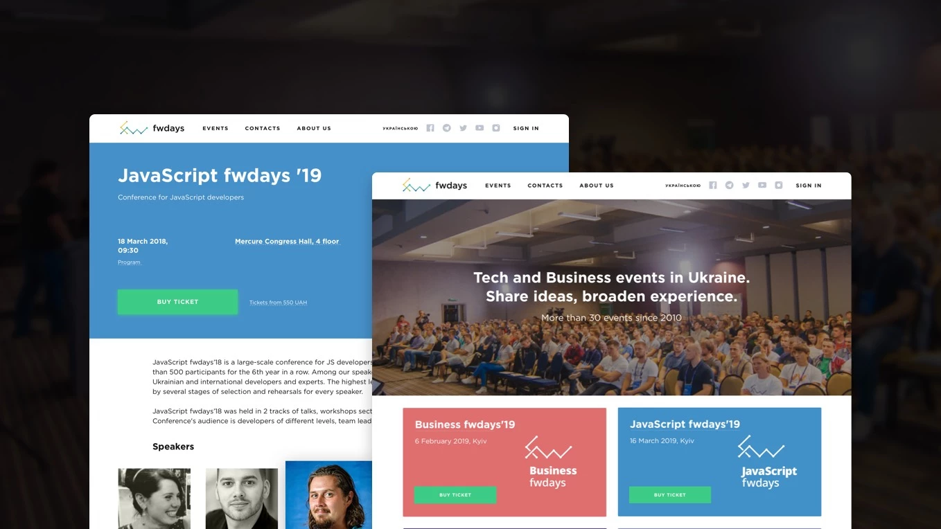
Education
Ukraine
The site of the largest Ukrainian tech conferences
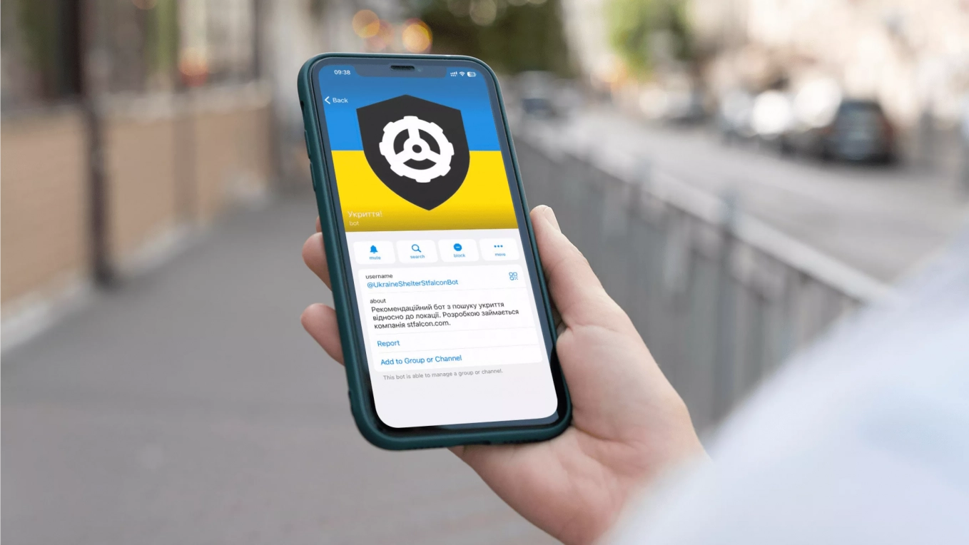
Emergency
Ukraine
Telegram bot with a full base of shelters

Education
Singapore
An app for learning with the video materials

Travel and Hospitality
Cyprus
Lean Canvas, CJM, and UX prototyping to validate a marketplace idea for local artists and venues
Build logistics software with generative AI
We help transportation and logistics companies automate operations and scale faster through: