Nova Poshta Personal Account — Web Document Creation Form

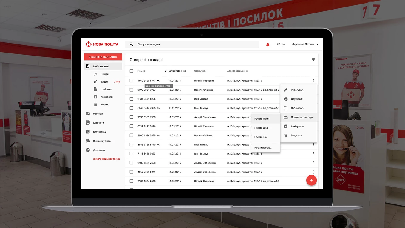
The main aims of the new form creation were the following:
- Maximum automated interface. Everything, what can be filled in for the user, should be filled in.
- Reducing the number of mistakes during the creation of a new addressee.
- The possibility to add any Nova Poshta service to the invoice.
The Old Shipping Invoice Creation Form
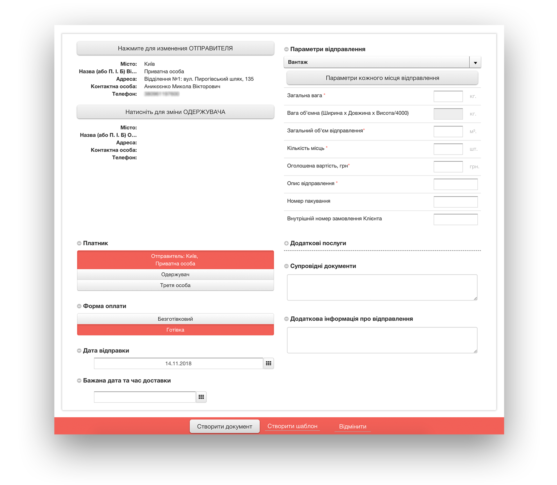
Personal Account 2.0 (it’s Business Account at present) reflects the whole system in its interface. In the digital world it’s called “technical dependency”. The system is customized according to the loads, data base, architecture, etc. and the result is demonstrated to the user in the form of the interface adjusted to the technological peculiarities of the project, but not to the real life.
In the old form, the creation of a new contact or a new address was realized in a modular window due to the fact that it is a separate request. But such actions are needless for the users. We can show all the fields at a time and save the new contact automatically, during the invoice creation. Any e-mail client can do this.
The conventional types of shipment were used «Посилка» (for the parcels under 30 kg) and «Вантаж» (for the shipments above 30 kg). To send, for instance, less than 30 kg, the user had to switch between the shipment types. We can do it automatically judging from the indicated parcel weight.
The representation of the additional services was extremely poor. We wanted to show them to their fullest. There were also some other problems of different character.
All the drawbacks slowed down the users’ work with the form and caused mistakes.
Testing the Old Form
We had decided to additionally test the usability of the old form to find out if the problems we had detected were really problems for the users. Besides, we wanted to know what else could cause them inconvenience.
Only Nova Poshta employees participated in testing.
Prototyping the New Form
After the performed tests we’ve created a list of the requirements to the form-to-be. Obviously, we wanted to test the solutions we have generated. They were based on the received list of requirements on the real users. It could help us to be more sure about them.
Working with a simple interface, you can test the paper prototype at the initial stages. It takes minimum time for interface design creation. Besides, you can quickly make the corrections to it simply redrawing it in accordance with the results of users’ testing. Even using the low level of detalization, you can understand whether the essence of the interface, the navigation process, the names of buttons, etc. is clear to the clients.
The Form of the Internet document creation is very complicated and includes multiple scripts. That’s why we chose Axure for prototyping. Only this tool allows creating a prototype, most corresponding to the reality. For testing such kind of service functionality it’s very significant.
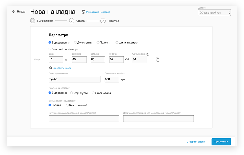
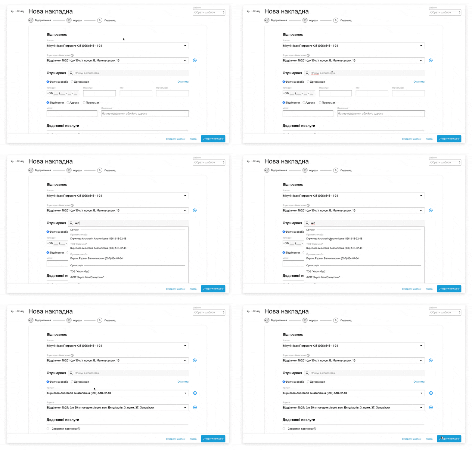
Prototype Testing
We decided to make several testing series and started from the NP employees again. After the testing with the employees, we asked for a list of loyal NP users who could help us with the usability testing.
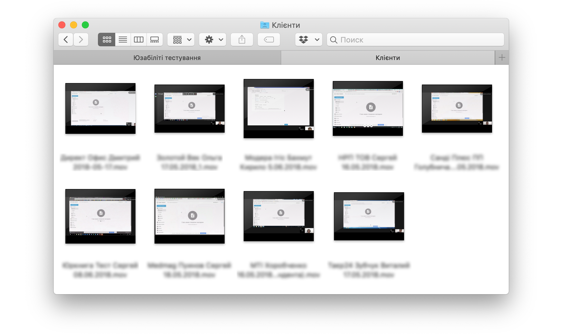
It’s better to perform testing off-line, meaning you sit by the user’s side and control the whole process. However, it was extremely difficult to find the users who would agree to spend half a day (in fact) to come to our office and to participate in testing. So we had made our mind to perform testing via Skype. To control the process we asked the users to share their screen with us. All the manipulations with the prototype were video-recorded with sound so that we could come back to the recording in case of need and demonstrate our customer the advantages and the disadvantages of the solution.
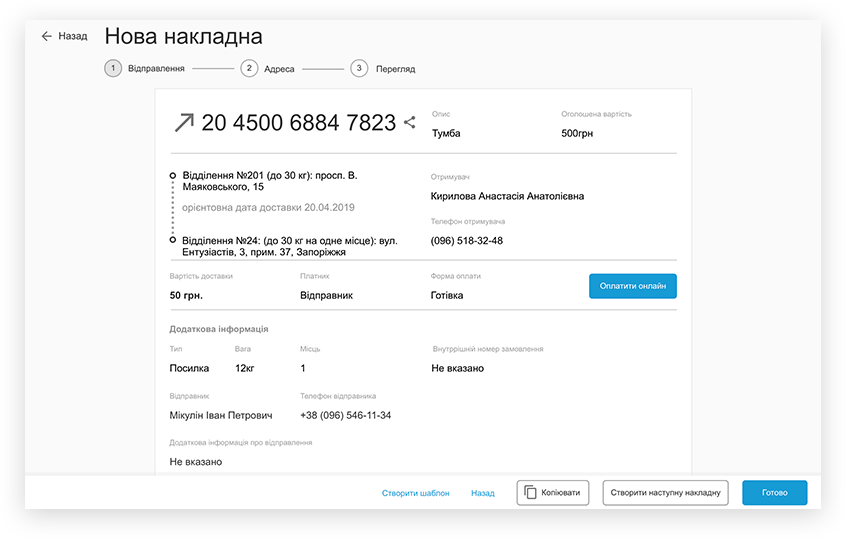
Final Digital Mockups
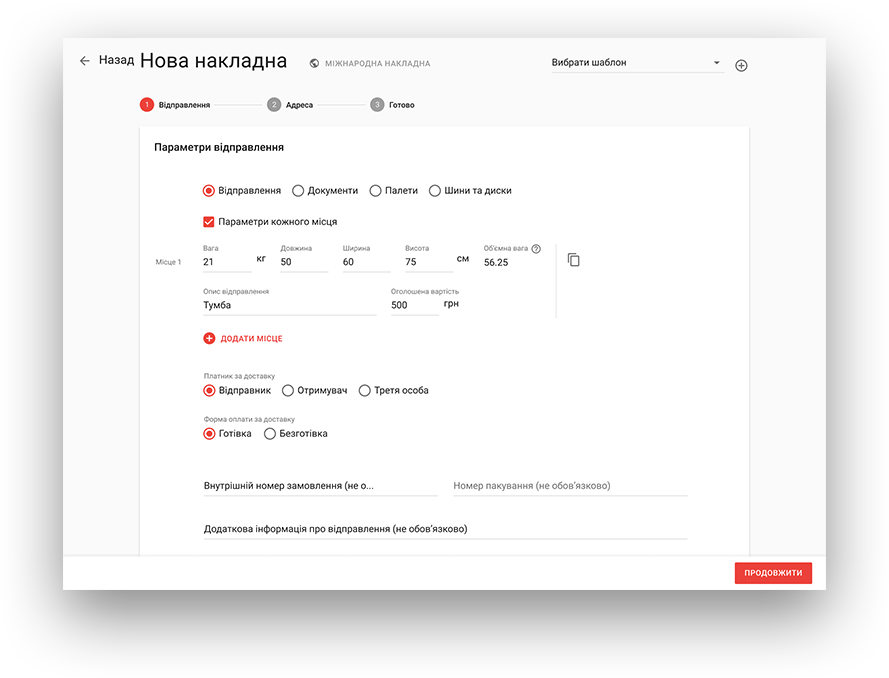
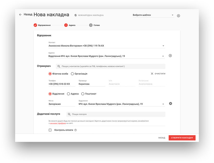
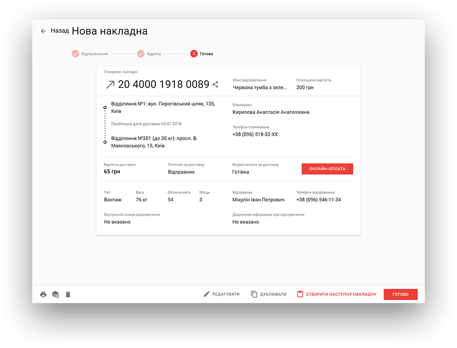
We have run 3 series of testing. After each series the prototype was improved and customized even better. It allowed us to sharpen all the main scripts. In the course of the last testing series, the users went through the procedures without any significant delays or misunderstandings. It was what we had aimed for and meant we can proceed to the final UI creation.
Conclusion
The work on the Shipping Invoice Creation Form was a comprehensive task. The task required a unique approach to the project work; we had to minimize the risk of mistakes. Initially, the project manager and the designer performed the primary job, and the devs joined them, having accurate tech specifications.
Cast:
 Mykola Anikieienko
Designer
 Andriy
Frontend Developer
 Ruslan
Team Lead Frontend
 Maks
MaksDesign Team Lead
Build logistics software with generative AI
We help transportation and logistics companies automate operations and scale faster through:
- 16+ years of proven logistics expertise
- Full-cycle software development
- 30% faster delivery with AI
- CTO-led delivery on time and on budget

