
In the world of iOS development, there is a well-known JSQMessagesViewController library which helps iOS developers to implement UI chat in their applications easily. Unfortunately, Android developers are deprived of such a wonderful tool. Therefore, we decided to give Android developers wide options for creating a fast and attractive user chatting interface in their apps.
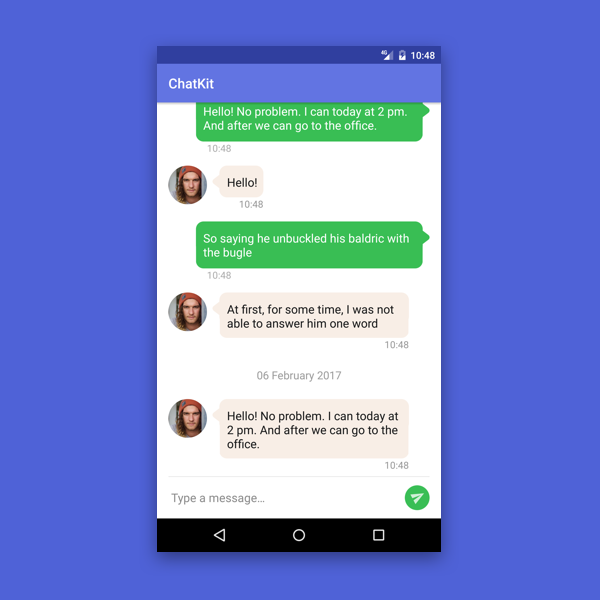
ChatKit is a library designed to simplify the development of a user interface for such a trivial task as chat. This library has flexible capabilities for styling, setting up, and data management.
Key Features and Advantages of ChatKit
- Ready-to-go solution. It’s already a developed tool for rapid implementation;
- Fully customizable layouts. Styles can be installed from the box (use your own colors, text images, streamers, selectors, and sizes) or creating your own custom markup and/or holders for unique behavior;
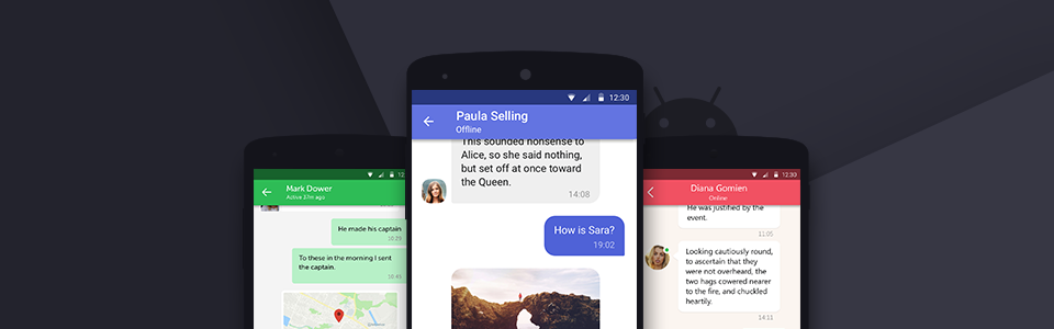
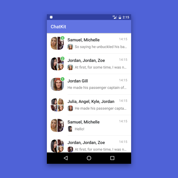
- List of dialogues, including private and group chat,s, markers for unread messages and viewing of users’ last messages;
- List of messages (incoming and outgoing) with a pagination chronology and already calculated date headers;
- Various avatars without a specific implementation of image uploading. You can use any library you like;
- Selection mode for interactions with messages;
- Simple date formatting;
- Your own dialog and message models. Conversion is not required;
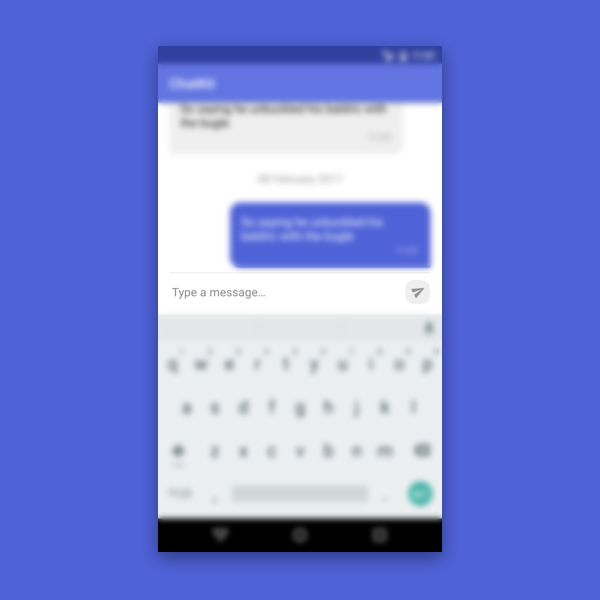
- Message input view is ready to use;
- Custom animations (according to the RecyclerView usage).
Core Components of ChatKit Architecture
1. DialogsList
DialogList is a сomponent for displaying and managing the list of dialogs. Main functions are: quick and easy implementation, private and group dialog support, and markers of unread messages. There are also several customization methods of changing the dialog list appearance and implementing additional functions not included by default.
2. MessageList
This is a component for displaying and managing messages in a conversation. Its main feature is correct and simple interaction with message list and the date header, which is implemented through the adapter. In addition, it supports several levels of configuration, allowing you to add all the features that were not included by default.
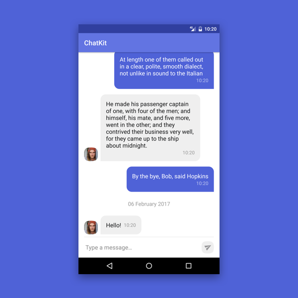
3. MessageInput
MessageInput is an auxiliary component for entering text messages. It supports simple check and handles all the states of the «send» button. In addition, it supports enough attributes for stylizing the appearance.
All components can be stylized with xml attributes.
With the help of attributes for read and unread dialogs in DialogsList we can separately change following characteristics: background color of the list item, font size, color and text style for the dialog title, last message, date of the last message, as well as size of dialogue avatar and size of the avatar of author of the message (only for group chats), settings of the separator between the elements (appearance, color, indents).
MessageList attributes allow us to set a background color for incoming and outgoing messages; moreover, a color for their «pressed,» and «selected» states. Also we can change color and size of the message, message font, sending time font and title font.
When using available MessageInput attributes, we can change the color and size of the text and input tip, the maximum number of allowed lines, the size, and indent of the «send» button, its icon, and background.
But what if, besides changing elements’ appearance, you also need to change its position? No matter what, you shouldn’t worry about it, because you can create your own layout. There’s identification: element identifiers have to match with default identifiers, and widget types must not throw the exception of the ClassCastException class (they should belong to the same type or subclass type).
Here’s the example of changing the MessageList layout:
Sometimes the function of displaying a text message is not enough. For example, you might need to add a message processing status and a Slack-like receiving it (Slack-like). Of course, in this case you need to create your own layout, but you can’t do it without changing the ViewHolder logic. For this reason our library has an option to use your own ViewHolder for the elements.
For examples of use, you can find all the necessary documentation on our GitHub page library.


