Studies show that nearly 90% of users will abandon a mobile application due to poor performance or a confusing, non-intuitive layout. When launching a software solution, diving straight into coding without a solid design strategy doesn't yield results. In today's digital landscape, a seamless user interface is the ultimate determining factor in a customer's purchasing decisions. In fact, according to Forrester research, every $1 invested in professional UX/UI design can yield a return of up to $100, resulting in an impressive ROI of up to 9,900%.
At Stfalcon, we understand that exceptional mobile app user interface design is more than just beautiful visuals — it is a critical business asset. As an experienced custom development company, we craft interfaces that align perfectly with user expectations and technical constraints.
In this article, we’ll explore the core principles of mobile UI design, analyze the latest industry trends, and show you how to build an engaging interface that drives measurable business success.
Want a web app that does more?
Let's build a solution that's smart, sleek, and powerful.
Alina
Client Manager

What Is a Mobile App User Interface (UI)?
UI design is a crucial element of modern app design. It’s a human-first approach to the application's aesthetic experience. It allows users to spend less time in the app and complete more tasks. A proper interface increases the chances that the users will return.
So, UI development is a process of turning important wireframes into attractive, convenient, and easy-to-use interfaces. UI is focused on integrative, simple, and aesthetic visual elements and is also aimed at product scalability.
If implemented properly, UI is hard to ignore. But what are the key principles of the best mobile app interface design in 2024?
4 Essential UI Design Principles for Mobile Applications
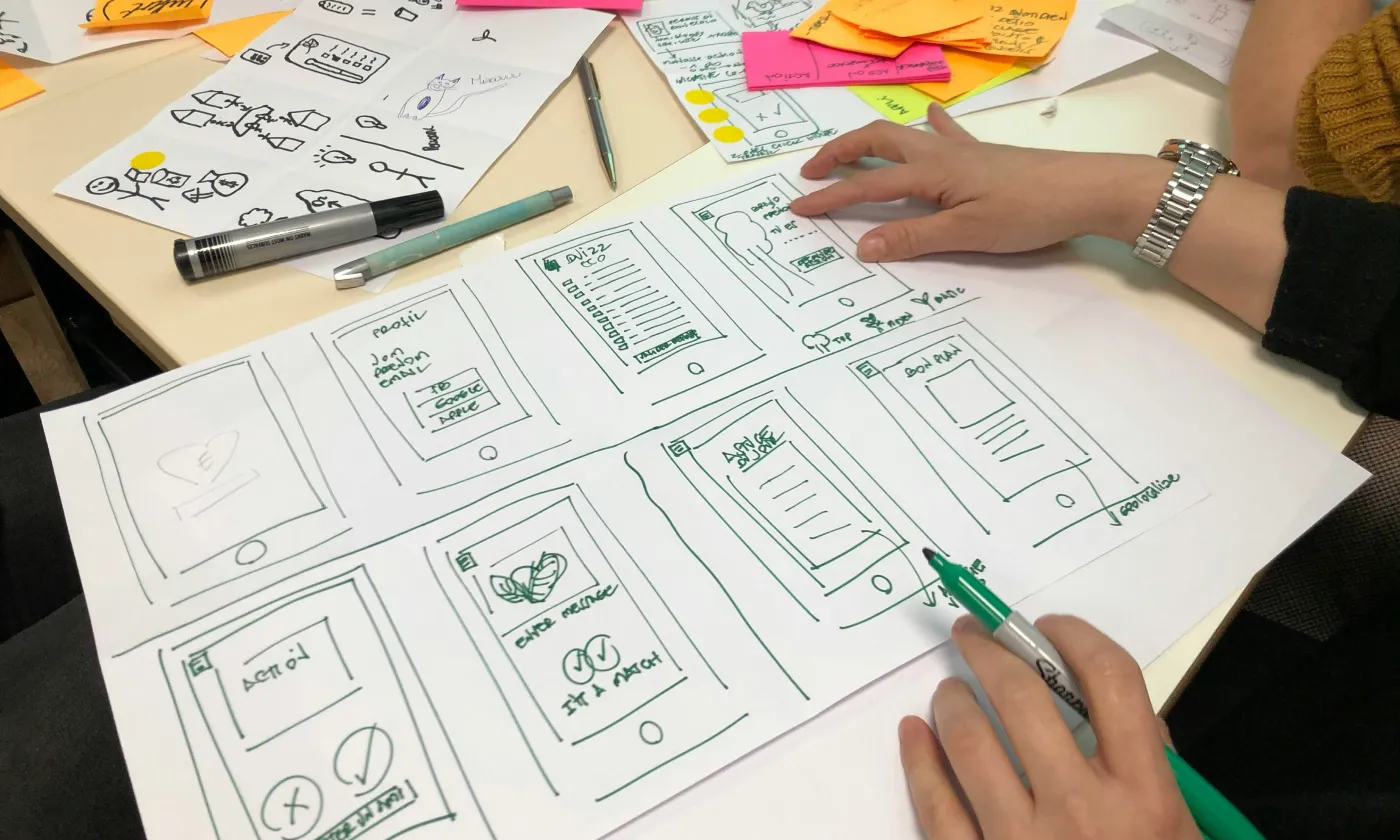
To make the life of an app interface designer easier, certain principles have been worked out. They remove lots of guesswork at the same time, making designs more predictable and easier to use.
So, when developing a software solution, you should conduct profound research first to comprehend its main tasks and then make them the focus of your interface. A sound idea is to user-test the prototypes, you can thus iron out the bugs before the code is written. In such a way, you can avoid costly rework later on and save your team's time for development.
Below, we are going to speak about some of the user interface app design principles in more detail.
Read Also: Web Design for Car Rental — Invest in Design That Converts.
1. The Structure Principle (Clear Information Architecture)
This principle is concerned with UI architecture and general usage. Your user interface should be arranged purposefully and designed in a meaningful and useful way. Take clear and consistent models familiar to your users as the basis for your UI, put related things together and separate unrelated things, differentiate dissimilar things, and make similar elements resemble one another.
2. The Simplicity Principle (Decluttering the Interface)
This principle says for itself - the design should be simple, facilitating easy task-solving. For clear communication, the design should speak the same language as your users and provide good shortcuts meaningfully related to longer procedures.
3. The Visibility Principle (High Accessibility & Contrast)
All the necessary options should be visible to the user without the unnecessary distraction of superfluous or unnecessary details. The same works for materials; the users should not be confused or overwhelmed with many alternatives and redundant info.
4. The Reuse Principle (Consistency & Familiar Patterns)
External and internal components, patterns, and actions should be reused in UI. It will help you maintain consistency with the purpose and relieve your users from the necessity to remember unnecessary actions.
Key Challenges a Mobile App Interface Design Must Solve
As it was found out by a DFA 10-year overview of the S&P Index companies, the platforms that have a good app design do better than the companies having solutions with a weaker design by almost 220 %. About 50% of users consider app design to be the fundamental factor in shaping business credibility.
So, when designing a mobile app interface, you should keep it in mind.
In your solution, UI is responsible for how the app looks, responds, and functions, so make it attractive, quick, and capable of coping with many operations. The main tasks it should solve are app simplification, desirability, and user attachment.
A perfect app design interface simplifies the usage of the app, so it needs to make complicated processes simple and easy.
Avoid multiple utilities; instead, straightforwardly design your app so that people from different age ranges can use it effortlessly. The best PP interfaces automatically reflect solutions desired by many people.
Older people are, for instance, often reluctant to use innovations, because they find it difficult even to use smartphones. That’s why you should create such a mobile app interface design that everyone can use and find simple.
With UI, your development should never stop. First, you should conduct a detailed audience analysis, including demographics, age range, interests, and so on, and then get feedback from your users and make it your guide for further continuous improvements.
Why Investing in Mobile App UI Design Is Crucial for Your Marketing
As we have already stated, the value of any app is determined by how it solves the problem of the users. So your software UI should help accomplish their goals and demonstrate value from the very first screen; it is also great for marketing purposes.
Enhancing Customer Loyalty
By creating a user-centered design, you make the interaction with your app smooth and hassle-free. If the users find value in your solution along with support, they will come and stay. Stable user engagement and retention mean more conversions and consequently greater business success as well as steady income for you.
Improving ROI and Conversion Rates
You develop your app to make your users' lives easier, but your main aim is naturally revenue generation for your business. The users satisfied with your product will use it more often and share it with friends. They can also spend money on in-app purchases, and more advertisements can run, also meaning more money for your company. What is more, you can also benefit from the option of removing ads for money.
All these will result in your increasing your return on investments for the best mobile app design creation.
Boosting Brand Recognition
A memorable custom UI that will create a positive reputation for your application will, sooner or later, become synonymous with your brand and can even become an industry standard. So, even a mobile app design can become a powerful tool for increasing your brand awareness; keep it in mind.
Gaining Competitive Advantages
When crafted and implemented well by an experienced transportation app design company, a great UI design will surely keep you one step ahead of other applications. However, the competition is high when a new app is developed, so you need to take on a challenge, do careful research, and take a big leap in the competition through custom UI development with all the nuances and modern trends considered.
So, let’s say a few words about the 2024 trends in UI design.
Top Modern Trends in Mobile App UI Design
Following the trends is a must to become successful nowadays, so in custom software development, you should keep the following app design trends in mind.
Simplification and minimalism
Simple things with pleasant appearances can arouse positive emotions. In UI design, it’s about highlighting the content and giving the design a supportive role.
3D
It’s one of the old good mobile app design trends, yet it still tops the list. The advance of virtual and augmented reality resulted in the greater popularity of 3D. Users appreciate the depth of 3D on the screen; more than that, it helps to understand the app navigation better.
AI-Driven Personalization and Dynamic UI
Static mobile interfaces are fading away, giving user-centric systems a major boost. Modern applications leverage generative AI to analyze user behavior, habits, and preferences in real time. This allows the UI to dynamically transform changing layouts, highlighting frequently used features, restructuring navigation menus, and adjusting content feeds for a specific individual. Implementing smart personalization ensures higher retention rates and delivers a tailored digital product experience that feels uniquely personal.
How to Design a Mobile User Interface That Engages Users
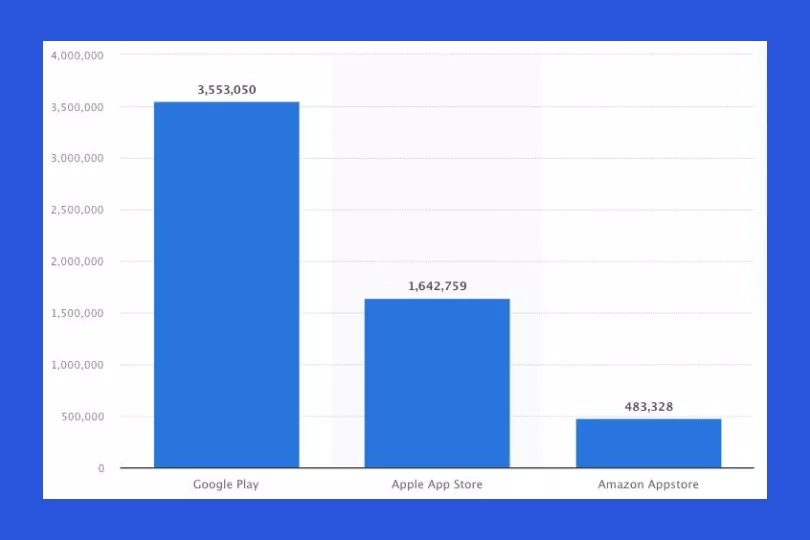
As of the 3rd quarter of 2022, Google Play comprises over 3.55 million available apps and an App Store around 1.6 million.
With each app having its rating, you can only imagine how many tests were made before uncovering the most effective and enjoyable applications. However, thanks to that, we can figure out certain golden rules on how to design a UI that works.
It’s critical to understand your users, their behavior, and their context. People live busy lives nowadays, solving thousands of tasks on the go, so your solution should ideally match their reality.
Break down your service into micro-tasks possible to be pieced together over time, avoiding long procedures and operations at a time. When you think about how to design an app interface, consider your users' natural environment and typical situations when they utilize your solution and craft the UI accordingly.
Keep in mind that people often operate their smartphones on the go, in transport with only one hand available, and so on.
To cut a long story short, in a mobile app design process:
- Get rid of the clutter – avoid anything that isn’t required 100%,
- Develop your app to be fast and responsive,
- Design for one-handed operation and control,
- Make navigation available any time,
- Avoid replication of your web experience on a mobile app,
- Personalize user experience as much as it’s possible.
Let’s now look at Stfalcon’s best mobile app designs.
Best Mobile App Interface Designs: Stfalcon Case Studies
At Stfalco,n we always try to follow the best practices of Android and iOS app user interface design, for our clients to enjoy the popularity of their mobile solutions from the very release. Just to name a few:
Strong Mom
Strong Mom is a platform for women who are planning to get pregnant, carry a child, or are eager to improve their physical shape after pregnancy. The mobile app provides users with all the instruments and tools for keeping fit and staying healthy. The platform contains video lessons from professional trainers, medical experts, and other specialists, allowing women to create a training program based on the materials and track the results.
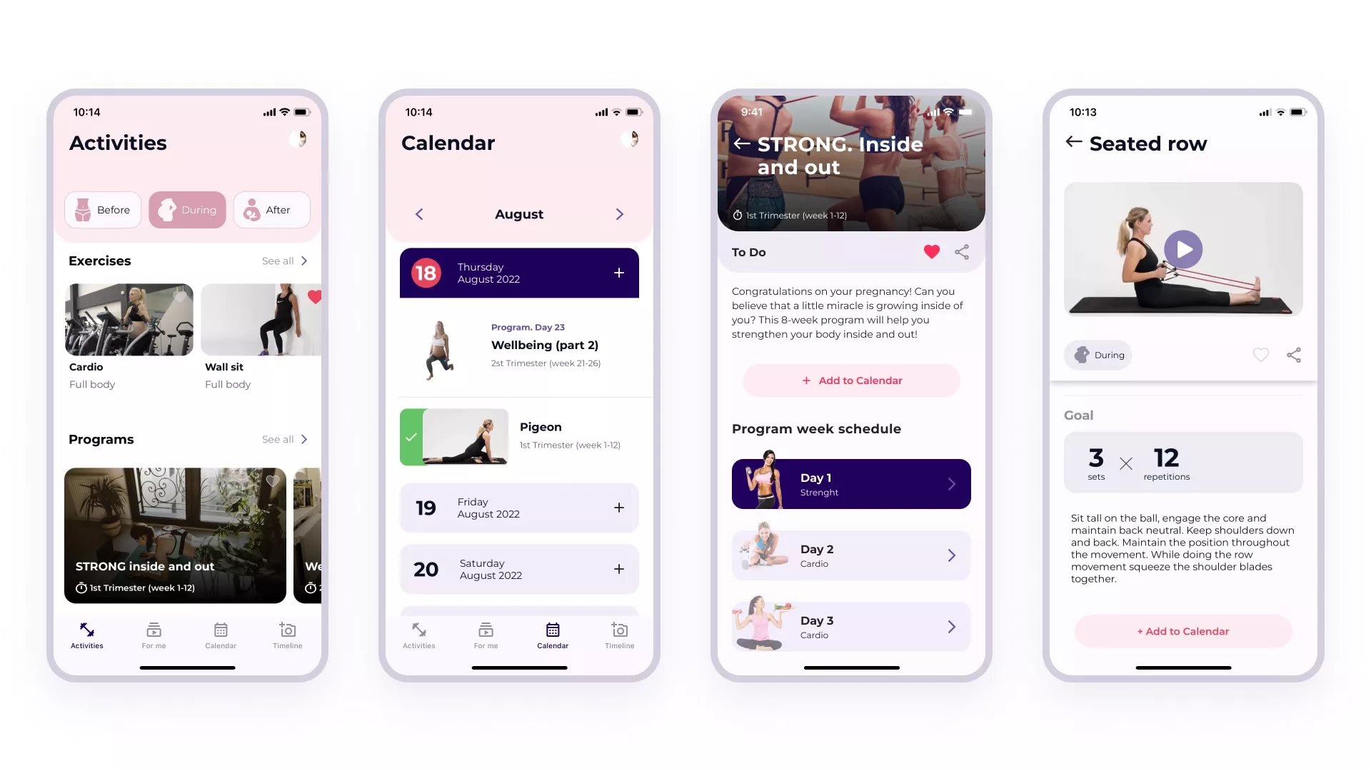
The client came to Stfalcon with a ready-made product, but the users complained about the confusing logic and malfunctions of the platform. After a thorough audit, it was agreed to develop the project from scratch, using a new design and modern technologies. So, our team managed to develop a user-friendly platform with a fresh design that satisfied our client and appeals to the target audience.

DreamTrak
DreamTrak is an app that combines homework management tracking for students and goal achievement management for everyone with a system of motivation and social approval. The solution allows recording daily thoughts and moods via video and audio.
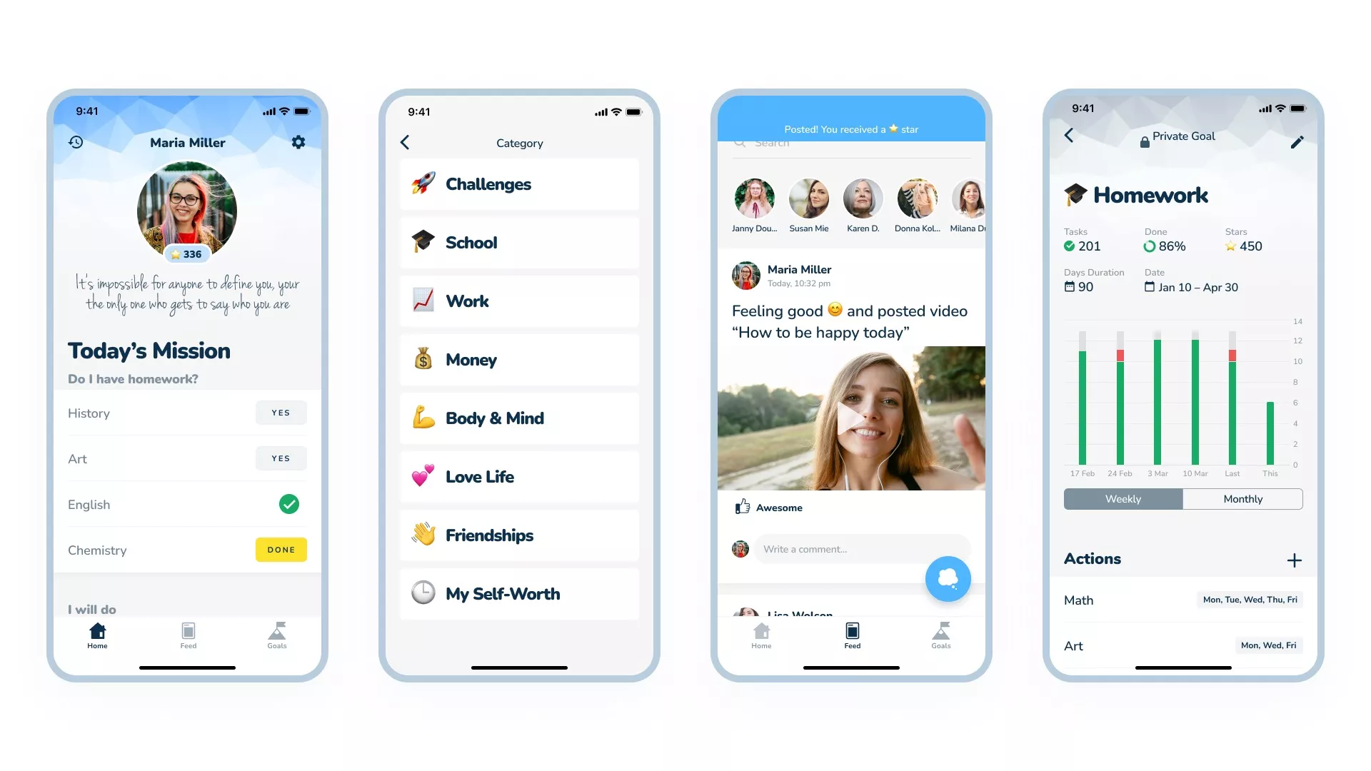
Since the Stfalcon team provided the full-cycle development for this, we provided UX and UI design services. It was crucial to research and understand the app’s target audience - teenagers. Based on their specifics, we decided to create a playful UI design.
TaskRunner
TaskRunner is a platform for ordering services, where the users are divided into two categories — executants (those who carry out the tasks) and posters (those who order services). Posters create and publish tasks, and the executants send requests to fulfill them. The poster chooses who will perform the task and pays for it.
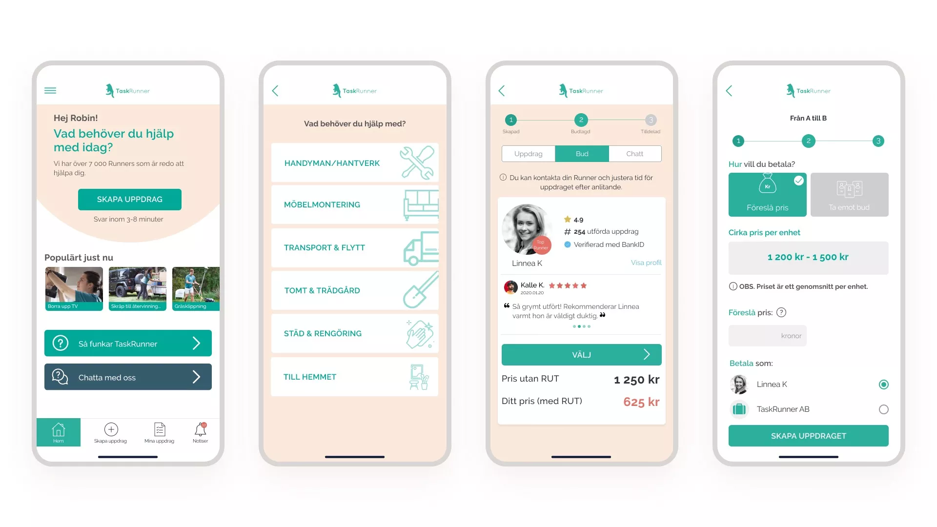
The client turned to Stfalcon with a developed application, but the users were constantly complaining about the problems and failures of the application and the admin panel as well. Stfalcon recreated the project from scratch, using the most advanced modern technologies.
All the system components were redesigned from scratch, and the operational stability of the product was improved, as well as the speed and convenience of the app and Admin Panel usage. We made it convenient and intuitive. What is important — all the users were preserved in the process of app redesign.

Whizzy
Whizzy is an items delivery service operating in the countries of the Middle East. The platform comprises two logistics apps: one for clients and one for drivers. The clients create orders and choose drivers who will carry out the order. The drivers look for the necessary items and fulfill the orders.
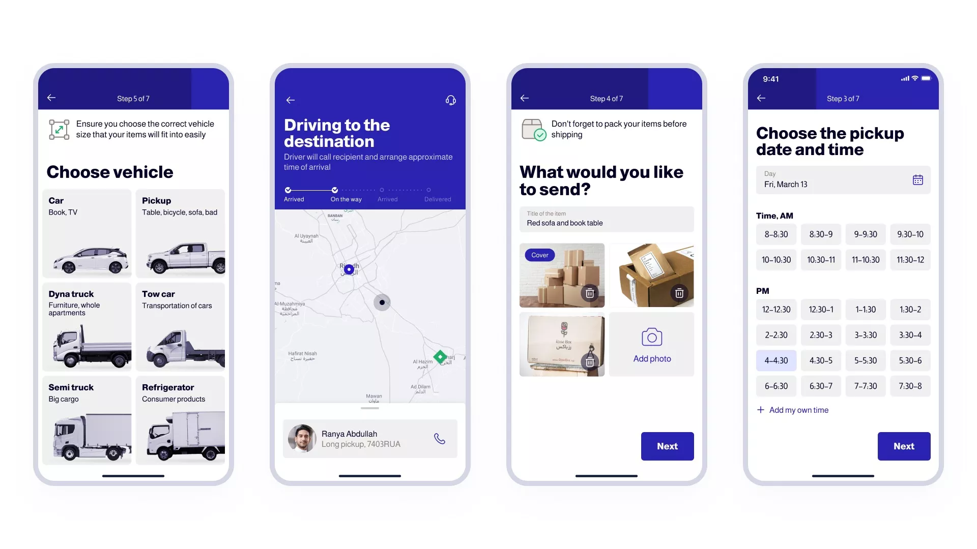
Carrying out the project for Whizzy, Stfalcon built IOS and Android mobile apps from scratch, so iOS and Android user interface design services were a part of this project.
Air Alert
Air Alert is our unique case because many people united after the war in Ukraine began on February 24 to create a complex technical solution as an alternative to the outdated street notification system. Such projects have been created for years, and we did it in a few days.
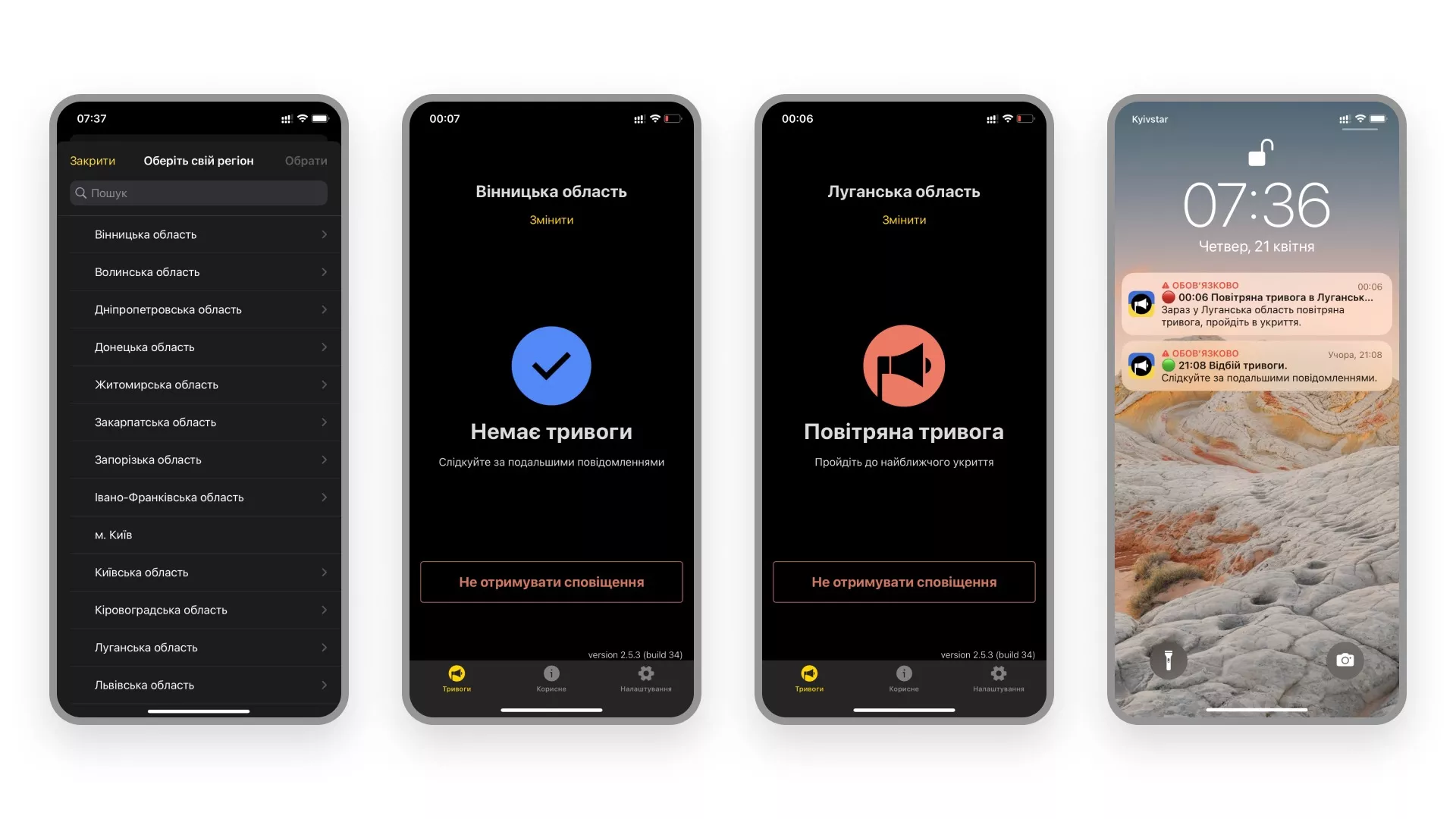
The first versions of the applications were created in a few days in cooperation with the Ajax team, with the support of the Ministry of Digital Transformation of Ukraine. The complete development cycle from understanding the need to the first release took 1 day (it was the 4th day of the war). On the 6th day of the war, we went into an official release, and the app counted 140,000 users. In a few days, all regions of Ukrainewill bee connected to the application, and now the number of users exceeds 11 million.
The design in Air Alert is minimalistic, and the lesson we took from this project is that even the very basic design can help save lives!
Conclusion: Elevate Your Product with Professional UI Design
As demonstrated by our diverse portfolio, a successful mobile app user interface is never accidental. It is the result of strategic planning, deep user research, and strict adherence to modern design principles. At Stfalcon, we combine outstanding visual aesthetics with flawless functionality to deliver mobile products that boost user engagement, drive conversion rates, and strengthen your brand's market position.
Your digital product deserves an interface that stands out and delivers measurable business results. Contact Stfalcon today to get a detailed consultation from our senior design experts, and let’s transform your vision into our next award-winning case study.
To explore more specific details about mobile user experiences, look through our frequently asked questions below.
FAQ: Mobile App Interface Design
How can you ensure that your app's interface is intuitive and user-friendly?
To make your mobile app design UI intuitive and user-friendly, it's crucial to follow design principles that prioritize simplicity, clarity, and ease of use. Your first step should be to understand your target audience and their needs. Find out where users are having pain points and how they can be improved. You can do it through user research and testing. Keep the user interface design for mobile applications clean and uncluttered. Ensure the layout of the app is logical to guide users through its features. Making use of familiar design patterns and conventions that users are already familiar with minimizes the learning curve. Labels, icons, and visual cues should be consistent, clear, and easy for users to understand.
What design elements and patterns are commonly used in mobile app interfaces?
Common mobile user interface elements include navigation menus (such as bottom navigation bars or hamburger menus), cards or tiles to display content, swipe gestures for navigation or interaction, and floating action buttons for primary actions. Design patterns like Material Design(for Android apps) or Human Interface Guidelines (for iOS apps) provide established mobile app ui design guidelines for layout, typography, and visual styling. Additionally, micro-interactions, such as animations, feedback, and transitions, can improve user satisfaction in general and increase the responsiveness of the interface.
How important is consistency in the design of a mobile app interface, and how can it be achieved?
When thinking of how to design an app interface, keep consistency in mind. Consistency is crucial in mobile app interface design, as it helps create a cohesive UX. When elements like color schemes, typography, icons, and layout patterns are consistent throughout the app, it is easier for users to understand and recognize the interface. The result is a reduced cognitive load and a more efficient navigation process. To achieve consistency, it's essential to establish a comprehensive design system or style guide that outlines the rules and guidelines for various interface components. Regular user testing and feedback can help identify any inconsistencies or areas that may require refinement to maintain a seamless experience.