Cookorama is an online cooking community for foodies. Its participants share recipes, rate and comment them, friend each other and discuss food and cooking. Main feature of the community is step-by-step recipes with photo or video for each step.
We have created Android and iOS apps for the Cookorama community. They don’t copy website functions; instead, these applications offer a selection of the best and tastiest recipes chosen by the admins. New recipes are added regularly.
App Icon: Crafting a Recognizable Brand Identity
An icon is your chance to make a good first impression since it’s the first thing users see in the app store and after installing the app. That’s why it has to be recognizable and stand out. Simple form and bright colors will help users easily find your app in the app store and among other apps installed on their device. Apps with icons that aren’t standing out easily get lost among others and users forget about them.
For iOS we have put an icon into a standard shape. Android allows us to use any shape for an icon so we have used the shape from the website logo but turned it into a square. Chef’s hat was already associated with Cookorama community so we used it for the app icon as well.

Visual Strategy: A Warm Palette for an Appetizing UI

We used Helvetica Neue font-family that is in line with the overall style of the app.

We have chosen a special shade of red for a base color and added shades of brown and beige that match it. This color palette is quite bright, warm and together will all the tasty recipes gives users an appetite.
Home Screen: Intuitive Navigation and Content Discovery
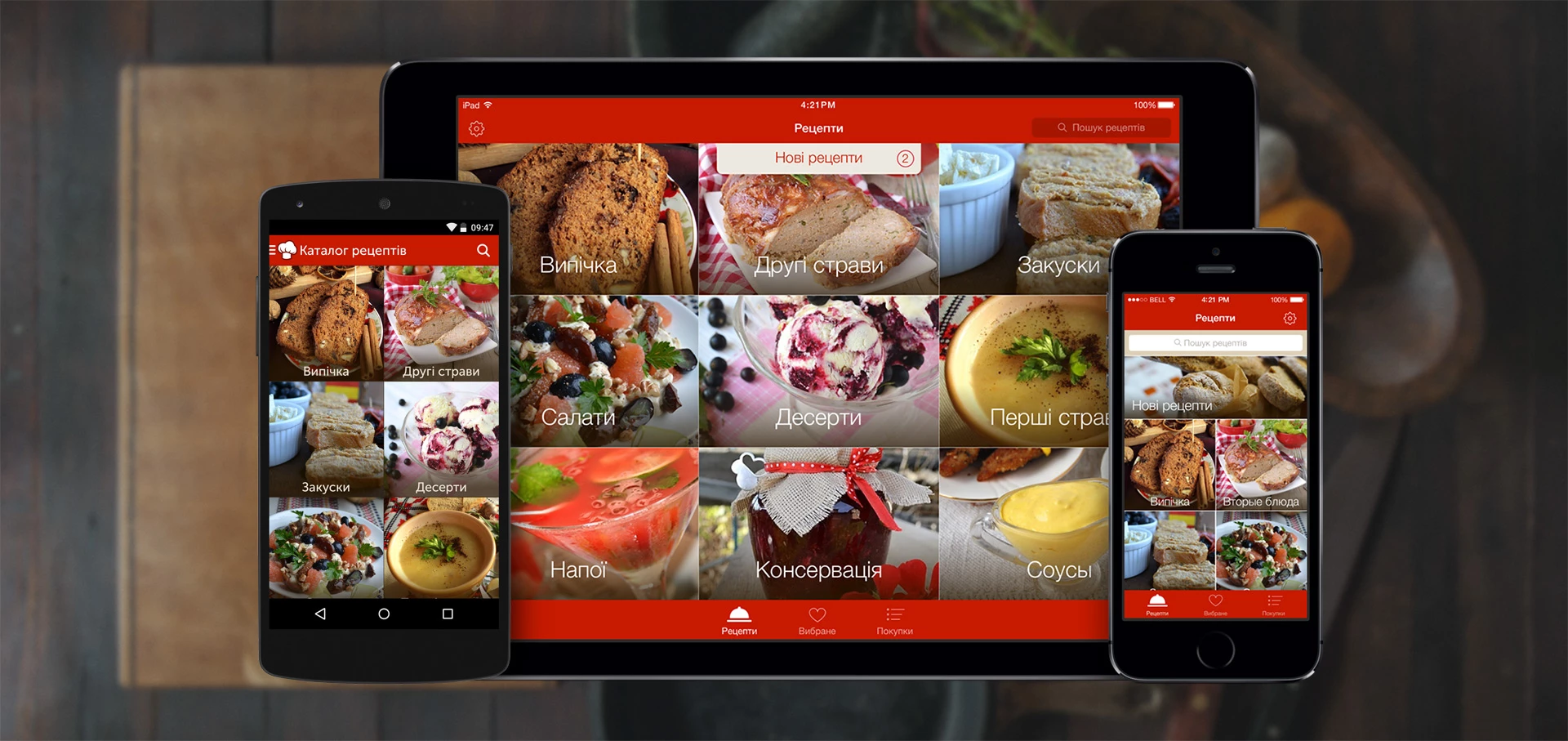
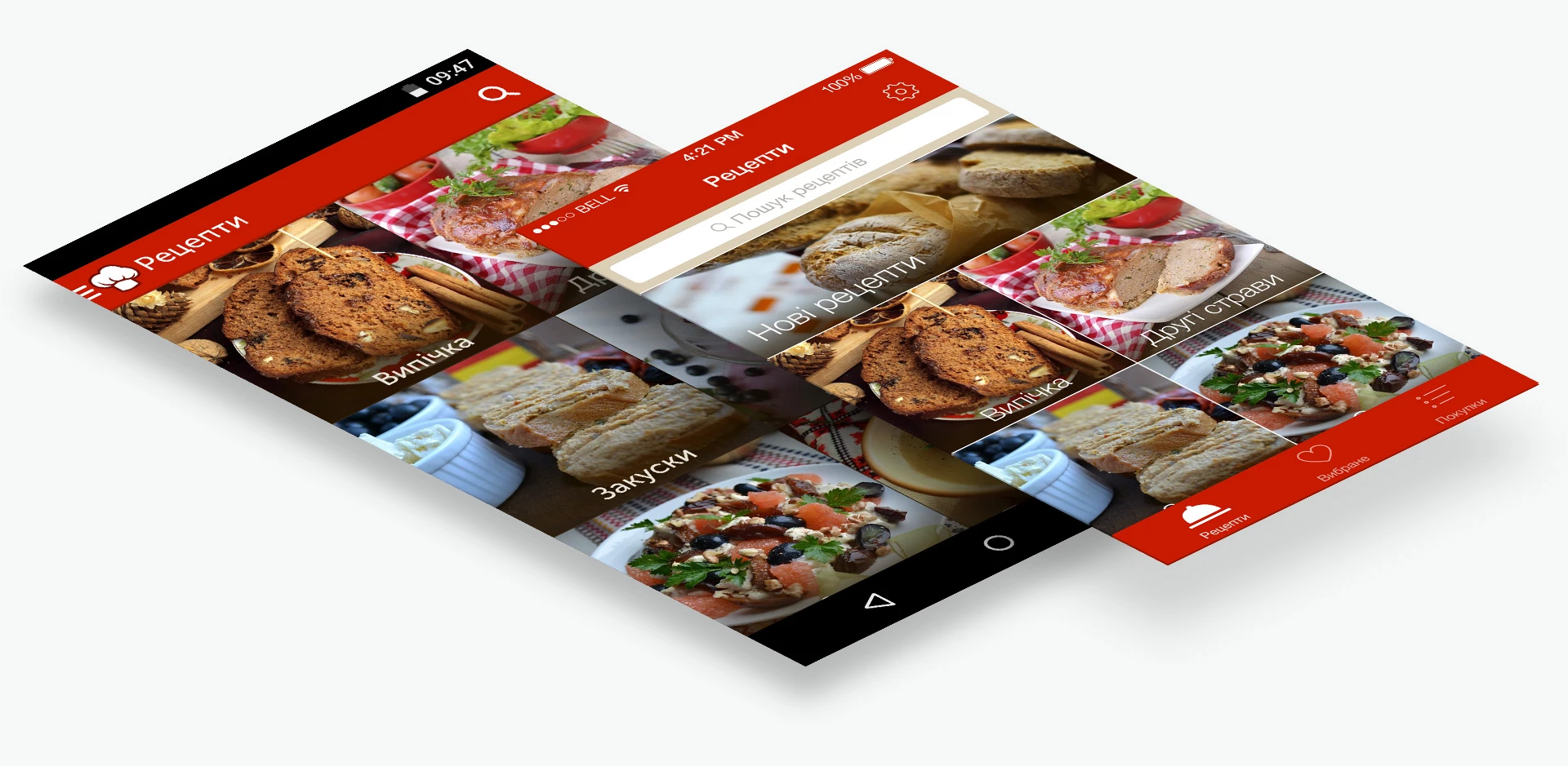
After launching the app, the, the user sees the main screen with navigation elements and recipe categories that take up almost the whole space. There is also a separate block with new recipes from all the categories for those who regularly check the app for new delights.
UX & Navigation: Adapting to Native iOS and Android Patterns
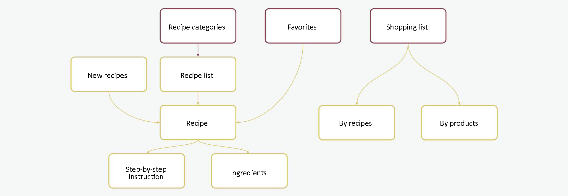
We have created the app structure that offers users the shortest way to any recipe. It’s important to take this aspect into account since it helps to retain users. The app makes use of mobile devices’ advantages over desktop computers and offers to create a shopping list with all the ingredients needed for cooking chosen dishes.
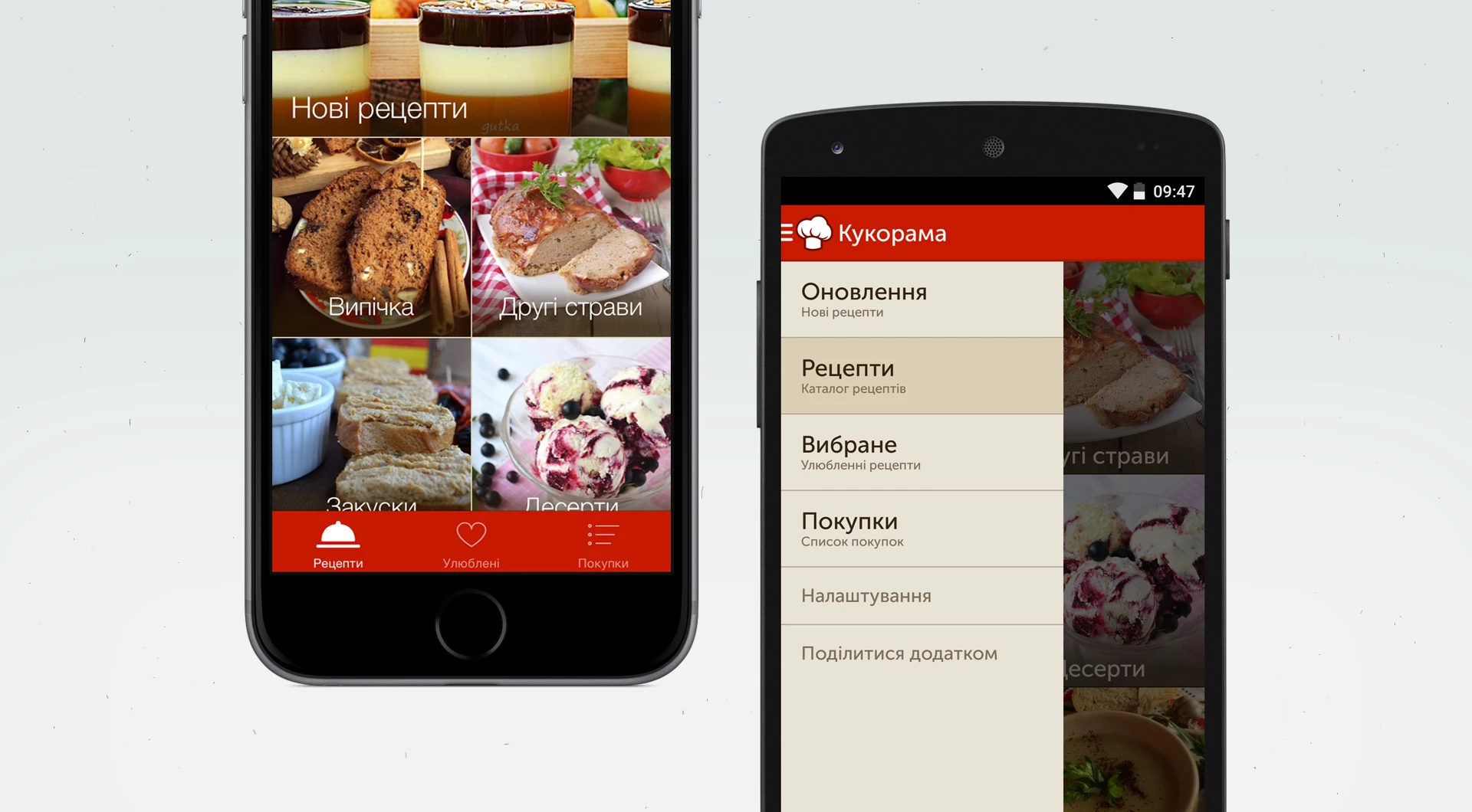
In iOS tab navigation is usually used while Android users are more familiar with a side menu. Following official iOS and Android guidelines and taking into account user patterns we created a menu that adheres to the requirements of each system.
Users can navigate recipes through categories displayed as a grid. Alternatively, a recipe can be accessed via list or favorites if it was added there earlier. Search can be conducted from the main screen or from a category.
Recipe detail screen: interactive step-by-step guide
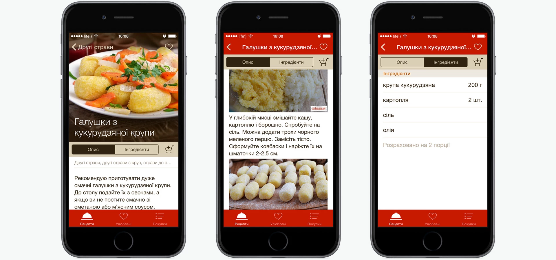
This screen solves the main user problem. Each recipe is a step-by-step guide with photos showing all the details of the cooking process. All the ingredients are shown in the list with an amount of each ingredient indicated near it.
In case users don’t have all the ingredients in the fridge, they can add products to the shopping list and purchase them later.
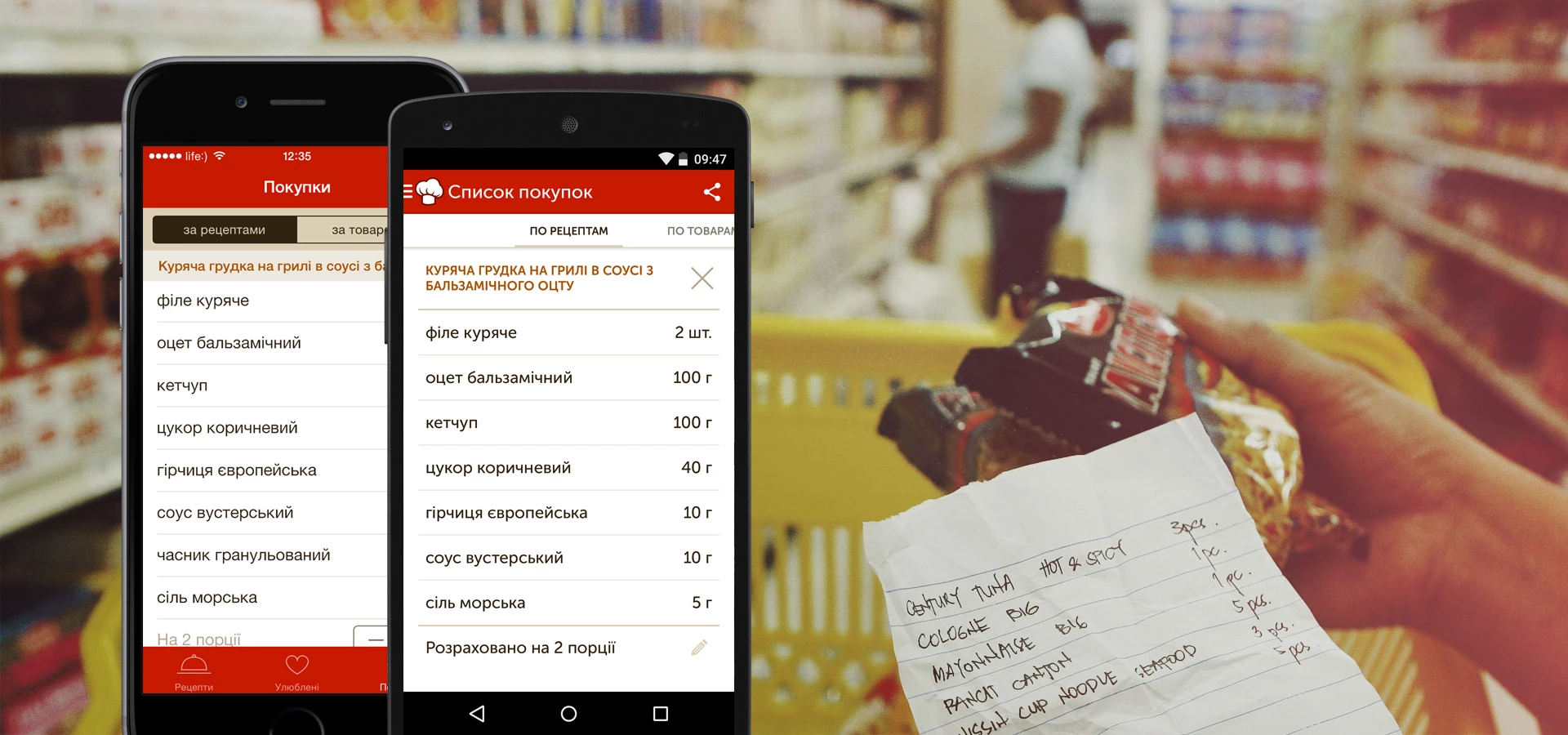
Shopping list
This screen helps to make the process of buying ingredients for the recipes easier. When ingredients from the recipe are added to the shopping list app adds the recipe to favorites for easy access. Shopping list is grouped by recipes and products. The number of products is automatically calculated based on the number of portions.
If ingredients from several recipes were added to the shopping list, the list is grouped by products and users can see how of much of each product they need. Products that are already bough are checked out. Shopping list can be sent via SMS or email.
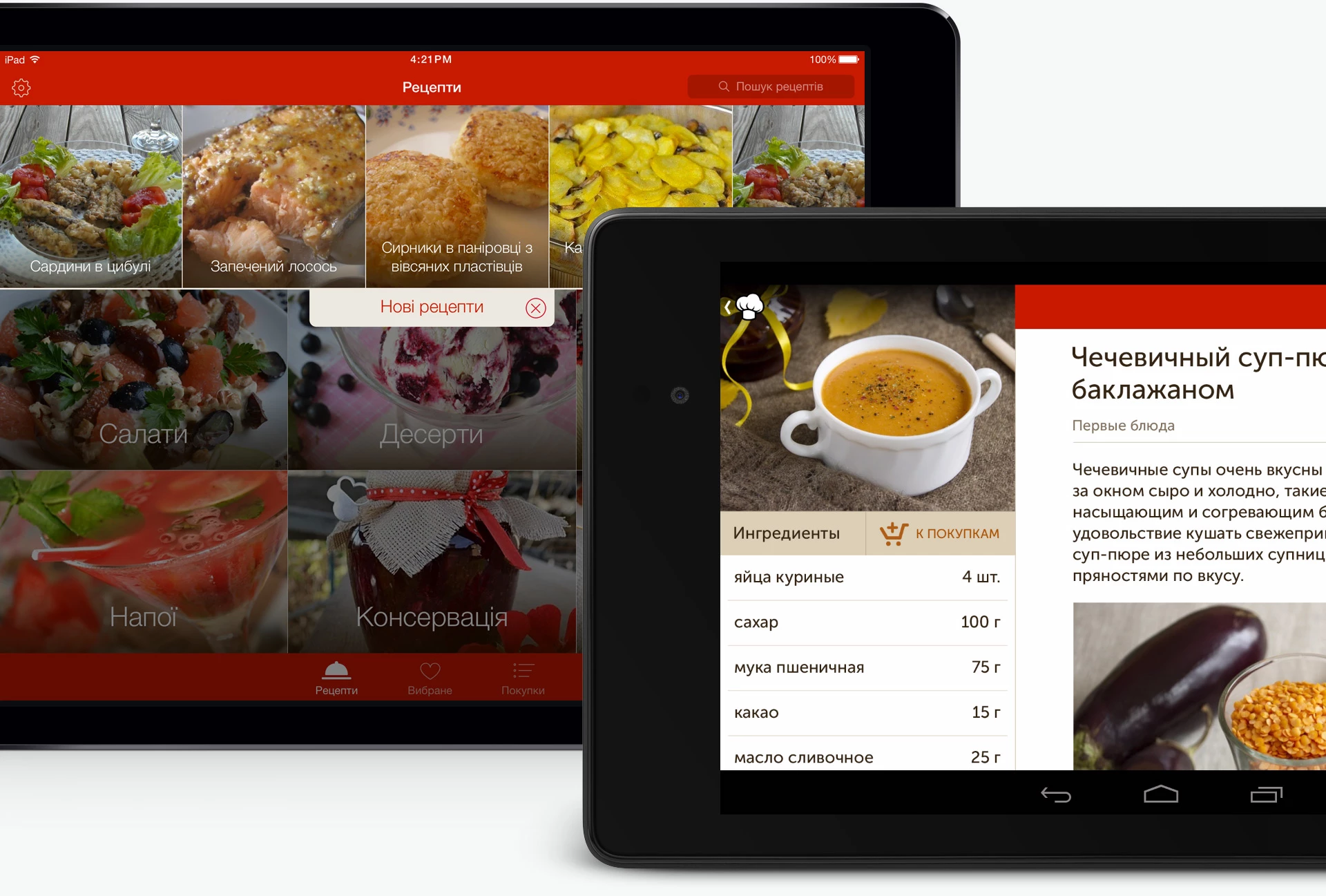
Adaptive design: optimizing the interface for tablets
After launching a mobile app we decided to create a separate design for tablets. We improved category and recipe list but the recipe screen underwent the biggest change. New recipes appear in a pop-up block on the main screen. Thanks to bigger screens recipe description and ingredients that were previously put on separate tabs are now displayed on the same screen. User can read recipe description and simultaneously look through the list of ingredients required to cook the dish.
For 7-12” Android tablets we implemented several layouts with elements being displayed differently depending on the screen size.
App development details
We made iOS app universal by using two UIStoryboards for iPhone и iPad. Android app was divided into fragments for development purposes, that’s why it was easy to implement several variants of layout for screens of different size. And thanks to AppCompat and Support Design libraries all layout elements look identically on various versions of Android OS. We used graphics caching mechanism to created galleries with smooth scrolling for iOS devices.
At first we relied on Robospice library for communicating with RestFull API of the server but later thanks to the flexible app architecture we have moved to the more modern Retrofit library. To implement API for communicating with server we used AFNetworking framework that is popular among iOS developers.
App allows users to download recipes on the device and view them offline. We used SQLite database for storing data in Android. Local Core Data solves this task for iOS devices, not forgetting about shopping lists that can be grouped by recipes and product categories.
For sending daily updates on the new recipes to Android devices we rely on Google Cloud Messaging. In Apple products we use native APNS technology for Remote Push Notifications delivery.
Cast:
 Stepan Tanasiychuk
CEO & Founder
 Oleg U.
Designer
 Maks
MaksDesigner
 Oleksandr
Android Developer
 Anton
AntonAndroid Developer
 Konstantin Kolesnik
iOS Developer
 Sergei
iOS Developer


