imbi — Discovery Phase for a Networking App That Allows Users to Meet Instantly

Task: Overcoming the Digital Barrier to Real-Life Interaction
Create an app with a mega cool and modern design with a simple flow to encourage people to meet in real life and throw their phones away. At first glance, the application has entertainment purposes, but in fact, we solve serious problems such as:
- People began to communicate less in real life and became afraid of dating offline in person
- People focus on working life more to live more decently
- Remote work due to the coronavirus pandemic
- The pressure of society and the imposition of a type of social behavior
- Inefficiency of dating apps, as very often people are not who they seem to be online
- Lack of an appropriate application for the friendship only
Solution: The Discovery Phase
The client came with specific ideas and a superficial flow. But we suggested starting with the discovery phase to study the problem and market situation in detail.
The Discovery stage consisted of
- Lean Model Canvas
- Customer journey map
- Prototypes of the main user flow
- User Stories
- Estimation
Key Product Decisions to Drive Spontaneous Connections
- Create a modern application design that will promote a friendly atmosphere
- Offer a list of famous meeting types
- Provide an opportunity to plan meetings quickly, easily, and affordably, immediately at the desired location
- Planning which takes no more than 3 minutes, to have great time management
- Spontaneity - provide an opportunity to plan meetings spontaneously (half an hour before the meeting starts)
- A good interface and clear UX - encourage users to take the first steps
- Use filters to provide a list of users with similar interests
- Move away from dating app ideas, and create a space for communication and exchange of emotions.
Experience Design
Lean Canvas: Identifying Market Advantages & Monetization Paths
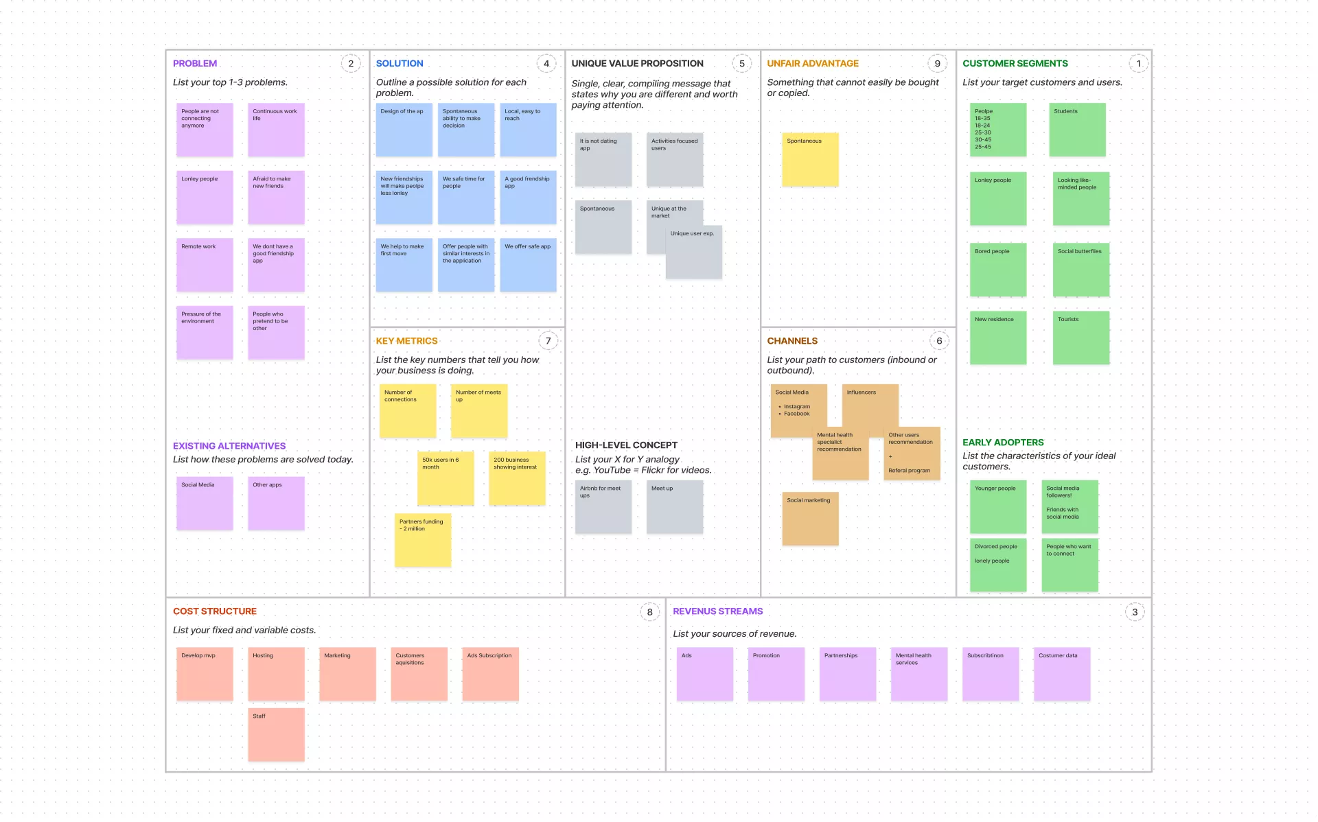
During discovery, we completed the Lean Canvas with the client to gain a deeper understanding of the product. This made it possible to focus on problems, solutions, key indicators, and competitive advantages. We paid particular attention to the study of competitors since there are many Dating apps on the market. We determined the advantages of our application and thought out strategies for product monetization.
Customer Journey Map: Modeling Seamless User Interaction
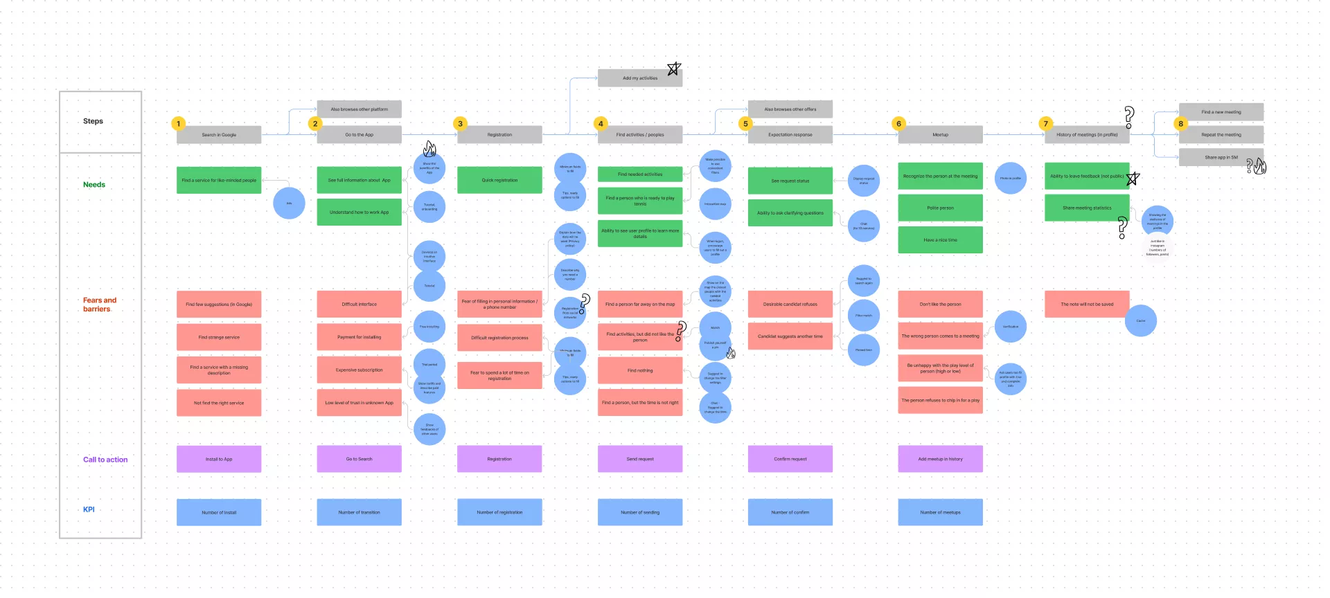
To understand the client, you need to place yourself in his shoes. We created two proto-personas, each of which had its scenario. The user who creates the meeting and the user who responds to the meeting. According to these scenarios, a user map was developed.
The First Scenario: Spontaneous Search for Sports & Hobby Partners
A user (Anna) whose planned tennis game was interrupted - at the last moment, the partner refused to play. We urgently need to find a new partner. Anna opens the application and creates an activity, choosing the type of activity, place, time, and comment. Then she waits for someone to respond. After the meeting itself, the user leaves a review.
The Second Scenario: Socializing & Finding Friends in a New City
Oscar recently moved to another city. He wants to get to know the locals and make friends as soon as possible. Oscar finds the application through a search service, quickly registers, and creates activity in a coffee shop near his home. Users of the application who are nearby can respond to his activity. After the meeting, Oscar leaves a review of the meeting and can view past meetings in the archive. Also, through the archive, Oscar can make an offer to repeat the meeting.
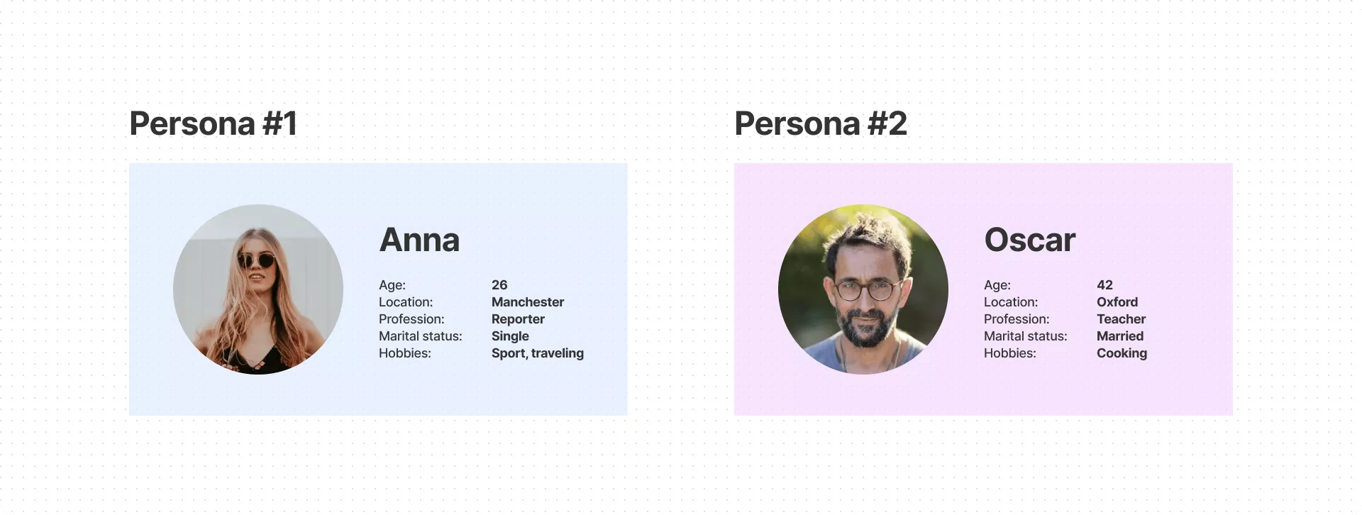
A customer journey map enables us to understand the stages of the user's journey, to determine the needs and problems (fears and barriers) of each of the parties, and to put forward hypotheses for their solution. Also, each step provides calls to action with a transition to the next step.
Figma Prototyping: Validating Ideas Through Corridor Testing
Based on the research results, a prototype of the future application was created in Figma. In the prototype, the main screens of the application were displayed without deep detail and with the ability to go through the process of creating a meeting or responding to a meeting from start to finish.
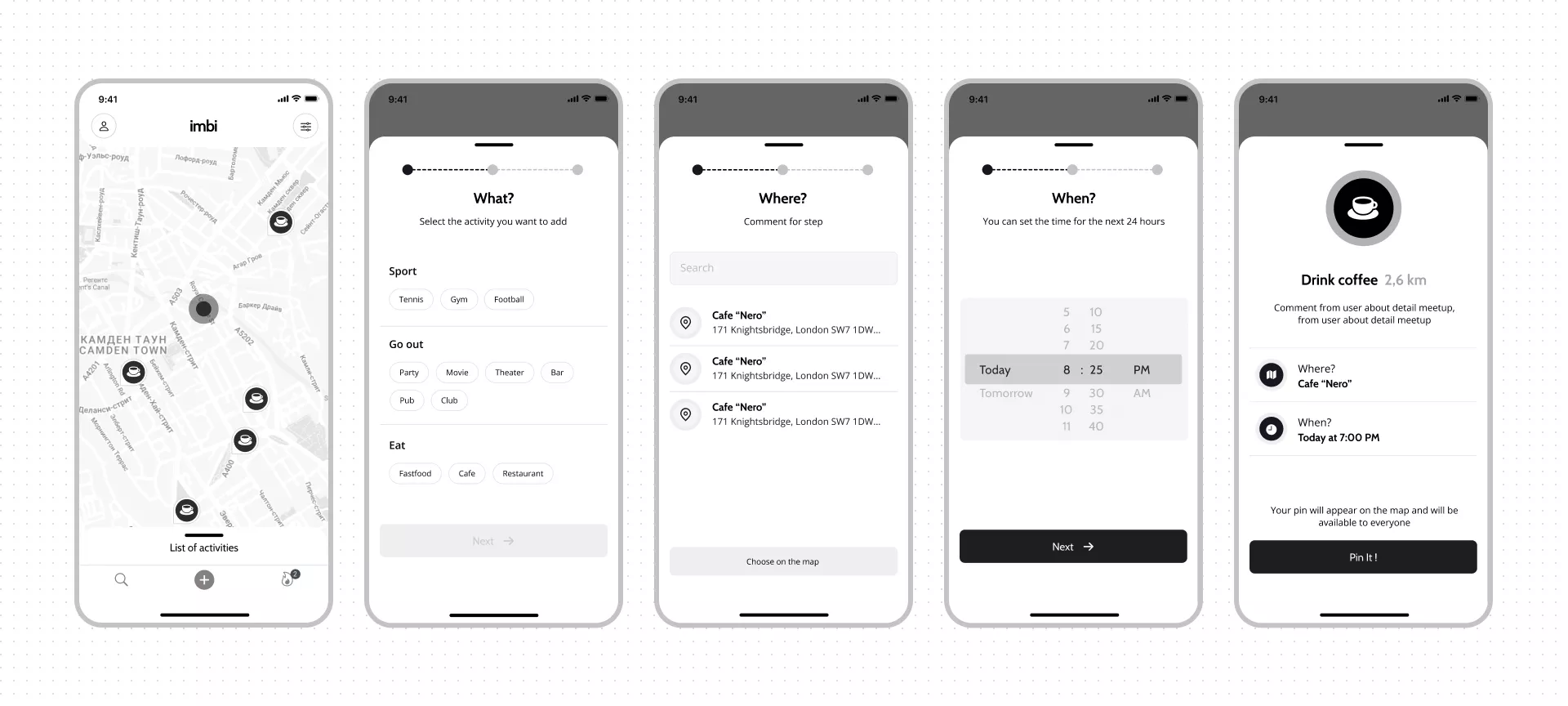
Other branches of the application were also prototyped, such as leaving a review, viewing and editing a profile, and using filters to display search results. The prototype made it possible to carry out testing, during which minor errors were detected and corrected.
Next, User Stories were written, and an estimation of development was made.
Result
From one idea, we got exact business and functional requirements and a well-thought-out flow. We studied the market and competitors. Prepared the basis for the design and evaluation of future development.
Cast:
 Vadym
VadymDesign Team Lead
 Viktoriya
Project Manager
 Oleksandr K.
Flutter developer
 Hennadii
Backend Developer
 Oleksandr
СТО
 Anton
AntonQA
 Yuliia
Account manager

