Interface design for Credit Agricole payment kiosks
Credit Agricole — is the biggest French bank and one of the French biggest companies. An extensive branch network and assets allow us to consider the banking group the largest in France and one of the largest in the world.
Task
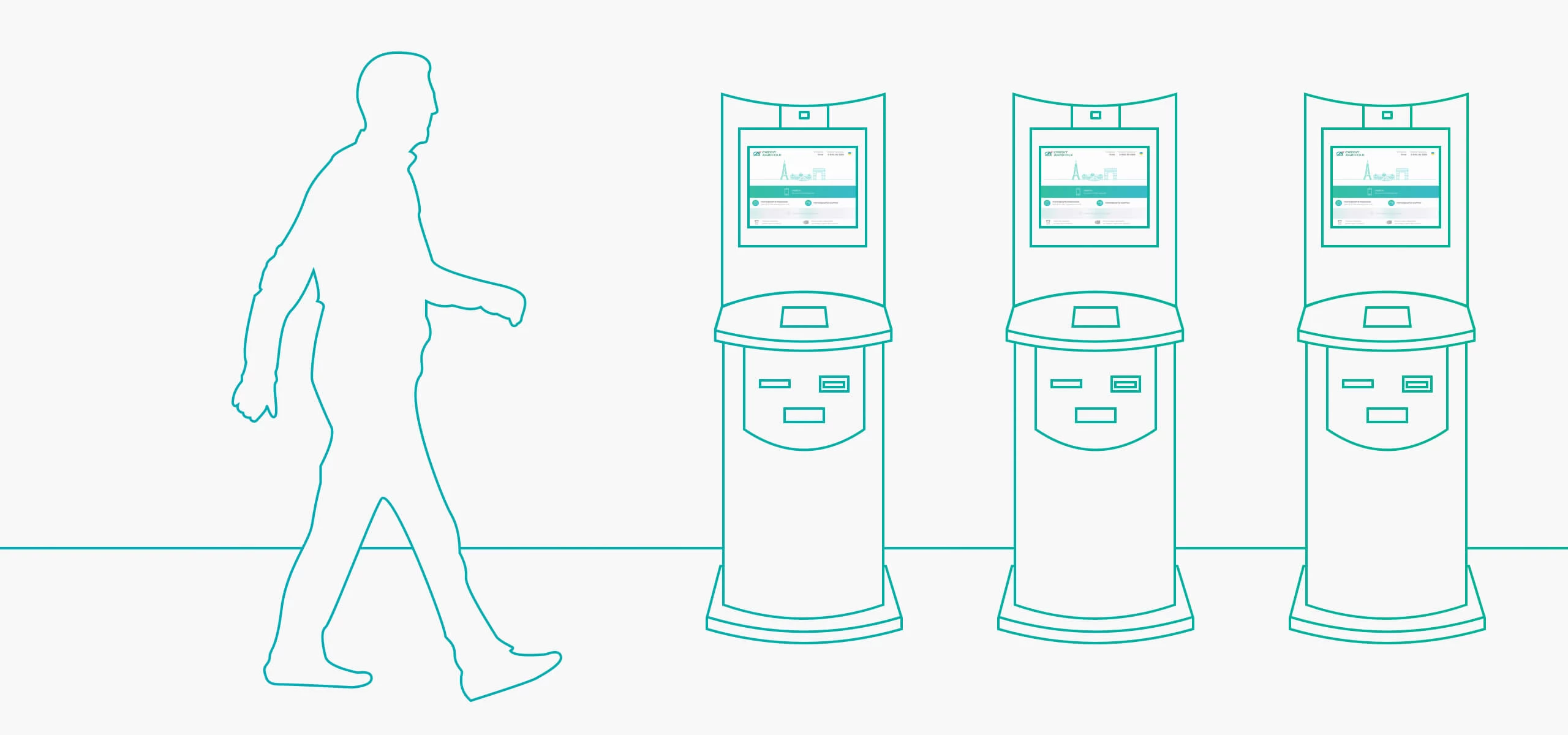
Our team had a task to develop an interface design for Credit Agricole payment kiosks.
The main task of such kiosks is to release the bank offices of queues and relieve cashiers of some work. That’s why the kiosks must be as simple as possible in operation even for the most unsophisticated users.
— The main difficulty was the technical limitations associated with the framework used to develop the final product and certain overall restrictions on the size of the screen.
Alexander Kononenko, Designer
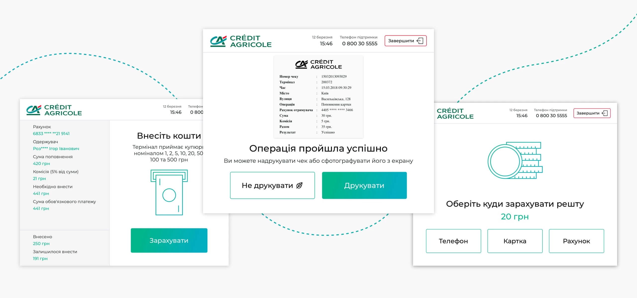
Main principles
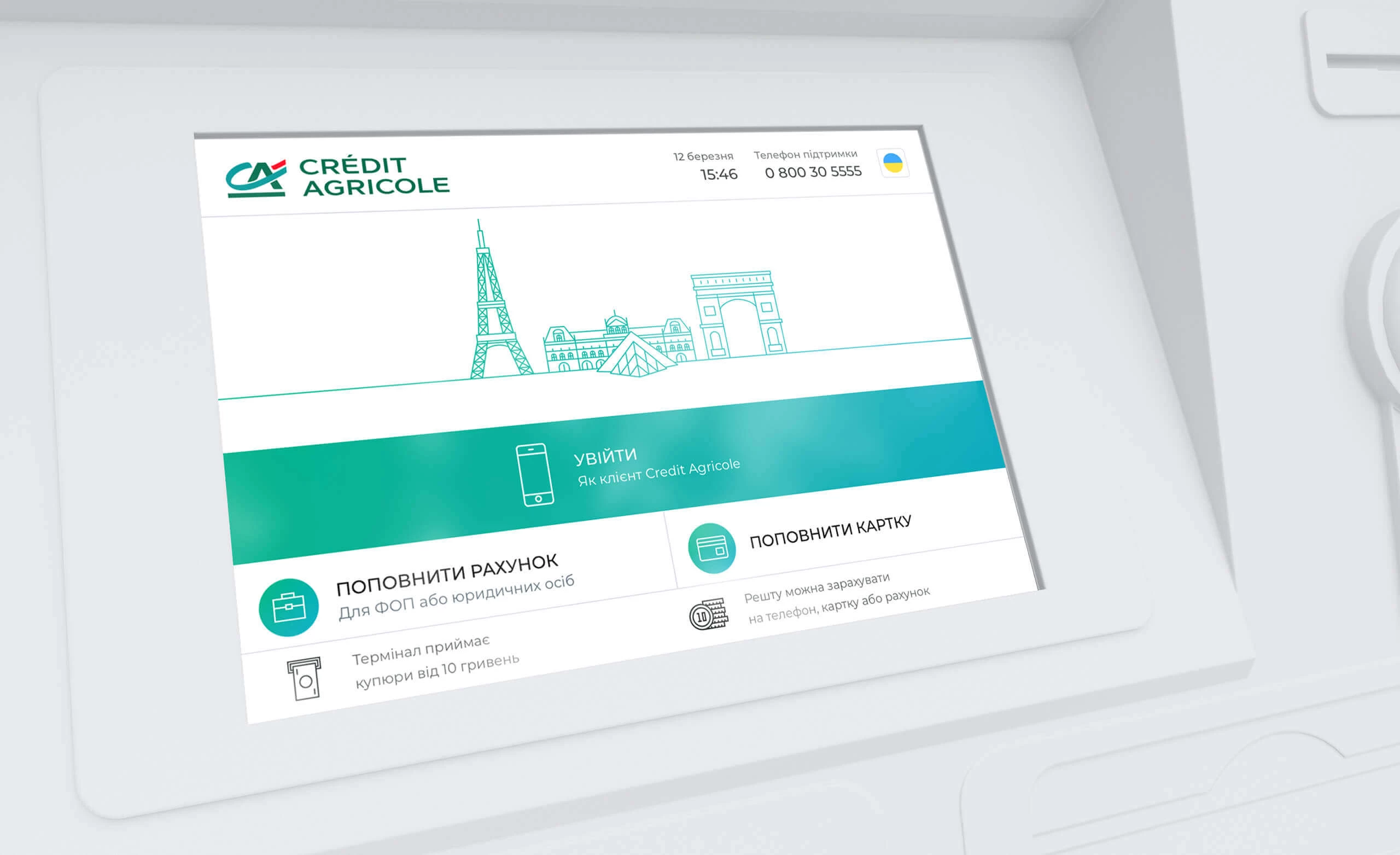
Since payment kiosks have touch-sensitive screens with relatively low resolution capability, when crafting the interface design, we tried to make all the interactive elements rather large. So it’s convenient to operate them with fingertips.
At the same time, we had to strike a balance between the elements’ size and the content scope displayed on a single screen page.
When choosing the colors, we used bank corporate colors as a basis. It allowed us to be flexible using contrast and to make the most important page elements stand out.
Structure
There are two kiosk users types: the clients of the bank and the users, who are not Credit Agricole clients.
For the bank customers, we implemented the possibility of user authorization through the telephone and the extended list of services. Noncustomers have quick and hassle-free access without authorization to the most popular services like topping up, cash deposits and some others.
The services for independent entrepreneurs are listed separately.

Cash Operations
Among the other issues, our team has developed detailed operating scenarios for various cash operations while payment services of different kinds.
Depending on the type of service, there are several possible variants:
- Cash deposits without change,
- Cash deposits with change depositing to a mobile account,
- Cash deposits with change depositing to a bank account.
Depending on the service type, the fee for the operation performed may be displayed on the screen.
Errors and notifications
Finally, we have developed the screens for all the possible errors and notifications.

Result
We implemented an intuitive interface, covering a large volume of functionality using concise solutions. As a result, we got a scalable system which is simple and convenient to work with.
Cast:
 Mariia
Project Manager
- Maks
Design Team Lead
- Oleksandr Kononenko
Designer
- Andrii Tkach
QA Team Lead


Other Case Studies
Logistics
Ukraine
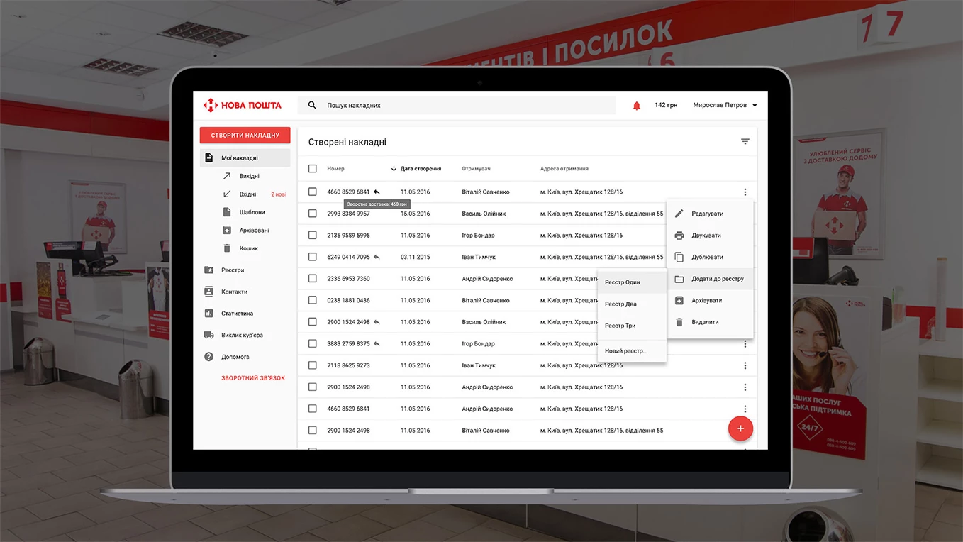
Nova Poshta — Dashboard
Personal dashboard design for the leader of express delivery
E-commerce
Ukraine
Nova Poshta Shopping V2.0
Redesign of the site for a delivery service
Logistics
Ukraine
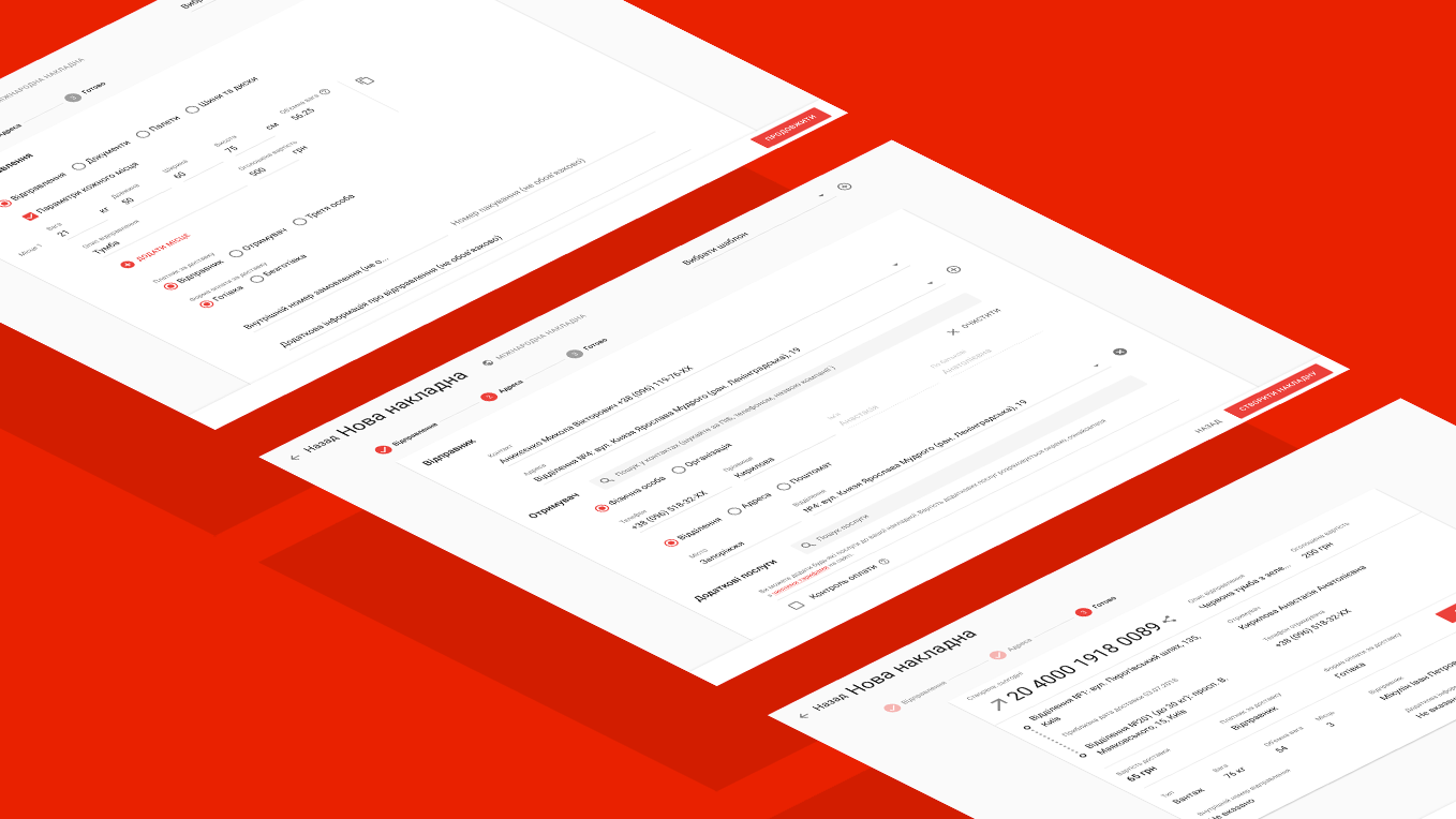
Web Document Creation Form in Nova Poshta Personal Account
A new way to work with packages.