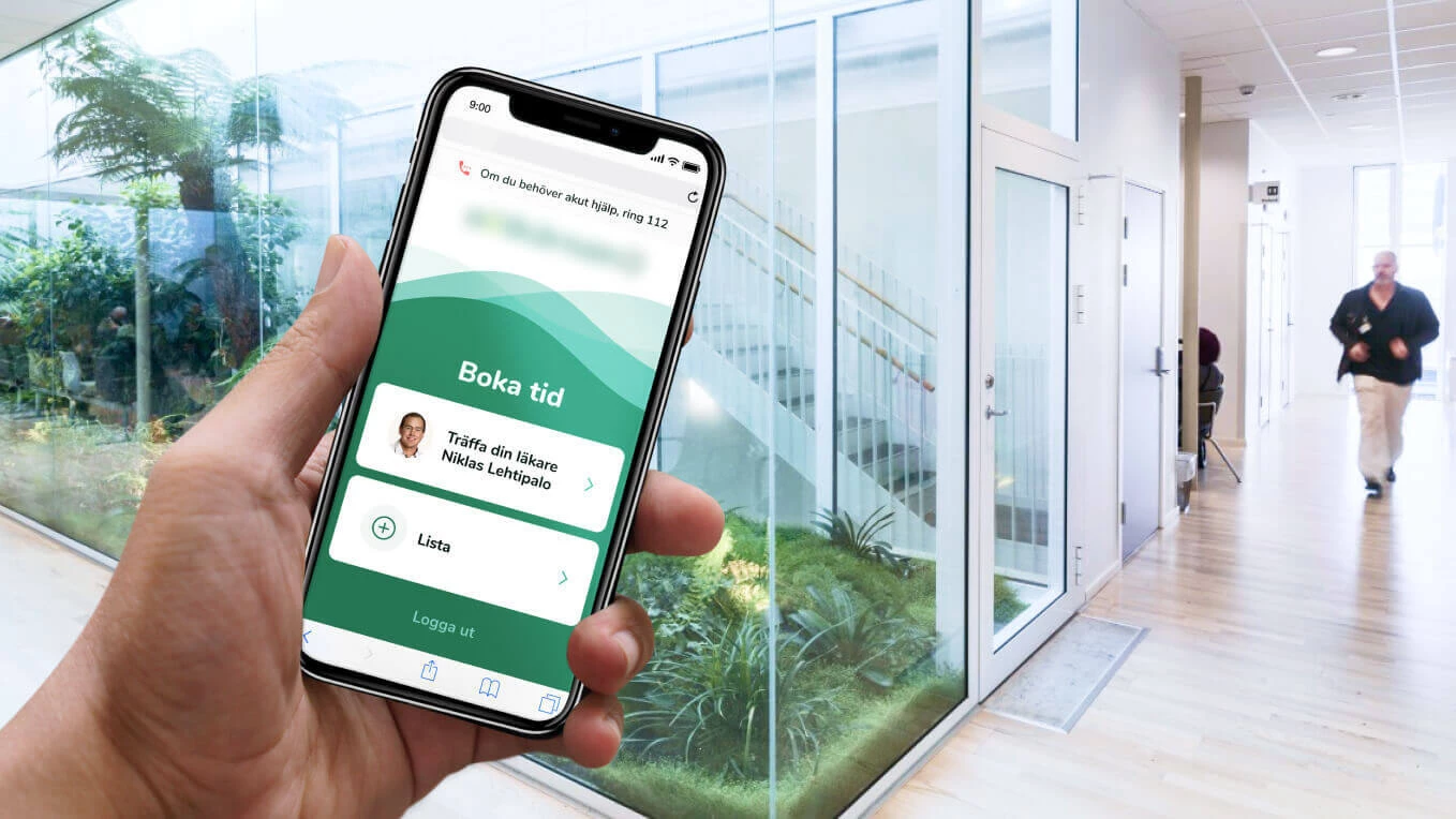
The project goal was to create a mobile app for a service that helps people to make appointments with doctors. Doctors can set up profiles and receive notifications when somebody has booked an appointment with them.
We created UI for a mobile app used by patients, designed iOS and Android versions, and developed high-performance native applications based on the validated UI/UX.
Design and Prototyping
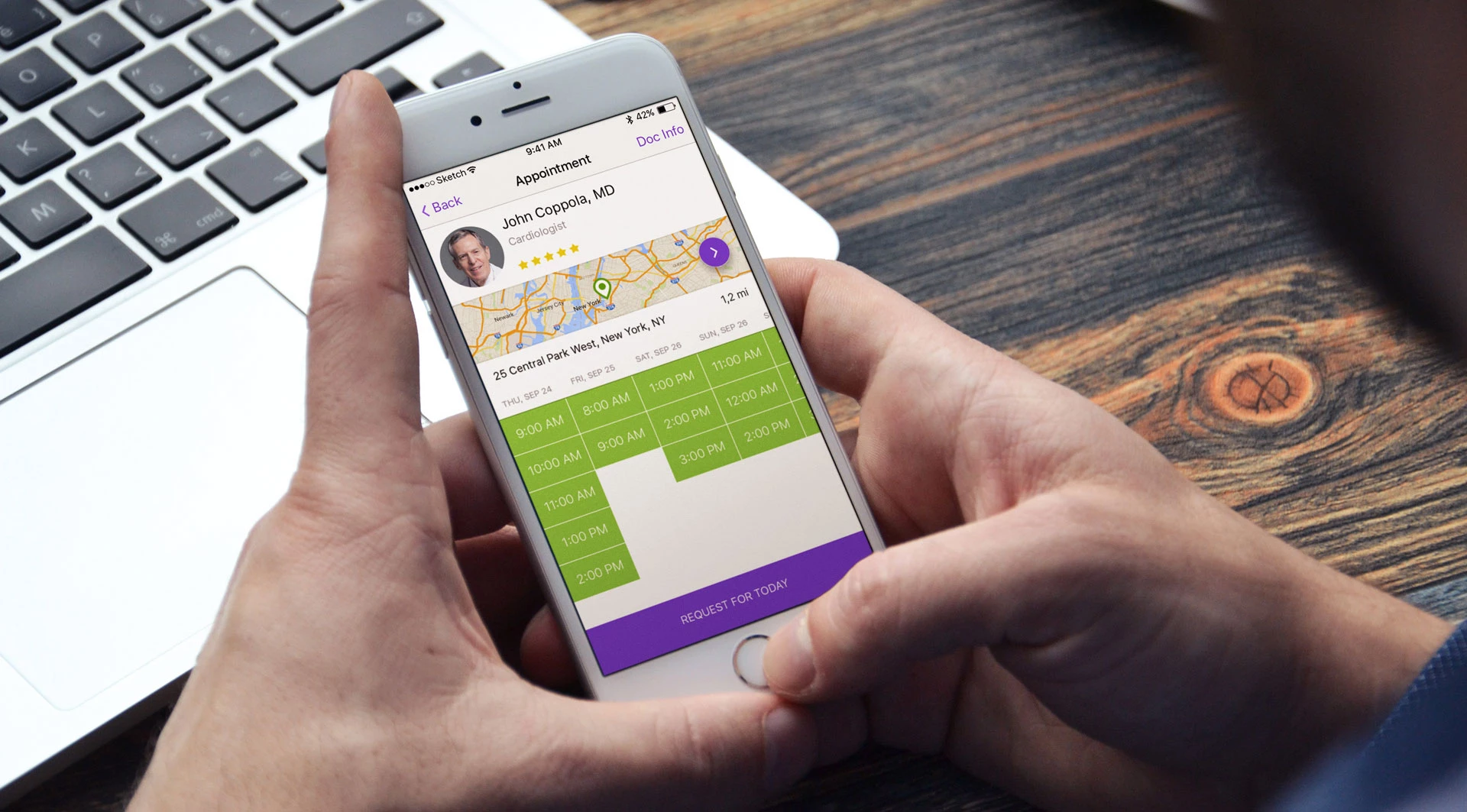
Customer provided detailed user stories, which allowed us to quickly start working on the prototype of mobile interface. We had conducted consultations with the client (who has expertise in the field of medical professional routines) as well as with his back-end team to create smooth experience for patients. Complying to all the procedures while providing a clear and easy-to-use interface was a challenging task. But after working out a vision and creating a list of all the necessary features we have successfully built an interactive prototype.

Interface Validation: Corridor Testing & Lookback Session Analysis
After the prototype was ready, we conducted user testing. The goal of this process was to check whether the interface is well-understood by the end users. By conducting user testing on early stages you can make changes to the interface without bringing in the developers which saves time and resources.
We conducted an advanced variation of corridor testing with studio employees as participants. Since the app is aimed at all active smartphone users, it was a justified choice. For testing we have prepared several scenarios describing user actions. Testing itself was recorded using InVison prototype integration with Lookback. We have recorded 16 sessions.
First scenario: New User’s Journey to the First Appointment
The first thing we checked was how user who is unfamiliar with the system would go through the process of making an appointment. In this scenario a person was looking for a doctor, choosing time of an appointment and registering for it.
Second scenario: Booking an Appointment for a Family Member
In the next scenario we assumed that the user is already familiar with the interface and needs to perform the same actions but make an appointment for another person, such as a wife or a husband.
Third scenario: Flexible Management of Records & Reminders
With this test we checked how users would be editing a record created earlier. Mobile app allows users to add notification about an appointment into their device calendar, change appointment date and request an early appointment.
UI Design: Universal Navigation & Visual Clarity for Medical Services
Based on the user testing results we created a report with problems users came across and recommendations on fixing them. This way we have painlessly introduced changes to the prototype and proceeded to designing the app.
Although the app was developed both for iOS and Android, we have chosen a universal solution for in-app navigation. Tabs allow us to keep all important navigation elements at user’s fingertips. But we hide a tab bar when we need a user to stay on the important screen, for example when creating or editing an appointment.
Booking an Appointment: Filtering by Insurance, Location, and Available Slots
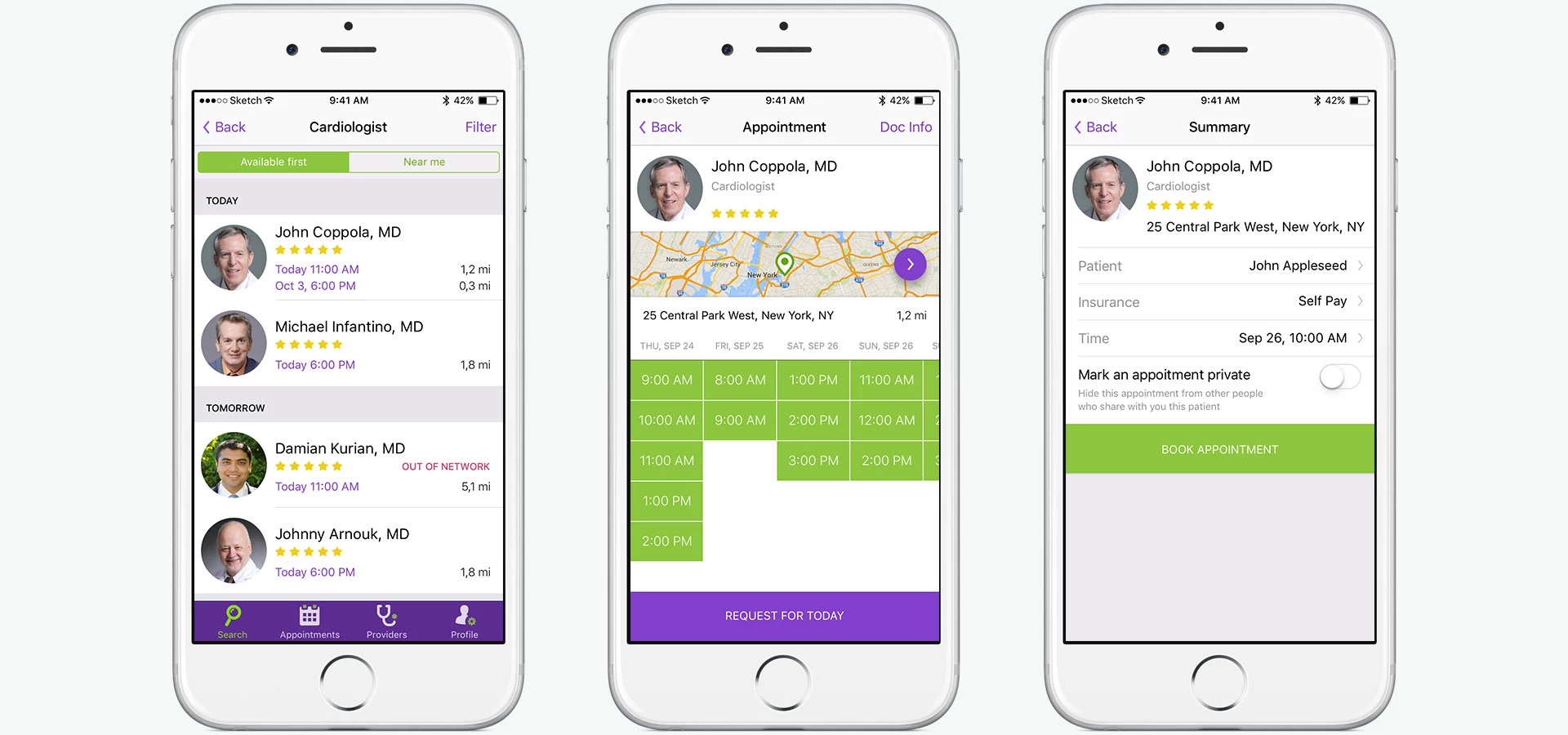
The process of booking an appointment starts with choosing insurance type and looking for doctors based on their specialization. Search results are sorted by the nearest time free for appointment and doctor location. On the appointment creation screen there’s a calendar with slots available for appointment sorted by doctor location. On the confirmation screen users can edit their data and confirm appointment booking.
Native Development: Implementing Complex UI Components for iOS & Android
For building user interface in Android we used native libraries with reverse compatibility that allow developers to implement the newest approaches towards both displaying and optimization of the UI. Using them we created single interface for various versions of Android OS.
Following the requirements of Google guidelines we implemented animated transitions between the screens and communication patterns for lists. Some of the design elements (such as a calendar and a radar progress bar) were created from scratch which allowed us to set up the widgets very precisely.
When developing app for iOS we used some of the new features:
- UISearchController class for searching within available data, for example when looking for doctors from a list.
- UIAppearance class for specifying some of the parameters and styles (color, font, etc.) for UI elements before they are actually loaded. It saves time and prevents code duplicates since we specify the general style once.
- Refactor to Storyboard… — Xcode tool used for classifying and grouping screens with related functionality. It makes working with a large number of screens in the storyboard much easier.
In the iOS app we used only standard libraries and elements. It allows clients to avoid problems that might arise when using third-party solutions.
Cast:
 Maks
MaksDesigner
 Oleg U.
Designer
 Oleksandr K.
Android Developer
 Artem Kryshchuk
Android Developer
 Viktor
iOS Developer

