
Launching a dating app sounds exciting—until you realize how hard it is to get real traction. Users expect ease, speed, and instant gratification they get from Tinder. If your app takes too long to onboard users, lacks intuitive swiping mechanics, or doesn’t match people accurately, it’ll be uninstalled in minutes.
Tinder didn’t dominate the market by luck. It nailed user experience, scalability, and engagement through a swipe-first interface and data-driven matchmaking.
That’s where we come in. At Stfalcon, we specialize in developing mobile apps that are fast, intuitive, and scalable. With hands-on experience in building social and dating platforms, we help founders go from idea to launch without cutting corners. Here’s what it takes to build a Tinder-like app that actually stands out.

Essential Features of Tinder-like Dating Apps
Building your own Tinder clone dating app means replicating more than just swipe gestures. You’re designing an experience that feels fast, intuitive, and engaging from the very first tap. To get there, you need the proper feature set in place from day one. Below, we break down the must-have components, the core value features that drive user retention, and the enhancements you can roll out post-MVP to keep the momentum going.
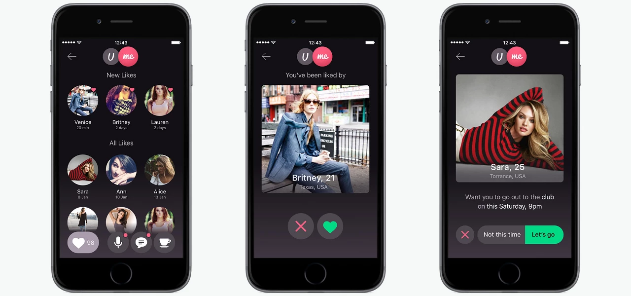
Prior to development, a sit-down or Skype call with your development team is required to clear all the details and discuss the structure of the app. Based on this information, technical documentation is prepared. For example, UME, a new Tinder-like app we’ve created has two sections U and Me, Search with various filters, Hot and Top lists, rating screen, date invites, text and voice messages available to users who swiped right on each other.
Basic Features
These are the absolute must-have features and components of a Tinder app clone based on the swipe mechanic. Without these, the app wouldn't function as intended, serving as the fundamental building blocks of user interaction and app operation.
- User Profiles – Name, age, bio, photos, and other basic user info.
- Swipe Mechanism – The familiar left/right swipe for rejecting or showing interest.
- Matching – Users can only chat if both sides swipe right (mutual interest).
- Chat/Messages – Simple, real-time text-based messaging once matched.
- Account Management – Sign-up, login (email, phone, social), and profile editing.
- Admin Panel – For managing users, reported content, app analytics, and moderation.
- Push Notifications – Alerts for new matches, messages, and key activity.
Want a web app that does more?
Let's build a solution that's smart, sleek, and powerful.
Alina
Client Manager

Let's talk about the most crucial features a Tinder-like app should have.
Registration
Facebook,Twitter and Google have already become three most popular quick registration options for many websites and apps for Android and iOS. Since people looking for a partner are interested in finding other genuine people, Facebook or other similar network popular in your country is a the best choice here. In Tinder alternative called UME we used both Facebook and VK registration options. But most Tinder like apps for Android and iOS offer Facebook as a single registration option. Only OkCupid app relies on email registration.
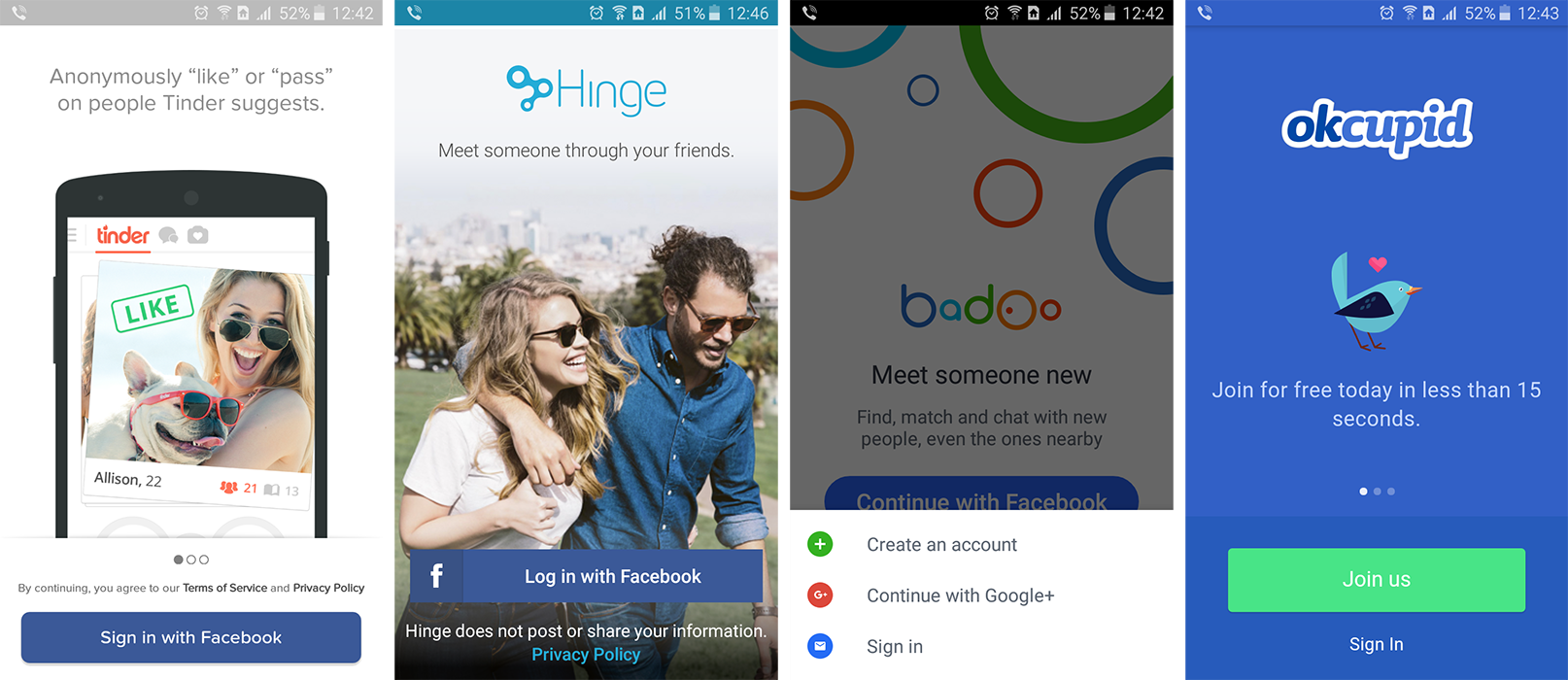
Our Android team has developed a handy SocialAuthHelper library for implementing registration via social networks.
User profiles
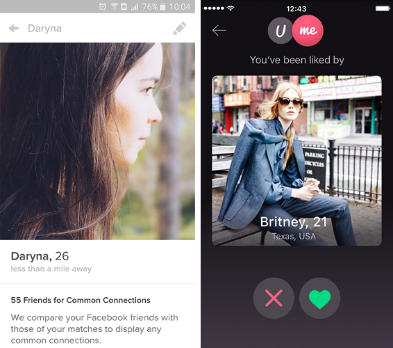
In the beginning of the online dating era such websites as Match.com, Plenty of Fish and OkCupid offered long questionnaires and a lengthy user profiles specifying everything from astrological signs to yearly income range. But nowadays, people read less and less, plus web has become more visual. So three main components of a user profile in a Tinder-like app would be:
- User photos
- Age
- Location (identified using GPS or data received from the Wi-Fi network)
Filters
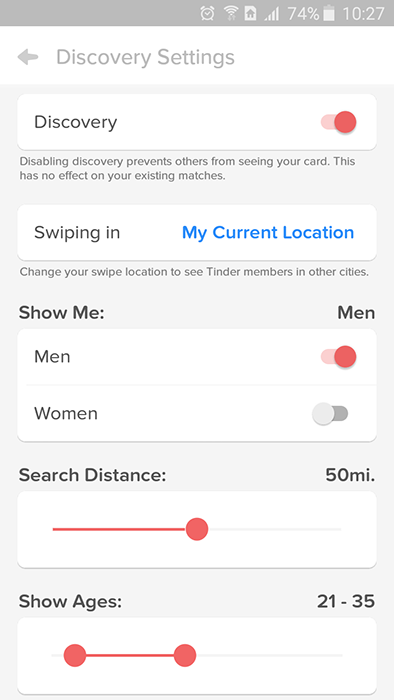
Instead of manually searching for potential dating partners, Tinder clones provide users with very simple filters (location, sex, age) and show them only candidates who match them. While users might not be able to find people who are into their favorite movies this way, they are enough for initial screening:
Since starting to use Tinder-like apps is so easy, they have a lot of potential to become a habit.
Matching
We decide whether a person is attractive or not in seconds and Tinder used that common knowledge to create a simple algorithm: swipe left if you don’t like person’s photo and swipe right if you are into it. As simple as that, your mind decides and your fingers swipe. Only after two people have swiped right on each other’s photos, they can chat. This approach eliminates a confusion when you are messaged by someone you’re absolutely not into and provides more safety and privacy.
Here’s how swipe looks like in our UME Tinder-like app:
Realtime events
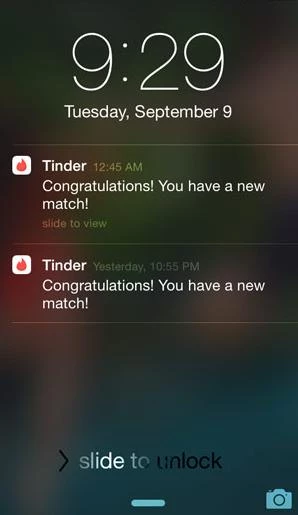
Era of email-like communications is long gone. FoMO or not, people want to be notified if something important happens. That’s why real-time events are a must-have for a Tinder-like app. When the user receives a new match or message, the server is notified, and depending on whether the user is online or offline, they instantly receive a push notification or email.
Paid features
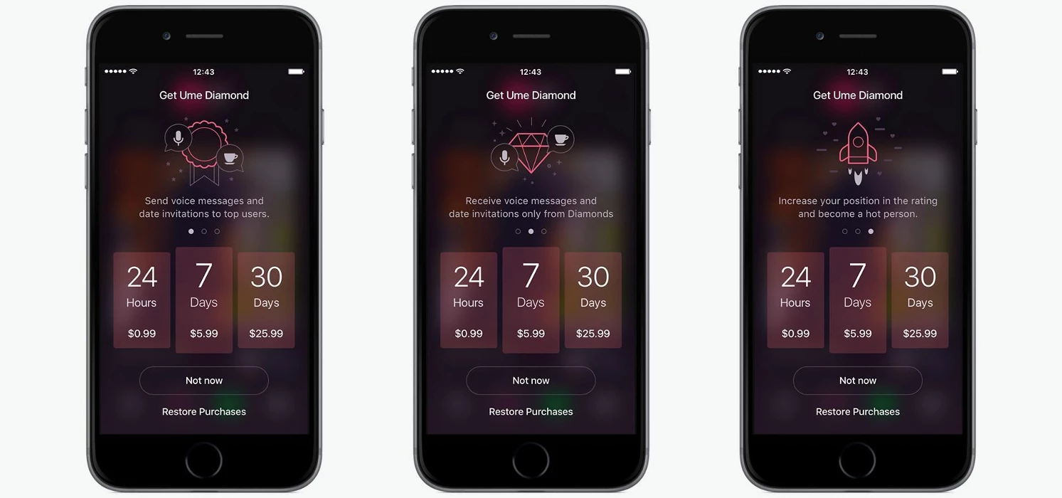
Different Tinder like apps provide different features to paid users. For example, Tinder offers:
- No-ads experience.
- Rewinding your last swipe if you accidentally swiped left on somebody you actually like.
- Changing your location if you want to meet somebody from another city or country.
- More likes (free users have about 100 swipes per 12 hours).
If your Tinder-like app has a rating feature, you can monetize it as well by either providing means to stay on the top of the list. Other apps like Tinder make messaging top users a paid feature.
Core Value Features
And then, above and beyond the must-haves, some features truly set the user experience apart, encourage participation, improve match quality, and seal the app's appeal. They are what transform a functional app into an app that truly delivers on its promise to connect people.
- Location Services (Proximity-Based Matching): Utilizing GPS to match users who are geographically close to each other, a feature common to most dating apps, facilitating face-to-face meetings. To create an app like Tinder, you should give users options for selecting the desired range of distances.
- Refined Profile Details and Preferences: In addition to the essential information, this includes making it possible for users to add interest tags, specify relationship goals (e.g., friendship, serious, casual), and use advanced filtering to search for possible matches based on specific factors such as lifestyle, hobbies, or demographics.
- Enhanced Matching Algorithms: More sophisticated models than simple proximity. These algorithms are trained on user behavior (swipes, messaging habits), interests, and preferences to provide more smart, compatible match suggestions with an increased likelihood of viable matches.
For one of our clients’ projects, a social discovery app designed for friendly meetings, we needed a solution that would connect people through shared interests. That’s why, as core features, we added the ability to create events like a picnic or a theater visit and invite other people or browse the existing events on an interactive map.
Additional Features
Still, you can’t just make a Tinder clone app and call it a day; you need to design something that will set your application apart. Such features can be introduced during later development phases or post-launch (after your Minimum Viable Product, or MVP, is validated). They have the potential to significantly boost user engagement, offer new avenues of monetization, or address evolving user requirements.
- Video Profiles: Allowing for the posting of short video clips on a user's profile, providing a more dynamic and authentic representation than static photographs.
- Voice Chat: Integration of in-app voice chat between matched users, offering a more interactive and real-time interaction feature over text.
- Premium Features: Monetization-focused functionalities such as "Super Likes" (indicating strong interest), "Boosts" (temporarily increasing profile visibility), "Rewind" (undoing an accidental swipe), or "See Who Liked You" (revealing profiles that swiped right on the user).
- AI-Driven Compatibility Suggestions: This approach leverages artificial intelligence to analyze deeper user data points (e.g., personality traits from bio, interaction patterns) to suggest highly compatible matches, going beyond surface-level preferences.
Planning and Strategy: First Steps in Creating a Dating App
Strategic planning is crucial before you write a single line of code or sketch your first screen. Many dating apps fail not because of bad tech but because they lack focus, a clear differentiator, or a monetization model that actually works.
Defining Your Niche and Unique Value Proposition
Instead of just building the Tinder dating app clone, ask: Who is this app for, and why would they choose it over existing options? If you want to know how to create a successful dating app, these are the first questions you need to answer. The dating and social discovery market is saturated. Simply replicating Tinder's model is unlikely to yield breakthrough results. Instead, focus on differentiation.
Beyond the Clone: Resist the urge to create a direct clone. The market is saturated, and a lack of innovation will hinder adoption. Your app needs a compelling reason to exist and thrive.
Identify Your Target Audience: Who are you trying to connect? Are they Gen Z, specific professionals, hobbyists, or people seeking very particular types of relationships? A narrow, well-understood niche can be a powerful starting point (e.g., an app for dog owners, for remote workers, or for specific cultural groups).
Unique Features and Matching Mechanisms: What makes your app different? This could be:
- Specific Interests: Matching based on deeply shared hobbies or passions.
- Demographics: Targeting specific age groups, locations, or communities.
- Alternative Matching: Moving beyond simple swiping (e.g., personality quizzes, shared events, video introductions, curated daily matches).
- Problem-Solving: Addressing a specific pain point in existing dating apps (e.g., focus on safety, in-depth compatibility, anti-ghosting features).
One of our clients came to us with a problem they observed: while the market is filled with dating apps of all kinds, it lacked an application focused on friendship only. This was how they came up with a project that encouraged friendly meetings that would unite people based on their interests.
Business Model and Monetization
While you are developing a dating app, you need to determine how the app is going to generate revenue. Your choice of monetization model isn't just about making money; it directly affects your app's design, feature set, and overall development complexity.
- Freemium Model: This popular model offers basic app functionality for free (e.g., limited daily swipes, basic profiles) and requires payment for advanced features.
- Subscriptions: Consumers pay a recurring fee (weekly, monthly, yearly) for premium access or an ad-free experience.
- In-App Purchases (IAPs): Single payments by users for some items or temporary power-ups (e.g., "Super Likes," profile visibility boosters, virtual gifts).
- Advertising: Displaying non-intrusive ads within the app.
Impact on Development: Demands careful delineation of paid and free features, robust subscription management capabilities, and a clear value proposition for the upgrades.
Impact on Development: Demands recurring billing infrastructure, managing subscription tiers, and potentially providing exclusive content or access for the subscribers.
Impact on Development: Requires integration with platform-specific IAP APIs (Apple App Store, Google Play Store) and good inventory management of virtual goods.
Impact on Development: Entails collaborating with ad networks and designing ad placements that will not deteriorate the user experience, typically in conjunction with a premium ad-free option.
Your preferred monetization strategy directly affects the features you prioritize during development, the complexity of your backend, and also the long-term upkeep needs. Possessing a clear monetization plan from the earliest stage ensures your app is built with monetization in mind.
Legal and Ethical Considerations
Creating a dating or social app entails significant obligations beyond the technological. Navigating legal systems and maintaining ethical standards are crucial to user trust and long-term viability, as they directly impact your app's business and design.
Data Privacy is Paramount
With personal user data at its core, adherence to strict data privacy policies is inevitable. This includes:
- GDPR (General Data Protection Regulation): Required for European Union users, governing the collection, processing, and storing of personal data.
- CCPA (California Consumer Privacy Act): Similar protections for California residents.
- Other regional privacy laws.
Robust data encryption, clear consent flows, data retention practices, and transparent privacy policies are embedded in the app's user flow and backend infrastructure.
User Safety and Content Moderation
Building a safe and positive community is crucial.
- Content Moderation Policies: Establishing clear policies against hate speech, harassment, obscene content, and fake profiles.
- Reporting Mechanisms: Developing easy-to-use in-app mechanisms for users to report abuse easily.
This creates the need for advanced reporting tools, potential AI/ML-driven content filtering, a dedicated moderation team or outsourced service, and automated systems for handling violations. Each of these functionalities must be baked in from the start, influencing your app's database design, user interaction flow, and overall administrative capabilities.
How to Create a Dating App: The Development Process
With a strategy and a defined niche, step two, the crucial one, is selecting the right technological tools and designing the user experience with care. This is where your app takes form, turning concepts into functional features. Stfalcon guides clients through every phase, from determining the right tech stack to deploying and maintaining an extensible solution. Here is the way this process would be organized.
Choosing Your Technology Stack
The tech stack for developing a dating app is the foundation of your app’s performance, scalability, and flexibility. Here’s how to make an app like Tinder with the right tools:
Native Development (iOS & Android)
- Swift/Objective-C (iOS) and Kotlin/Java (Android) offer excellent performance and access to platform-specific APIs.
- Perfect for apps that value advanced animations, OS integration, or demanding media capabilities.
Cross-Platform Development (Flutter, React Native)
These frameworks allow you to build a single codebase for both platforms, hence saving time and money.
- Flutter delivers near-native performance as well as great UI flexibility, while React Native takes advantage of a massive ecosystem.
- Best suited for MVPs or apps that need fast, iterative development.
Backend Technologies
- Server-side logic can be built using Node.js (for high-speed, scalable network applications), Python (for flexibility and data processing), or Ruby on Rails (ideal for rapid application development). All of these technologies can accommodate real-time matching and chat capabilities.
- PostgreSQL or MongoDB are common choices for data storage, depending on the structure and scalability needs.
- Hosting and infrastructure can be powered by AWS, Google Cloud, or Firebase for simplicity, scalability, and real-time capabilities. These are most critical for handling features such as complex matching algorithms and real-time chat at scale.
UI/UX Design
The success of a dating app is highly dependent on its user interface (UI) and user experience (UX). The application may possess awesome features, but customers will quickly lose interest if it is not natural and enjoyable to use. This makes design one of the most crucial processes for creating a dating app.
For Tinder-like apps, simplicity, intuitiveness, and attractiveness are the most important. Users should be able to browse through profiles easily, make quick decisions (by swiping left or right), and smoothly proceed to conversations. Design must reduce friction and encourage users to engage in substantial interaction.
The design stage requires meticulous preparation. At this point, you can make good use of tools like Lean Canvas and Customer Journey Map. For example, for our client project, we created two proto-personas with their own scenarios: meeting creator user and meeting responder user. From these scenarios, a user map was developed.
At Stfalcon, we approach UI/UX design methodically:
- Wireframing: We start with basic structural diagrams, defining the app's hierarchy and flow.
- Prototyping: Then, we create interactive mockups that simulate the app's behavior, allowing us to test user journeys and receive early feedback.
- Usability Testing: In this critical phase, we observe real users interact with prototypes or early versions of the app to identify pain points, streamline workflows, and ensure the design is meeting user needs.
For a Tinder-like app, this means painstakingly designing the profile card (getting photos large and key information glanceable), tweaking the swipe animation for responsiveness and smoothness, and creating an intuitive, attractive chat interface. Every detail, from the "Match!" screen flourish to the subtle hints of shared interests, maximizes emotional engagement and delight for the user.
Development and Maintenance
Tinder clone app development is an ongoing process that extends far beyond the initial launch. It requires continuous effort to ensure stability, relevance, and ongoing user satisfaction.
Development
This is where the chosen technology stack comes alive.
- Front-end Coding: Building the user-facing parts of the app (UI/UX) for both iOS and Android.
- Back-end Coding: Developing the server logic, databases, APIs, and the Admin Panel that power the app's functionality, including the matching algorithms, push notifications, and user data management.
- API Integration: Connecting your app to external services for functionalities like social media logins, integration with other services (e.g., Spotify for shared music tastes), or payment gateways for premium features like "Super Likes" or "Boosts."
Testing and Quality Assurance (QA)
Before launch, rigorous testing is non-negotiable. This involves:
- Functional Testing: Ensuring all features work as intended.
- Performance Testing: Checking how the app handles large user loads.
- Security Testing: Identifying vulnerabilities that could compromise user data.
- Compatibility Testing: Ensuring the app works flawlessly across various devices, operating systems, and network conditions.
Deployment
The exciting phase of publishing your app to the respective app stores: the Apple App Store for iOS and Google Play Store for Android. This involves conforming to the guidelines and submission criteria for both platforms. We support our customers during this phase as well and guide them through publishing apps.
Maintenance and Updates
An app is never truly "finished." Post-launch, ongoing efforts are essential:
- Bug Fixes: Addressing any issues that arise from real-world usage.
- Feature Additions: Based on user feedback and market trends, we will introduce new functionalities, potentially including video profiles or voice chat.
- Performance Optimization: Continuously refining the app's speed and efficiency.
- Security Updates: Staying ahead of potential threats and patching vulnerabilities.
- Algorithm Refinement: Continuously tweaking and improving your enhanced matching algorithms and exploring AI-driven compatibility suggestions to keep your app competitive and engaging.
Do you need help determining which features to launch first or how to prioritize your roadmap? We’ll help you align development with your business goals, ensuring you build the right features at the right time.
How Much Does It Cost to Make an App Like Tinder?
The cost to make an app like Tinder is not a fixed figure; it's a dynamic estimation heavily influenced by various factors. Whether you're aiming for a lean MVP or a full-scale platform with advanced matching features, it's crucial to understand the key cost drivers upfront.
Typical Cost Ranges
MVP Version
A basic app with user profiles, swipe functionality, matching, chat, and admin panel can cost between $40,000–$80,000 depending on the platform and scope.
Full-Featured Version
A complete app with advanced features like premium subscriptions, video/voice integration, AI-driven recommendations, and third-party integrations may cost $100,000–$200,000+.
These numbers can help you generally estimate Tinder-like app cost — we provide tailored quotes based on your specific needs, goals, and timeline.
What Influences the Cost?
Several factors can significantly affect your development budget:
- App Complexity. Advanced matching algorithms, real-time chat, and in-app purchases require more engineering effort and testing.
- Platform Choice. Building for both iOS and Android increases the dating app development cost, especially with native stacks. Cross-platform development can reduce time and budget for MVPs.
- Design. A polished, intuitive UI/UX experience is essential in dating apps, and custom animations, swipe interactions, and onboarding flows can require extra design time.
- Real-Time Infrastructure. Matching, messaging, and presence detection must happen in real time. Implementing and maintaining this infrastructure (e.g., WebSockets, Firebase, custom backends) adds to the scope and technical complexity.
Why Working with the Right Development Partner Saves Money
Partnering with a team that has built similar apps before can dramatically reduce development time, prevent costly mistakes, and ensure a smoother go-to-market.
At Stfalcon, we’ve helped startups and tech companies bring dating and social apps to life—from MVPs to full-featured platforms. We reuse proven components where possible, optimize infrastructure from the start, and guide you through monetization and scaling strategies that maximize ROI.
Common Challenges and How to Overcome Them
Building a dating app like Tinder offers exciting business opportunities, but it's not without its challenges. From user acquisition to backend scaling, here’s what to expect—and how to build an app like Tinder, tackling each issue effectively.
Standing Out in a Crowded Market
The dating app space is saturated with copycats and clones. Simply replicating Tinder's swipe feature isn’t enough to attract and retain users.
The Solution: Define a unique value proposition early in your planning. Whether it’s targeting a specific demographic, offering a new kind of matching logic, or adding creative features (e.g., music-based matching, community games), uniqueness is your competitive edge. A solid niche strategy helps your app resonate with the right audience and improves marketing efficiency.
User Acquisition and Retention
Even with a great app, attracting an initial user base and, more importantly, keeping them engaged is a continuous uphill battle. A dating app thrives on network effects – the more users, the more valuable it becomes. Low user numbers in early stages can lead to a "chicken or egg" problem where new users leave due to a lack of matches.
The Solution: Invest in user-friendly onboarding, personalized recommendations, and regular engagement triggers like push notifications or in-app events. Consider referral incentives and social sharing features to drive organic growth. Post-launch, continuously test and optimize features based on user behavior and feedback to improve retention.
Scaling the Infrastructure
If your application is successful in gaining users, your early backend infrastructure will quickly buckle under the load. Dating applications require immediate data processing, continuous location updates, heavy volumes of messages, and complex algorithms for matching. Poorly scaling performance becomes slow, generates crashes, and ultimately results in churned users.
The Solution: Build on a scalable backend architecture from day one. Use proven technologies like Firebase, AWS, or Google Cloud to handle spikes in activity. Modularize services (e.g., messaging, notifications, matching) so each can scale independently. Partnering with experienced developers ensures your system won’t buckle under pressure.
Maintaining User Safety and Trust
The bad news is that dating apps are hubs for phony profiles, spammers, harassers, and objectionable content. Trust breaches or critical safety incidents can ruin an app's reputation immediately and drive users en masse away, regardless of its potential.
The Solution: Implement profile verification tools, AI-driven content moderation, and real-time reporting tools. Educate users on privacy settings and safety best practices. Comply with regulations such as GDPR and CCPA, and regularly audit your app's security practices. Proactive safety keeps users safe and builds long-term brand trust.
By addressing these issues head-on with careful planning and robust technical solutions, you're giving your app a significantly better chance to take off and succeed in the online dating world.
How We Can Help You Build a Tinder-like App
In our portfolio, we have multiple successfully created dating apps, that take the best from Tinder.
“imbi is a revolutionary social app that allows users to create spontaneous meetings. Planning takes no more than 3 minutes and a good interface and clear UX - encourage users to take the first steps.“
“UME is a dating app for Android and iOS. App itself has two sections, U and Me: U section contains profiles of other app users and Me section shows your own profile as well as all the incoming data.“
At Stfalcon, we bring over 15 years of experience in the software development market and a proven track record of building scalable, high-performing platforms, including dating and social discovery apps. Our cross-functional team covers every development aspect, from UX/UI design and mobile engineering to backend architecture, QA, and project management.
But we don’t stop at code — we support our clients from the very beginning through discovery and strategy, helping define the right product-market fit. Post-launch, we remain a long-term partner, assisting with scaling, feature evolution, and business growth.
Final Thoughts
The dating app market continues to offer significant opportunities for founders who can spot a niche and deliver a compelling, user-first experience. While Tinder set the standard, the real potential lies in going beyond replication by innovating around features, targeting specific communities, and creating a platform that truly resonates with your audience.
Ready to transform your innovative concept into a tangible, thriving application? Don't navigate this complex journey alone. Reach out to us for a consultation. Our seasoned team is ready to leverage our 15+ years of experience and expertise in building similar platforms to guide you from initial discovery to a successful launch and beyond. Let's build something extraordinary together.
FAQ About Tinder Clone App Development
How long does it take to create a dating app like Tinder?
The development timeline for a Tinder-like app varies significantly based on complexity. A Minimum Viable Product (MVP) with core functionalities typically takes 4-6 months. A more full-featured version, including advanced matching, premium options, and enhanced UI/UX, can extend this to 8-12 months or more.
Are there any additional costs besides the initial development cost?
Yes, the initial Tinder app development cost is just the start. You'll need to account for ongoing costs like server and database hosting (cloud services), third-party API subscriptions (e.g., for SMS verification or payment gateways), regular maintenance and bug fixes, feature updates, marketing and user acquisition, and app store fees. These are crucial for long-term sustainability and growth.
How do dating apps like Tinder generate revenue?
Dating apps primarily monetize through a combination of strategies. These often include freemium models (offering basic features for free while charging for premium functionalities like unlimited swipes or profile boosts), subscriptions (recurring payments for enhanced access), and in-app purchases for one-time benefits. Some apps also incorporate non-intrusive advertising.

 Read the full case study
 Read the full case study


